
 v3.0.0
flutter_datetime_picker_plus
适用于 Flutter 的日期时间选择器,您可以在英文、荷兰语和中文中选择日期/时间/日期和时间,并且还可以自定义自己的选择器内容
171喜欢 4.2万近 30 天下载140Pub 分数
AndroidiOSWebmacOSWindowsLinux
Flutter 中的日期时间选择器

{"sdk":"flutter"}{"sdk":"flutter"}以下为英文项目原文快照,最新内容请访问 GitHub。
Forked from (Pub) flutter_datetime_picker as it had issues with dart 3.0/Flutter 3.10.
This package only works on Flutter >=3.10.0. If you need an older version, please use the original package.
(Pub) flutter_datetime_picker_plus
A flutter date time picker inspired by flutter-cupertino-date-picker
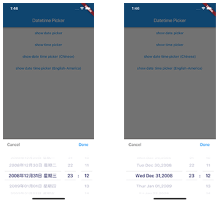
you can choose date / time / date&time in multiple languages:
and you can also custom your own picker content
| Date picker | Time picker | Date Time picker |
|---|---|---|
| https://raw.githubusercontent.com/Team-Picky/flutter_datetime_picker_plus/HEAD/screen_date.png | https://raw.githubusercontent.com/Team-Picky/flutter_datetime_picker_plus/HEAD/screen_time.png | https://raw.githubusercontent.com/Team-Picky/flutter_datetime_picker_plus/HEAD/screen_datetime_chinese.png |
International:
| Date Time picker (Chinese) | Date Time picker (America) | Date Time picker (Dutch) | Date Time picker (Russian) |
|---|---|---|---|
| https://raw.githubusercontent.com/Team-Picky/flutter_datetime_picker_plus/HEAD/screen_datetime_chinese.png | https://raw.githubusercontent.com/Team-Picky/flutter_datetime_picker_plus/HEAD/screen_datetime_english.png | https://raw.githubusercontent.com/Team-Picky/flutter_datetime_picker_plus/HEAD/screen_datetime_dutch.png | https://raw.githubusercontent.com/Team-Picky/flutter_datetime_picker_plus/HEAD/screen_datetime_russian.png |
main page
TextButton(
    onPressed: () {
        DatePicker.showDatePicker(context,
                              showTitleActions: true,
                              minTime: DateTime(2018, 3, 5),
                              maxTime: DateTime(2019, 6, 7), onChanged: (date) {
                            print('change $date');
                          }, onConfirm: (date) {
                            print('confirm $date');
                          }, currentTime: DateTime.now(), locale: LocaleType.zh);
    },
    child: Text(
        'show date time picker (Chinese)',
        style: TextStyle(color: Colors.blue),
    ));
If you want to customize your own style of date time picker, there is a class called CommonPickerModel, every type of date time picker is extended from this class, you can refer to other picker model (eg. DatePickerModel), and write your custom one, then pass this model to showPicker method, so that your own date time picker will appear, it’s easy, and will perfectly meet your demand
How to customize your own picker model:
class CustomPicker extends CommonPickerModel {
  String digits(int value, int length) {
    return '$value'.padLeft(length, "0");
  }

  CustomPicker({DateTime currentTime, LocaleType locale}) : super(locale: locale) {
    this.currentTime = currentTime ?? DateTime.now();
    this.setLeftIndex(this.currentTime.hour);
    this.setMiddleIndex(this.currentTime.minute);
    this.setRightIndex(this.currentTime.second);
  }

  @override
  String leftStringAtIndex(int index) {
    if (index >= 0 && index < 24) {
      return this.digits(index, 2);
    } else {
      return null;
    }
  }

  @override
  String middleStringAtIndex(int index) {
    if (index >= 0 && index < 60) {
      return this.digits(index, 2);
    } else {
      return null;
    }
  }

  @override
  String rightStringAtIndex(int index) {
    if (index >= 0 && index < 60) {
      return this.digits(index, 2);
    } else {
      return null;
    }
  }

  @override
  String leftDivider() {
    return "|";
  }

  @override
  String rightDivider() {
    return "|";
  }

  @override
  List<int> layoutProportions() {
    return [1, 2, 1];
  }

  @override
  DateTime finalTime() {
    return currentTime.isUtc
        ? DateTime.utc(currentTime.year, currentTime.month, currentTime.day,
            this.currentLeftIndex(), this.currentMiddleIndex(), this.currentRightIndex())
        : DateTime(currentTime.year, currentTime.month, currentTime.day, this.currentLeftIndex(),
            this.currentMiddleIndex(), this.currentRightIndex());
  }
}
By default every picker shows a Cancel/Done bar above the wheels. Pass a
titleActionsBuilder to any DatePicker.show* method to replace it with your
own widget. The builder receives onCancel / onConfirm callbacks (which
dismiss the picker the same way the default buttons do) and the currently
selected DateTime:
DatePicker.showDatePicker(
  context,
  titleActionsBuilder: (context, onCancel, onConfirm, currentTime) {
    return Row(
      mainAxisAlignment: MainAxisAlignment.spaceBetween,
      children: [
        TextButton(onPressed: onCancel, child: const Text('Close')),
        Text('${currentTime.year}-${currentTime.month}-${currentTime.day}'),
        TextButton(onPressed: onConfirm, child: const Text('Pick')),
      ],
    );
  },
);
The bar is laid out within the theme's titleHeight, so keep your widget
within that height (or raise titleHeight via a custom DatePickerTheme). The
builder is only used when showTitleActions is true (the default).
For help getting started with Flutter, view our online documentation.
For help on editing package code, view the documentation.