

 v0.1.5
flutter_scrolling_fab_animated
用于添加滚动时大小会变化的悬浮按钮的包
68喜欢 484近 30 天下载160Pub 分数
AndroidiOSWebmacOSWindowsLinux
ajomuch92/flutter-scrolling-fab-animated open-source repository details.

以下为英文项目原文快照,最新内容请访问 GitHub。
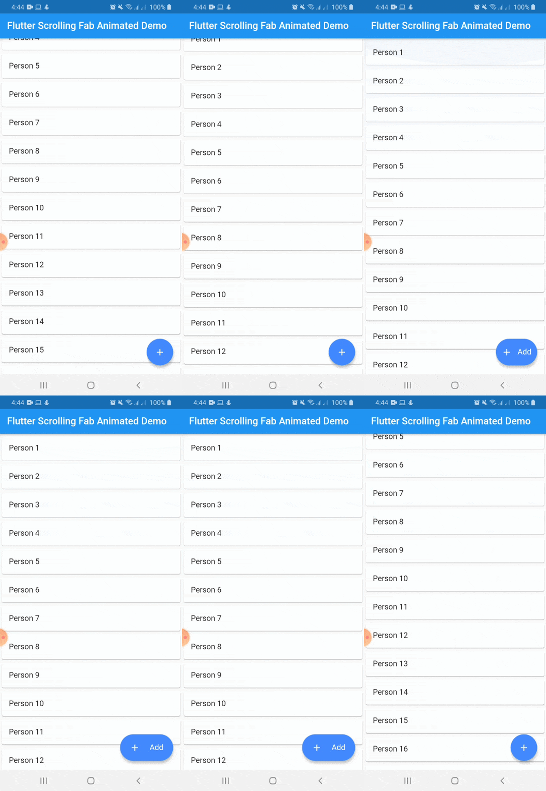
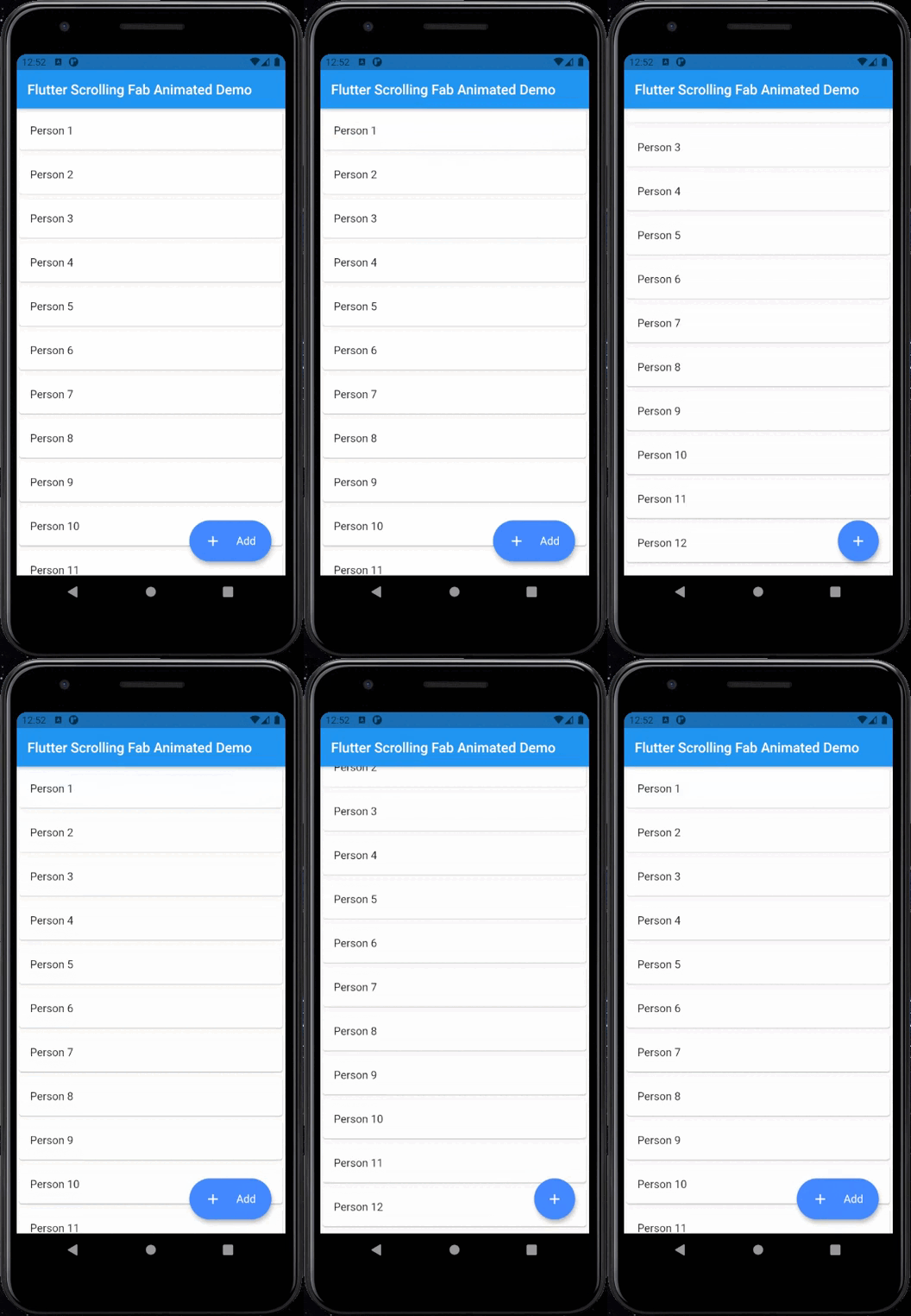
This package is a floating button whose change of size when scroll down and return to its original size when on top again. It's useful with ListView widget and other scrollable widgets.
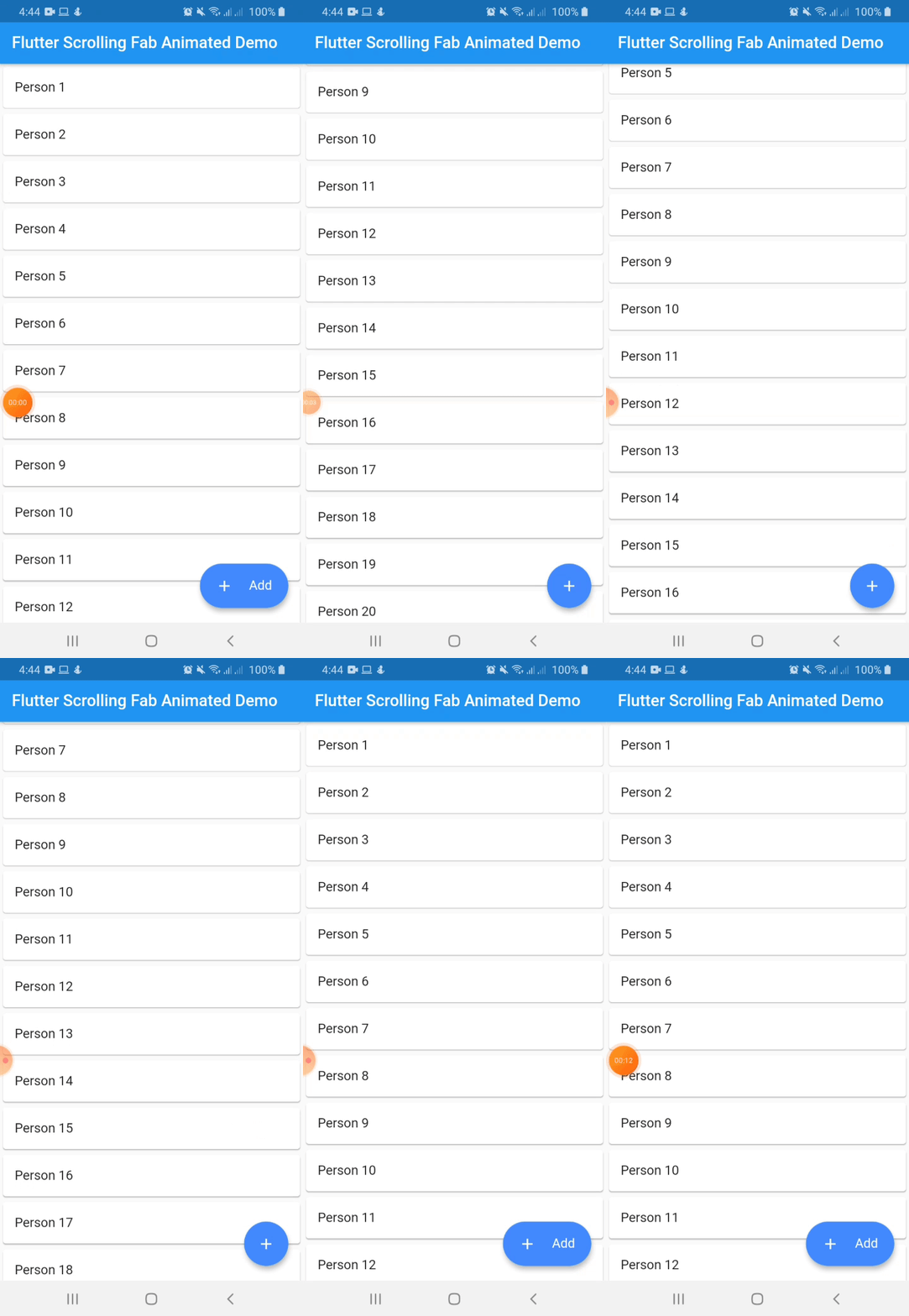
With animated icon
Include flutter_scrolling_fab_animated in your pubspec.yaml file:
dependencies:
  flutter:
    sdk: flutter
  flutter_scrolling_fab_animated: version
To use this package, just import it into your file and enjoy it.
import 'package:bottom_sheet_expandable_bar/bottom_sheet_bar_icon.dart';
import 'package:flutter_scrolling_fab_animated/flutter_scrolling_fab_animated.dart';

...

  @override
  Widget build(BuildContext context) {
    return Scaffold(
      appBar: AppBar(
        title: Text('Flutter Scrolling Fab Animated Demo'),
      ),
      body: Container(
        child: new ListView.builder(
          controller: _scrollController,
          itemCount: items.length,
          itemBuilder: (BuildContext ctxt, int index) {
            return new Card(
              child: ListTile(
                title: Text(items[index]),
              )
            );
          }
        ),
      ),
      floatingActionButton: ScrollingFabAnimated(
        icon: Icon(Icons.add, color: Colors.white,),
        text: Text('Add', style: TextStyle(color: Colors.white, fontSize: 16.0),),
        onPress: (){},
        scrollController: _scrollController,
        gradient: const LinearGradient(colors: [Color(0xff0CA2E6),Color(0xff2E3D97),],begin: Alignment.topCenter, end: Alignment.bottomCenter),
        animateIcon: true,
        inverted: false,
        radius: 10.0,
      )
    );
  }

...
Example with a GridView
import 'package:bottom_sheet_expandable_bar/bottom_sheet_bar_icon.dart';
import 'package:flutter_scrolling_fab_animated/flutter_scrolling_fab_animated.dart';

...

  @override
  Widget build(BuildContext context) {
    return Scaffold(
      appBar: AppBar(
        title: Text('Flutter Scrolling Fab Animated Demo'),
      ),
      body: Container(
        child: new GridView.builder(
          gridDelegate: SliverGridDelegateWithFixedCrossAxisCount(crossAxisCount: 2),
          controller: _scrollController,
          itemCount: items.length,
          itemBuilder: (BuildContext ctxt, int index) {
            return new Card(
              child: ListTile(
                title: Center(child: Text(items[index])),
              )
            );
          }),
      ),
      floatingActionButton: ScrollingFabAnimated(
        icon: Icon(Icons.add, color: Colors.white,),
        text: Text('Add', style: TextStyle(color: Colors.white, fontSize: 16.0),),
        onPress: (){},
        scrollController: _scrollController,
        animateIcon: true,
        inverted: false,
        radius: 10.0,
      )
    );
  }

...
| Name | Description | Required | Default |
|---|---|---|---|
| icon | Widget to use as button icon | True | |
| text | Widget to use as button text when button is expanded | True | |
| onPress | Function to use when press the button | True | |
| scrollController | ScrollController to use to determine when user is on top or not | True | |
| elevation | Double value to set the button elevation | False | 5.0 |
| shadowColor | Color value to set the button shadow color | False | ThemeData.shadowColor |
| width | Double value to set the button width when is expanded | False | 120.0 |
| height | Double value to set the button height | False | 60.0 |
| duration | Value to set the duration for animation | False | 250 milliseconds |
| curve | Value to set the curve for animation | False | Curves.easeInOut |
| limitIndicator | Double value to set the boundary value when scroll animation is triggered | False | 10.0 |
| color | Color to set the button background color | False | Colors.blueAccent |
| gradient | Color to set the button background gradient | False | null |
| animateIcon | Value to indicate if animate or not the icon | False | true |
| inverted | Value to inverte the behavior of the animation | False | false |
| radius | Double value to set the button radius | False | null |
依赖清单 2 项
{"sdk":"flutter"}{"sdk":"flutter"}先按使用场景筛选,再比较项目活跃情况,最后到原始仓库核对使用要求。
“A repository is the most basic element of GitHub.”
GitHub Docs — About repositories ↗