

 v3.2.2
flutter_advanced_switch
一个高级开关控件提供了丰富的 API 用于小部件自定义,为您的应用带来全新的外观和感觉。
166喜欢 2.4万近 30 天下载160Pub 分数
AndroidiOSWebmacOSWindowsLinux
https://pub.dev/packages/flutter_advanced_switch

以下为英文项目原文快照,最新内容请访问 GitHub。
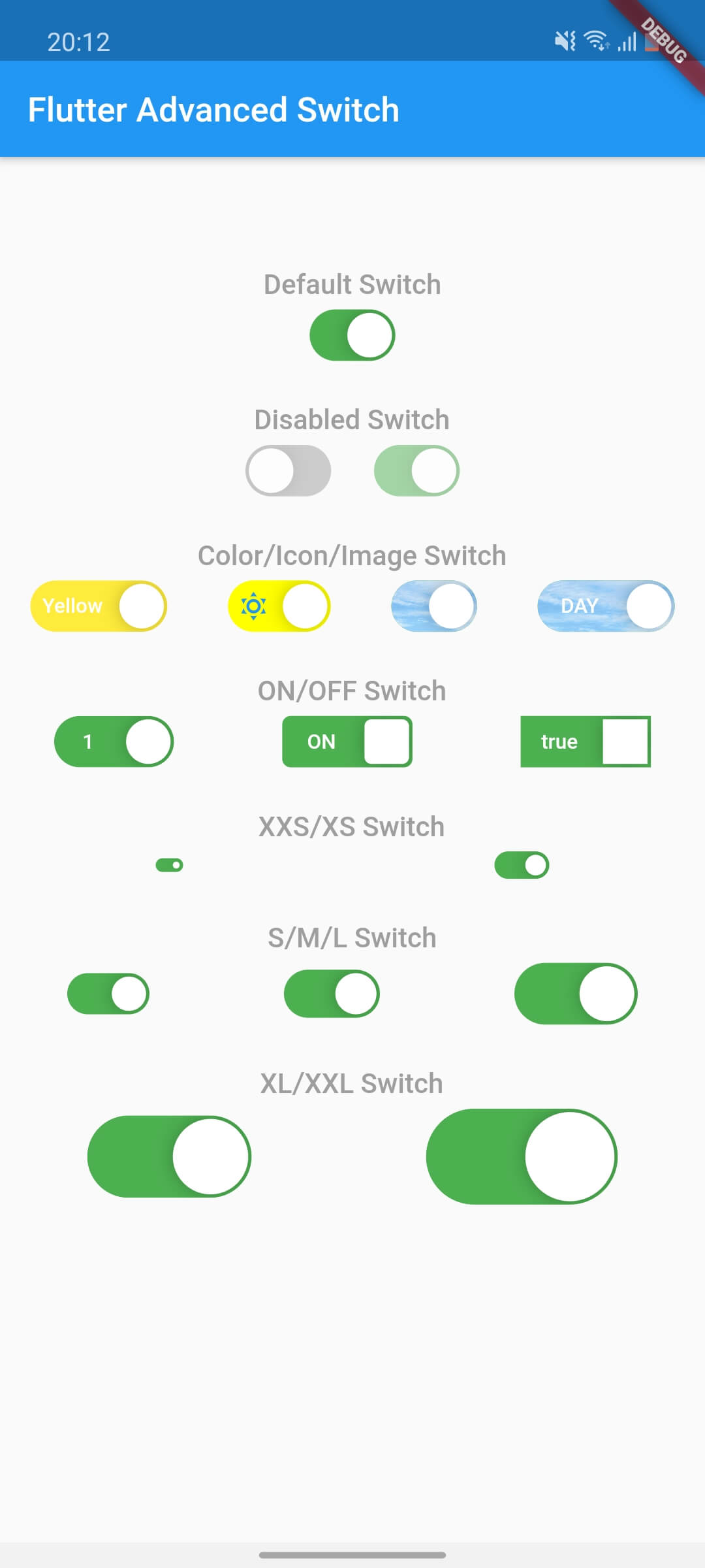
A highly customizable switch widget for Flutter with support for custom colors, text, icons, images, and more.

| Switch Light | Switch Dark |
|---|---|
 |
 |
In the pubspec.yaml of your flutter project, add the following dependency:
dependencies:
  flutter_advanced_switch: ^3.2.0
Import in your project:
import 'package:flutter_advanced_switch/flutter_advanced_switch.dart';
class MyWidget extends StatefulWidget {
  @override
  State<MyWidget> createState() => _MyWidgetState();
}

class _MyWidgetState extends State<MyWidget> {
  final _controller = ValueNotifier<bool>(false);

  @override
  void dispose() {
    _controller.dispose();
    super.dispose();
  }

  @override
  Widget build(BuildContext context) {
    return AdvancedSwitch(
      controller: _controller,
    );
  }
}
AdvancedSwitch(
  initialValue: false,
  onChanged: (value) {
    print('Switch value: $value');
  },
)
final _controller = ValueNotifier<bool>(false);

AdvancedSwitch(
  controller: _controller,
  activeColor: Colors.green,
  inactiveColor: Colors.red,
  activeChild: const Text('ON'),
  inactiveChild: const Text('OFF'),
  width: 70.0,
  height: 35.0,
  decoration: BoxDecoration(
    borderRadius: BorderRadius.circular(20),
  ),
)
final _controller = ValueNotifier<bool>(false);

AdvancedSwitch(
  controller: _controller,
  thumb: ValueListenableBuilder<bool>(
    valueListenable: _controller,
    builder: (_, value, __) {
      return Icon(
        value ? Icons.check : Icons.close,
        size: 16,
      );
    },
  ),
)
final _controller = ValueNotifier<bool>(false);

AdvancedSwitch(
  controller: _controller,
  activeImage: const AssetImage('assets/images/day.png'),
  inactiveImage: const AssetImage('assets/images/night.png'),
  activeChild: const Text('DAY'),
  inactiveChild: const Text('NIGHT'),
  width: 80,
)
final _controller = ValueNotifier<bool>(false);

AdvancedSwitch(
  controller: _controller,
  activeChild: const Icon(Icons.wb_sunny, size: 16),
  inactiveChild: const Icon(Icons.nightlight_round, size: 16),
  activeColor: Colors.orange,
  inactiveColor: Colors.indigo,
  width: 60,
)
class _MyWidgetState extends State<MyWidget> {
  final _controller = ValueNotifier<bool>(false);

  @override
  void initState() {
    super.initState();
    _controller.addListener(() {
      setState(() {
        // React to state changes
        print('Switch is now: ${_controller.value}');
      });
    });
  }

  @override
  void dispose() {
    _controller.dispose();
    super.dispose();
  }

  @override
  Widget build(BuildContext context) {
    return Column(
      children: [
        AdvancedSwitch(controller: _controller),
        Text('Switch is ${_controller.value ? "ON" : "OFF"}'),
      ],
    );
  }
}
| Parameter | Description | Type | Default |
|---|---|---|---|
controller |
Controls the state of the switch. If provided, the switch will use this controller to manage its state. | ValueNotifier<bool>? |
null |
activeColor |
The background color when the switch is in the active (on) state. | Color |
Color(0xFF4CAF50) |
inactiveColor |
The background color when the switch is in the inactive (off) state. | Color |
Color(0xFF9E9E9E) |
activeChild |
A widget to display on the left side when the switch is active. | Widget? |
null |
inactiveChild |
A widget to display on the right side when the switch is inactive. | Widget? |
null |
activeImage |
An optional background image to display when the switch is active. | ImageProvider? |
null |
inactiveImage |
An optional background image to display when the switch is inactive. | ImageProvider? |
null |
decoration |
The decoration to apply to the switch container. Typically used to set the border radius and shape. | BoxDecoration |
BorderRadius.circular(15) |
width |
The width of the switch. | double |
50.0 |
height |
The height of the switch. The thumb size is automatically calculated based on this value. | double |
30.0 |
enabled |
Whether the switch is enabled. If false, the switch will be displayed with reduced opacity and will not respond to user interactions. | bool |
true |
disabledOpacity |
The opacity to apply when the switch is disabled. | double |
0.5 |
thumb |
A custom widget to use as the thumb (the sliding part of the switch). If null, a default white rounded rectangle with a shadow will be used. | Widget? |
null |
thumbPadding |
The padding around the thumb. This creates space between the thumb and the switch edges. | double |
1.0 |
initialValue |
The initial state of the switch when controller is not provided. This value is only used when controller is null. | bool |
false |
onChanged |
Called when the user toggles the switch. The switch will call this callback with the new value. If null and no controller is provided, the switch will be disabled. | ValueChanged<bool>? |
null |

依赖清单 1 项
{"sdk":"flutter"}先按使用场景筛选,再比较项目活跃情况,最后到原始仓库核对使用要求。
“A repository is the most basic element of GitHub.”
GitHub Docs — About repositories ↗