
 v0.0.4
any_animated_button
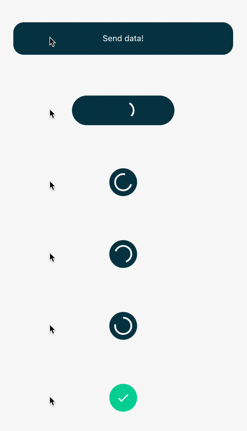
按钮在空闲、进度以及成功/错误状态之间进行动画切换,表示后台正在运行某个进程。
105喜欢 102近 30 天下载150Pub 分数
AndroidiOSWebmacOSWindowsLinux
在点击按钮后,我们经常需要将一些数据或表单发送到远程 API,并需要向用户发出信号。该包通过创建可扩展的 AnyAnimatedButton 和 AnyAnimatedButtonBloc,使这一过程变得简单。

{"sdk":"flutter"}^2.0.3^8.0.0^0.10.0^0.2.5{"sdk":"flutter"}以下为英文项目原文快照,最新内容请访问 GitHub。
Very often after tapping a button we send some data or form to remote API and we need to signalize it to the user. This package makes it easy for us by creating expandable AnyAnimatedButton and AnyAnimatedButtonBloc.
https://github.com/appvinio/any_animated_button/blob/main/gifs/pretty_button.gif?raw=true
AnyAnimatedButton depends on bloc pattern. To create custom button we need to create new bloc and
widget.
We need to create class, which extends AnyAnimatedButtonBloc and override asyncAction.
AnyAnimatedButtonBloc<Input, Output, Failure> takes 3 generic types:
Input - type of the input data we want to send or processOutput - type of the output data we will receive from i.e. APIFailure - type of error returned from bloc when any error occurs. It helps you manage your error handlingThe function we need to override depends on dartz Either, which return either a Failure or data of type Output and takes in an event with type Input.
Future<Either<Failure, Output>> asyncAction(Input input);
AnyAnimatedButton is based on AnimatedContainer. To create our own button we need to create class, which extends CustomAnyAnimatedButton. CustomAnyAnimatedButton consists of 2 fields, which needs to be overridden:
bloc - AnyAnimatedButtonBloc? - bloc which should be connected with the button. If we won't pass it, the button won't animatedefaultParams - AnyAnimatedButtonParams - params object, which describes how button should look and behaveand 3 optional fields:
progressParams - AnyAnimatedButtonParams - params object for describing button in progress statesuccessParams - AnyAnimatedButtonParams - params object for describing button in success stateerrorParams - AnyAnimatedButtonParams - params object for describing button in error stateThe class that holds all the data about button look and behavior. All properties that we want to animate should be put directly inside all corresponding fields. Rest of them (like Text) should go to child field, which takes Widget.
Fields list:
Key? key;
AlignmentGeometry? alignment;
EdgeInsetsGeometry? padding;
Color? color;
Decoration? decoration;
Decoration? foregroundDecoration;
double? width;
double height;
BoxConstraints? constraints;
EdgeInsetsGeometry? margin;
Matrix4? transform;
AlignmentGeometry? transformAlignment;
Widget? child;
Clip clipBehavior;
Curve curve;
Duration duration;
VoidCallback? onEnd;
The only required field is height, rest of them are optional.
We have got also 3 factory constructors, which describe default progress, error and success button state. We can reuse them with changed colors and size.
factory AnyAnimatedButtonParams.progress({
  double? size,
  Color backgroundColor = Colors.blue,
  Color progressColor = Colors.white,
  EdgeInsets padding = const EdgeInsets.all(10.0),
  Duration duration = const Duration(milliseconds: 300),
})
factory AnyAnimatedButtonParams.success({
  double? size,
  Color backgroundColor = Colors.green,
  Color iconColor = Colors.white,
  EdgeInsets padding = const EdgeInsets.all(8.0),
  Duration duration = const Duration(milliseconds: 300),
})
factory AnyAnimatedButtonParams.error({
  double? size,
  Color backgroundColor = Colors.red,
  Color iconColor = Colors.white,
  EdgeInsets padding = const EdgeInsets.all(8.0),
  Duration duration = const Duration(milliseconds: 300),
})
There are 3 possible width behaviors:
double.infinity - the button expands as much as he cannull - the button is as small as it can - it fits its contentfixed - we can set fixed width i.e. 200 and the button will always be this wideThere is one problem with InkWell splash effect. If we want the splash effect to work we need to put in child field firstly Material with transparent color → InkWell → rest of the child.
@override
AnyAnimatedButtonParams get defaultParams => AnyAnimatedButtonParams(
  child: Material(
    color: Colors.transparent,
    child: InkWell(
      onTap: onTap,
      borderRadius: someBorderRadius,
      child: restOfTheButton,
    ),
  ),
);
The package has built-in BlocListener, which makes it easier for you to listen to the state changes. AnyAnimatedButtonBlocListener<Input, Output, Failure> takes 3 generic types,Input is type of data that goes into the bloc, Output is type of data returned on success and Failure is the error which will be returned, when any error occurs in bloc.
AnyAnimatedButtonBlocListener<int, double, Failure>(
  bloc: _successBloc,
  onDefault: () {
    print('Default state');
  },
  onProgressStart: () {
    print('Progress state starts');
  },
  onProgressEnd: () {
    print('Progress state ends');
  },
  onSuccessStart: (value) {
   print('Value: $value');
  },
  onSuccessEnd: (value) {
   print('Value: $value');
  },
  onErrorStart: (failure) {
    print('Error state starts');
  },
  onErrorEnd: (failure) {
    print('Error state ends');
  },
),
My way of handling errors is to create abstract class Failure and extending it for every possible error place.
abstract class Failure extends Equatable {
  @override
  List<Object> get props => [];

  String get errorMessage => 'error';
}

class DefaultFailure extends Failure {}
All of the examples beneath are made based on only 1 button class:
class MinimalisticButton extends CustomAnyAnimatedButton {
  MinimalisticButton({
    required this.onTap,
    required this.text,
    this.enabled = true,
    this.width,
    this.bloc,
  });

  @override
  final AnyAnimatedButtonBloc? bloc;
  final VoidCallback onTap;
  final String text;
  final bool enabled;
  final double? width;

  final BorderRadius _borderRadius = BorderRadius.circular(22.0);

  @override
  AnyAnimatedButtonParams get defaultParams => AnyAnimatedButtonParams(
        width: width,
        height: 56.0,
        decoration: BoxDecoration(
          color: enabled ? Colors.blue : Colors.grey,
          borderRadius: _borderRadius,
        ),
        child: Material(
          color: Colors.transparent,
          child: InkWell(
            onTap: enabled ? onTap : null,
            borderRadius: _borderRadius,
            child: Padding(
              padding: const EdgeInsets.all(8.0),
              child: Column(
                mainAxisAlignment: MainAxisAlignment.center,
                children: [
                  Text(
                    text,
                    style: const TextStyle(color: Colors.white),
                    maxLines: 1,
                    softWrap: false,
                  ),
                ],
              ),
            ),
          ),
        ),
      );
}
and 3 bloc classes
_successBloc = SuccessBloc();
_success2Bloc = SuccessBloc();
_errorBloc = ErrorBloc();
_shortBloc = ShortBloc();
_enabledButton = ShortBloc();
_nullWidth = ShortBloc();
_infinityWidth = ShortBloc();
_fixedWidth = ShortBloc();
class SuccessBloc extends AnyAnimatedButtonBloc<int, double, Failure> {
  @override
  Future<Either<Failure, double>> asyncAction(int input) {
    return Future.delayed(
      const Duration(milliseconds: 2000),
      () => Right(input * 10.0),
    );
  }
}
class ErrorBloc extends AnyAnimatedButtonBloc<int, String, Failure> {
  @override
  Future<Either<Failure, String>> asyncAction(int input) {
    return Future.delayed(
      const Duration(milliseconds: 2000),
      () => Left(DefaultFailure()),
    );
  }
}
class ShortBloc extends AnyAnimatedButtonBloc<int, String, Failure> {
  @override
  Future<Either<Failure, String>> asyncAction(int input) {
    return Future.delayed(
      const Duration(milliseconds: 50),
      () => Left(DefaultFailure()),
    );
  }
}
MinimalisticButton(
  text: 'Non animated button',
  onTap: () {},
),
https://github.com/appvinio/any_animated_button/blob/main/gifs/not_animated_button.gif?raw=true
MinimalisticButton(
  bloc: _successBloc,
  text: 'Animated success button',
  onTap: () => _successBloc.add(TriggerAnyAnimatedButtonEvent(13)),
),
https://github.com/appvinio/any_animated_button/blob/main/gifs/success_animated_button.gif?raw=true
MinimalisticButton(
  bloc: _errorBloc,
  text: 'Animated error button',
  onTap: () => _errorBloc.add(TriggerAnyAnimatedButtonEvent(13)),
),
https://github.com/appvinio/any_animated_button/blob/main/gifs/error_animated_button.gif?raw=true
MinimalisticButton(
  bloc: _shortBloc,
  text: 'Short animation button',
  onTap: () => _shortBloc.add(TriggerAnyAnimatedButtonEvent(13)),
),
https://github.com/appvinio/any_animated_button/blob/main/gifs/short_animation_button.gif?raw=true
Row(
  mainAxisAlignment: MainAxisAlignment.center,
  children: [
    MinimalisticButton(
      bloc: _enabledButton,
      text: 'Enabled button',
      enabled: _enabled,
      onTap: () => _enabledButton.add(TriggerAnyAnimatedButtonEvent(13)),
    ),
    const SizedBox(width: 12.0),
    MinimalisticButton(
      text: _enabled ? '<- disable' : '<- enable',
      onTap: () {
        setState(() {
          _enabled = !_enabled;
        });
      },
    ),
  ],
),
https://github.com/appvinio/any_animated_button/blob/main/gifs/enabled_animated_button.gif?raw=true
MinimalisticButton(
  bloc: _nullWidth,
  text: 'width: null',
  onTap: () => _nullWidth.add(TriggerAnyAnimatedButtonEvent(13)),
),
https://github.com/appvinio/any_animated_button/blob/main/gifs/null_animated_button.gif?raw=true
MinimalisticButton(
  bloc: _infinityWidth,
  width: double.infinity,
  text: 'width: double.infinity',
  onTap: () => _infinityWidth.add(TriggerAnyAnimatedButtonEvent(13)),
),
https://github.com/appvinio/any_animated_button/blob/main/gifs/infinity_animated_button.gif?raw=true
MinimalisticButton(
  bloc: _fixedWidth,
  width: 200.0,
  text: 'width: 200.0',
  onTap: () => _fixedWidth.add(TriggerAnyAnimatedButtonEvent(13)),
),
https://github.com/appvinio/any_animated_button/blob/main/gifs/fixed_animated_button.gif?raw=true
width set to null does not work properly. The button width will adjust only to the first text width. The workaround is to set fixed width of the longer text instead of null.Created by Piotr Białas, appvinio