搜索插件、代码仓与 APP 分类

any_animated_button 封面
插件详情v0.0.4

any_animated_button

按钮在空闲、进度以及成功/错误状态之间进行动画切换,表示后台正在运行某个进程。

AndroidiOSWebmacOSWindowsLinux
近 30 天下载
455
喜欢数
105
Pub 分数
150

安装插件

flutter pub add any_animated_button

插件介绍

基于插件公开信息、社区数据与项目使用情况整理的选型参考。

AnyAnimatedButton 是一个 Flutter 包,提供可自定义的按钮,支持在空闲、进度、成功和错误状态之间的平滑动画。它能直观地显示后台进程的进行情况,从而在表单提交或数据加载等操作中增强用户反馈。该按钮支持多种自定义选项,包括颜色、图标、标签和动画持续时间。专为跨平台使用设计,可在 Android、iOS、Web、macOS、Windows 和 Linux 上无缝运行。非常适合需要实时反馈的应用程序来提升用户体验。

适合场景

  • 表单提交并加载状态
  • 文件上传进度指示器
  • 带有成功/错误反馈的认证流程
  • 带有动画过渡的入门流程
  • 后台任务状态可视化

主要特点

  • 平滑的状态转换动画
  • 可自定义的成功和错误状态
  • 支持按状态更改图标和文本
  • 跨平台兼容性
  • 可配置的动画持续时间和缓动
  • 可扩展的样式选项

适合对象

  • 寻求直观用户界面反馈的开发者
  • 频繁执行异步操作的应用程序
  • 以用户体验为中心的移动和Web应用
  • 快速原型化交互式按钮
  • 需要最少样板代码的进度指示器项目

使用建议

  • 需要理解 Flutter 的状态管理
  • 可能需要额外的逻辑来触发状态变化
  • 多个实例的性能影响
  • 限于预定义的动画类型
  • 不适合超出所提供状态的复杂自定义动画

原始 README

以下为关联源码仓库的 README 原文快照,最新内容请访问源码仓库。

any_animated_button

Very often after tapping a button we send some data or form to remote API and we need to signalize it to the user. This package makes it easy for us by creating expandable AnyAnimatedButton and AnyAnimatedButtonBloc.

Easy usage

AnyAnimatedButton depends on bloc pattern. To create custom button we need to create new bloc and
widget.

AnyAnimatedButtonBloc

We need to create class, which extends AnyAnimatedButtonBloc and override asyncAction.

AnyAnimatedButtonBloc<Input, Output, Failure> takes 3 generic types:

  • Input - type of the input data we want to send or process
  • Output - type of the output data we will receive from i.e. API
  • Failure - type of error returned from bloc when any error occurs. It helps you manage your error handling

The function we need to override depends on dartz Either, which return either a Failure or data of type Output and takes in an event with type Input.

Future<Either<Failure, Output>> asyncAction(Input input);

AnyAnimatedButton

AnyAnimatedButton is based on AnimatedContainer. To create our own button we need to create class, which extends CustomAnyAnimatedButton. CustomAnyAnimatedButton consists of 2 fields, which needs to be overridden:

  • bloc - AnyAnimatedButtonBloc? - bloc which should be connected with the button. If we won't pass it, the button won't animate
  • defaultParams - AnyAnimatedButtonParams - params object, which describes how button should look and behave

and 3 optional fields:

  • progressParams - AnyAnimatedButtonParams - params object for describing button in progress state
  • successParams - AnyAnimatedButtonParams - params object for describing button in success state
  • errorParams - AnyAnimatedButtonParams - params object for describing button in error state

AnyAnimatedButtonParams

The class that holds all the data about button look and behavior. All properties that we want to animate should be put directly inside all corresponding fields. Rest of them (like Text) should go to child field, which takes Widget.

Fields list:

Key? key;
AlignmentGeometry? alignment;
EdgeInsetsGeometry? padding;
Color? color;
Decoration? decoration;
Decoration? foregroundDecoration;
double? width;
double height;
BoxConstraints? constraints;
EdgeInsetsGeometry? margin;
Matrix4? transform;
AlignmentGeometry? transformAlignment;
Widget? child;
Clip clipBehavior;
Curve curve;
Duration duration;
VoidCallback? onEnd;

The only required field is height, rest of them are optional.

We have got also 3 factory constructors, which describe default progress, error and success button state. We can reuse them with changed colors and size.

factory AnyAnimatedButtonParams.progress({
  double? size,
  Color backgroundColor = Colors.blue,
  Color progressColor = Colors.white,
  EdgeInsets padding = const EdgeInsets.all(10.0),
  Duration duration = const Duration(milliseconds: 300),
})
factory AnyAnimatedButtonParams.success({
  double? size,
  Color backgroundColor = Colors.green,
  Color iconColor = Colors.white,
  EdgeInsets padding = const EdgeInsets.all(8.0),
  Duration duration = const Duration(milliseconds: 300),
})
factory AnyAnimatedButtonParams.error({
  double? size,
  Color backgroundColor = Colors.red,
  Color iconColor = Colors.white,
  EdgeInsets padding = const EdgeInsets.all(8.0),
  Duration duration = const Duration(milliseconds: 300),
})

Buttons width

There are 3 possible width behaviors:

  • double.infinity - the button expands as much as he can
  • null - the button is as small as it can - it fits its content
  • fixed - we can set fixed width i.e. 200 and the button will always be this wide

Splash effect

There is one problem with InkWell splash effect. If we want the splash effect to work we need to put in child field firstly Material with transparent color → InkWell → rest of the child.

@override
AnyAnimatedButtonParams get defaultParams => AnyAnimatedButtonParams(
  child: Material(
    color: Colors.transparent,
    child: InkWell(
      onTap: onTap,
      borderRadius: someBorderRadius,
      child: restOfTheButton,
    ),
  ),
);

AnyAnimatedButtonBlocListener

The package has built-in BlocListener, which makes it easier for you to listen to the state changes. AnyAnimatedButtonBlocListener<Input, Output, Failure> takes 3 generic types,Input is type of data that goes into the bloc, Output is type of data returned on success and Failure is the error which will be returned, when any error occurs in bloc.

AnyAnimatedButtonBlocListener<int, double, Failure>(
  bloc: _successBloc,
  onDefault: () {
    print('Default state');
  },
  onProgressStart: () {
    print('Progress state starts');
  },
  onProgressEnd: () {
    print('Progress state ends');
  },
  onSuccessStart: (value) {
   print('Value: $value');
  },
  onSuccessEnd: (value) {
   print('Value: $value');
  },
  onErrorStart: (failure) {
    print('Error state starts');
  },
  onErrorEnd: (failure) {
    print('Error state ends');
  },
),

Examples

My way of handling errors is to create abstract class Failure and extending it for every possible error place.

abstract class Failure extends Equatable {
  @override
  List<Object> get props => [];

  String get errorMessage => 'error';
}

class DefaultFailure extends Failure {}

All of the examples beneath are made based on only 1 button class:

class MinimalisticButton extends CustomAnyAnimatedButton {
  MinimalisticButton({
    required this.onTap,
    required this.text,
    this.enabled = true,
    this.width,
    this.bloc,
  });

  @override
  final AnyAnimatedButtonBloc? bloc;
  final VoidCallback onTap;
  final String text;
  final bool enabled;
  final double? width;

  final BorderRadius _borderRadius = BorderRadius.circular(22.0);

  @override
  AnyAnimatedButtonParams get defaultParams => AnyAnimatedButtonParams(
        width: width,
        height: 56.0,
        decoration: BoxDecoration(
          color: enabled ? Colors.blue : Colors.grey,
          borderRadius: _borderRadius,
        ),
        child: Material(
          color: Colors.transparent,
          child: InkWell(
            onTap: enabled ? onTap : null,
            borderRadius: _borderRadius,
            child: Padding(
              padding: const EdgeInsets.all(8.0),
              child: Column(
                mainAxisAlignment: MainAxisAlignment.center,
                children: [
                  Text(
                    text,
                    style: const TextStyle(color: Colors.white),
                    maxLines: 1,
                    softWrap: false,
                  ),
                ],
              ),
            ),
          ),
        ),
      );
}

and 3 bloc classes

_successBloc = SuccessBloc();
_success2Bloc = SuccessBloc();
_errorBloc = ErrorBloc();
_shortBloc = ShortBloc();
_enabledButton = ShortBloc();
_nullWidth = ShortBloc();
_infinityWidth = ShortBloc();
_fixedWidth = ShortBloc();
class SuccessBloc extends AnyAnimatedButtonBloc<int, double, Failure> {
  @override
  Future<Either<Failure, double>> asyncAction(int input) {
    return Future.delayed(
      const Duration(milliseconds: 2000),
      () => Right(input * 10.0),
    );
  }
}
class ErrorBloc extends AnyAnimatedButtonBloc<int, String, Failure> {
  @override
  Future<Either<Failure, String>> asyncAction(int input) {
    return Future.delayed(
      const Duration(milliseconds: 2000),
      () => Left(DefaultFailure()),
    );
  }
}
class ShortBloc extends AnyAnimatedButtonBloc<int, String, Failure> {
  @override
  Future<Either<Failure, String>> asyncAction(int input) {
    return Future.delayed(
      const Duration(milliseconds: 50),
      () => Left(DefaultFailure()),
    );
  }
}
Button with no bloc (not animating)
MinimalisticButton(
  text: 'Non animated button',
  onTap: () {},
),

Animated button with success outcome
MinimalisticButton(
  bloc: _successBloc,
  text: 'Animated success button',
  onTap: () => _successBloc.add(TriggerAnyAnimatedButtonEvent(13)),
),

Animated button with error outcome
MinimalisticButton(
  bloc: _errorBloc,
  text: 'Animated error button',
  onTap: () => _errorBloc.add(TriggerAnyAnimatedButtonEvent(13)),
),

Animated button with short loading state
MinimalisticButton(
  bloc: _shortBloc,
  text: 'Short animation button',
  onTap: () => _shortBloc.add(TriggerAnyAnimatedButtonEvent(13)),
),

Animated button with enabling functionality
Row(
  mainAxisAlignment: MainAxisAlignment.center,
  children: [
    MinimalisticButton(
      bloc: _enabledButton,
      text: 'Enabled button',
      enabled: _enabled,
      onTap: () => _enabledButton.add(TriggerAnyAnimatedButtonEvent(13)),
    ),
    const SizedBox(width: 12.0),
    MinimalisticButton(
      text: _enabled ? '<- disable' : '<- enable',
      onTap: () {
        setState(() {
          _enabled = !_enabled;
        });
      },
    ),
  ],
),

Animated button with width: null
MinimalisticButton(
  bloc: _nullWidth,
  text: 'width: null',
  onTap: () => _nullWidth.add(TriggerAnyAnimatedButtonEvent(13)),
),

Animated button with width: double.infinity
MinimalisticButton(
  bloc: _infinityWidth,
  width: double.infinity,
  text: 'width: double.infinity',
  onTap: () => _infinityWidth.add(TriggerAnyAnimatedButtonEvent(13)),
),

Animated button with fixed width: 200.0
MinimalisticButton(
  bloc: _fixedWidth,
  width: 200.0,
  text: 'width: 200.0',
  onTap: () => _fixedWidth.add(TriggerAnyAnimatedButtonEvent(13)),
),

Known bugs

  • updating text on button with width set to null does not work properly. The button width will adjust only to the first text width. The workaround is to set fixed width of the longer text instead of null.

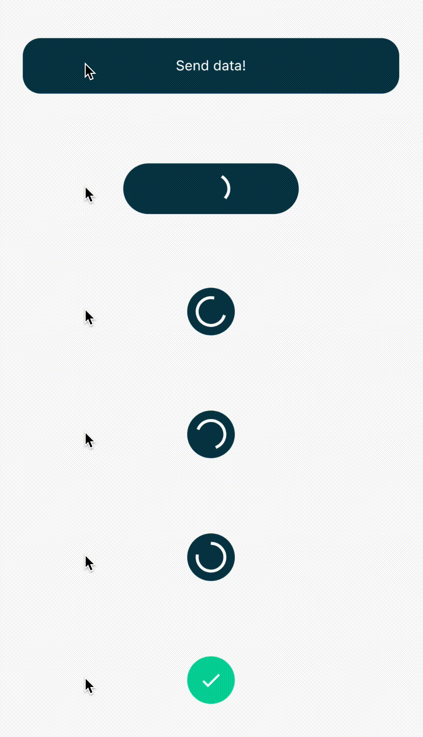
Created by Piotr Białas, appvinio

所属分类

依赖

依赖清单 3 项

源码仓库

使用此插件的项目

暂无相关数据。