
 v1.0.0
flip_board
FlipBoards 是 FlipWidgets 的组合,FlipWidgets 是一种通过翻转动画来实现内容变化的控件。包括 FlipFraseBoard、FlipMatrix、FlipClock 等。
115喜欢 1130近 30 天下载150Pub 分数
AndroidiOSWebmacOSWindowsLinux
cc-nogueira/flip_board open-source repository details.

^2.11.0{"sdk":"flutter"}^2.0.2{"sdk":"flutter"}以下为英文项目原文快照,最新内容请访问 GitHub。
Widgets to build displays that resemble Mechanical Flip Boards.
The basic component is a stateful FlipWidget that renders flip transitions for a stream of items and an itemBuilder.
The package also includes other widgets that compose this basic component in useful Flip Boards:
The most distinctive characteristic of a FlipWidget is its flip type to define the type of movement that will animate items rendering, either FlipType.middleFlip or FlipType.spinFlip.
This widget renders flip animations in a configured Axis and AxisDirection, animating the transition to each new item received in the given item stream. It is commonly used to display digits and letters but can actually render any widget you build through the given itemBuilder.
It is constructed with four required parameters (besides many optional parameters):
Please check the class documentation to see all options.
When we think of Mechanical Flip Boards as we used to see in airports and sport score boards we think on a Vertical MiddleFlip Widget or, most likely, on a composition (row) of them.
Its construction could look like:
FlipWidget({
  flipType: FlipType.middleFlip,
  itemStream: _stream,
  itemBuilder: _itemBuilder,
  flipDirection: AxisDirection.down,
});
With FlipType.spinFlip this widget will render a Flip Card animation when new items arrive in the stream.
It has a similiar constructor, something like:
FlipWidget({
  flipType: FlipType.spinFlip,
  itemStream: _stream,
  itemBuilder: _itemBuilder,
  flipDirection: AxisDirection.right,
});
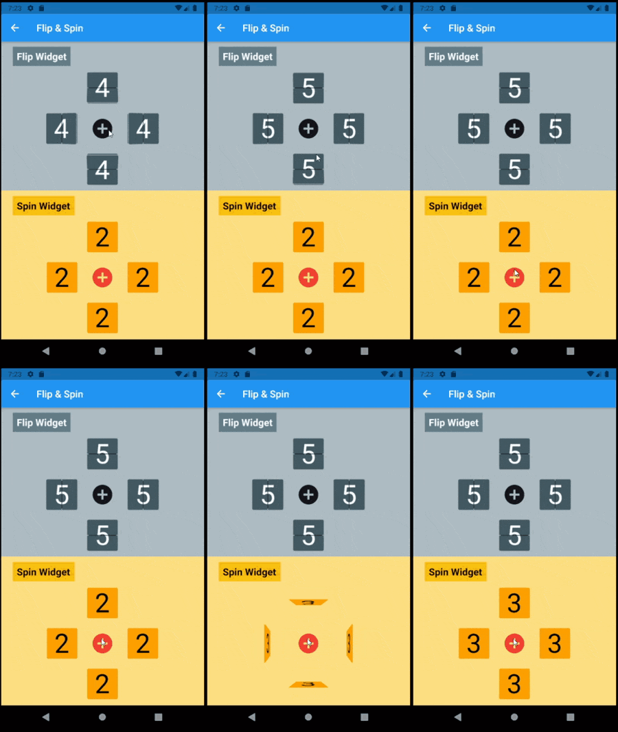
Example page that shows both types and all flipping directions (full code in examples folder):
https://raw.githubusercontent.com/cc-nogueira/flip_board/master/screenshots/Flip_and_Spin_300.gif?raw=true @override
Widget build(BuildContext context) =>
Center(
child: Column(
mainAxisAlignment: MainAxisAlignment.center,
children: [
_flipWheel,
_spinWheel,
],
),
);
Widget get _flipWheel =>
Center(
child: Column(
mainAxisSize: MainAxisSize.min,
children: [
_wheelTitle('Flip Widget'),
_flipWidget(AxisDirection.up),
Row(
mainAxisSize: MainAxisSize.min,
children: [
_flipWidget(AxisDirection.left),
_button,
_flipWidget(AxisDirection.right),
],
),
_flipWidget(AxisDirection.down),
],
),
);
Widget _flipWidget(AxisDirection direction) =>
FlipWidget(
flipType: FlipType.middleFlip,
itemStream: _flipController.stream,
itemBuilder: _itemBuilder,
initialValue: _nextFlipValue,
flipDirection: direction,
hingeWidth: 1.0,
hingeLength: 56.0,
hingeColor: Colors.black,
);
Widget _itemBuilder(BuildContext context, int? value) =>
Container(
width: 64.0,
height: 64.0,
alignment: Alignment.center,
decoration: BoxDecoration(
borderRadius: const BorderRadius.all(Radius.circular(4.0)),
border: Border.all(),
),
child: Text(
(value ?? 0).toString(),
style: TextStyle(fontSize: 54.0),
),
);
void _flip() => _flipController.add(++_nextFlipValue % 10);
Basic FlipWidgets are usually composed in a layout, this package provides a few configurable compositions of FlipWidgets of the same type and orientation, sometimes varying some elements direction within that axis orientation.
All these composed widgets are described below and explored in the examples folder.
There two classes of FlipMatrixBoard that animate the display in a matrix of FlipWidgets. The first class displays a single child, an image in the given example. The second class animates the display of a stream of items, also given as a stream of images in the example below.
The board is configured with the number of rows and columns, flipping orientation and animation speed and delays parameters.
FlipMatrixBoardSingleChild
https://raw.githubusercontent.com/cc-nogueira/flip_board/master/screenshots/Flip_Image_300.gif?raw=true Widget get _flipImage =>
Container(
decoration: BoxDecoration(
border: Border.all(width: 3.0, color: Colors.red[900]!),
),
child: FlipMatrixBoardSingleChild.assetImage(
imageName: 'assets/horizontal/dart-frog.jpg',
backgroundColor: Colors.black,
axis: Axis.vertical,
width: 364.0,
height: 205.0,
columnCount: 8,
rowCount: 4,
),
);
FlipMatrixBoardStream
https://raw.githubusercontent.com/cc-nogueira/flip_board/master/screenshots/Flip_Stream_300.gif?raw=true Widget get _flipWidget =>
Container(
decoration: BoxDecoration(border: Border.all(color: Colors.blue)),
child: FlipMatrixBoardStream<String>(
itemStream: _controller.stream,
itemBuilder: _itemBuilder,
axis: Axis.vertical,
width: 375.0,
height: 200.0,
columnCount: 8,
rowCount: 4,
),
);
FlipClock will default to Theme colors but can be further customized through constructor parameters.
The default flip direction is AxisDirection.down and the default animation curve is a custom curve that acceletares like gravity and bounces back at the end (like a mechanical bang).
In the example below some colors are inherited by a parent ThemeData from the amber color scheme. While some colors are defined in the constructor invocation:
https://raw.githubusercontent.com/cc-nogueira/flip_board/master/screenshots/Flip_Clock_300.gif?raw=true Widget _flipClock(ColorScheme colors) =>
Container(
decoration: BoxDecoration(
color: colors.onPrimary,
borderRadius: const BorderRadius.all(Radius.circular(8.0)),
),
padding: const EdgeInsets.all(16.0),
child: FlipClock(
digitSize: 54.0,
width: 46.0,
height: 62.0,
separatorColor: colors.primary,
hingeColor: Colors.black,
showBorder: true,
),
);
FlipCountdownClock is similar, it requires a duration parameter and may be configured with an onDone callback function.
Countdown default flip direction is AxisDirection.up, the opposite of FlipClock, with no panel bang animation.
In the following example most colors are configured with constructor parameters:
https://raw.githubusercontent.com/cc-nogueira/flip_board/master/screenshots/Flip_Countdown_300.gif?raw=true Widget _flipCountdown(ColorScheme colors) =>
Container(
decoration: BoxDecoration(
color: colors.secondary,
borderRadius: BorderRadius.circular(8.0),
),
padding: const EdgeInsets.all(24.0),
child: FlipCountdownClock(
duration: const Duration(minutes: 1),
digitSize: 54.0,
width: 46.0,
height: 62.0,
digitColor: colors.surface,
backgroundColor: colors.onSurface,
separatorColor: colors.onSurface,
borderColor: colors.primary,
hingeColor: colors.surface,
borderRadius: const BorderRadius.all(Radius.circular(8.0)),
onDone: () => print('Buzzzz!'),
),
);
This composed widget displays a Frase Board that will animate each letter up to the the given frase letters.
Flip type, initial and end colors, delays and more are all customized at constructor level. Check the class documentation for a run over all configurations.
The provided example looks like this:
https://raw.githubusercontent.com/cc-nogueira/flip_board/master/screenshots/Flip_Frase_Board_300.gif?raw=trueThis page displays a variety of frase boards, one of them would be constructed like this:
  Widget _flipFraseBoard(FlipType type, Axis axis, String frase) =>
    FlipFraseBoard(
      flipType: type,
      axis: axis,
      startLetter: 'A',
      endFrase: frase,
      fontSize: 30.0,
      hingeWidth: 0.6,
      hingeColor: Colors.black,
      borderColor: Colors.black,
      endColors: _flipEndColors,
      letterSpacing: 2.0,
    );
We created a simple game to use a FlipWidget in a more complex context. Check the code in the example folder to see the complete implementation.
Flip cards untill you make all three cards match the same painting.
There are two valid actions: