
 v3.0.0
flutter_floating_bottom_bar
一个 Flutter 包,允许显示一个浮动小部件,可用于标签栏、底部导航栏等。该小部件还能响应滚动事件。
363喜欢 8640近 30 天下载160Pub 分数
AndroidiOSWebmacOSWindowsLinux
codenameakshay/flutter-floating-bottom-bar open-source repository details.

{"sdk":"flutter"}>=1.0.0 <1.3.0>=1.0.0 <1.1.0^1.1.0{"sdk":"flutter"}^6.0.0以下为英文项目原文快照,最新内容请访问 GitHub。
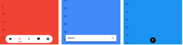
A Flutter package that floats any widget above your content and reacts to scrolling. Use it as a tab bar, bottom navigation bar, search bar, command surface, or any custom child.
Platform Pub Package License: MIT Donate
| Issues dock | AI prompt dock | Basic TabBar |
|---|---|---|
| Issues dock | AI prompt dock | Basic TabBar |
| Minimal API | Nested scroll | Badged nav |
| Minimal API | Nested scroll | Badged nav |
| Custom transition | ||
| Custom transition |
TabBar, BottomBarItems, a search
composer, or a custom Row.ScrollController plumbing.BottomBarLayout.adaptive(maxWidth: ...) fills the host width while keeping
a hard cap for tablets, desktop, and wide layouts.BottomBarBodyPadding reserves the bar's full measured footprint, including
configured offset and bottom safe-area, so body content stays clear even
while the bar is hidden.BottomBarMotion() defaults to Motor-backed Cupertino spring motion with
velocity-preserving redirects when scroll direction changes mid-animation.ColorScheme.onPrimary.BottomBarController supports imperative show/hide plus
scrollToStart()/scrollToEnd(), including correct NestedScrollView
boundary targeting.Motion from the motor package is re-exported intentionally for
BottomBarMotion.motor(...).Requires Dart >=3.12.0 and Flutter >=3.44.0.
See the 3.0.0 release notes for the complete list of new layout, scrolling, accessibility, and reliability improvements.
flutter pub add flutter_floating_bottom_bar
import 'package:flutter_floating_bottom_bar/flutter_floating_bottom_bar.dart';
If you use Claude Code, this repo ships a skill for integration, migration, and debugging help around this package.
Install by copying .claude/skills/flutter-floating-bottom-bar/
into your Claude skills directory.
BottomBar(
  layout: const BottomBarLayout.adaptive(maxWidth: 420),
  body: BottomBarBodyPadding(
    padding: const EdgeInsets.only(top: 24),
    child: ListView.builder(
      padding: const EdgeInsets.symmetric(horizontal: 16),
      itemCount: 50,
      itemBuilder: (_, index) => ListTile(title: Text('Item $index')),
    ),
  ),
  child: const Padding(
    padding: EdgeInsets.symmetric(horizontal: 16, vertical: 14),
    child: Row(
      mainAxisAlignment: MainAxisAlignment.spaceBetween,
      children: [
        Icon(Icons.home_rounded),
        Text('Floating bar'),
        Icon(Icons.search_rounded),
      ],
    ),
  ),
)
BottomBar needs two required arguments:
body: the subtree that emits ScrollNotifications.child: the floating widget shown above that body.The bar is stacked above the body, so use BottomBarBodyPadding when your body
should reserve enough bottom space to stay clear of the bar.
Use BottomBarLayout.adaptive(maxWidth: ...) to span narrow screens while
stopping at a defined maximum on wide screens. Pair it with
BottomBarBodyPadding when the body should reserve the full footprint.
BottomBar(
  layout: const BottomBarLayout.adaptive(maxWidth: 440),
  body: const BottomBarBodyPadding(
    child: CustomScrollView(
      slivers: [
        SliverAppBar(title: Text('Inbox')),
        SliverList.list(
          children: [
            ListTile(title: Text('Message 1')),
            ListTile(title: Text('Message 2')),
          ],
        ),
      ],
    ),
  ),
  child: const SizedBox(
    height: 56,
    child: Center(child: Text('Compose')),
  ),
)
BottomBarScope.barHeight and BottomBarBodyPadding use the bar's measured
layout footprint, not its animated transform. The reported value includes the
bar height plus configured layout.offset and bottom safe-area when
respectSafeArea is enabled.
BottomBarController.scrollToStart() always targets the minimum extent and
scrollToEnd() always targets the maximum extent. In a NestedScrollView, the
controller automatically chooses the correct coordinated boundary controller:
scrollToStart() drives the outer controller so pinned/expanded header
slivers return to their true top state.scrollToEnd() drives the inner controller so the body scrolls to the end
and the header collapses naturally.If your body emits unrelated notifications, use
BottomBarScrollBehavior.predicate to filter them.
BottomBar(
  controller: controller,
  scrollBehavior: BottomBarScrollBehavior(
    predicate: (notification) => notification.depth == 0,
    showAtStart: true,
    showOnScrollEnd: true,
  ),
  body: NestedScrollView(
    headerSliverBuilder: (_, __) => const [
      SliverAppBar(
        pinned: true,
        expandedHeight: 180,
        flexibleSpace: FlexibleSpaceBar(title: Text('Nested scroll')),
      ),
    ],
    body: ListView.builder(
      itemCount: 100,
      itemBuilder: (_, index) => ListTile(title: Text('Row $index')),
    ),
  ),
  child: const SizedBox(
    height: 56,
    child: Center(child: Text('Scroll-aware')),
  ),
)
BottomBar normally drives visibility from ScrollNotifications bubbled up
from body. Some content — most notably an embedded WebView — scrolls
internally without ever emitting one. For those cases, call
BottomBarController.reportScroll from the WebView's own scroll callback:
controller.reportScroll(delta: newPixels - oldPixels);
This drives the same threshold/reverse/hideOnScroll visibility rules as
body scrolling. It only affects visibility — scrollToStart()/scrollToEnd()
still require a real ScrollPosition, which a WebView cannot provide.
Custom transition builders must preserve the child's layout footprint. Use
paint-only wrappers such as Opacity, Transform.translate, or
Transform.scale.
Do not use layout-changing widgets such as SizeTransition or Align with a
heightFactor; those break the stable footprint contract used by
BottomBarScope.barHeight and BottomBarBodyPadding.
BottomBar(
  motion: BottomBarMotion(
    transitionBuilder: (context, animation, child) {
      final value = animation.value.clamp(0.0, 1.0);
      return Opacity(
        opacity: value,
        child: Transform.scale(
          scale: 0.92 + (0.08 * value),
          child: child,
        ),
      );
    },
  ),
  body: ListView.builder(
    itemCount: 100,
    itemBuilder: (_, index) => ListTile(title: Text('Row $index')),
  ),
  child: const SizedBox(
    height: 56,
    child: Center(child: Text('Paint-only transition')),
  ),
)
Spring progress can overshoot. Clamp animation.value before using it for
opacity or scale.
BottomBarItems and BottomBarItemBottomBarItems is a row helper. BottomBarItem is an opinionated item widget
with built-in accessibility and RTL-aware badge placement.
PositionedDirectional, so it follows the top-end corner in
both LTR and RTL layouts.semanticLabel wins, otherwise
tooltip, otherwise descendant semantics.semanticLabel or tooltip provides the explicit accessible name,
descendant semantics are excluded to avoid duplicate announcements.BottomBarItems wraps every child in Expanded, so items share the row's
width equally. Narrow bounded rows use a horizontal scroll view to preserve
the minimum targets; unbounded rows keep their raw children.BottomBarItem's Text label (with non-null data) is truncated to a
single line with an ellipsis. Text.rich and other label widgets are left
untouched.BottomBarItems.labelBehavior (BottomBarLabelBehavior.alwaysShow by
default) controls when descendant labels render: alwaysShow,
onlySelected, or alwaysHide. An item used outside a BottomBarItems
row always shows its label.| v1.x | v2.x | Migration |
|---|---|---|
body: (context, controller) => Widget |
body: Widget |
Drop the builder. The bar listens to ScrollNotifications from descendant scrollables. |
barColor |
removed | Use BottomBarThemeData.barDecoration or theme:. |
width, offset, borderRadius, barAlignment, fit, clip, respectSafeArea |
BottomBarLayout |
Move these into layout: BottomBarLayout(...). barAlignment became alignment. |
duration, curve, start, end |
BottomBarMotion |
BottomBarMotion() now defaults to Cupertino spring motion. start/end became slideStart/slideEnd. |
hideOnScroll, reverse, scrollOpposite, scrollDeltaThreshold |
BottomBarScrollBehavior |
Move these into scrollBehavior: BottomBarScrollBehavior(...). scrollDeltaThreshold became deltaThreshold. |
iconWidth, iconHeight, iconDecoration, barDecoration |
BottomBarThemeData |
Move these to the theme or the theme: override. |
BottomBarScrollControllerProvider |
BottomBarScope |
The old controller provider was replaced by BottomBarScope, which exposes barHeight and isVisible. |
No backward-compatibility shim ships with v2.
BottomBar| Parameter | Type | Default | Notes |
|---|---|---|---|
child |
Widget |
required | Floating content shown above the body. |
body |
Widget |
required | Descendant scrollables here drive hide/show via notifications. |
controller |
BottomBarController? |
null |
Imperative show/hide/scroll API. |
layout |
BottomBarLayout? |
null |
Falls back to theme layout, then const BottomBarLayout(). |
motion |
BottomBarMotion? |
null |
Falls back to theme motion, then const BottomBarMotion(). |
scrollBehavior |
BottomBarScrollBehavior? |
null |
Falls back to theme scroll behavior, then const BottomBarScrollBehavior(). |
theme |
BottomBarThemeData? |
null |
Per-instance theme overrides. |
icon |
BackToTopIconBuilder? |
null |
Custom hidden action visual. |
showIcon |
bool |
true |
Enables or removes the built-in hidden action. |
iconSemanticLabel |
String? |
null |
Defaults to the direction-aware tooltip text. |
iconTooltip |
String? |
null |
Defaults to Scroll to top or Scroll to bottom. |
The hidden action is only interactive while the bar is hidden. While the bar is visible it is ignored for hit testing and removed from the semantics tree.
BottomBarLayout| Field | Type | Default | Notes |
|---|---|---|---|
width |
double |
300 |
Requested bar width before viewport/max-width clamping. |
maxWidth |
double? |
null |
Optional explicit width cap after host constraints. |
offset |
double |
10 |
Outer padding applied around the bar or hidden action. |
borderRadius |
BorderRadius |
BorderRadius.circular(28) |
Matches the default Material 3 bar decoration; pass BorderRadius.zero for a square bar. |
iconOffset |
Offset |
Offset.zero |
Extra translation applied only to the hidden action. |
alignment |
Alignment |
Alignment.bottomCenter |
Shared alignment for the bar and hidden action. |
fit |
StackFit |
StackFit.loose |
Host stack fit. |
clip |
Clip |
Clip.hardEdge |
Host stack clip behavior. |
respectSafeArea |
bool |
true |
Wraps the bar and hidden action in SafeArea. |
avoidKeyboard |
bool |
true |
Pads the bar and hidden action by MediaQuery.viewInsets.bottom so they sit above the keyboard. No-op when insets are 0 (typical inside a Scaffold body). |
Use BottomBarLayout.adaptive(maxWidth: ...) to fill available width up to a
hard cap. When deriving layouts, copyWith(clearMaxWidth: true) explicitly
removes an existing cap.
BottomBarMotion| Field | Type | Default | Notes |
|---|---|---|---|
mode |
BottomBarMotionMode |
cupertino |
BottomBarMotion() defaults to Cupertino spring mode. |
duration |
Duration |
500ms in default Cupertino mode |
Used for curved motion and scroll-to-boundary animation timing. |
curve |
Curve |
Curves.easeOutCubic |
Used by curved motion and controller boundary scrolling. |
cupertinoPreset |
BottomBarCupertinoMotion |
snappy |
Default Cupertino preset. |
transition |
BottomBarTransition |
slide |
Built-in transition when transitionBuilder is null. |
transitionBuilder |
Widget Function(BuildContext, Animation<double>, Widget)? |
null |
Overrides the enum. Must preserve layout footprint and stay paint-only. |
slideStart |
Offset |
Offset(0, 2) |
Hidden offset for slide and slideAndFade. |
slideEnd |
Offset |
Offset.zero |
Visible offset for slide and slideAndFade. |
Reduced-motion environments snap to the target shown/hidden state instead of animating.
BottomBarScrollBehavior| Field | Type | Default | Notes |
|---|---|---|---|
hideOnScroll |
bool |
true |
Disables scroll-driven hiding when false. |
reverse |
bool |
false |
Inverts the scroll direction that hides vs shows the bar. |
scrollOpposite |
bool |
false |
Changes only the built-in hidden action direction, tooltip, and glyph. It does not change scrollToStart() or scrollToEnd(). |
deltaThreshold |
double |
8 |
Minimum absolute delta required before visibility can flip. |
showAtStart |
bool |
false |
Forces the bar visible when a scrollable reaches its minimum extent. |
showOnScrollEnd |
bool |
false |
Forces the bar visible when scrolling settles. |
keepVisibleOnFocus |
bool |
true |
Skip scroll-hide while the floating child has focus. BottomBarController.hide() still hides it. |
predicate |
bool Function(ScrollNotification)? |
null |
Skip notifications entirely when it returns false. |
BottomBarController| Member | Notes |
|---|---|
isVisible |
Tracks the currently attached bar's visibility. |
isAttached |
Whether the controller is attached to a live bar. |
show() / hide() / toggle() |
Imperative visibility controls. |
scrollToStart() |
Always scrolls the last active scrollable to its minimum extent. |
scrollToEnd() |
Always scrolls the last active scrollable to its maximum extent. |
reportScroll(delta: ...) |
Drives visibility from a source that doesn't emit ScrollNotifications (e.g. WebView). Visibility only; doesn't affect scrollToStart/scrollToEnd. |
A controller can own only one live bar at a time. Double-attach fails in both debug and release, and visibility updates are accepted only from the owning bar binding.
BottomBarScopeBottomBarScope exposes two listenables inside BottomBar.body:
barHeight: the live measured bar footprint, including offset and bottom
safe-area when enabled.isVisible: the current shown/hidden target state.Use BottomBarBodyPadding when you want the common "reserve the bottom
footprint for me" behavior without wiring your own ValueListenableBuilder.
example/example/lib/main.dartSee CONTRIBUTING.md for setup, quality checks, and release dry-run steps.
Open an issue at https://github.com/codenameakshay/flutter-floating-bottom-bar/issues.