

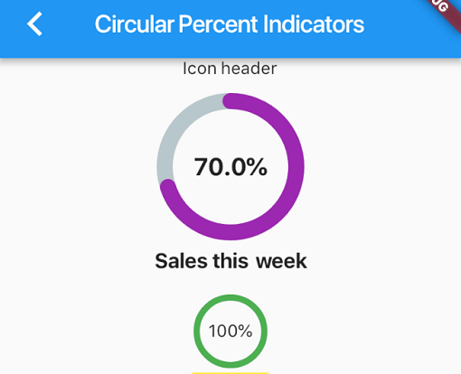
 v4.2.5
percent_indicator
一个允许您根据百分比显示进度控件的库,可以是圆形或线性,您还可以根据需要进行自定义。
2780喜欢 72.2万近 30 天下载140Pub 分数
AndroidiOSWebmacOSWindowsLinux
Flutter 百分比指示器库

以下为英文项目原文快照,最新内容请访问 GitHub。

Circular, Linear and Multi-segment linear percent indicators


You should ensure that you add the router as a dependency in your flutter project.
dependencies:
  percent_indicator: ^4.2.5
You should then run flutter packages upgrade or update your packages in IntelliJ.
There is a example project in the example folder. Check it out. Otherwise, keep reading to get up and running.
Need to include the import the package to the dart file where it will be used, use the below command,
import 'package:percent_indicator/percent_indicator.dart';
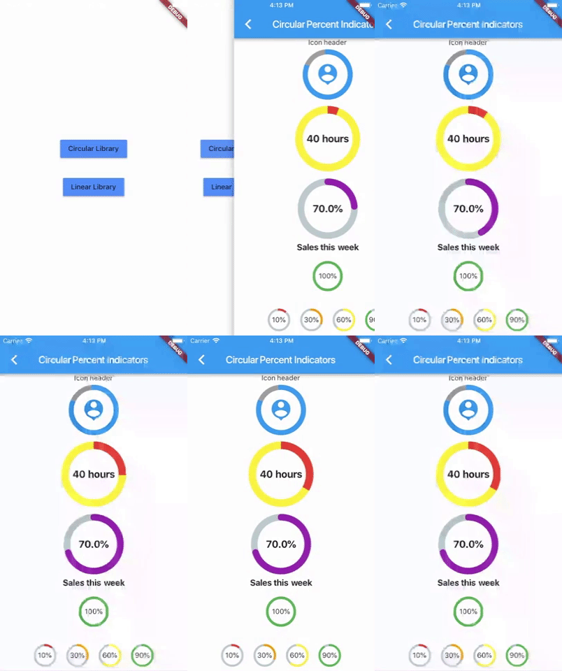
Circular percent indicator
Basic Widget
new CircularPercentIndicator(
                  radius: 60.0,
                  lineWidth: 5.0,
                  percent: 1.0,
                  center: new Text("100%"),
                  progressColor: Colors.green,
                )
Complete example
  @override
  Widget build(BuildContext context) {
    return Scaffold(
      appBar: new AppBar(
        title: new Text("Circular Percent Indicators"),
      ),
          body: Center(
        child: ListView(
            children: <Widget>[
              new CircularPercentIndicator(
                radius: 100.0,
                lineWidth: 10.0,
                percent: 0.8,
                header: new Text("Icon header"),
                center: new Icon(
                  Icons.person_pin,
                  size: 50.0,
                  color: Colors.blue,
                ),
                backgroundColor: Colors.grey,
                progressColor: Colors.blue,
              ),
              new CircularPercentIndicator(
                radius: 130.0,
                animation: true,
                animationDuration: 1200,
                lineWidth: 15.0,
                percent: 0.4,
                center: new Text(
                  "40 hours",
                  style:
                      new TextStyle(fontWeight: FontWeight.bold, fontSize: 20.0),
                ),
                circularStrokeCap: CircularStrokeCap.butt,
                backgroundColor: Colors.yellow,
                progressColor: Colors.red,
              ),
              new CircularPercentIndicator(
                radius: 120.0,
                lineWidth: 13.0,
                animation: true,
                percent: 0.7,
                center: new Text(
                  "70.0%",
                  style:
                      new TextStyle(fontWeight: FontWeight.bold, fontSize: 20.0),
                ),
                footer: new Text(
                  "Sales this week",
                  style:
                      new TextStyle(fontWeight: FontWeight.bold, fontSize: 17.0),
                ),
                circularStrokeCap: CircularStrokeCap.round,
                progressColor: Colors.purple,
              ),
              Padding(
                padding: EdgeInsets.all(15.0),
                child: new CircularPercentIndicator(
                  radius: 60.0,
                  lineWidth: 5.0,
                  percent: 1.0,
                  center: new Text("100%"),
                  progressColor: Colors.green,
                ),
              ),
              Container(
                padding: EdgeInsets.all(15.0),
                child: new Row(
                  mainAxisAlignment: MainAxisAlignment.center,
                  children: <Widget>[
                    new CircularPercentIndicator(
                      radius: 45.0,
                      lineWidth: 4.0,
                      percent: 0.10,
                      center: new Text("10%"),
                      progressColor: Colors.red,
                    ),
                    new Padding(
                      padding: EdgeInsets.symmetric(horizontal: 10.0),
                    ),
                    new CircularPercentIndicator(
                      radius: 45.0,
                      lineWidth: 4.0,
                      percent: 0.30,
                      center: new Text("30%"),
                      progressColor: Colors.orange,
                    ),
                    new Padding(
                      padding: EdgeInsets.symmetric(horizontal: 10.0),
                    ),
                    new CircularPercentIndicator(
                      radius: 45.0,
                      lineWidth: 4.0,
                      percent: 0.60,
                      center: new Text("60%"),
                      progressColor: Colors.yellow,
                    ),
                    new Padding(
                      padding: EdgeInsets.symmetric(horizontal: 10.0),
                    ),
                    new CircularPercentIndicator(
                      radius: 45.0,
                      lineWidth: 4.0,
                      percent: 0.90,
                      center: new Text("90%"),
                      progressColor: Colors.green,
                    )
                  ],
                ),
              )
            ]),
      ),
    );
  }
Linear percent indicator
Basic Widget
new LinearPercentIndicator(
                width: 140.0,
                lineHeight: 14.0,
                percent: 0.5,
                backgroundColor: Colors.grey,
                progressColor: Colors.blue,
              ),
Complete example
@override
  Widget build(BuildContext context) {
    return Scaffold(
      appBar: new AppBar(
        title: new Text("Linear Percent Indicators"),
      ),
      body: Center(
        child: Column(
          mainAxisAlignment: MainAxisAlignment.center,
          children: <Widget>[
            Padding(
              padding: EdgeInsets.all(15.0),
              child: new LinearPercentIndicator(
                width: 140.0,
                lineHeight: 14.0,
                percent: 0.5,
                center: Text(
                  "50.0%",
                  style: new TextStyle(fontSize: 12.0),
                ),
                trailing: Icon(Icons.mood),
                linearStrokeCap: LinearStrokeCap.roundAll,
                backgroundColor: Colors.grey,
                progressColor: Colors.blue,
              ),
            ),
            Padding(
              padding: EdgeInsets.all(15.0),
              child: new LinearPercentIndicator(
                width: 170.0,
                animation: true,
                animationDuration: 1000,
                lineHeight: 20.0,
                leading: new Text("left content"),
                trailing: new Text("right content"),
                percent: 0.2,
                center: Text("20.0%"),
                linearStrokeCap: LinearStrokeCap.butt,
                progressColor: Colors.red,
              ),
            ),
            Padding(
              padding: EdgeInsets.all(15.0),
              child: new LinearPercentIndicator(
                width: MediaQuery.of(context).size.width - 50,
                animation: true,
                lineHeight: 20.0,
                animationDuration: 2000,
                percent: 0.9,
                center: Text("90.0%"),
                linearStrokeCap: LinearStrokeCap.roundAll,
                progressColor: Colors.greenAccent,
              ),
            ),
            Padding(
              padding: EdgeInsets.all(15.0),
              child: new LinearPercentIndicator(
                width: MediaQuery.of(context).size.width - 50,
                animation: true,
                lineHeight: 20.0,
                animationDuration: 2500,
                percent: 0.8,
                center: Text("80.0%"),
                linearStrokeCap: LinearStrokeCap.roundAll,
                progressColor: Colors.green,
              ),
            ),
            Padding(
              padding: EdgeInsets.all(15.0),
              child: Column(
                children: <Widget>[
                  new LinearPercentIndicator(
                    width: 100.0,
                    lineHeight: 8.0,
                    percent: 0.2,
                    progressColor: Colors.red,
                  ),
                  new LinearPercentIndicator(
                    width: 100.0,
                    lineHeight: 8.0,
                    percent: 0.5,
                    progressColor: Colors.orange,
                  ),
                  new LinearPercentIndicator(
                    width: 100.0,
                    lineHeight: 8.0,
                    percent: 0.9,
                    progressColor: Colors.blue,
                  )
                ],
              ),
            ),
          ],
        ),
      ),
    );
  }
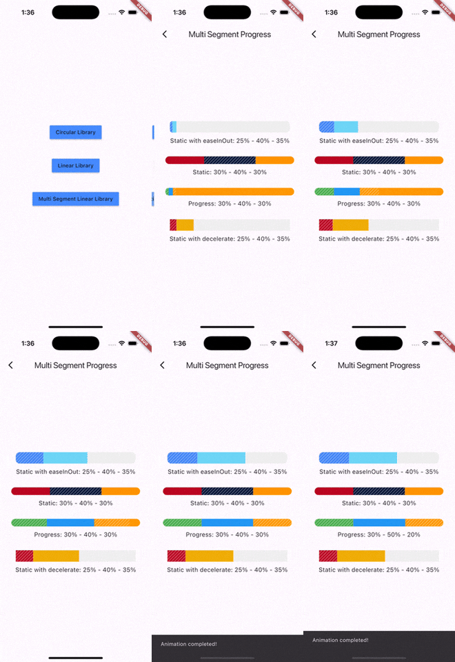
Multi-segment linear indicator
Basic Widget
new MultiSegmentLinearIndicator(
                width: MediaQuery.of(context).size.width - 64,
                lineHeight: 30.0,
                segments: [
                  SegmentLinearIndicator(
                    percent: 0.25,
                    color: Color(0xFF4285F4),
                    enableStripes: true,
                  ),
                  SegmentLinearIndicator(
                    percent: 0.4,
                    color: Color(0xFF6DD5F6),
                  ),
                  SegmentLinearIndicator(
                    percent: 0.35,
                    color: Color(0xFFEFEFEF),
                  ),
                ],
                barRadius: Radius.circular(10.0),
                animation: true,
                animationDuration: 1000,
                curve: Curves.easeInOut,
                animateFromLastPercent: true,
                onAnimationEnd: () {
                  ScaffoldMessenger.of(context).showSnackBar(
                    const SnackBar(
                      content: Text('Animation completed!'),
                      duration: Duration(seconds: 1),
                    ),
                  );
                },
              ),
Complete example
@override
  Widget build(BuildContext context) {
    return Scaffold(
      appBar: AppBar(
        title: Text('Multi Segment Progress'),
      ),
      body: Center(
        child: Padding(
          padding: const EdgeInsets.all(20.0),
          child: Column(
            mainAxisAlignment: MainAxisAlignment.center,
            children: [
              MultiSegmentLinearIndicator(
                width: MediaQuery.of(context).size.width - 64,
                lineHeight: 30.0,
                segments: [
                  SegmentLinearIndicator(
                    percent: 0.25,
                    color: Color(0xFF4285F4),
                    enableStripes: true,
                  ),
                  SegmentLinearIndicator(
                    percent: 0.4,
                    color: Color(0xFF6DD5F6),
                  ),
                  SegmentLinearIndicator(
                    percent: 0.35,
                    color: Color(0xFFEFEFEF),
                  ),
                ],
                barRadius: Radius.circular(10.0),
                animation: true,
                animationDuration: 1000,
                curve: Curves.easeInOut,
                animateFromLastPercent: true,
                onAnimationEnd: () {
                  ScaffoldMessenger.of(context).showSnackBar(
                    const SnackBar(
                      content: Text('Animation completed!'),
                      duration: Duration(seconds: 1),
                    ),
                  );
                },
              ),
              SizedBox(height: 10),
              Text(
                'Static with easeInOut: 25% - 40% - 35%',
                style: TextStyle(fontSize: 16),
              ),
              SizedBox(height: 30),
              MultiSegmentLinearIndicator(
                width: MediaQuery.of(context).size.width - 40,
                lineHeight: 20.0,
                segments: [
                  SegmentLinearIndicator(
                    percent: 0.3,
                    color: Color(0xFFBA0521),
                  ),
                  SegmentLinearIndicator(
                    percent: 0.4,
                    color: Color(0xFF071437),
                    enableStripes: true,
                  ),
                  SegmentLinearIndicator(
                    percent: 0.3,
                    color: Color(0xFFFF9205),
                  ),
                ],
                barRadius: Radius.circular(20),
              ),
              SizedBox(height: 10),
              Text(
                'Static: 30% - 40% - 30%',
                style: TextStyle(fontSize: 16),
              ),
              SizedBox(height: 30),
              MultiSegmentLinearIndicator(
                width: MediaQuery.of(context).size.width - 40,
                lineHeight: 20.0,
                segments: [
                  SegmentLinearIndicator(
                    percent: firstSegment,
                    color: Colors.green,
                    enableStripes: true,
                  ),
                  SegmentLinearIndicator(
                    percent: secondSegment,
                    color: Colors.blue,
                    enableStripes: true,
                  ),
                  SegmentLinearIndicator(
                    percent: thirdSegment,
                    color: Colors.orange,
                  ),
                ],
                animation: true,
                animateFromLastPercent: true,
                animationDuration: 1000,
                curve: Curves.easeInOut,
                barRadius: Radius.circular(10),
              ),
              SizedBox(height: 10),
              Text(
                'Progress: ${(firstSegment * 100).toInt()}% - ${(secondSegment * 100).toInt()}% - ${(thirdSegment * 100).toInt()}%',
                style: TextStyle(fontSize: 16),
              ),
              SizedBox(height: 30),
              MultiSegmentLinearIndicator(
                width: MediaQuery.of(context).size.width - 64,
                lineHeight: 30.0,
                segments: [
                  SegmentLinearIndicator(
                    percent: 0.15,
                    color: Color(0xFFBA0521),
                    enableStripes: true,
                  ),
                  SegmentLinearIndicator(
                      percent: 0.4, color: Color(0xFFAEFAB00)),
                  SegmentLinearIndicator(
                      percent: 0.45, color: Color(0xFFEFEFEF)),
                ],
                animation: true,
                animationDuration: 1000,
                curve: Curves.decelerate,
                animateFromLastPercent: true,
              ),
              SizedBox(height: 10),
              Text(
                'Static with decelerate: 25% - 40% - 35%',
                style: TextStyle(fontSize: 16),
              ),
              SizedBox(height: 30),
            ],
          ),
        ),
      ),
    );
  }
You can follow me on twitter @diegoveloper
依赖清单 2 项
{"sdk":"flutter"}{"sdk":"flutter"}先按使用场景筛选,再比较项目活跃情况,最后到原始仓库核对使用要求。
“A repository is the most basic element of GitHub.”
GitHub Docs — About repositories ↗