

 v0.0.3
flutter_circular_progress_indicator
Flutter 美丽的加载
6喜欢 34近 30 天下载125Pub 分数
AndroidiOSWebmacOSWindowsLinux
edris-mazhari/flutter_circular_progress open-source repository details.

以下为英文项目原文快照,最新内容请访问 GitHub。
Load your data more beautiful.
V 0.0.2 :
setState error fixed
You just need to add flutter_circular_progress_indicator as a dependency in your pubspec.yaml file.
dependencies:
  flutter_circular_progress_indicator: ^0.0.2
All features you can use :
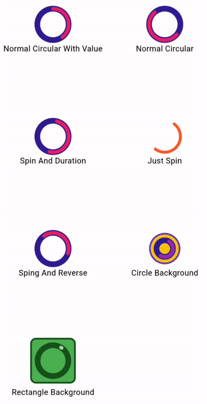
CircularProgressInd().normalCircular(
                      height: 55,
                      width: 55,
                      valueColor: Colors.pink,
                      secondaryColor: Colors.deepPurple[900],
                      secondaryWidth: 10,
                      valueWidth: 6);
CircularProgressInd().normalCircular(
                      height: 55,
                      width: 55,
                      isSpining: true,
                      spinDuration: Duration(seconds: 3),
                      valueColor: Colors.pink,
                      secondaryColor: Colors.deepPurple[900],
                      secondaryWidth: 10,
                      valueWidth: 6);
CircularProgressInd().normalCircular(
                    height: 55,
                    width: 55,
                    valueColor: Colors.deepOrange,
                    valueWidth: 5,
                    isSpining: true,
                  );
CircularProgressInd().normalCircular(
                      height: 55,
                      width: 55,
                      value: .4,
                      isSpining: true,
                      hasSpinReverse: true,
                      valueColor: Colors.pink,
                      secondaryColor: Colors.deepPurple[900],
                      secondaryWidth: 10,
                      valueWidth: 6);
CircularProgressInd().normalCircular(
                      height: 55,
                      width: 55,
                      isSpining: true,
                      secondaryColor: Colors.deepPurple[900],
                      secondaryWidth: 10,
                      backgroundColor: Colors.amber,
                      padding: EdgeInsets.all(10),
                      backgroundBorder:
                          Border.all(color: Colors.deepPurple, width: 3),
                      valueWidth: 6);
 CircularProgressInd().normalCircular(
                      height: 80,
                      width: 80,
                      isSpining: true,
                      value: .01,
                      secondaryColor: const Color.fromARGB(255, 23, 82, 27),
                      secondaryWidth: 10,
                      backgroundShape: BoxShape.rectangle,
                      backgroundRadius: 10,
                      backgroundColor: Colors.green,
                      padding: EdgeInsets.all(10),
                      valueColor: Colors.green[200],
                      backgroundBorder: Border.all(
                          color: const Color.fromARGB(255, 23, 82, 27),
                          width: 3),
                      valueWidth: 6);
依赖清单 2 项
{"sdk":"flutter"}{"sdk":"flutter"}先按使用场景筛选,再比较项目活跃情况,最后到原始仓库核对使用要求。
“A repository is the most basic element of GitHub.”
GitHub Docs — About repositories ↗