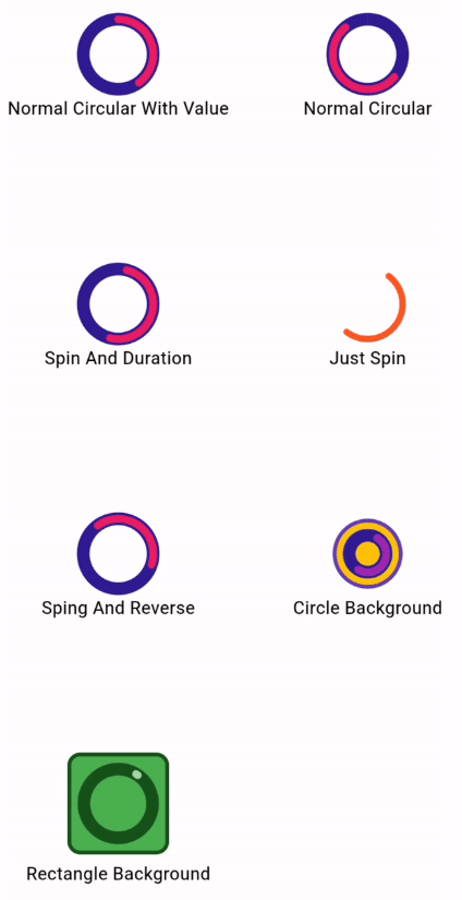
Load your data more beautiful.
Fixed Bugs
V 0.0.2 :
setState error fixed
Installation
You just need to add flutter_circular_progress_indicator as a dependency in your pubspec.yaml file.
dependencies:
  flutter_circular_progress_indicator: ^0.0.2
Getting started
All features you can use :

Usage

CircularProgressInd().normalCircular(
                      height: 55,
                      width: 55,
                      valueColor: Colors.pink,
                      secondaryColor: Colors.deepPurple[900],
                      secondaryWidth: 10,
                      valueWidth: 6);

CircularProgressInd().normalCircular(
                      height: 55,
                      width: 55,
                      isSpining: true,
                      spinDuration: Duration(seconds: 3),
                      valueColor: Colors.pink,
                      secondaryColor: Colors.deepPurple[900],
                      secondaryWidth: 10,
                      valueWidth: 6);

CircularProgressInd().normalCircular(
                    height: 55,
                    width: 55,
                    valueColor: Colors.deepOrange,
                    valueWidth: 5,
                    isSpining: true,
                  );

CircularProgressInd().normalCircular(
                      height: 55,
                      width: 55,
                      value: .4,
                      isSpining: true,
                      hasSpinReverse: true,
                      valueColor: Colors.pink,
                      secondaryColor: Colors.deepPurple[900],
                      secondaryWidth: 10,
                      valueWidth: 6);

CircularProgressInd().normalCircular(
                      height: 55,
                      width: 55,
                      isSpining: true,
                      secondaryColor: Colors.deepPurple[900],
                      secondaryWidth: 10,
                      backgroundColor: Colors.amber,
                      padding: EdgeInsets.all(10),
                      backgroundBorder:
                          Border.all(color: Colors.deepPurple, width: 3),
                      valueWidth: 6);

 CircularProgressInd().normalCircular(
                      height: 80,
                      width: 80,
                      isSpining: true,
                      value: .01,
                      secondaryColor: const Color.fromARGB(255, 23, 82, 27),
                      secondaryWidth: 10,
                      backgroundShape: BoxShape.rectangle,
                      backgroundRadius: 10,
                      backgroundColor: Colors.green,
                      padding: EdgeInsets.all(10),
                      valueColor: Colors.green[200],
                      backgroundBorder: Border.all(
                          color: const Color.fromARGB(255, 23, 82, 27),
                          width: 3),
                      valueWidth: 6);