

 v2.0.3
uiblock
完全可自定义且易于使用的 uiblock 包,适用于您的 Flutter 应用
53喜欢 1180近 30 天下载150Pub 分数
AndroidiOSWebmacOSWindowsLinux
Flutter 应用程序中阻止/取消阻止 UI 的最简单方法

以下为英文项目原文快照,最新内容请访问 GitHub。


Easiest and simplest method to block/unblock ui for your flutter apps.
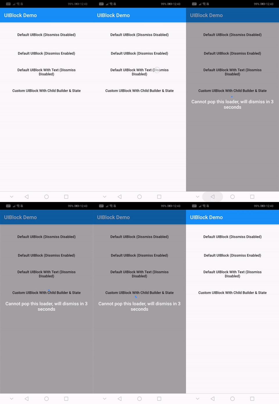
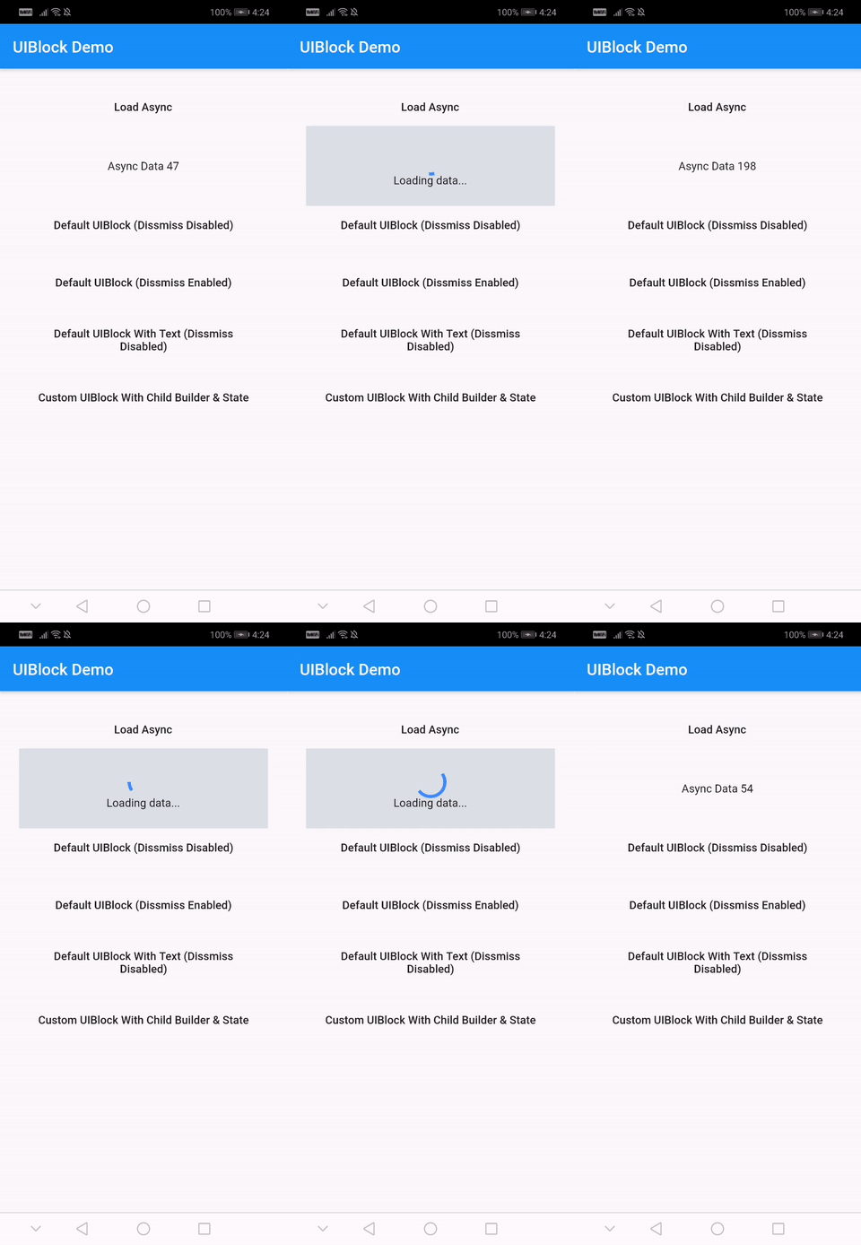
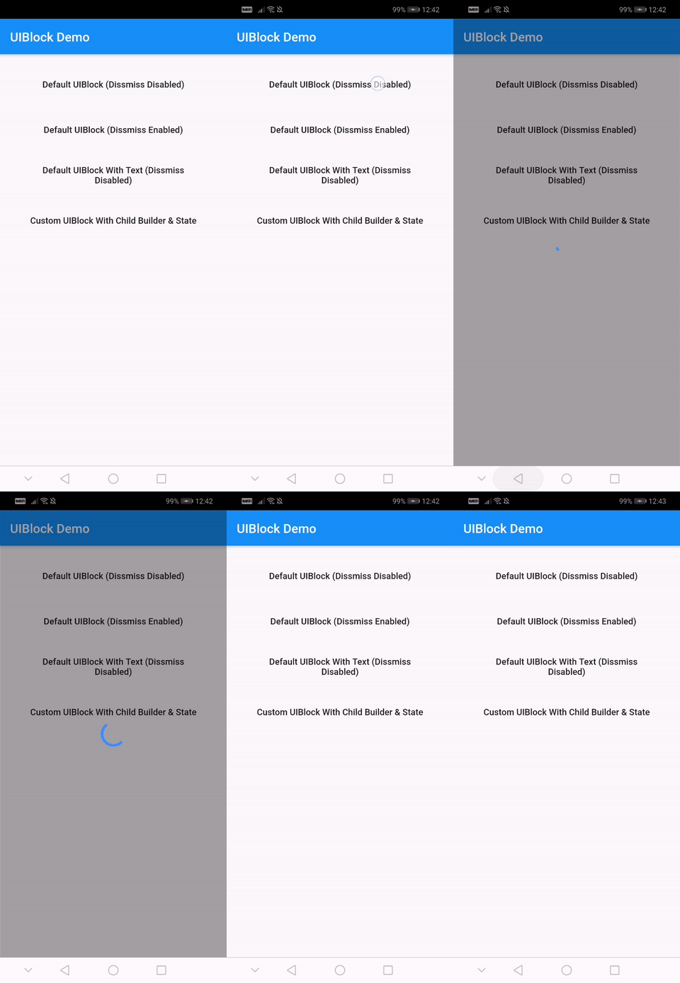
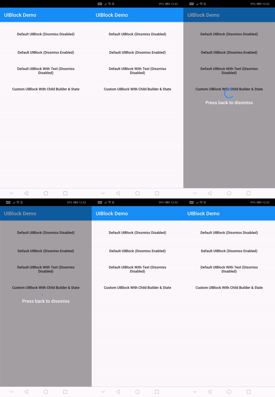
One line of code to block/unblock ui and stop user from navigating during loading or processing in your flutter apps. You could use it as a widget or directly as a global service/util.
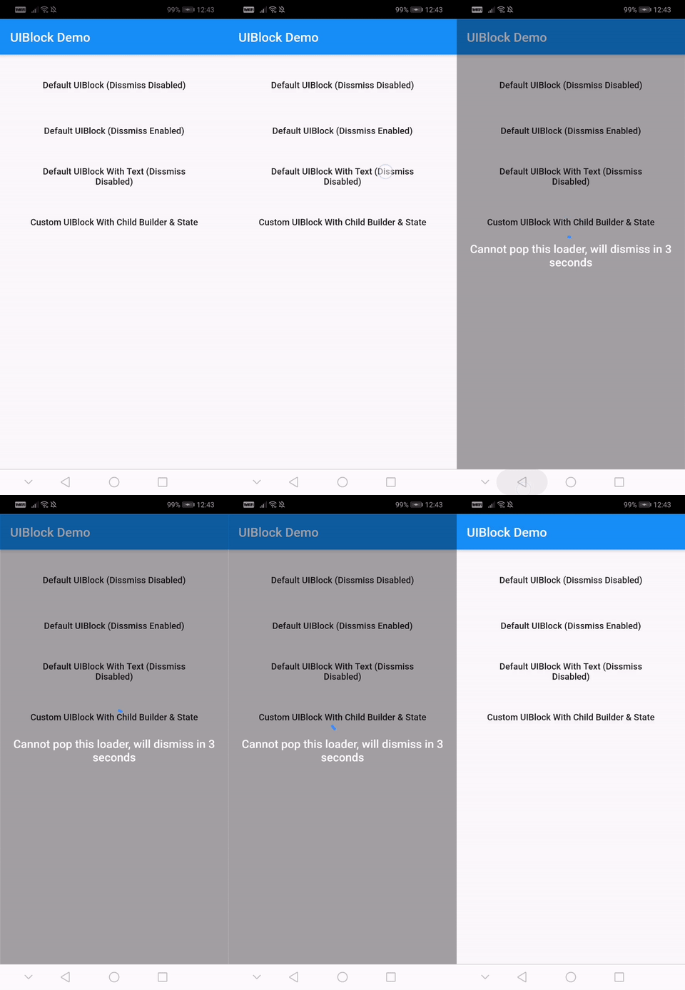
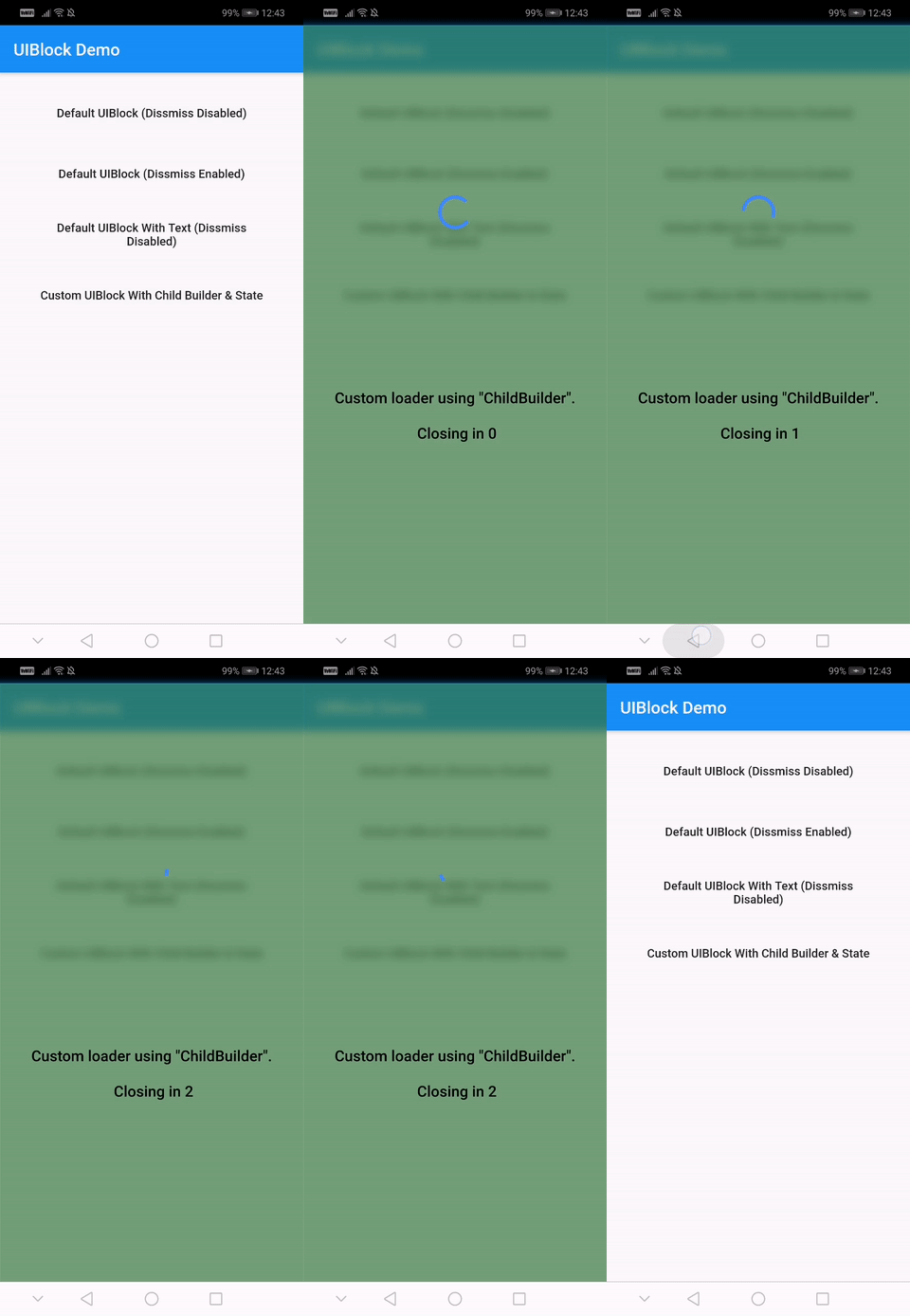
With null-safety
      dependencies:
        uiblock: ^2.0.1
Without null-safety
      dependencies:
        uiblock: 1.2.0
Add the dependency to your project and start using uiblock everywhere:
Import the package.
import 'package:uiblock/uiblock.dart';
To block ui
 // default
 UIBlock.block(context);

 //OR

 // if using globalKey
 UIBlock.block(_scaffoldGlobalKey.currentContext);
To unblock ui
 // call unblock after blockui to dissmiss
 UIBlock.unblock(context);

 //OR

 // if using globalKey
 UIBlock.unblock(_scaffoldGlobalKey.currentContext);
//toggle showLoader to block/unblock
FlatButton(
    child: Text('Load Async'),
    onPressed: () {
        setState(() {
            showLoader = !showLoader;
        });
    },
),

 // easily create custom block ui body
 Container(
    height: _height,
    child: UIBlock(
        loadingStateFromFuture: () async {
        if (showLoader) {
            // return null, to block ui
            return null;
        }
        // unblocks ui on hasData or hasError
        return Future.value(Random().nextInt(200));
        },
        barrierColor: Colors.blueGrey,
        barrierOpacity: 0.2,
        loadingTextWidget: Text('Loading data...'),
        hideBuilderOnNullData: true,
        builder: (BuildContext context, AsyncSnapshot<dynamic> snapshot) {
            return Center(child: Text('Async Data ${snapshot.data}'));
        },
    ),
 );
UIBlock.block(
    _scaffoldGlobalKey.currentContext,
    canDissmissOnBack: true,
    loadingTextWidget: Padding(
        padding: const EdgeInsets.all(8.0),
        child: Text(
        'Press back to dissmiss',
        textAlign: TextAlign.center,
        style: TextStyle(
            color: Colors.white,
            fontSize: 18.0,
            fontWeight: FontWeight.w600,
        ),
        ),
    ),
);
 // easily create custom block ui body
 UIBlock.block(
     _scaffoldGlobalKey.currentContext,
    backgroundColor: Colors.green.withOpacity(0.5),
    imageFilter: ImageFilter.blur(sigmaX: 5.0, sigmaY: 5.0),
    childBuilder: (BuildContext context) {
        // return your widget here
    },
 );

 // Don't forget to call unblock after block :)
// NOTE : only for on UIBlock.block as this uses Modal Barrier
// widget block is inline widget replacement with loader widget

UIBlock.block(
    //...
    // more code
    customBuildBlockModalTransitions:
        (context, animation, secondaryAnimation, child) {
        return RotationTransition(
            turns: animation,
            child: child,
        );
    },
    // ...
);
// NOTE : canDissmissOnBack is alaways true
 var result = await UIBlock.blockWithData(
           _scaffoldGlobalKey.currentContext,
           loadingTextWidget: Padding(
               padding: const EdgeInsets.all(8.0),
               child: FlatButton(
               onPressed: () {
                   // unblock and return data
                   UIBlock.unblockWithData(context, "hello world");
               },
               child: Text(
                       'Press here to dissmiss with data. Back for null',
                       textAlign: TextAlign.center,
                       style: TextStyle(
                       color: Colors.white,
                       fontSize: 18.0,
                       fontWeight: FontWeight.w600,
                       ),
                   ),
               ),
           ),
       );

   print(result);
For more details have a look at the other examples.
| Property | Type | Default | Note |
|---|---|---|---|
| context (required) | BuildContext | - | |
| childBuilder | Function | - | |
| customLoaderChild | Widget | - | |
| loadingTextWidget | Widget | - | |
| imageFilter | ImageFilter | - | |
| backgroundColor | Color | Transparent | |
| canDissmissOnBack | bool | false | |
| safeAreaLeft | bool | true | Set as 'false' to disable 'Left' Safe Area |
| safeAreaTop | bool | true | Set as 'false' to disable 'Top' (usually status bar) Safe Area |
| safeAreaRight | bool | true | Set as 'false' to disable 'Right' Safe Area |
| safeAreaBottom | bool | true | Set as 'false' to disable 'Bottom' Safe Area |
| safeAreaMinimumPadding | EdgeInsets | EdgeInsets.zero | |
| safeAreaMaintainBottomViewPadding | bool | false | |
| isSlideTransitionDefault | bool | true | Toggle between slide or fade transition |
| buildBlockModalTransitions | Function | - | Use this to create custom transition other than fade/slide |
| Property | Type | Default |
|---|---|---|
| builder | Function | you implement it |
| loadingStateFromFuture | Future Function() | your future function (APIs,etc) |
| loaderBuilder | Function | - |
| customLoaderChild | Widget | - |
| loadingTextWidget | Widget | - |
| offset | offset | - |
| barrierOpacity | double | 0.4 |
| barrierColor | Color | black45 |
| canDismiss | bool | false |
| hideBuilderOnNullData | bool | false |
Help me by reporting bugs, submit new ideas for features or anything else that you want to share.
Check out my other useful packages on pub.dev
依赖清单 2 项
{"sdk":"flutter"}{"sdk":"flutter"}先按使用场景筛选,再比较项目活跃情况,最后到原始仓库核对使用要求。
“A repository is the most basic element of GitHub.”
GitHub Docs — About repositories ↗