
 v2.3.0
custom_radio_grouped_button
自定义单选按钮和分组复选框按钮
156喜欢 1300近 30 天下载140Pub 分数
AndroidiOSWebmacOSWindowsLinux
自定义的 Flutter 小部件,让复选框和单选按钮更加简洁易用。

{"sdk":"flutter"}{"sdk":"flutter"}以下为英文项目原文快照,最新内容请访问 GitHub。
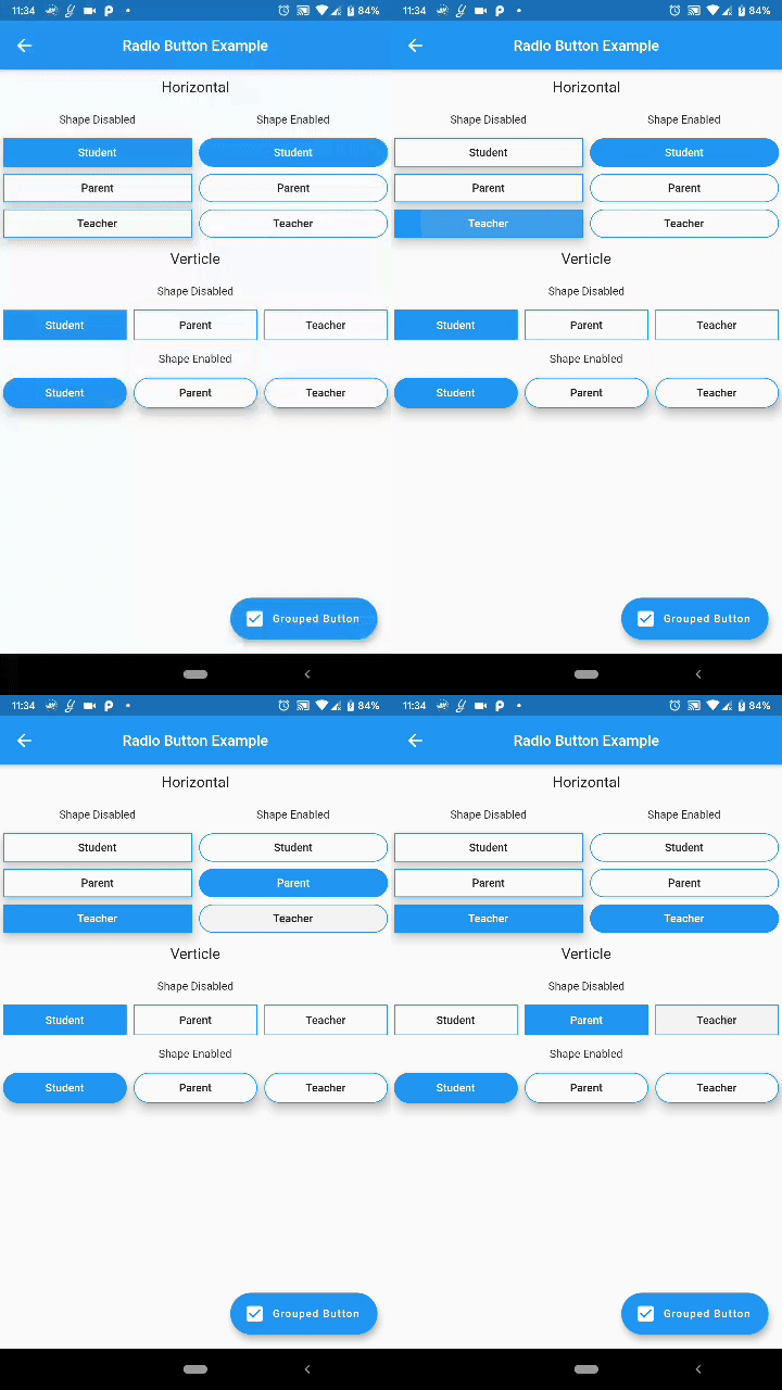
Custom Radio Buttons and Grouped Check Box Button
Custom Flutter widgets that makes Checkbox and Radio Buttons much cleaner and easier
Add the following to your pubspec.yaml file:
dependencies:
  custom_radio_grouped_button: any
CustomRadioButton(
  elevation: 0,
  absoluteZeroSpacing: true,
  unSelectedColor: Theme.of(context).canvasColor,
  buttonLables: [
    'Student',
    'Parent',
    'Teacher',
  ],
  buttonValues: [
    "STUDENT",
    "PARENT",
    "TEACHER",
  ],
  buttonTextStyle: ButtonTextStyle(
      selectedColor: Colors.white,
      unSelectedColor: Colors.black,
      textStyle: TextStyle(fontSize: 16)),
  radioButtonValue: (value) {
    print(value);
  },
  selectedColor: Theme.of(context).accentColor,
),
CustomCheckBoxGroup(
  buttonTextStyle: ButtonTextStyle(
    selectedColor: Colors.red,
    unSelectedColor: Colors.orange,
    textStyle: TextStyle(
      fontSize: 16,
    ),
    selectedTextStyle: TextStyle(
      fontSize: 20,
      fontWeight: FontWeight.w700,
    ),
  ),
  unSelectedColor: Theme.of(context).canvasColor,
  buttonLables: [
    "M",
    "T",
    "W",
    "T",
    "F",
    "S",
    "S",
  ],
  buttonValuesList: [
    "Monday",
    "Tuesday",
    "Wednesday",
    "Thursday",
    "Friday",
    "Saturday",
    "Sunday",
  ],
  checkBoxButtonValues: (values) {
    print(values);
  },
  spacing: 0,
  defaultSelected: "Monday",
  horizontal: false,
  enableButtonWrap: false,
  width: 40,
  absoluteZeroSpacing: false,
  selectedColor: Theme.of(context).accentColor,
  padding: 10,
);
You can acces the widget's state using Key now
Example: Create a key for the CustomRadioButton widget
final key = new GlobalKey<CustomRadioButtonState<T>>();
now to change the value of the widget pass the value to the selectButton method
key.currentState.selectButton(<value>);
Similarly for the CustomCheckBoxGroup widget
final key = new GlobalKey<CustomCheckBoxGroupState<T>>();

key.currentState.selectButton(<value>);