
 v2.2.2+1
shimmer_animation
此闪烁动画小部件可帮助您轻松地为项目添加简单而美观的骨架加载器。
517喜欢 9530近 30 天下载160Pub 分数
AndroidiOSWebmacOSWindowsLinux
Shimmer 动画提供了一个简单且可自定义的 widget,可轻松创建骨架加载和占位符效果。

{"sdk":"flutter"}{"sdk":"flutter"}^5.1.1以下为英文项目原文快照,最新内容请访问 GitHub。
pub package Libraries.io dependency status for latest release License
Supports Null Safety
This shimmer animation widget can help you bring simple yet beautiful skeleton loaders to your project with ease.
Shimmer is very widely used as the default animation for skeleton loaders or placeholder widgets throughout the development community. Therefore, having an easy to use, yet customizable widget ready to use for Android, iOS and Web, gives developers an advantage to focus on their actual functionality, let shimmer make the loading experience smoother.
An example can be found in the example directory of this repository.
A list of detailed examples can be found in this Examples Repository
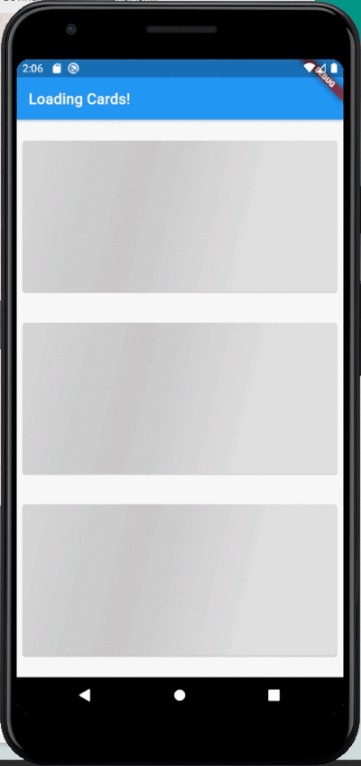
| Full Screen | Loading Widgets | Loading Buttons |
|---|---|---|
| https://github.com/maddyb99/shimmer_animation/blob/master/screenshots/shimmer.gif?raw=true | https://github.com/maddyb99/shimmer_examples/blob/master/loading_cards/screenshots/shimmer.gif?raw=true | https://github.com/maddyb99/shimmer_examples/blob/master/buttons/screenshots/shimmer.gif?raw=true |
Add shimmer_animation to pubspec.yaml of your project:
dependencies:
  shimmer_animation: ^2.1.0
Import it in your Dart code:
import 'package:shimmer_animation/shimmer_animation.dart';
Wrap any widget with Shimmer() widget to apply animaton:
  Shimmer(
    child: Container(
      color: Colors.deepPurple,
    ),
  ),
A number of parameters can be passed to customise the look and feel of this animation:
  Shimmer(
    duration: Duration(seconds: 3), //Default value
    interval: Duration(seconds: 5), //Default value: Duration(seconds: 0)
    color: Colors.white, //Default value
    colorOpacity: 0, //Default value
    enabled: true, //Default value
    direction: ShimmerDirection.fromLTRB(),  //Default Value
    child: Container(
      color: Colors.deepPurple,
    ),
  ),
A detailed API Reference can be found here.