
 v6.2.1
responsive_navigation_bar
一个响应式的底部导航栏。非常适合初学者。欢迎贡献。
83喜欢 765近 30 天下载160Pub 分数
AndroidiOSWebmacOSWindowsLinux
nohli/responsive_navigation_bar open-source repository details.
以下为英文项目原文快照,最新内容请访问 GitHub。
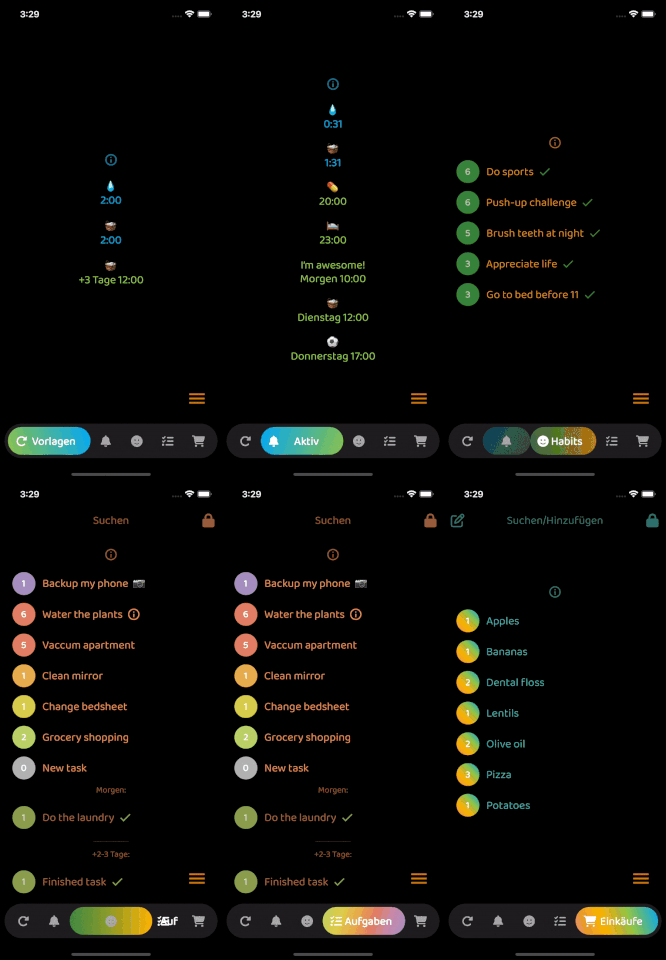
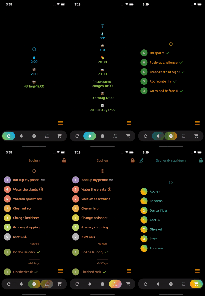
Very easy to set up, beginner friendly
Everything is documented + you will be asked to add required values - the rest is optional (with sound null safety)
By default, fontSize, iconSize and padding are responsive (change size with screen size)
Set iconSize to control icon size independently (defaults to fontSize if not specified)
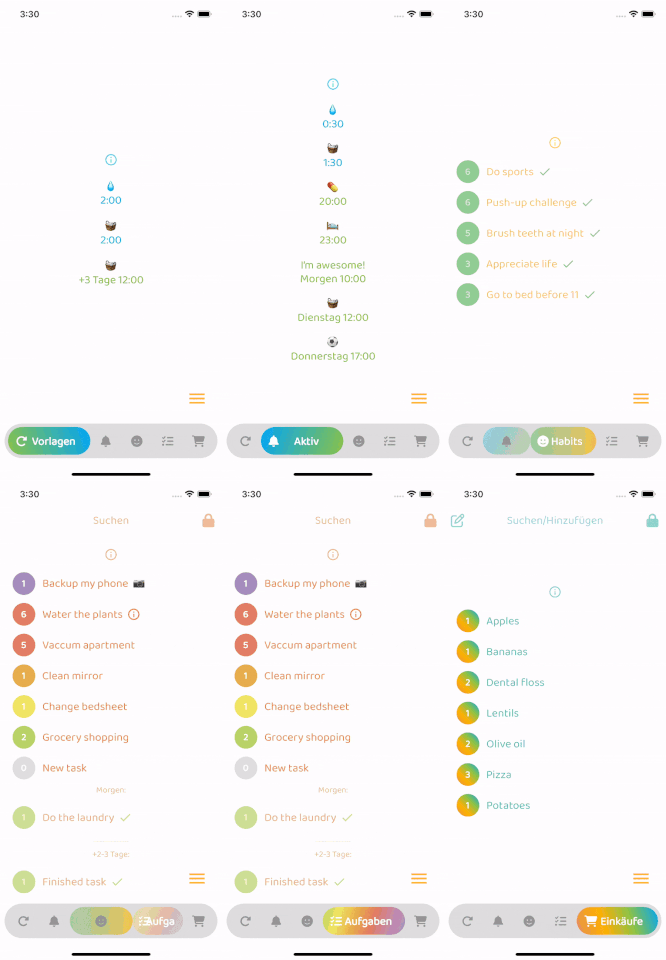
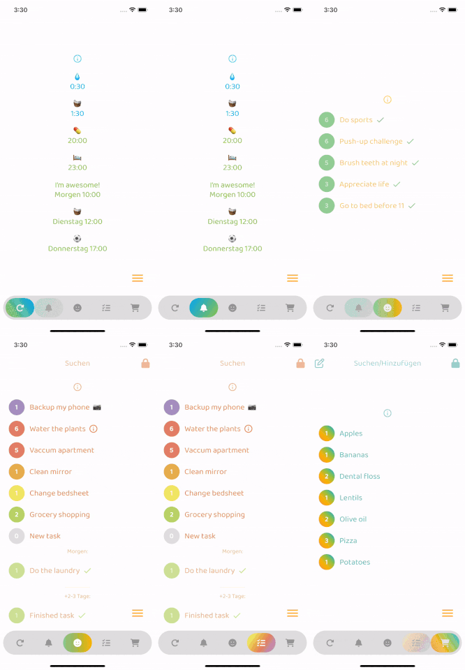
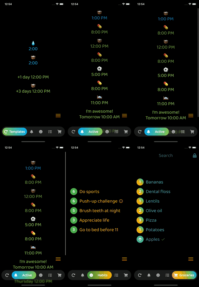
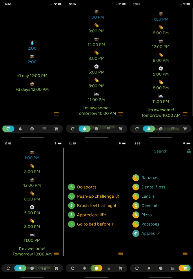
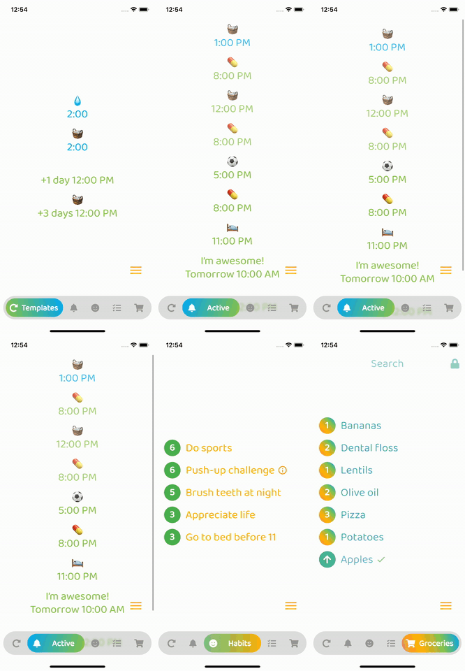
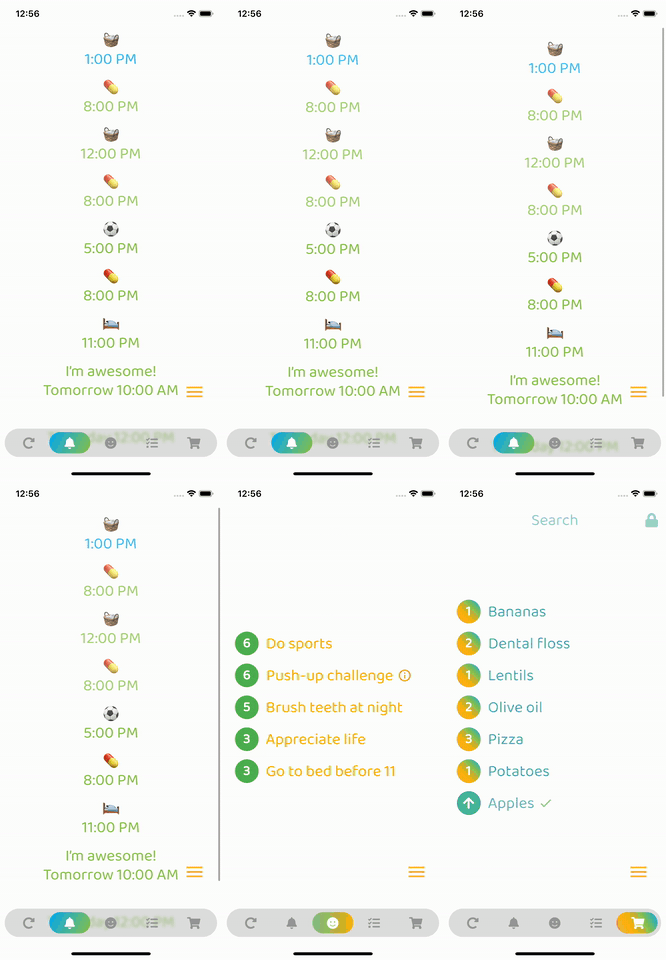
Optional: Beautiful gradient (backgroundGradient) for navigation bar and/or buttons (or solid colors)
Optional: Colored borders (border) for navigation bar and/or buttons
Optional: Change the opacity (backgroundOpacity) of the menu bar
Optional: Blurred background (backgroundBlur) from the top of the navigation bar to the bottom of the screen
Optional: Separate border radius controls (borderRadius, buttonBorderRadius)
Optional: Control button spacing (buttonSpacing)
By default shows text on selected button, optionally show on inactive buttons too (showInactiveButtonText)
Only StatelessWidgets
How to make the bottomNavigationBar float above the Scaffold's body:
Scaffold(
  extendBody: true,
  body: SafeArea(bottom: false, ...),
  bottomNavigationBar: ...
  ...
)
backgroundColor:
    Theme.of(context).brightness == Brightness.dark
        ? const Color(0xff3c3c3c)
        : const Color(0xffbebebe),
inactiveIconColor:
    Theme.of(context).brightness == Brightness.dark
        ? const Color(0xffaaaaaa)
        : const Color(0xff969696),

依赖清单 3 项
{"sdk":"flutter"}^6.0.0{"sdk":"flutter"}先按使用场景筛选,再比较项目活跃情况,最后到原始仓库核对使用要求。
“A repository is the most basic element of GitHub.”
GitHub Docs — About repositories ↗