Getting Started
Installation
Example Code
Features
-
Very easy to set up, beginner friendly
-
Everything is documented + you will be asked to add required values - the rest is optional (with sound null safety)
-
By default, fontSize, iconSize and padding are responsive (change size with screen size)
-
Set iconSize to control icon size independently (defaults to fontSize if not specified)
-
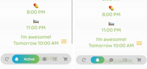
Optional: Beautiful gradient (backgroundGradient) for navigation bar and/or buttons (or solid colors)
-
Optional: Colored borders (border) for navigation bar and/or buttons
-
Optional: Change the opacity (backgroundOpacity) of the menu bar
-
Optional: Blurred background (backgroundBlur) from the top of the navigation bar to the bottom of the screen
-
Optional: Separate border radius controls (borderRadius, buttonBorderRadius)
-
Optional: Control button spacing (buttonSpacing)
-
By default shows text on selected button, optionally show on inactive buttons too (showInactiveButtonText)
-
Only StatelessWidgets
-
How to make the bottomNavigationBar float above the Scaffold's body:
Scaffold(
  extendBody: true,
  body: SafeArea(bottom: false, ...),
  bottomNavigationBar: ...
  ...
)
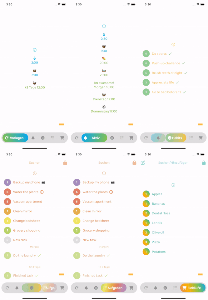
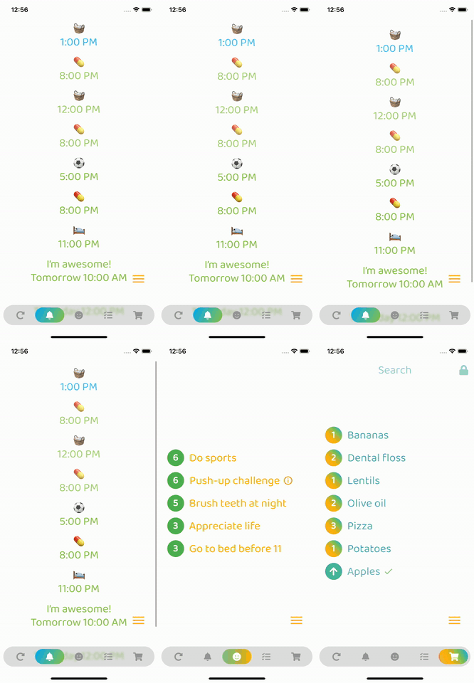
- Colors in the example GIFs below:
backgroundColor:
    Theme.of(context).brightness == Brightness.dark
        ? const Color(0xff3c3c3c)
        : const Color(0xffbebebe),
inactiveIconColor:
    Theme.of(context).brightness == Brightness.dark
        ? const Color(0xffaaaaaa)
        : const Color(0xff969696),
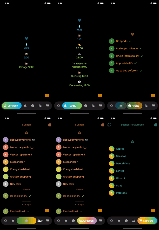
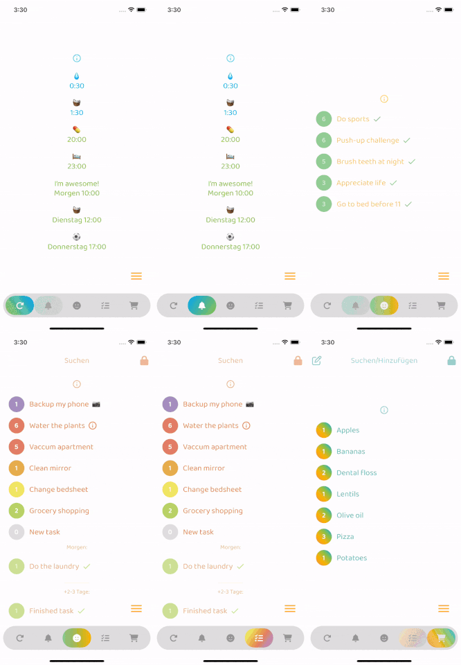
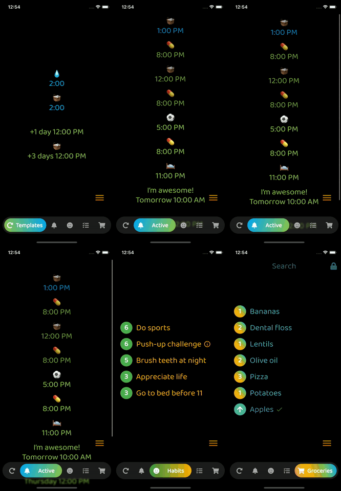
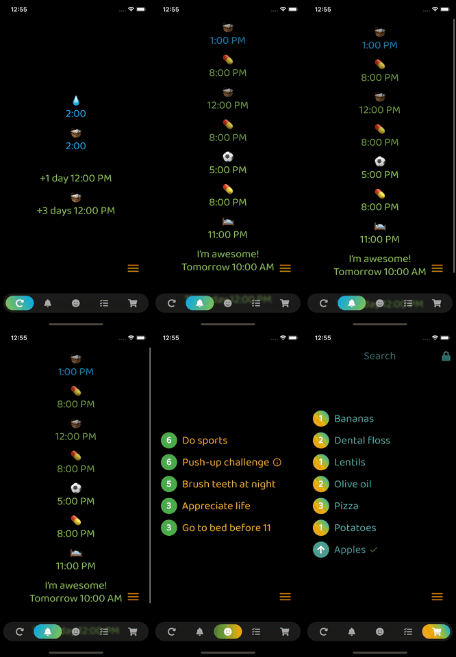
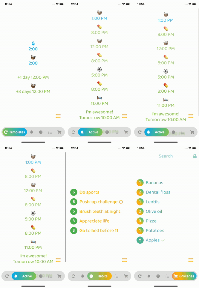
ResponsiveNavigationBar in Action
With animation
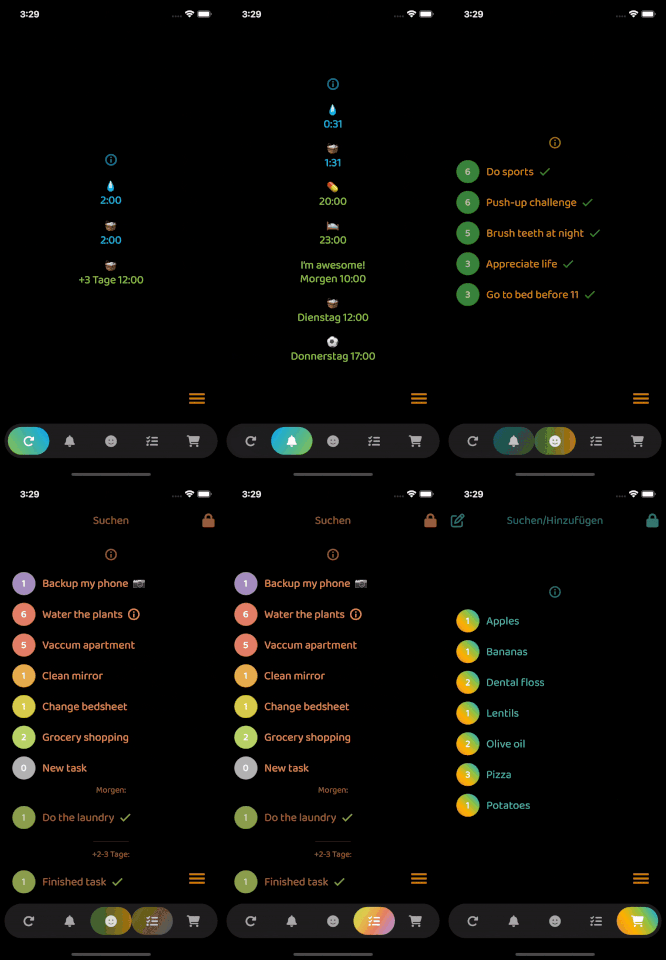
Without animation
Todo
- Add feature requests
- Merge your pull requests