
 v4.1.0
titled_navigation_bar
一个美观、简洁且简单的底部导航栏,点击时具有平滑的动画效果。此包高度可定制,请参阅下方以了解更多信息。
142喜欢 80近 30 天下载40Pub 分数
平台暂无数据
一个美观且简单的底部导航栏,切换选中项时具有平滑的动画效果。

{"sdk":"flutter"}{"sdk":"flutter"}以下为英文项目原文快照,最新内容请访问 GitHub。
Pub Awesome Flutter
A beautiful, clean and simple bottom navigation bar with smooth animation on click. This package is high customizable, read more bellow for more details.
You can see the source code of this lib inside the /lib folder.
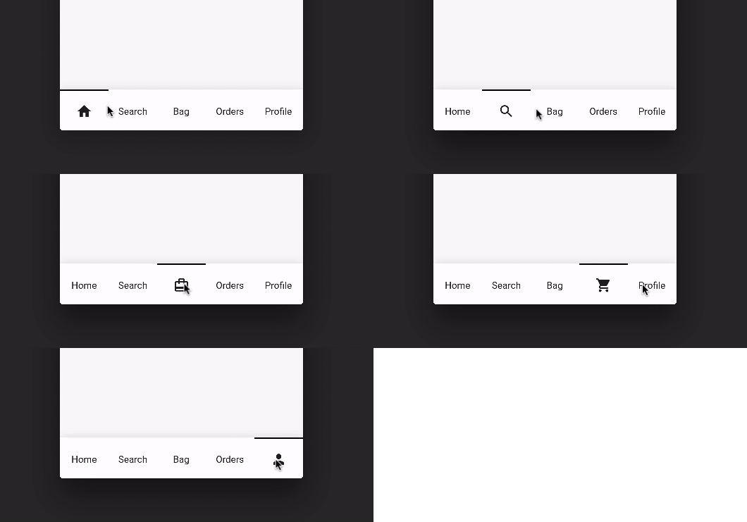
Default Mode Gif
Reversed Mode Gif
Follow these steps to use this library
dependencies:
  ...
  titled_navigation_bar: ^5.0.0-nullsafety.0
import 'package:titled_navigation_bar/titled_navigation_bar.dart';
bottomNavigationBar: TitledBottomNavigationBar(
  currentIndex: 2, // Use this to update the Bar giving a position
  onTap: (index){
    print("Selected Index: $index");
  },
  items: [
      TitledNavigationBarItem(title: Text('Home'), icon: Icons.home),
      TitledNavigationBarItem(title: Text('Search'), icon: Icons.search),
      TitledNavigationBarItem(title: Text('Bag'), icon: Icons.card_travel),
      TitledNavigationBarItem(title: Text('Orders'), icon: Icons.shopping_cart),
      TitledNavigationBarItem(title: Text('Profile'), icon: Icons.person_outline),
  ]
)
onTap - Use this to get notified when an item is clicked, you can retrieve the current item's index on this function. Should not be null!
items - The items of your bottom navigation bar. Use the TitledNavigationBarItem class to add items. Should not be null!
curve - Use this to define your custom curve animation. Should not be null!
reverse - If true, the visible widget of the selected item will be the Text (with the title of the item). If false, the visible widget of the selected item will be the icon. Default to false
activeColor - The active Text/Icon color. The default color is the indicatorColor of your app Theme.
inactiveColor - The inactive Text/Icon color. The default is the black color.
indicatorColor - The indicator color. The default color is the indicatorColor of your app Theme.
currentIndex - Use this to update the Bar giving a position.
enableShadow - Use this to remove the NavigationBar's shadow
icon -The icon of this item. This will be used as default state if reverse mode is disabled
title - The title of this item. This will be used as default state if reverse mode is enabled