
 v2.1.0
kf_drawer
侧边菜单(Drawer)
143喜欢 1400近 30 天下载160Pub 分数
AndroidiOSWebmacOSWindowsLinux
Flutter 抽屉(动态准备的侧边菜单)

{"sdk":"flutter"}>=3.0.1 <7.0.0{"sdk":"flutter"}以下为英文项目原文快照,最新内容请访问 GitHub。
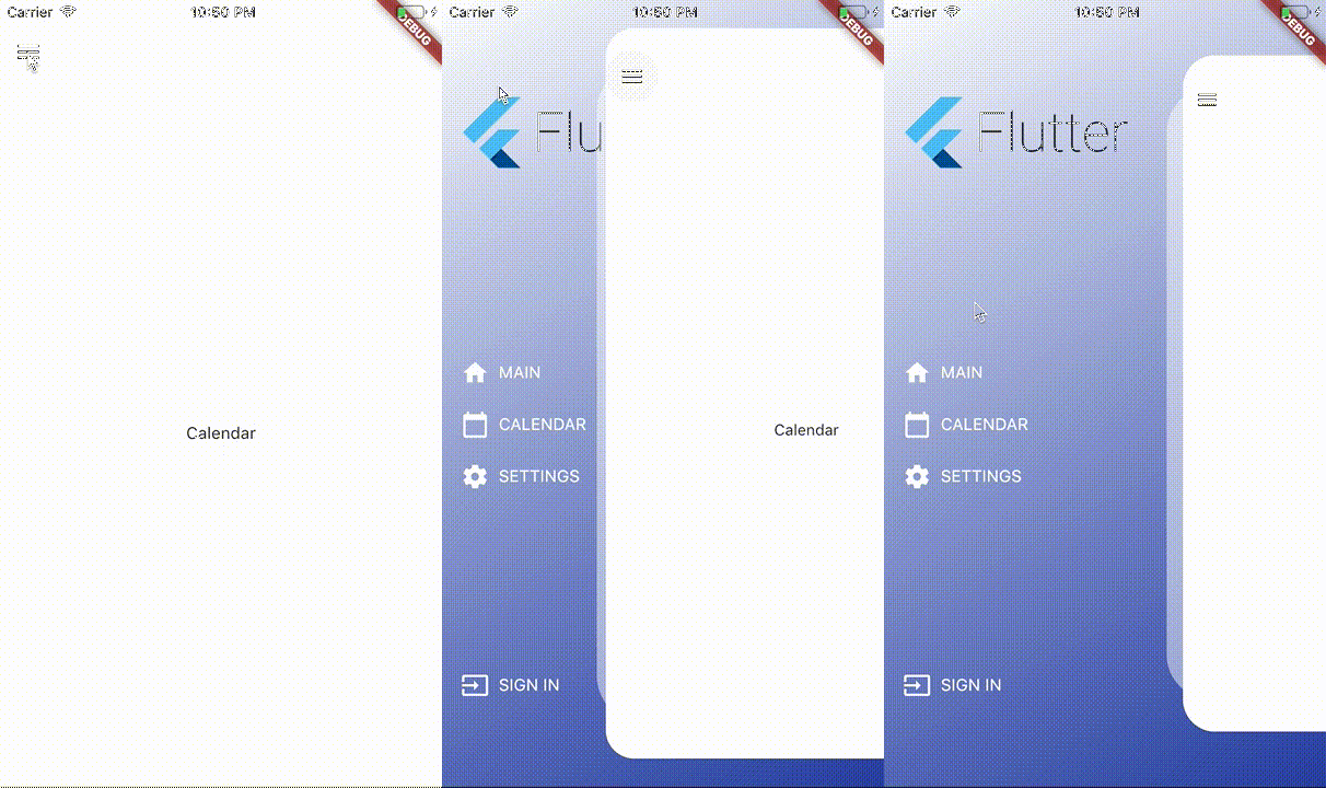
A dependency-free animated side drawer for Flutter. KFDrawer supports controller and context-based control, gestures, pinned or centered menus, page history, right-side drawers, and RTL layouts on every Flutter platform.
dependencies:
  kf_drawer: ^2.1.0
KFDrawer 2.1 supports Dart 3 and Flutter 3.10 or newer. The package is tested against both its compatibility floor and the current Flutter stable release.
Create a controller, give each page item a widget, and place KFDrawer in your
Scaffold body:
late final KFDrawerController drawerController;

@override
void initState() {
  super.initState();
  drawerController = KFDrawerController(
    initialPage: const HomePage(),
    items: <KFDrawerItem>[
      KFDrawerItem.withPage(
        alias: 'home',
        icon: const Icon(Icons.home, color: Colors.white),
        text: const Text('HOME', style: TextStyle(color: Colors.white)),
        page: const HomePage(),
      ),
      KFDrawerItem.withPage(
        alias: 'settings',
        icon: const Icon(Icons.settings, color: Colors.white),
        text: const Text('SETTINGS', style: TextStyle(color: Colors.white)),
        page: const SettingsPage(),
      ),
    ],
  );
}

@override
Widget build(BuildContext context) {
  return Scaffold(
    body: KFDrawer(
      controller: drawerController,
      decoration: const BoxDecoration(
        gradient: LinearGradient(
          colors: <Color>[Colors.white, Color(0xFF2C48AB)],
        ),
      ),
    ),
  );
}

@override
void dispose() {
  drawerController.dispose();
  super.dispose();
}
The page widgets do not need to extend a KFDrawer-specific base class. Open or close the nearest drawer directly from a descendant page:
IconButton(
  tooltip: 'Open navigation menu',
  icon: const Icon(Icons.menu),
  onPressed: () => KFDrawer.of(context)?.toggle(),
)
The controller callbacks remain available for existing integrations:
drawerController.open?.call();
drawerController.close?.call();
drawerController.toggle?.call();
Use content when your application manages navigation elsewhere, such as with a
bottom navigation bar:
KFDrawer(
  content: Scaffold(
    body: pages[currentIndex],
    bottomNavigationBar: BottomNavigationBar(
      currentIndex: currentIndex,
      onTap: onBottomNavigationTap,
      items: const <BottomNavigationBarItem>[
        BottomNavigationBarItem(icon: Icon(Icons.home), label: 'Home'),
        BottomNavigationBarItem(icon: Icon(Icons.person), label: 'Profile'),
      ],
    ),
  ),
  items: <KFDrawerItem>[
    KFDrawerItem(
      text: const Text('Open profile'),
      onPressed: openProfile,
    ),
  ],
)
By default, header, items, and footer use the original scrollable layout. Two opt-in properties cover fixed-footer and centered-menu use cases:
KFDrawer(
  controller: drawerController,
  header: const MyDrawerHeader(),
  footer: const MyDrawerFooter(),
  footerPinned: true,
  centerScrollableItems: true,
)
footerPinned keeps the footer outside the scrolling item list.centerScrollableItems centers a shrink-wrapped item list between a fixed
header and footer.scrollable: false retains the non-scrolling centered column layout.KFDrawerDirection is logical, so start automatically follows the ambient
text direction:
// Left in LTR, right in RTL (default).
KFDrawer(direction: KFDrawerDirection.start)

// Right in LTR, left in RTL.
KFDrawer(direction: KFDrawerDirection.end)
Translation, edge dragging, content tap regions, shadow offset, icon padding, and menu alignment all follow the resolved side.
Controller changes rebuild the drawer automatically:
drawerController.items = <KFDrawerItem>[...newItems];
drawerController.addItem(newItem);
drawerController.removeItem(oldItem);
drawerController.clearItems();

// If you mutate drawerController.items directly:
drawerController.items.add(newItem);
drawerController.refreshItems();

drawerController.selectItem('settings');
KFDrawer swaps page widgets; it does not push Navigator routes. Enable the lightweight controller history only if this is the behavior your app needs:
final drawerController = KFDrawerController(
  initialPage: const HomePage(),
  maintainPageHistory: true,
);

AnimatedBuilder(
  animation: drawerController,
  builder: (context, child) {
    return PopScope<Object?>(
      canPop: !drawerController.canGoBack,
      onPopInvokedWithResult: (didPop, result) {
        if (!didPop) drawerController.goBack();
      },
      child: child,
    );
  },
  child: KFDrawer(controller: drawerController),
)
Use replacePage to change the current page without adding a history entry and
clearHistory after a navigation reset.
When an item has both page and onPressed, KFDrawer now performs both actions:
it selects the page, optionally closes the drawer, and invokes the callback.
KFDrawerItem.withPage(
  page: const ProfilePage(),
  text: const Text('PROFILE'),
  onPressed: logProfileSelection,
  closeOnTap: true,
)
Use an item without page when the callback should fully own navigation.
| Property | Default | Purpose |
|---|---|---|
drawerWidth |
0.66 |
Revealed fraction of available width |
minScale |
0.86 |
Content scale while open |
borderRadius |
32 |
Open content corner radius |
shadowColor |
translucent white | Decorative layer color; use transparent to hide it |
disableContentTap |
true |
Absorb content interaction and close it on tap |
dragEnabled |
true |
Enable pointer dragging |
edgeDragWidth |
8 |
Edge gesture activation width |
animationDuration |
280 ms |
Programmatic animation duration |
slideCurve |
easeInOutCubic |
Translation curve |
scaleCurve |
easeInOutBack |
Scale curve |
onDrawerChanged |
null |
Observe open-state targets |
semanticLabel |
localized drawer label | Accessibility label |
See the runnable example for a complete integration.
If KFDrawer saves you time, you can support its ongoing maintenance on Buy Me a Coffee.
KFDrawer is released under the MIT License.