搜索插件、代码仓与 APP 分类

kf_drawer 封面
插件详情v2.1.0

kf_drawer

侧边菜单(Drawer)

AndroidiOSWebmacOSWindowsLinux
近 30 天下载
817
喜欢数
144
Pub 分数
160

安装插件

flutter pub add kf_drawer

插件介绍

基于插件公开信息、社区数据与项目使用情况整理的选型参考。

kf_drawer 是一个 Flutter 包,为跨平台应用提供可自定义的侧边菜单(Drawer)。它提供了简洁轻量的导航实现,支持多种自定义选项,如宽度、动画和项目样式。设计简单易用,可无缝集成到 Android、iOS、Web、macOS、Windows 和 Linux 上的 Flutter 应用中。该包非常适合需要一致且响应式导航抽屉体验的应用。

适合场景

  • 移动应用导航
  • Web 仪表板侧边栏
  • 桌面应用程序菜单
  • 跨平台导航
  • 可自定义的抽屉布局

主要特点

  • 跨平台兼容性
  • 可自定义抽屉宽度
  • 流畅的动画
  • 轻松集成
  • 对自定义控件的支持

适合对象

  • 开发跨平台应用的开发者
  • 需要一致导航的团队
  • 具有复杂侧边栏需求的应用
  • 以用户界面为重点的项目
  • 快速原型设计

使用建议

  • 有限的内置主题
  • 需要手动样式设置以实现高级设计
  • 无内置暗色模式支持
  • 依赖于 Flutter 的 Drawer API
  • 可能需要额外的状态管理

原始 README

以下为关联源码仓库的 README 原文快照,最新内容请访问源码仓库。

KFDrawer

pub package CI

A dependency-free animated side drawer for Flutter. KFDrawer supports controller and context-based control, gestures, pinned or centered menus, page history, right-side drawers, and RTL layouts on every Flutter platform.

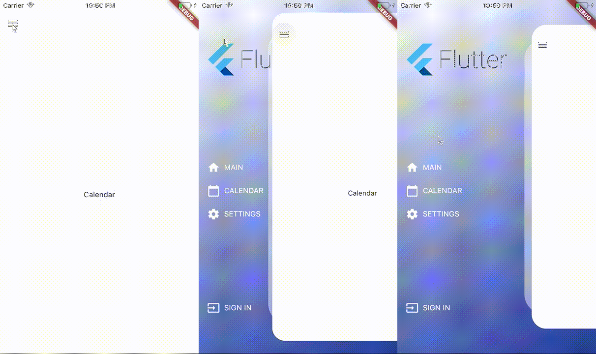
KFDrawer demo

Install

dependencies:
  kf_drawer: ^2.1.0

KFDrawer 2.1 supports Dart 3 and Flutter 3.10 or newer. The package is tested against both its compatibility floor and the current Flutter stable release.

Quick start

Create a controller, give each page item a widget, and place KFDrawer in your Scaffold body:

late final KFDrawerController drawerController;

@override
void initState() {
  super.initState();
  drawerController = KFDrawerController(
    initialPage: const HomePage(),
    items: <KFDrawerItem>[
      KFDrawerItem.withPage(
        alias: 'home',
        icon: const Icon(Icons.home, color: Colors.white),
        text: const Text('HOME', style: TextStyle(color: Colors.white)),
        page: const HomePage(),
      ),
      KFDrawerItem.withPage(
        alias: 'settings',
        icon: const Icon(Icons.settings, color: Colors.white),
        text: const Text('SETTINGS', style: TextStyle(color: Colors.white)),
        page: const SettingsPage(),
      ),
    ],
  );
}

@override
Widget build(BuildContext context) {
  return Scaffold(
    body: KFDrawer(
      controller: drawerController,
      decoration: const BoxDecoration(
        gradient: LinearGradient(
          colors: <Color>[Colors.white, Color(0xFF2C48AB)],
        ),
      ),
    ),
  );
}

@override
void dispose() {
  drawerController.dispose();
  super.dispose();
}

The page widgets do not need to extend a KFDrawer-specific base class. Open or close the nearest drawer directly from a descendant page:

IconButton(
  tooltip: 'Open navigation menu',
  icon: const Icon(Icons.menu),
  onPressed: () => KFDrawer.of(context)?.toggle(),
)

The controller callbacks remain available for existing integrations:

drawerController.open?.call();
drawerController.close?.call();
drawerController.toggle?.call();

Custom content without a controller

Use content when your application manages navigation elsewhere, such as with a bottom navigation bar:

KFDrawer(
  content: Scaffold(
    body: pages[currentIndex],
    bottomNavigationBar: BottomNavigationBar(
      currentIndex: currentIndex,
      onTap: onBottomNavigationTap,
      items: const <BottomNavigationBarItem>[
        BottomNavigationBarItem(icon: Icon(Icons.home), label: 'Home'),
        BottomNavigationBarItem(icon: Icon(Icons.person), label: 'Profile'),
      ],
    ),
  ),
  items: <KFDrawerItem>[
    KFDrawerItem(
      text: const Text('Open profile'),
      onPressed: openProfile,
    ),
  ],
)

Menu layout

By default, header, items, and footer use the original scrollable layout. Two opt-in properties cover fixed-footer and centered-menu use cases:

KFDrawer(
  controller: drawerController,
  header: const MyDrawerHeader(),
  footer: const MyDrawerFooter(),
  footerPinned: true,
  centerScrollableItems: true,
)
  • footerPinned keeps the footer outside the scrolling item list.
  • centerScrollableItems centers a shrink-wrapped item list between a fixed header and footer.
  • scrollable: false retains the non-scrolling centered column layout.

Right-side and RTL drawers

KFDrawerDirection is logical, so start automatically follows the ambient text direction:

// Left in LTR, right in RTL (default).
KFDrawer(direction: KFDrawerDirection.start)

// Right in LTR, left in RTL.
KFDrawer(direction: KFDrawerDirection.end)

Translation, edge dragging, content tap regions, shadow offset, icon padding, and menu alignment all follow the resolved side.

Dynamic items

Controller changes rebuild the drawer automatically:

drawerController.items = <KFDrawerItem>[...newItems];
drawerController.addItem(newItem);
drawerController.removeItem(oldItem);
drawerController.clearItems();

// If you mutate drawerController.items directly:
drawerController.items.add(newItem);
drawerController.refreshItems();

drawerController.selectItem('settings');

Optional page history and Back handling

KFDrawer swaps page widgets; it does not push Navigator routes. Enable the lightweight controller history only if this is the behavior your app needs:

final drawerController = KFDrawerController(
  initialPage: const HomePage(),
  maintainPageHistory: true,
);

AnimatedBuilder(
  animation: drawerController,
  builder: (context, child) {
    return PopScope<Object?>(
      canPop: !drawerController.canGoBack,
      onPopInvokedWithResult: (didPop, result) {
        if (!didPop) drawerController.goBack();
      },
      child: child,
    );
  },
  child: KFDrawer(controller: drawerController),
)

Use replacePage to change the current page without adding a history entry and clearHistory after a navigation reset.

Page item callbacks

When an item has both page and onPressed, KFDrawer now performs both actions: it selects the page, optionally closes the drawer, and invokes the callback.

KFDrawerItem.withPage(
  page: const ProfilePage(),
  text: const Text('PROFILE'),
  onPressed: logProfileSelection,
  closeOnTap: true,
)

Use an item without page when the callback should fully own navigation.

Useful options

Property Default Purpose
drawerWidth 0.66 Revealed fraction of available width
minScale 0.86 Content scale while open
borderRadius 32 Open content corner radius
shadowColor translucent white Decorative layer color; use transparent to hide it
disableContentTap true Absorb content interaction and close it on tap
dragEnabled true Enable pointer dragging
edgeDragWidth 8 Edge gesture activation width
animationDuration 280 ms Programmatic animation duration
slideCurve easeInOutCubic Translation curve
scaleCurve easeInOutBack Scale curve
onDrawerChanged null Observe open-state targets
semanticLabel localized drawer label Accessibility label

See the runnable example for a complete integration.

Support

If KFDrawer saves you time, you can support its ongoing maintenance on Buy Me a Coffee.

License

KFDrawer is released under the MIT License.

所属分类

源码仓库

使用此插件的项目