

 v9.0.0
flex_color_scheme
一个用于使用和创建精美基于 Material Design 的主题的 Flutter 包。
3240喜欢 13.9万近 30 天下载160Pub 分数
AndroidiOSWebmacOSWindowsLinux
一个用于创建和使用基于精美色彩方案的主题的Flutter包。

以下为英文项目原文快照,最新内容请访问 GitHub。



FlexColorScheme 9.x builds matched light and dark ThemeData for Flutter 3.47+, with full support for the SDK-decoupled material_ui and cupertino_ui packages.
Version 9.0 is a major release because Flutter's UI libraries left the SDK. Theming features are otherwise an easy step from 8.4. Breaking API and seed-tone details are in the changelog and at docs.flexcolorscheme.com.
Use it to make Material Design themes with optional surface blends, seed-generated ColorSchemes, and quick component settings. The result is standard ThemeData, with more complete ColorScheme wiring than Flutter's ThemeData.from / colorSchemeSeed factories.
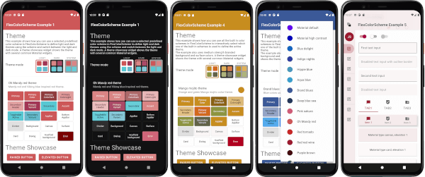
Configure visually in the Themes Playground and copy the API setup into your app.
 |
 |
 |
 |
FlexColorScheme themes all Flutter SDK UI components from your ColorScheme and custom colors, including legacy ThemeData color properties, in Material 2 or Material 3 mode. Opt in on component themes to adjust shared styles, for example border radius on many widgets with one property.
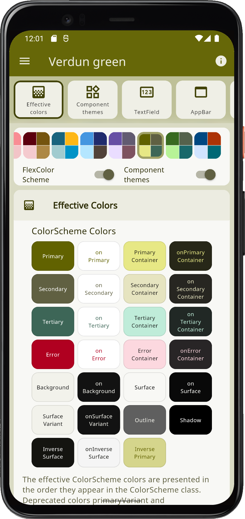 |
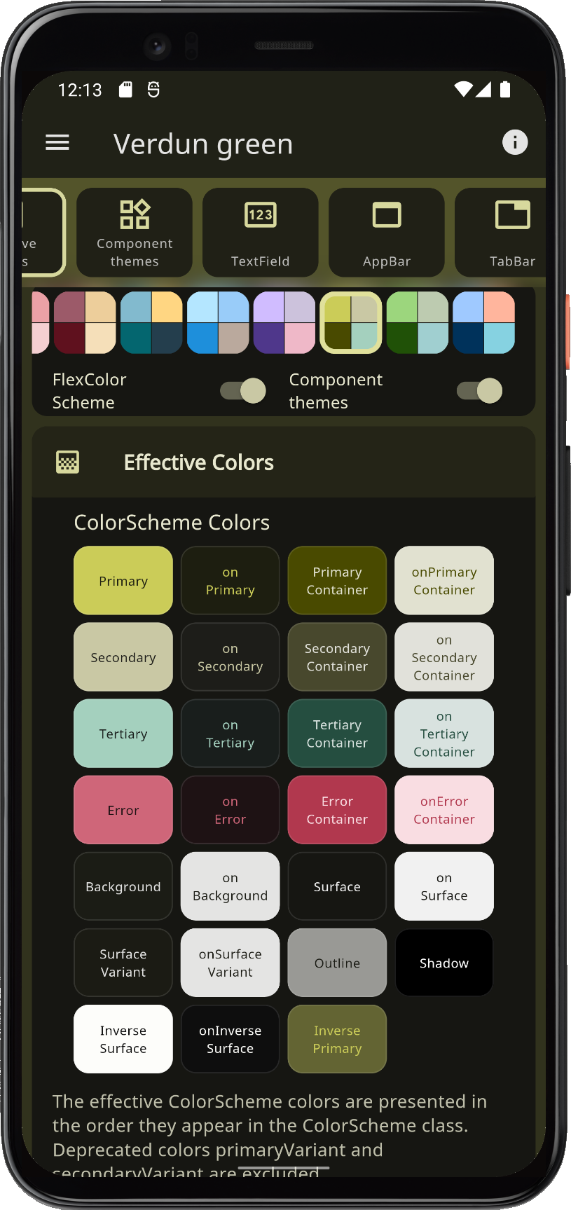 |
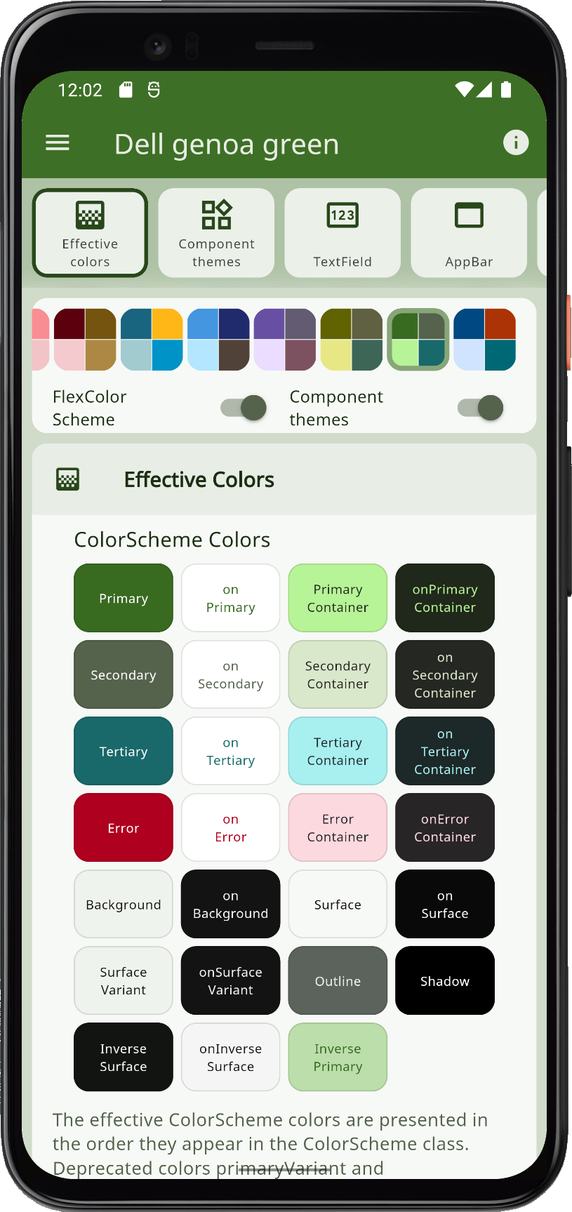 |
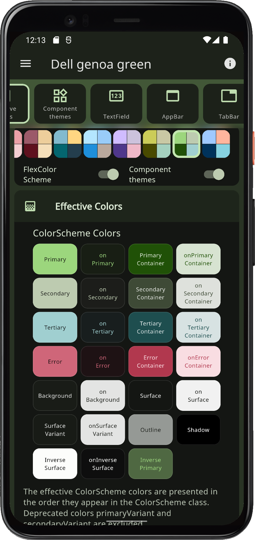 |
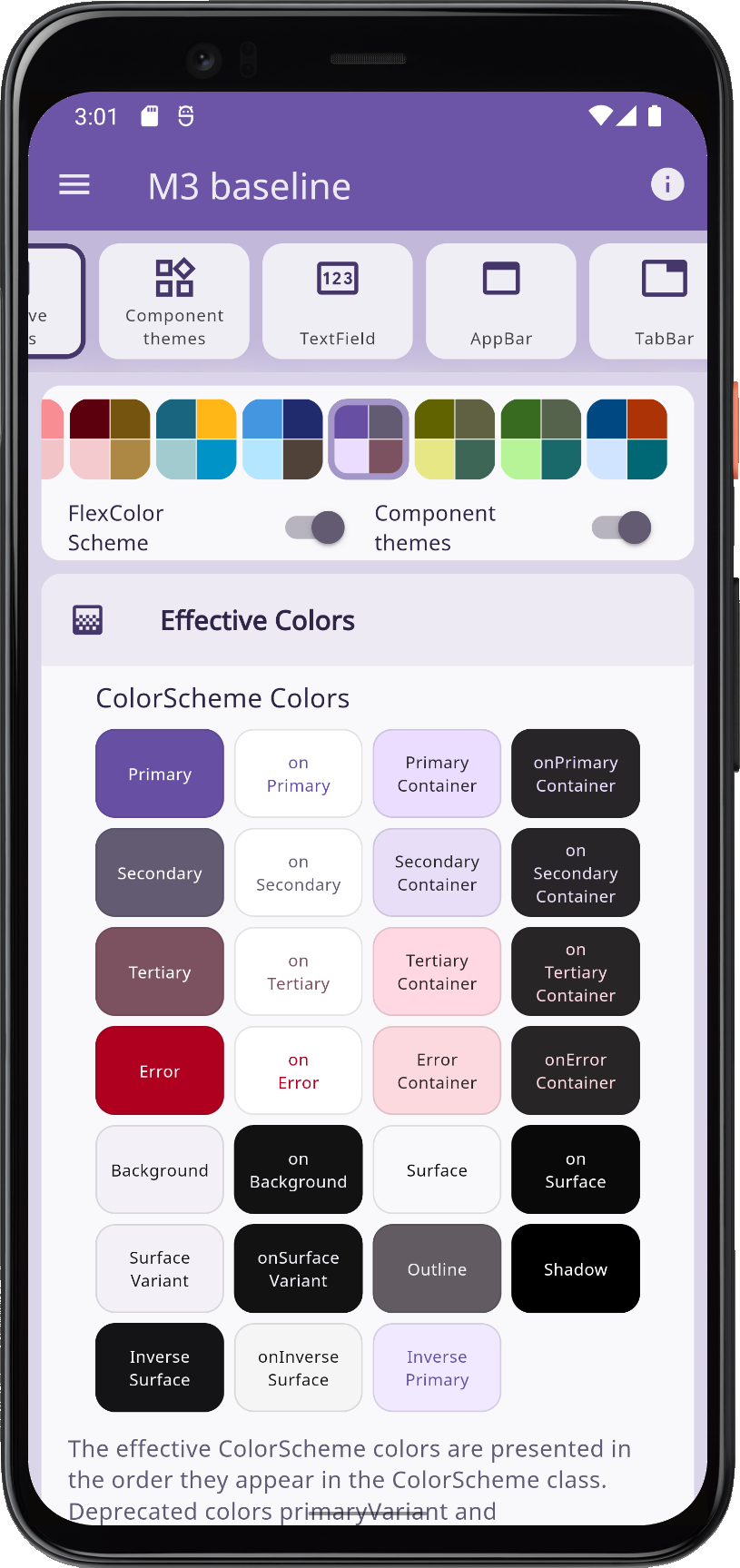
Material 3 is the default since FlexColorScheme v8, matching Flutter's ThemeData. Component theme defaults follow Material 3, including per-widget radii from the Material 3 Guide. Keep those defaults, set a shared global radius, or override radius per widget.
 |
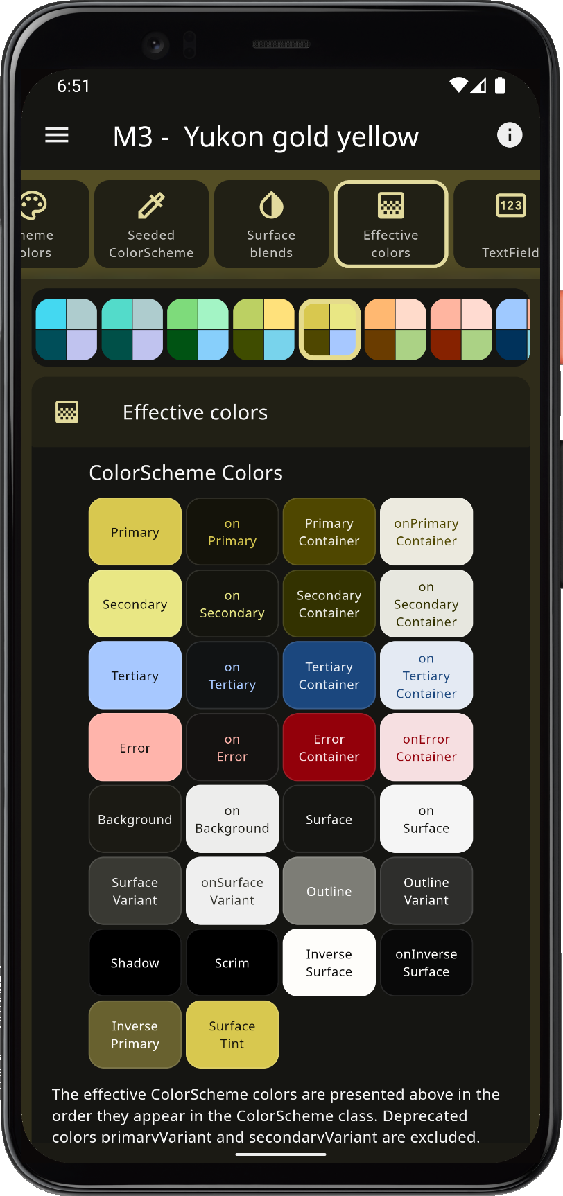 |
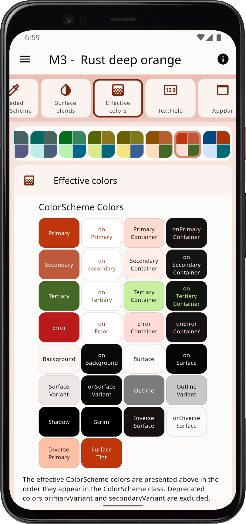 |
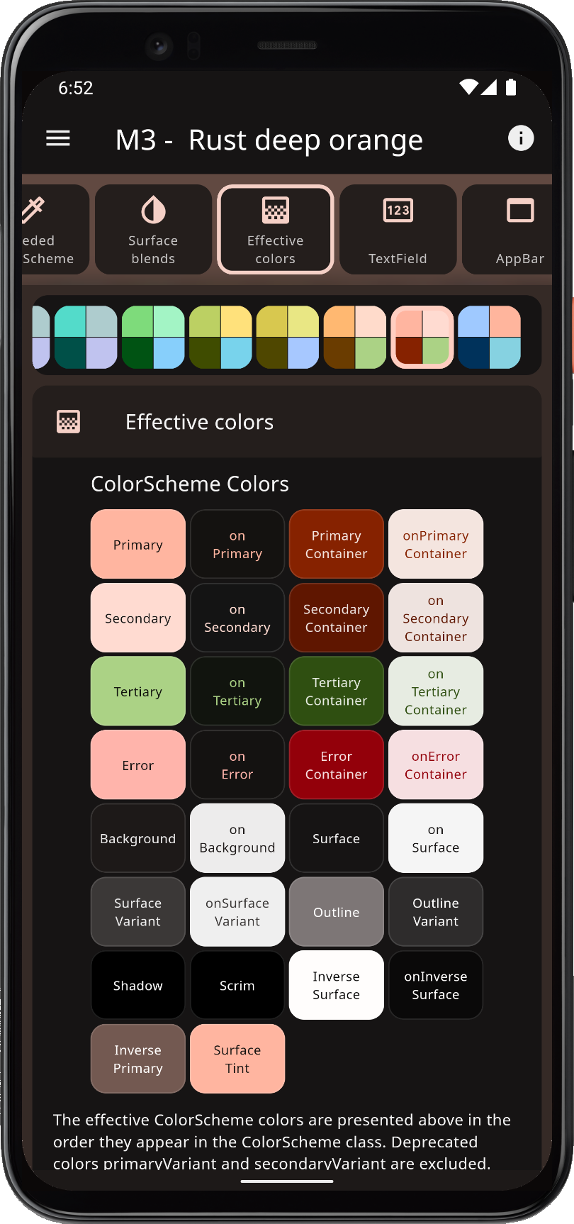 |
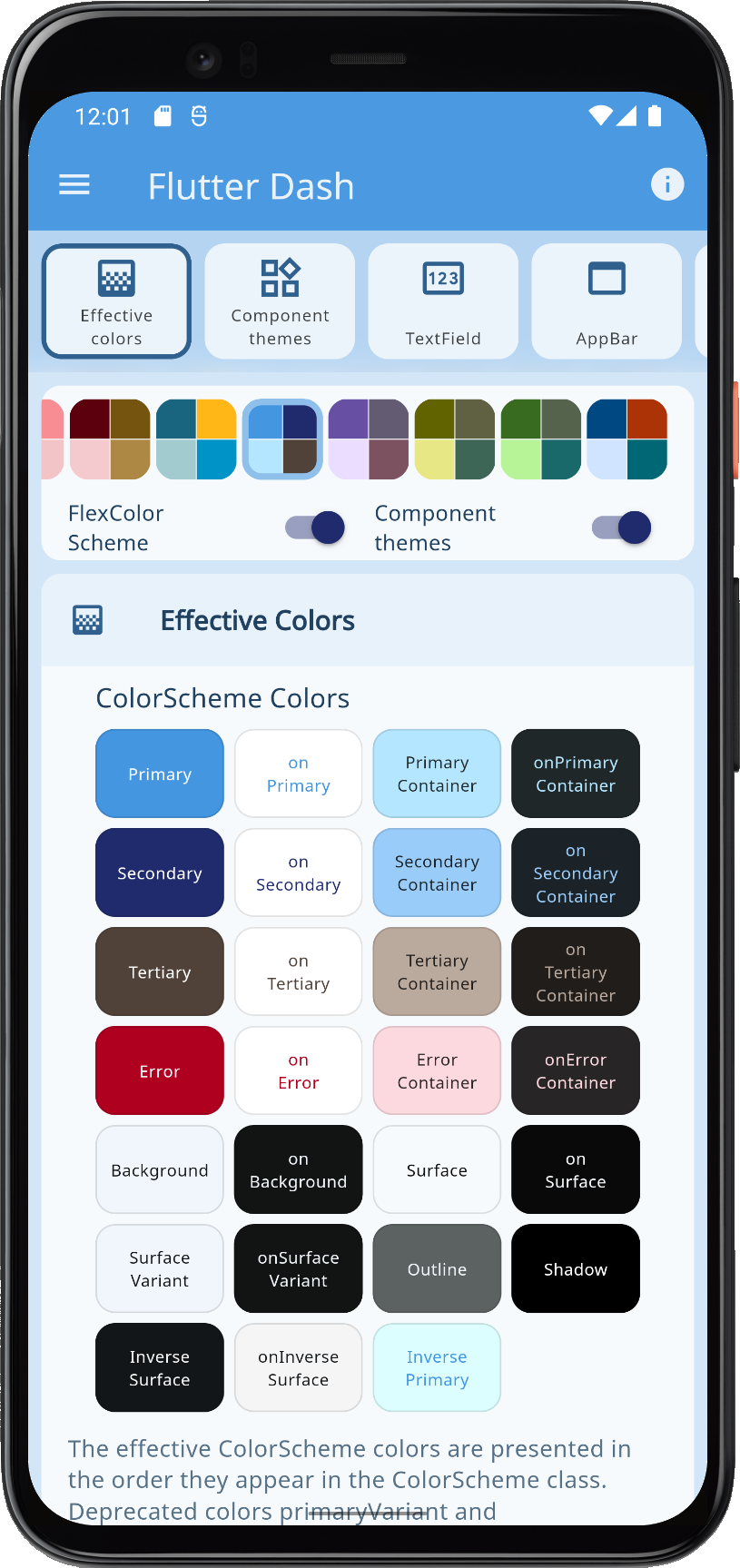
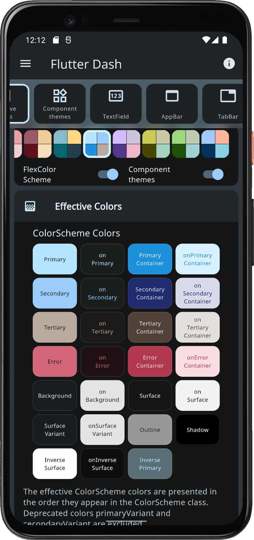
Surface alpha blends and seed-generated ColorSchemes go beyond Flutter's seed factory: multiple seed colors, custom minimum chroma, and custom tone mapping.
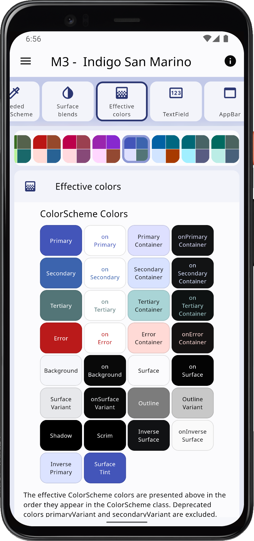 |
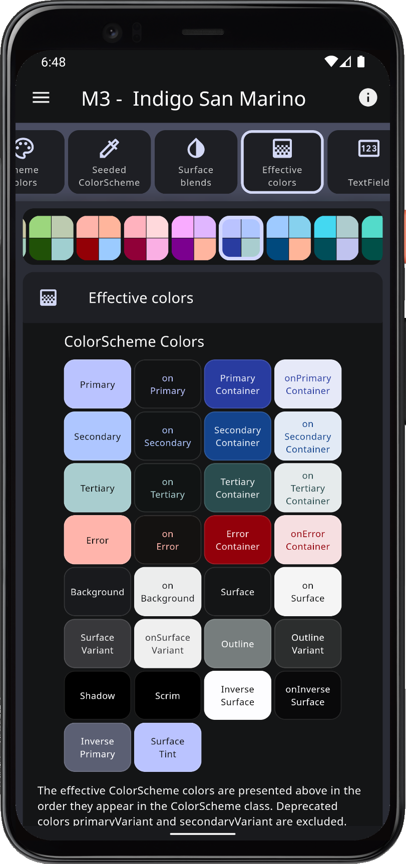 |
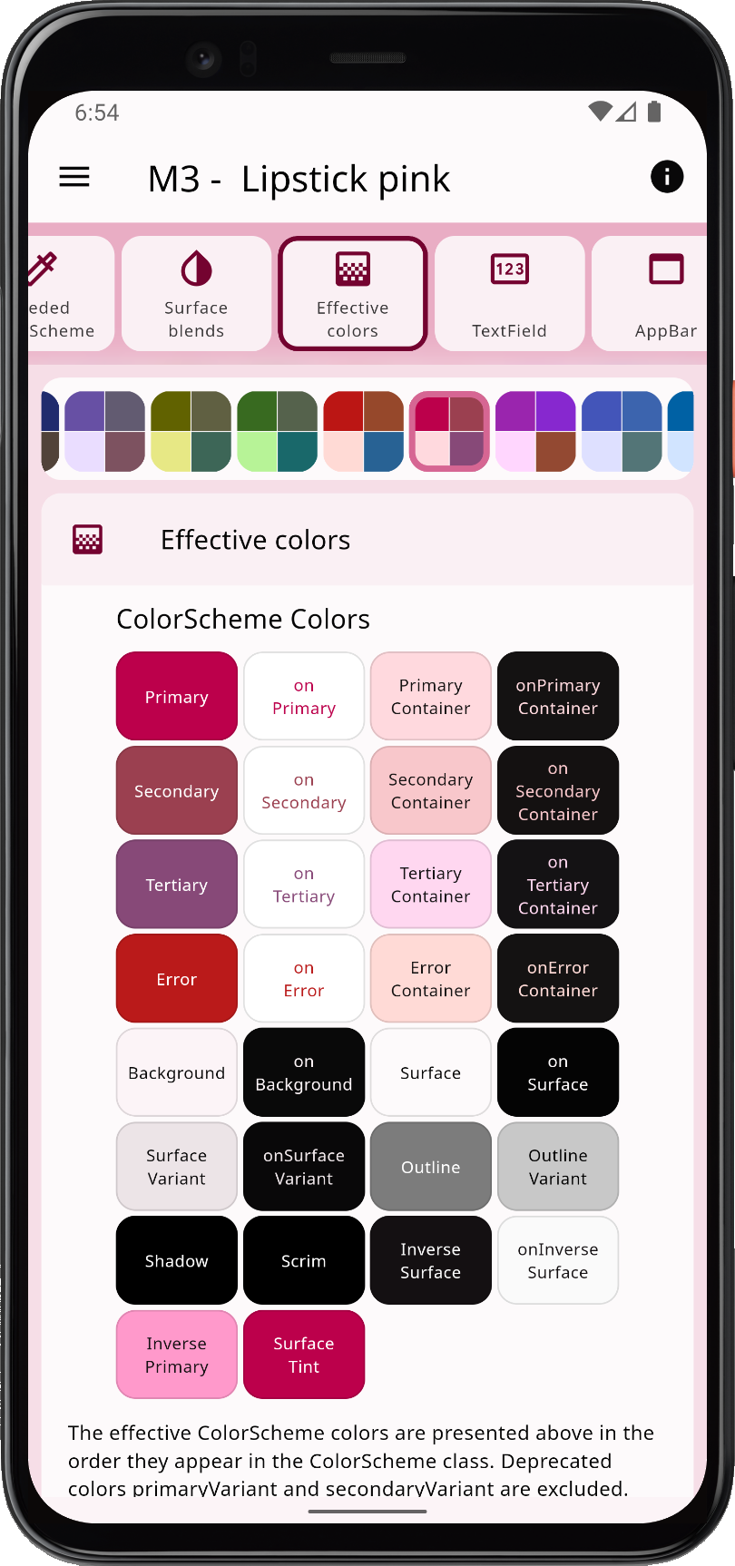 |
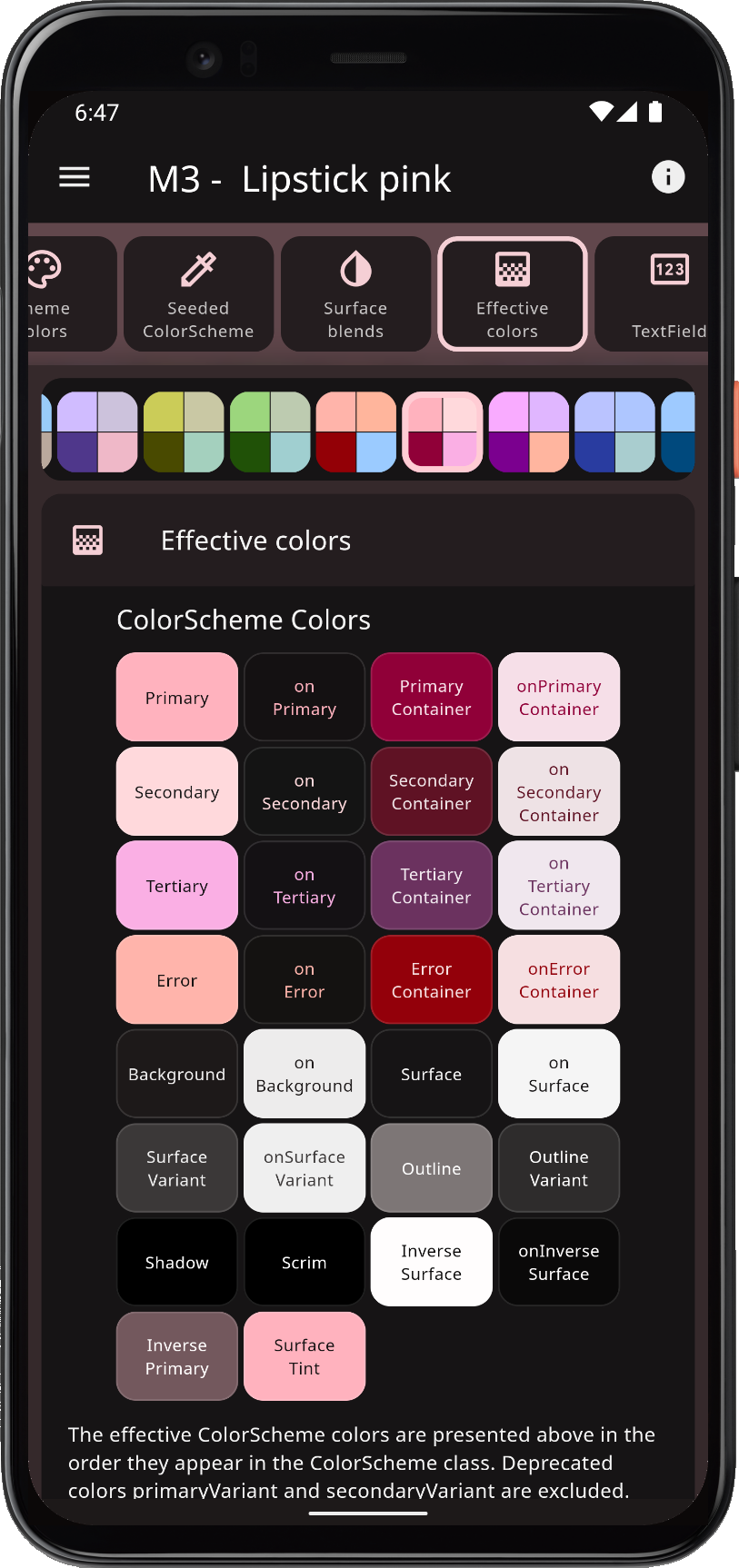 |
Component themes use simple flat properties. You can skip verbose SDK ShapeBorder and WidgetState theme objects for common cases.
Requires Flutter 3.47 or later. FlexColorScheme depends on material_ui and cupertino_ui; your app still needs a direct material_ui import for MaterialApp and widgets.
Version 9.0 allows any material_ui / cupertino_ui 1.x (^1.0.0). It does not use APIs added after 1.0.0 of those packages. Later FlexColorScheme releases will raise that floor when they adopt new features from them.
flutter pub add flex_color_scheme
import 'package:flex_color_scheme/flex_color_scheme.dart';
import 'package:material_ui/material_ui.dart';
Start with a built-in FlexScheme palette, or define your own colors. The package default example is a heavily commented guide. See Examples and the Tutorial.
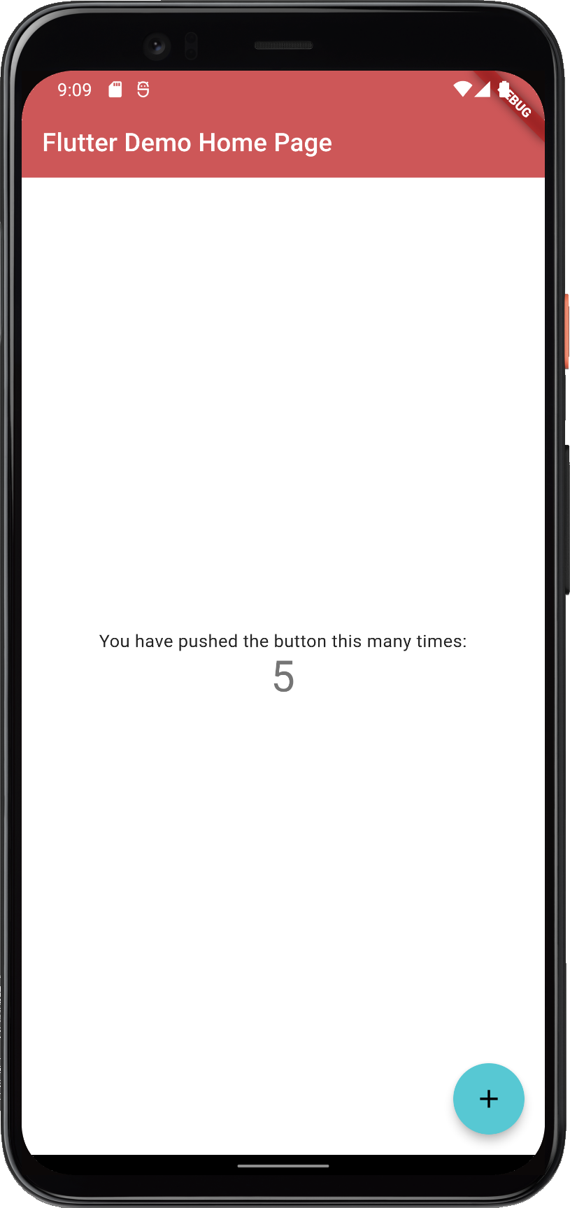
Create a new Flutter project and theme the default counter app with Oh Mandy red (FlexScheme.mandyRed). ThemeMode.system follows the device light/dark setting.
import 'package:flex_color_scheme/flex_color_scheme.dart';
import 'package:material_ui/material_ui.dart';

class MyApp extends StatelessWidget {
  const MyApp({super.key});
  @override
  Widget build(BuildContext context) {
    return MaterialApp(
      title: 'Flutter Demo',
      // The Mandy red, light theme.
      theme: FlexThemeData.light(scheme: FlexScheme.mandyRed),
      // The Mandy red, dark theme.
      darkTheme: FlexThemeData.dark(scheme: FlexScheme.mandyRed),
      // Use dark or light theme based on system setting.
      themeMode: ThemeMode.system,
      home: const MyHomePage(title: 'Flutter Demo Home Page'),
    );
  }
}
This gives a counter application that looks like this:
 |
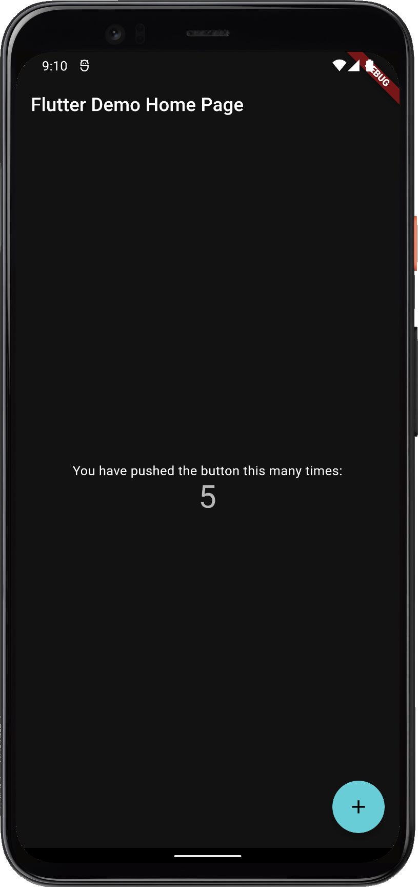 |
FlexColorScheme applied to the standard Flutter counter template
The counter app uses few widgets, so it does not show the theme well. The package examples use placeholder UI only to present results; that demo UI is not part of using FlexColorScheme.
Tutorials, API walkthroughs, and Flutter theming guidance: docs.flexcolorscheme.com. Generated API documentation is on pub.dev. The documentation site is powered by docs.page from Invertase.
The Themes Playground is a web companion that generates FlexColorScheme setup code for the active theme. The app itself, and the demos in its theme simulator, show the result of that code. Settings persist; reset them if you get lost. It is bundled as example 5, the last tutorial step.
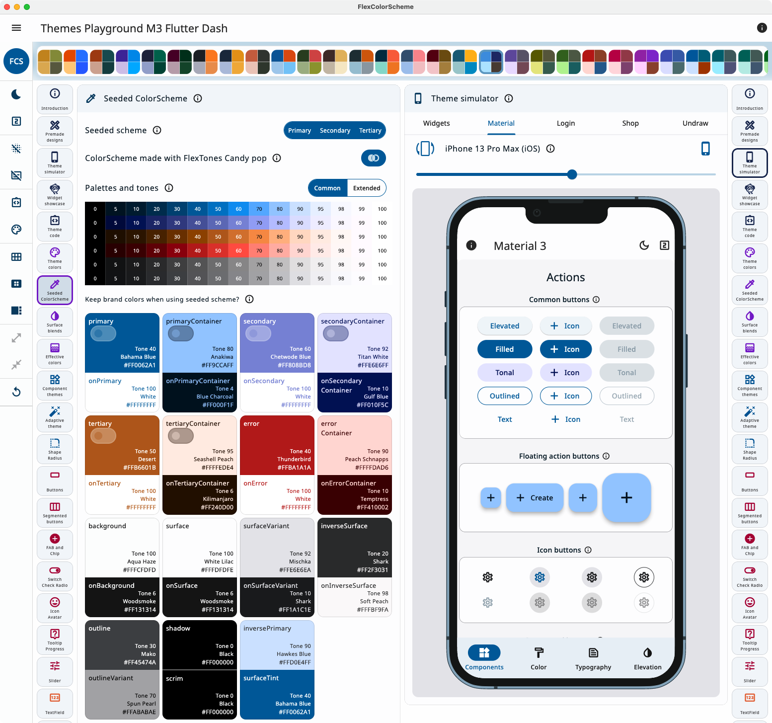
In Themes Playground you can visually configure your theme and copy its setup code.
Open the code view beside the controls to watch the API update as you change settings.
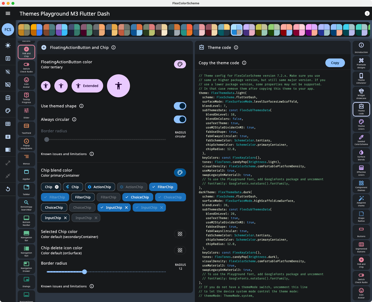
Viewing API configuration and its updates as you change settings in Themes Playground.
Latest live build (WASM GC, with JS fallback): playground.flexcolorscheme.com. Usage notes: Playground chapter. Use the same major version of Themes Playground as your flex_color_scheme package, and for versions 7, 8, and 9 prefer matching the minor version too. GitHub Pages JS builds are in the table below.
Happy theming! 💙
| Name | Version | Link |
|---|---|---|
| V9.0 WASM+JS | V9.0.0 | https://playground.flexcolorscheme.com/ |
| V9.0 JS | V9.0.0 | https://rydmike.com/flexcolorscheme/themesplayground-v9-0 |
| V8.4 | V8.4.0 | https://rydmike.com/flexcolorscheme/themesplayground-v8-4 |
| V8.2 & V8.3 | V8.2.0, V8.3.x | https://rydmike.com/flexcolorscheme/themesplayground-v8-3 |
| V8.1 | V8.1.1 | https://rydmike.com/flexcolorscheme/themesplayground-v8-1 |
| V8.0 | V8.0.2 | https://rydmike.com/flexcolorscheme/themesplayground-v8-0 |
| V7.3 | V7.3.1 | https://rydmike.com/flexcolorscheme/themesplayground-v7-3 |
| V7.2 | V7.2.0 | https://rydmike.com/flexcolorscheme/themesplayground-v7-2 |
| V7.1 | V7.1.2 | https://rydmike.com/flexcolorscheme/themesplayground-v7-1 |
| V7.0 | V7.0.5 | https://rydmike.com/flexcolorscheme/themesplayground-v7 |
| V6 | V6.1.1 | https://rydmike.com/flexcolorscheme/themesplayground-v6 |
| V5 | V5.1.0 | https://rydmike.com/flexcolorscheme/themesplayground-v5 |
| V4 | V4.2.0 | https://rydmike.com/flexcolorschemeV4Tut5 |
NOTE! Older and newer web builds on this domain share browser storage. Loading a newer Playground, then an older one, can fail until you clear site data (Settings → Delete browsing data → Cookies and other site data). You lose saved config. Version 8.0.0 and later uses a different storage name, so it does not conflict with V7 and older.
A Windows, macOS, or Linux build of Example 5 is smoother than the web app. For an older package version, download a ZIP from the GitHub releases.
依赖清单 9 项
^1.0.0^5.0.0{"sdk":"flutter"}^1.0.0^1.18.0^1.15.0{"sdk":"flutter"}^8.2.1—先按使用场景筛选,再比较项目活跃情况,最后到原始仓库核对使用要求。
“A repository is the most basic element of GitHub.”
GitHub Docs — About repositories ↗