

 v2.0.1
timelines_plus
Timelines 包的最新版本。注意:这只是该包的更新版本:https://pub.dev/packages/timelines
281喜欢 5.4万近 30 天下载160Pub 分数
AndroidiOSWebmacOSWindowsLinux
sawin0/timelines_plus open-source repository details.

以下为英文项目原文快照,最新内容请访问 GitHub。


A powerful & easy to use timeline package for Flutter! 🚀
Caveat: This package is an early stage. Not enough testing has been done to guarantee stability. Some APIs may change.
Check it out on the web or look at the source code.
| Timeline status | Package delivery tracking | Process timeline |
|---|---|---|
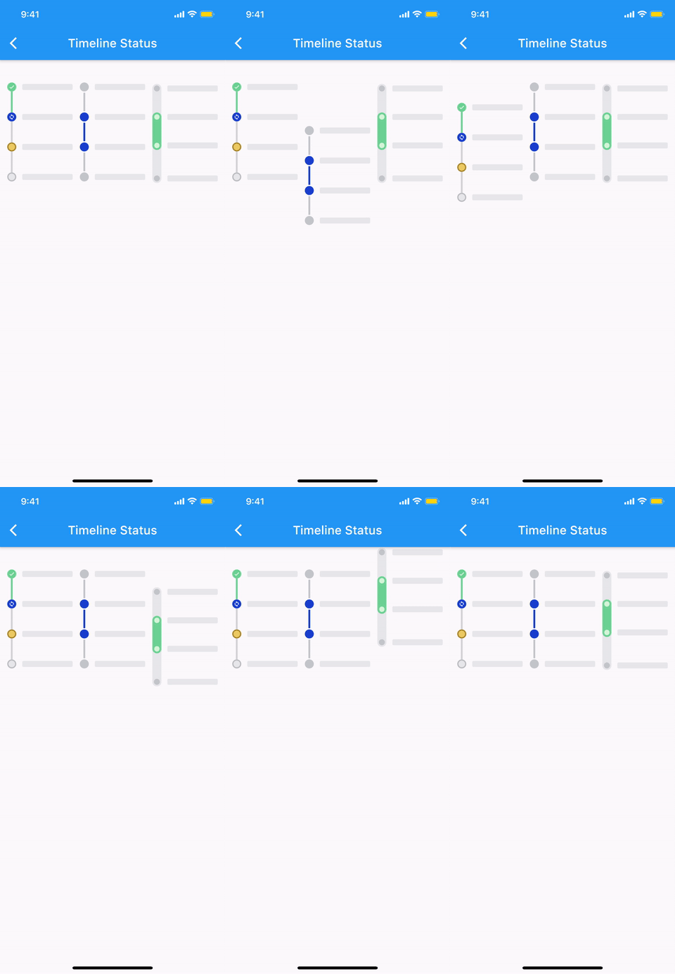 |
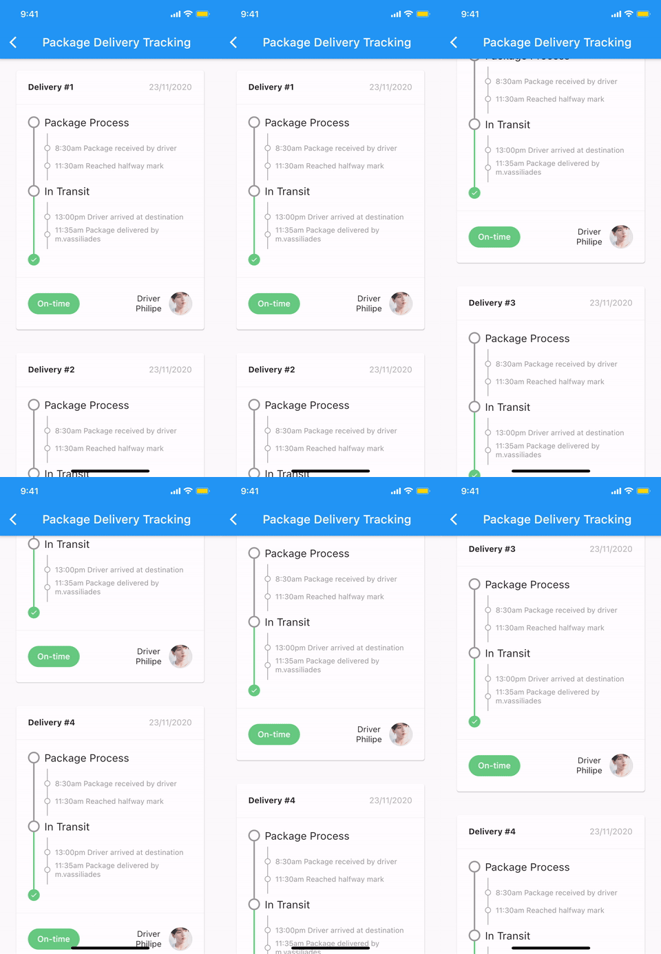 |
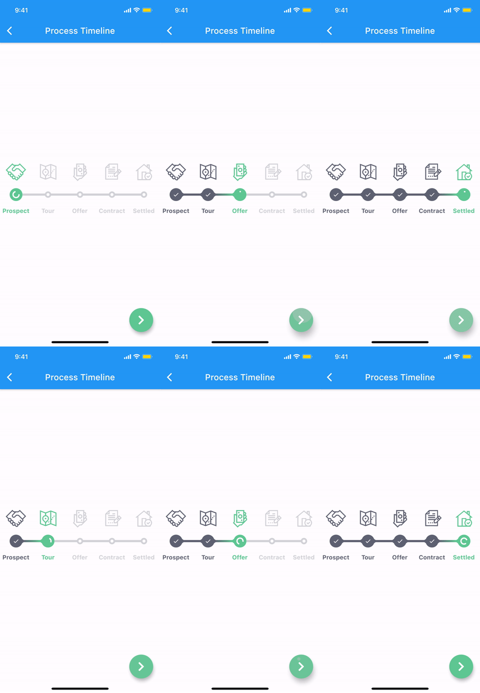 |
More examples
🚧 WIP 🚧
Add this to your package's pubspec.yaml file:
dependencies:
  timelines_plus: ^[latest_version]
You can install packages from the command line:
with Flutter:
$ flutter pub get
Alternatively, your editor might support flutter pub get. Check the docs for your editor to learn more.
Now in your Dart code, you can use:
import 'package:timelines_plus/timelines_plus.dart';
@override
Widget build(BuildContext context) {
  return Timeline.tileBuilder(
    builder: TimelineTileBuilder.fromStyle(
      contentsAlign: ContentsAlign.alternating,
      contentsBuilder: (context, index) => Padding(
        padding: const EdgeInsets.all(24.0),
        child: Text('Timeline Event $index'),
      ),
      itemCount: 10,
    ),
  );
}
Check the Example or the API reference for more details.
Check out Theme Demo to see how the values inside TimelineTile work with the theme.
To customize the timeline component with a theme, do the following:
TimelineTheme(
  data: TimelineThemeData(...),
  child: DotIndicator(...),
);
If you only want to change part of the parent theme, use TimelineTheme.of(context):
TimelineTheme(
  data: TimelineThemeData.of(context).copyWith(...),
  child: DotIndicator(...),
);
If the component you want to customize is Timeline or FixedTimeline, this is also possible:
FixedTimeline(
  theme: TimelineThemeData(...),
  children: [...],
);
| ContainerIndicator | |
|---|---|

|
ContainerIndicator(
  child: Container(
    width: 15.0,
    height: 15.0,
    color: Colors.blue,
  ),
)
|
DotIndicator |

|
DotIndicator() |
OutlinedDotIndicator |

|
OutlinedDotIndicator() |
| SolidLineConnector | |
|---|---|

|
SizedBox( height: 20.0, child: SolidLineConnector(), ) |
DashedLineConnector |

|
SizedBox( height: 20.0, child: DashedLineConnector(), ) |
DecoratedLineConnector |

|
SizedBox(
  height: 20.0,
  child: DecoratedLineConnector(
    decoration: BoxDecoration(
      gradient: LinearGradient(
        begin: Alignment.topCenter,
        end: Alignment.bottomCenter,
        colors: [Colors.blue, Colors.lightBlueAccent[100]],
      ),
    ),
  ),
)
|
Pure timeline UI component with no content.
The TimelineNode contains an indicator and two connectors on both sides of the indicator:
| Simple TimelineNode | |
|---|---|
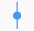
|
SizedBox( height: 50.0, child: TimelineNode.simple(), ) |
Complex TimelineNode |
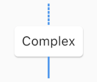
|
SizedBox(
  height: 80.0,
  child: TimelineNode(
    indicator: Card(
      margin: EdgeInsets.zero,
      child: Padding(
        padding: EdgeInsets.all(8.0),
        child: Text('Complex'),
      ),
    ),
    startConnector: DashedLineConnector(),
    endConnector: SolidLineConnector(),
  ),
)
|
Displays content on both sides of the node:
| TimelineTile | |
|---|---|
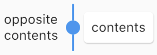
|
TimelineTile(
  oppositeContents: Padding(
    padding: const EdgeInsets.all(8.0),
    child: Text('opposite\ncontents'),
  ),
  contents: Card(
    child: Container(
      padding: EdgeInsets.all(8.0),
      child: Text('contents'),
    ),
  ),
  node: TimelineNode(
    indicator: DotIndicator(),
    startConnector: SolidLineConnector(),
    endConnector: SolidLineConnector(),
  ),
)
|
TimelineTileBuilder provides powerful build features.
Each tile draws only half of the line connecting the neighboring tiles.
Using the connected constructor, lines connecting adjacent tiles can build as one index.
| ConnectionDirection.before | |
|---|---|
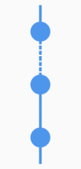
|
FixedTimeline.tileBuilder(
  builder: TimelineTileBuilder.connectedFromStyle(
    connectionDirection: ConnectionDirection.before,
    connectorStyleBuilder: (context, index) {
      return (index == 1) ? ConnectorStyle.dashedLine : ConnectorStyle.solidLine;
    },
    indicatorStyleBuilder: (context, index) => IndicatorStyle.dot,
    itemExtent: 40.0,
    itemCount: 3,
  ),
)
|
ConnectionDirection.after |
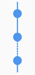
|
FixedTimeline.tileBuilder(
  builder: TimelineTileBuilder.connectedFromStyle(
    connectionDirection: ConnectionDirection.after,
    connectorStyleBuilder: (context, index) {
      return (index == 1) ? ConnectorStyle.dashedLine : ConnectorStyle.solidLine;
    },
    indicatorStyleBuilder: (context, index) => IndicatorStyle.dot,
    itemExtent: 40.0,
    itemCount: 3,
  ),
)
|
This value determines how the contents of the timeline will be built:
| ContentsAlign.basic | |
|---|---|
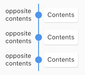
|
FixedTimeline.tileBuilder(
  builder: TimelineTileBuilder.connectedFromStyle(
    contentsAlign: ContentsAlign.basic,
    oppositeContentsBuilder: (context, index) => Padding(
      padding: const EdgeInsets.all(8.0),
      child: Text('opposite\ncontents'),
    ),
    contentsBuilder: (context, index) => Card(
      child: Padding(
        padding: const EdgeInsets.all(8.0),
        child: Text('Contents'),
      ),
    ),
    connectorStyleBuilder: (context, index) => ConnectorStyle.solidLine,
    indicatorStyleBuilder: (context, index) => IndicatorStyle.dot,
    itemCount: 3,
  ),
)
|
ContentsAlign.reverse |
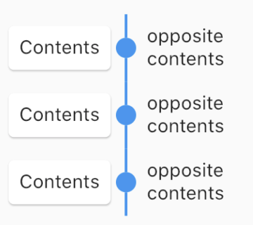
|
FixedTimeline.tileBuilder(
  builder: TimelineTileBuilder.connectedFromStyle(
    contentsAlign: ContentsAlign.reverse,
    oppositeContentsBuilder: (context, index) => Padding(
      padding: const EdgeInsets.all(8.0),
      child: Text('opposite\ncontents'),
    ),
    contentsBuilder: (context, index) => Card(
      child: Padding(
        padding: const EdgeInsets.all(8.0),
        child: Text('Contents'),
      ),
    ),
    connectorStyleBuilder: (context, index) => ConnectorStyle.solidLine,
    indicatorStyleBuilder: (context, index) => IndicatorStyle.dot,
    itemCount: 3,
  ),
)
|
ContentsAlign.alternating |
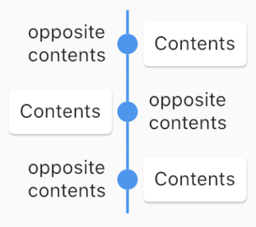
|
FixedTimeline.tileBuilder(
  builder: TimelineTileBuilder.connectedFromStyle(
    contentsAlign: ContentsAlign.alternating,
    oppositeContentsBuilder: (context, index) => Padding(
      padding: const EdgeInsets.all(8.0),
      child: Text('opposite\ncontents'),
    ),
    contentsBuilder: (context, index) => Card(
      child: Padding(
        padding: const EdgeInsets.all(8.0),
        child: Text('Contents'),
      ),
    ),
    connectorStyleBuilder: (context, index) => ConnectorStyle.solidLine,
    indicatorStyleBuilder: (context, index) => IndicatorStyle.dot,
    itemCount: 3,
  ),
)
|
The timeline component has two widgets, Timeline similar to ScrollView and FixedTimeline similar to Flex.
Also their constructors are similar to ScrollView and Flex.
The main difference is that they has TimelineTheme as an ancestor.
The tileBuilder constructor provides more powerful features using TimelineTileBuilder.
If you don't need TimelineTileBuilder, you can use other flutter widgets like ListView, Column, Row, etc.
Even if you use the flutter widget, you can use TimelineTheme.
See full documentation
See CHANGELOG.md.
依赖清单 3 项
{"sdk":"flutter"}{"sdk":"flutter"}^6.0.0先按使用场景筛选,再比较项目活跃情况,最后到原始仓库核对使用要求。
“A repository is the most basic element of GitHub.”
GitHub Docs — About repositories ↗