
 v0.3.1
input_slider
一个可自定义的输入框,用于同步滑块和文本字段。
25喜欢 789近 30 天下载150Pub 分数
AndroidiOSWebmacOSWindowsLinux
一个可自定义的输入控件,结合了与 TextField 同步的 Slider。

{"sdk":"flutter"}{"sdk":"flutter"}以下为英文项目原文快照,最新内容请访问 GitHub。
While Sliders offer a quick and visual way to change a value, it can be hard to achieve precise inputs with them. Additionally, some users really dislike Sliders, and especially on small devices they can get quite fiddly. One way to use the advantages of having a Slider while minimizing the drawbacks is to add an additional alternativ (text) input field.
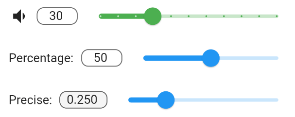
This packages InputSlider combines a TextField with a Slider and synchronizes both of them. They share the same minimum and maximum values and changes made to one also changes the other. Optionally, you can also specify a leading widget, such as a label Text or Icon.
grafik
InputSlider(
  onChange: (value) => print("change: $value"),
  min: 0.0,
  max: 100.0,
  decimalPlaces: 0,
  value: 50.0,
  leading: Text("Percentage:"),
)
You can group multiple InputSlider together using an InputSliderForm. By specifying leadingWeight and sliderWeight it is possible to align them together. They can be also styled together or individually.
InputSliderForm(
    leadingWeight: 1,
    sliderWeight: 20,
    activeSliderColor: Colors.red,
    inactiveSliderColor: Colors.green[100],
    filled: true,
    vertical: true,
    children: [
      InputSlider(
        onChange: (value) {
          print("Setting 1 changed");
        },
        min: 0.0,
        max: 10.0,
        decimalPlaces: 0,
        defaultValue: 5.0,
        leading: Text("Setting 1:"),
      ),
      InputSlider(
        onChange: (value) {
          print("Setting 2 changed");
        },
        min: 0.0,
        max: 1.0,
        decimalPlaces: 3,
        defaultValue: 0.32,
      ),
)
Sliders can be rotated by 90 degrees by setting vertical=true. This can be done to individual InputSliders or to InputSliderForms.
photo_2021-07-10_13-54-59