
 v1.4.0
stepper_a
StepperA 是一个简单且可靠的 Flutter 包,可实现 FormKey 验证,并轻松访问您自己的按钮点击控制。
39喜欢 52近 30 天下载160Pub 分数
AndroidiOSWebmacOSWindowsLinux
用于步骤条的新 Flutter 包

{"sdk":"flutter"}{"sdk":"flutter"}^6.0.0以下为英文项目原文快照,最新内容请访问 GitHub。
Stepper A can easily build Stepper facility of you any flutter app.
StepA.fromTheme(context)StepperAController.jumpToStep()onStepChanged callbackstepper_a: <latest version>
import 'package:stepper_a/stepper_a.dart';
 StepperA(
        stepperSize: const Size(300, 90),
        borderShape: BorderShape.rRect,
        borderType: BorderType.straight,
        stepperAxis: Axis.horizontal,
        lineType: LineType.dotted,
        stepperBackgroundColor: Colors.transparent,
        stepperAController: controller,
        stepHeight: 40,
        stepWidth: 40,
        stepBorder: true,
        pageSwipe: false,
        formValidation: true,
        previousButton: (int index) => StepperAButton(
            width: 90,
            height: 40,
            onTap: (int currentIndex){

            },
            buttonWidget: const Icon(
            Icons.arrow_back,
            color: Colors.white,
           ),
        ),
        forwardButton: (index) => StepperAButton(
            width: index == 0 ? 200 : 90,
            height: 40,
            onTap: (int currentIndex){

            },
            onComplete: (){
              debugPrint("Forward Button click complete step call back!");
            },
            buttonWidget: index == 3
            ? const Text('Complete', style: TextStyle(fontSize: 14, color: Colors.white))
                : const Text('Next', style: TextStyle(fontSize: 14, color: Colors.white)),
        ),
        customSteps: [
            const CustomSteps(stepsIcon: Icons.login, title: "LogIn"),
            const CustomSteps(stepsIcon: Icons.home, title: "Home"),
            const CustomSteps(stepsIcon: Icons.account_circle, title: "Account"),
            CustomSteps(image: Image.asset("assets/pic/pay.png",color: Colors.white,), title: "Payment"),
        ],
        step: const StepA(
            currentStepColor: Colors.green,
            completeStepColor: Colors.indigo,
            inactiveStepColor: Colors.black45,
            // loadingWidget: CircularProgressIndicator(color: Colors.green,),
            margin: EdgeInsets.all(5)
      ),
      stepperBodyWidget: [
            StepOne(controller: controller),
            StepTwo(controller: controller),
            StepThree(controller: controller),
            StepFour(controller: controller),
      ]
)
Let the stepper pick up your app's ColorScheme automatically:
step: StepA.fromTheme(context),
Any color you still pass explicitly (e.g. StepA.fromTheme(context, currentStepColor: Colors.green)) overrides the theme default.
controller.jumpToStep(
    index: 2,
    onTap: (currentIndex) {
      // currentIndex is now 2
    },
);
StepperA(
  // ...
  onStepChanged: (currentIndex) {
    debugPrint('Now on step $currentIndex');
  },
)
CustomSteps(
  title: "Payment",
  builder: (context, index, isCompleted, isCurrent) => Icon(
    isCompleted ? Icons.check : Icons.payment,
    color: Colors.white,
  ),
)
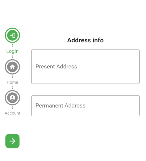
Horizontal rectangle
Screenshot_20230602_233154
vertical circle
vertical circle
Horizontal circle
Horizontal rectangle
If this package was useful to you, helped you to easily deliver your app, saved you a lot of time, or you just want to support the project, I would be grateful if you give us a rating.