
 v0.0.8
neon_circular_timer
一个帮助您快速构建计时器的包,具有美观的用户界面,高度可定制,您可以更改计时器的颜色、厚度以及时钟文本样式。
69喜欢 110近 30 天下载140Pub 分数
AndroidiOSWebmacOSWindowsLinux
制作一个带有华丽霓虹效果和精美用户界面的计时器应用

{"sdk":"flutter"}{"sdk":"flutter"}以下为英文项目原文快照,最新内容请访问 GitHub。
Make a timer application with a fancy neon effect and beautiful UI
v0.0.3 and above now the timer has also a neumorphic border
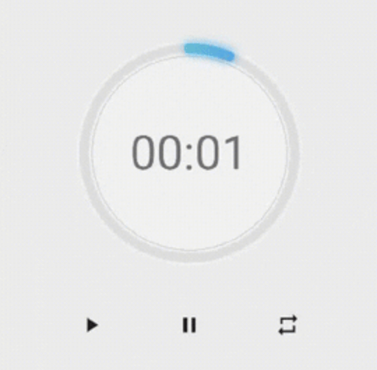
example preview
Use neumorphicEffect to show or hide the neumorphic border
Use isTimerTextShown to show or hide the text
With neumorphicEffect is true and isTimerTextShown is false
  NeonCircularTimer(
                width: 200,
                    duration: 20,
                    controller : your_controller
                    isTimerTextShown: false,
                    neumorphicEffect: true,
                    innerFillGradient: LinearGradient(colors: [
                      Colors.greenAccent.shade200,
                      Colors.blueAccent.shade400
                    ]),
                    neonGradient: LinearGradient(colors: [
                      Colors.greenAccent.shade200,
                      Colors.blueAccent.shade400
                    ]),
                   ),
neum no text
neumorphicEffect is false and isTimerTextShown is false
  NeonCircularTimer(
                width: 200,
                    duration: 20,
                    controller : your_controller
                    isTimerTextShown: false,
                    neumorphicEffect: false,
                    innerFillGradient: LinearGradient(colors: [
                      Colors.greenAccent.shade200,
                      Colors.blueAccent.shade400
                    ]),
                    neonGradient: LinearGradient(colors: [
                      Colors.greenAccent.shade200,
                      Colors.blueAccent.shade400
                    ]),
                   ),
no txt nor neum
| Name | Type | Default Value | Description |
|---|---|---|---|
key |
Key |
null | Key for Countdown Timer. |
neon |
double |
4.0 | The itensity of the neon |
duration |
int |
required | Countdown duration in Seconds. |
initialDuration |
int |
0 | Countdown initial elapsed Duration in Seconds. |
controller |
CountDownController |
required | Controls (i.e Start, Pause, Resume, Restart) the Countdown Timer. |
width |
double |
required | Width of the rectangle that surrounds the circle ( Diameter of the Countdown Timer). |
neonColor |
Color |
Colors.white54 | neon Color for Countdown Widget. |
neonGradient |
Gradient |
null | neon Gradient for Countdown Widget. Note that neonColor will not be effective if gradient is provided. |
neumorphicEffect |
bool |
true | show neumorphic border |
innerFillColor |
Color |
Colors.black12 | Filling Color for Countdown Widget. |
innerFillGradient |
Gradient |
null | Filling Gradient for Countdown Widget. Note that fillColor will not be effective if gradient is provided. |
outerStrokeColor |
Color |
Colors.white | border Color for Countdown Widget. |
backgroundColor |
Color |
Colors.white54 | must be provided if you choose to use neumorphic effect . |
outerStrokeGradient |
Gradient |
null | border Gradient for Countdown Widget. Note that backgroundColor will not be effective if gradient is provided. |
strokeWidth |
double |
10.0 | Border Thickness of the Countdown Ring. |
strokeCap |
StrokeCap |
StrokeCap.round | Begin and end contours with a flat edge and no extension. |
textStyle |
TextStyle |
Theme.of(context).textTheme.headline3 | Text Style for Countdown Text. |
textFormat |
String |
TextFormat.MM_SS | Format for the Countdown Text. |
isReverse |
bool |
false | Handles Countdown Timer (true for Reverse Countdown (max to 0), false for Forward Countdown (0 to max)). |
isReverseAnimation |
bool |
false | Handles Animation Direction (true for Reverse Animation, false for Forward Animation). |
isTimerTextShown |
bool |
true | Handles visibility of the Countdown Text. |
autoStart |
bool |
true | Handles the timer start. |
onStart |
VoidCallback |
null | This Callback will execute when the Countdown Starts. |
onComplete |
VoidCallback |
null | This Callback will execute when the Countdown Ends. |
to get the time in seconds use :
controller.getCurrentTimeInSeconds();
to get the time formated into the selected TextFormat use:
controller.getTime();
to control the timer use :
controller.restart(); // to reset the timer
controller.start(); // to start the timer from 0
controller.pause(); // to pause the timer
controller.resume(); // to continue from the value where the timer stopped