
 v0.1.3
user_profile_avatar
一个简单的控件,用于显示圆形头像,并在图像加载时显示原生的圆形进度指示器。
37喜欢 46近 30 天下载140Pub 分数
AndroidiOSmacOSWindowsLinux
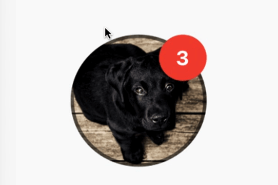
一个简单的控件,用于显示圆形头像,头像从网络获取,并在图像加载时显示圆形进度指示器。还具有显示通知气泡的功能。

{"sdk":"flutter"}^3.4.0{"sdk":"flutter"}以下为英文项目原文快照,最新内容请访问 GitHub。
A simple widget that display round profile picture where the picture is fetched from network and displays circular progress indicator whilst the image is being loaded. Also, has the ability to display notification bubble.
https://raw.githubusercontent.com/zeshanghayoomi/flutter_user_profile_avatar/master/repo_assets/simulator.gif
UserProfileAvatar(
        avatarUrl: 'https://picsum.photos/id/237/5000/5000',
        onAvatarTap: () {
          print('Avatar Tapped..');
        },
        notificationCount: 10,
        notificationBubbleTextStyle: TextStyle(
          fontSize: 30,
          color: Colors.white,
          fontWeight: FontWeight.bold,
        ),
        avatarSplashColor: Colors.purple,
        radius: 100,
        isActivityIndicatorSmall: false,
        avatarBorderData: AvatarBorderData(
          borderColor: Colors.white,
          borderWidth: 5.0,
        ),
      )
onAvatarTap
Use this to perform any action when the avatar gets tapped.
notificationCount
Pass an int to display the notification bubble. 99+ gets displayed if notification count was larger than 100.
notificationBubbleTextStyle
Used to style the notification count, if null then the default one will be applied.
avatarSplashColor
Splash color when user taps on the avatar.
radius
Use this to size the avatar.
isActivityIndicatorSmall
use this to display small/large circular progress indicator (native) when image is loading, default is true.