搜索插件、代码仓与 APP 分类

user_profile_avatar 封面
插件详情v0.1.3

user_profile_avatar

一个简单的控件,用于显示圆形头像,并在图像加载时显示原生的圆形进度指示器。

AndroidiOSmacOSWindowsLinux
近 30 天下载
77
喜欢数
37
Pub 分数
140

安装插件

flutter pub add user_profile_avatar

插件介绍

基于插件公开信息、社区数据与项目使用情况整理的选型参考。

一个 Flutter 小部件,用于显示圆形头像,并在图像加载期间显示原生风格的圆形进度指示器。它通过无缝处理图像获取和视觉反馈,简化了应用程序中用户头像的实现。该小部件确保在各个平台上外观一致,支持 Android、iOS、macOS、Windows 和 Linux。非常适合聊天界面、用户资料以及任何需要带有平滑加载状态的圆形头像的 UI。

适合场景

  • 用户资料展示
  • 聊天界面
  • 社交媒体应用头像
  • 身份验证屏幕
  • 仪表板用户卡片

主要特点

  • 圆形头像图像渲染
  • 原生圆形进度指示器
  • 跨平台兼容性
  • 简单 API 集成
  • 自动图像加载状态管理

适合对象

  • 开发聊天应用的开发者
  • 需要干净头像的UI设计师
  • 带有用户身份验证的应用程序
  • 跨平台移动和桌面应用
  • 项目需要最少的样板代码来处理个人资料图片

使用建议

  • 需要互联网访问以获取远程图像
  • 超出基本样式的定制功能有限
  • 依赖外部图像加载逻辑
  • 不适合非圆形头像设计
  • 高性能应用可能需要额外的缓存以提升性能

原始 README

以下为关联源码仓库的 README 原文快照,最新内容请访问源码仓库。

Flutter User Profile Avatar

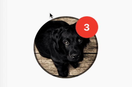
A simple widget that display round profile picture where the picture is fetched from network and displays circular progress indicator whilst the image is being loaded. Also, has the ability to display notification bubble.


How to use


UserProfileAvatar(
        avatarUrl: 'https://picsum.photos/id/237/5000/5000',
        onAvatarTap: () {
          print('Avatar Tapped..');
        },
        notificationCount: 10,
        notificationBubbleTextStyle: TextStyle(
          fontSize: 30,
          color: Colors.white,
          fontWeight: FontWeight.bold,
        ),
        avatarSplashColor: Colors.purple,
        radius: 100,
        isActivityIndicatorSmall: false,
        avatarBorderData: AvatarBorderData(
          borderColor: Colors.white,
          borderWidth: 5.0,
        ),
      )

Properties

  • avatarUrl
    The url for the image, if this set to null or empty then an empty user avatar gets displayed by default.


  • onAvatarTap
    Use this to perform any action when the avatar gets tapped.

  • notificationCount
    Pass an int to display the notification bubble. 99+ gets displayed if notification count was larger than 100.

  • notificationBubbleTextStyle
    Used to style the notification count, if null then the default one will be applied.

  • avatarSplashColor
    Splash color when user taps on the avatar.

  • radius
    Use this to size the avatar.

    • minimum default radius is 15
    • maximum default radius is 150
  • isActivityIndicatorSmall
    use this to display small/large circular progress indicator (native) when image is loading, default is true.


  • avatarBorderData
    Use this to apply border width and color of the avatar.

所属分类

依赖

依赖清单 1 项

源码仓库

使用此插件的项目

暂无相关数据。