
 v2.0.0
grouped_checkbox
一个用于在 Flutter 项目中轻松以不同样式分组复选框的包。
11喜欢 78近 30 天下载140Pub 分数
AndroidiOSWebmacOSWindowsLinux
一个 Flutter 包,可轻松在 Flutter 项目中以不同样式分组复选框。

{"sdk":"flutter"}{"sdk":"flutter"}以下为英文项目原文快照,最新内容请访问 GitHub。
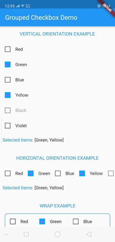
The GroupedCheckbox widget enables displaying a list of checkboxes in various orientations and styles. It's designed for flexibility, supporting generic types, and offers customizable options.
Add grouped_checkbox to your Flutter project's dependencies.
https://raw.githubusercontent.com/zfnadia/grouped-checkbox/master/screenshots/one.jpg https://media.giphy.com/media/v1.Y2lkPTc5MGI3NjExMHE3dTJxeTY4MjFyOWNxODYxazZoYzBueGJsNWVqbXk0Yjlicmd0aSZlcD12MV9pbnRlcm5hbF9naWZfYnlfaWQmY3Q9Zw/rCxjnhgA34BFo76lxt/giphy.gif
To use this plugin, add grouped_checkbox as a dependency in your pubspec.yaml file.
dependencies: grouped_checkbox: 2.0.0
import 'package:grouped_checkbox/grouped_checkbox.dart';
    final List<ColorItem> allItemList = [
      ColorItem('Red', Colors.red),
      ColorItem('Green', Colors.green),
      ColorItem('Blue', Colors.blue),
      ColorItem('Yellow', Colors.yellow),
      ColorItem('Black', Colors.black),
      ColorItem('Violet', Colors.purple)
    ];

    class ColorItem {
      String name;
      Color color;

      ColorItem(this.name, this.color);
    }

    GroupedCheckbox<ColorItem>(
      itemList: allItemList,
      checkedItemList: selectedItems,
      disabled: disabledItems,
      onChanged: (itemList) {
        updateFunction(itemList!);
      },
      orientation: orientation,
      checkColor: Colors.purpleAccent,
      activeColor: Colors.lightBlue,
      itemWidgetBuilder: (item) => Text(item.name, style: TextStyle(color: item.color)),
    )