
 v0.0.4
numeric_selector
Flutter के लिए एक कस्टमाइज़ करने योग्य संख्यात्मक चयनकर्ता विंडजेट जो लंबवत और क्षैतिज स्क्रॉलिंग दोनों को सपोर्ट करता है।
11लाइक 6430-दिन डाउनलोड160Pub अंक
AndroidiOS
Flutter के लिए एक कस्टमाइज़ेबल न्यूमेरिक सेलेक्टर पैकेज, जो चिकनी स्क्रॉलिंग और विकल्प के रूप में कंपन प्रतिक्रिया के साथ क्षैतिज और ऊर्ध्वाधर न्यूमेरिक सेलेक्टर प्रदान करता है।

{"sdk":"flutter"}^3.1.2{"sdk":"flutter"}^4.0.0यह अंग्रेज़ी मूल स्नैपशॉट है। नवीनतम सामग्री GitHub पर देखें।
A customizable Numeric Selector package for Flutter, providing both Horizontal and Vertical Numeric Selector with smooth scrolling and optional vibration feedback.
✅ Horizontal and Vertical pickers
✅ Customizable styles and colors
✅ Vibration feedback support
✅ Supports minimum, maximum, and step values
✅ Optional labels and arrow indicators
Add the following dependency to your pubspec.yaml file:
dependencies:
  numeric_selector: latest_version
Then, run:
flutter pub get
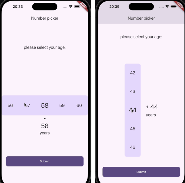
| Horizontal Numeric Selector | Vertical Numeric Selector |
|---|---|
| Horizontal Numeric Selector | Vertical Numeric Selector |
HorizontalNumericSelector(
  minValue: 0,
  maxValue: 100,
  step: 1,
  initialValue: 50,
  onValueChanged: (value) {
    print("Selected Value: $value");
  },
  viewPort: 0.3,
  selectedTextStyle: TextStyle(fontSize: 32, fontWeight: FontWeight.bold),
  unselectedTextStyle: TextStyle(fontSize: 24, color: Colors.grey),
  backgroundColor: Colors.white,
  showLabel: true,
  label: "Quantity",
  showArrows: true,
  enableVibration: true,
)
VerticalNumericSelector(
  minValue: 1,
  maxValue: 10,
  step: 1,
  initialValue: 5,
  onValueChanged: (value) {
    print("Selected Value: $value");
  },
  viewPort: 0.3,
  selectedTextStyle: TextStyle(fontSize: 32, fontWeight: FontWeight.bold),
  unselectedTextStyle: TextStyle(fontSize: 24, color: Colors.grey),
  backgroundColor: Colors.white,
  borderRadius: BorderRadius.circular(10),
  showLabel: true,
  label: "Speed",
  showArrows: true,
  enableVibration: true,
)
| Parameter | Type | Description |
|---|---|---|
minValue |
int |
Minimum selectable value |
maxValue |
int |
Maximum selectable value |
step |
int |
Step between values |
initialValue |
int |
Default selected value |
onValueChanged |
ValueChanged<int> |
Callback when value changes |
viewPort |
double |
Fraction of viewport occupied by picker |
selectedTextStyle |
TextStyle? |
Style for selected value |
unselectedTextStyle |
TextStyle? |
Style for unselected values |
backgroundColor |
Color? |
Background color |
borderRadius |
BorderRadius? |
Corner radius for picker background |
showLabel |
bool |
Show label text below selected value |
label |
String? |
Custom label text |
showArrows |
bool |
Show navigation arrows |
arrowIcon |
IconData? |
Custom arrow icon |
enableVibration |
bool |
Enable vibration feedback |
Contributions are welcome! Feel free to submit a PR or open an issue.
👤 Amirmahdi Nourkazemi
LinkedIn
This project is licensed under the MIT License.