
 v2.3.1
time_range_picker
फ्लटर के लिए समय सीमा चयनकर्ता। यह विजेट आपको शुरुआत और अंत समय के साथ एक समय अंतराल चुनने के लिए एक डायलॉग खोलने की अनुमति देता है।
186लाइक 5.5 हज़ार30-दिन डाउनलोड140Pub अंक
AndroidiOSWebmacOSWindowsLinux
Flutter के लिए समय सीमा चयनकर्ता

{"sdk":"flutter"}{"sdk":"flutter"}यह अंग्रेज़ी मूल स्नैपशॉट है। नवीनतम सामग्री GitHub पर देखें।
A time range picker for flutter.
Add
time_range_picker : any
to your pubspec.yaml, and run
flutter packages get
in your project's root directory.
import 'package:flutter/material.dart';

import 'package:time_range_picker/time_range_picker.dart';

void main() => runApp(MyApp());

class MyApp extends StatelessWidget {
  @override
  Widget build(BuildContext context) {
    return MaterialApp(
      theme: ThemeData(
        primarySwatch: Colors.blue,
      ),
      home: MyHomePage(),
    );
  }
}

class MyHomePage extends StatelessWidget {
  @override
  Widget build(BuildContext context) {
    return Scaffold(
        backgroundColor: Colors.blueGrey,
        body: Center(
          child: RaisedButton(
            onPressed: () async {
              TimeRange result = await showTimeRangePicker(
                context: context,
              );
              print("result " + result.toString());
            },
            child: Text("Pure"),
          ),
        ));
  }
}
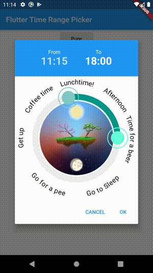
Simple
Interval
Filled Style
Disabled Timeframe
Background Widget
Rotated Clock
Max Duration
Min Duration
Default Widget
Custom Dialog
Custom Dialog iOS Style
| type | param | default | description | |
|---|---|---|---|---|
| TimeOfDay | start | TimeOfDay.now() | preselected start time | |
| TimeOfDay | end | now + 3h | preselected end time | |
| TimeRange | disabledTime | disabled time range (this time cannot be selected) | ||
| Color | disabledColor | Colors.red.withOpacity(0.5) | the color for the disabled section | |
| PaintingStyle | paintingStyle | PaintingStyle.stroke | Style of the arc (filled or stroke) | |
| Function(TimeOfDay) | onStartChange | |||
| Function(TimeOfDay) | onEndChange | |||
| Duration | interval | Duration(minutes: 5) | Minimum time steps that can be selected | |
| String | fromText | "From" | label for start time | |
| String | toText | "To" | label for end time | |
| bool | use24HourFormat | true | use 24 hours or am / pm | |
| double | padding | 36 | the padding of the ring | |
| double | strokeWidth | 12 | the thickness of the ring | |
| Color | strokeColor | primaryColor | the color of the active arc from start time to end time | |
| double | handlerRadius | 12 | the radius of the handler to drag the arc | |
| Color | handlerColor | primaryColor | the color of a handler | |
| Color | selectedColor | primaryColorLight | the color of a selected handler | |
| Color | backgroundColor | Colors.grey[200] | the color of the circle outline | |
| Widget | backgroundWidget | a widget displayed in the background, use e.g. an image | ||
| int | ticks | number of ticks displayed | ||
| double | ticksOffset | 0 | the offset for ticks | |
| double | ticksLength | strokeWidth | ticks length | |
| double | ticksWidth | 1 | ticks thickness | |
| Color | ticksColor | Colors.white | Color of ticks | |
| bool | snap | false | Snap time bar to interval | |
| List | labels | Show labels around the circle (start at 0 hours) | ||
| double | labelOffset | 20 | Offset of the labels | |
| bool | rotateLabels | true | rotate labels | |
| bool | autoAdjustLabels | true | flip labels if the angle woulb be upside down (only if rotate labels is active) | |
| TextStyle | labelStyle | Style of the labels | ||
| TextStyle | timeTextStyle | TextStyle of the time texts | ||
| TextStyle | activeTimeTextStyle | TextStyle of the currently moving time text | ||
| bool | hideTimes | false | hide the time texts | |
| double | clockRotation | 0 | rotate the clock around angle | |
| Duration | maxDuration | null | maximum Duration that can be picked | |
| Duration | minDuration | Duration(minutes: 30) | minimum Duration that can be picked | |
| bool | barrierDismissible | true | barrierDismissible false = user must tap button to close time range picker |