
 v0.0.5
circular
एक ऐसा फ्लटर पैकेज जो सर्कुलर स्लाइडर में डेटा को चुनने और प्रदर्शित करने के लिए बनाया गया है, जिससे विशिष्ट रेंज में मानों के साथ काम करना आसान हो जाता है
29लाइक 4230-दिन डाउनलोड140Pub अंक
AndroidiOSWebmacOSWindowsLinux
Mahmoudgarwallane/circular_slider open-source repository details.

{"sdk":"flutter"}{"sdk":"flutter"}^1.0.0यह अंग्रेज़ी मूल स्नैपशॉट है। नवीनतम सामग्री GitHub पर देखें।
https://img.shields.io/badge/Flutter-02569B?style=for-the-badge&logo=flutter&logoColor=white https://img.shields.io/badge/GitHub-100000?style=for-the-badge&logo=github&logoColor=white
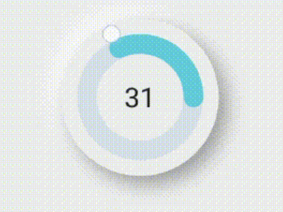
https://user-images.githubusercontent.com/68555232/166114114-d7e47d13-3d8c-49ee-af62-c89da85764ec.gifflutter pub add circular
import 'package:circular/circular.dart';
CircularSlider(
decoration: BoxDecoration(
    borderRadius: BorderRadius.circular(200),
    boxShadow: const [
      BoxShadow(
          offset: Offset(-10, -10),
          color: Colors.white,
          blurRadius: 20,
          spreadRadius: 1),
      BoxShadow(
          offset: Offset(10, 10),
          color: Color.fromARGB(255, 158, 158, 158),
          blurRadius: 20,
          spreadRadius: 1)
    ]),
maxValue: 100,
radius:100,
child: Text(
  value.toString(),
  style: TextStyle(fontSize: 30),
),
color: Color(0xffEEEEEE),
sliderColor: Color(0xff62CBDA),
unSelectedColor: Color(0xffD7DEE7),
onDrag: (value) {
  setState(() {
    this.value = value;
  });
},
),
CircularViewer(
  decoration: BoxDecoration(
      borderRadius: BorderRadius.circular(200),
      boxShadow: const [
        BoxShadow(
            offset: Offset(-10, -10),
            color: Colors.white,
            blurRadius: 20,
            spreadRadius: 1),
        BoxShadow(
            offset: Offset(10, 10),
            color: Color.fromARGB(255, 158, 158, 158),
            blurRadius: 20,
            spreadRadius: 1)
      ]),
  value: 50,
  maxValue: 100,
  radius: 100,
  textStyle: TextStyle(fontSize: 30),
  color: Color(0xffEEEEEE),
  sliderColor: Color(0xff62CBDA),
  unSelectedColor: Color(0xffD7DEE7),
)
check out the full example
after I made the the magic circle I decided to make it useful so I made this package
Contributions are always welcome!