


 v1.1.1
stylish_bottom_bar
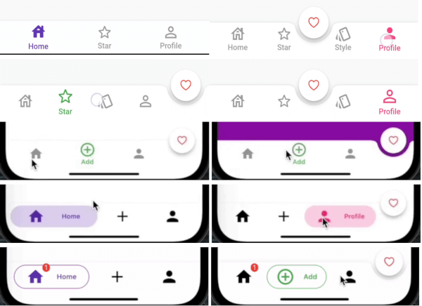
फ्लटर के लिए एनिमेटेड बॉटम बार और बबल बॉटम बार जैसे शैलीपूर्ण बॉटम नेविगेशन बार का संग्रह।
331लाइक 8.2 हज़ार30-दिन डाउनलोड150Pub अंक
AndroidiOSWebmacOSWindowsLinux
फ्लटर के लिए एक शानदार बॉटम नेविगेशन बार।

यह अंग्रेज़ी मूल स्नैपशॉट है। नवीनतम सामग्री GitHub पर देखें।


A collection of stylish bottom navigation bars like animated bottom bar and bubble bottom bar for flutter.
dependencies:
    stylish_bottom_bar: ^1.2.0-beta
import 'package:stylish_bottom_bar/stylish_bottom_bar.dart';
items:
option:
backgroundColor:
elevation:
currentIndex:
iconSize:
padding:
inkEffect:
inkColor:
onTap:
opacity:
borderRadius:
fabLocation:
hasNotch:
barAnimation:
barStyle:
unselectedIconColor:
bubbleFillStyle:
iconStyle:
selectedIcon:
dotStyle:
items → List<BottomBarItem>
option → AnimatedBarOptions
option → BubbleBarOptions
option → DotBarOptions
option → BarBlurOptions
backgroundColor → Color
elevation → double
currentIndex → int
iconSize → double
padding → EdgeInsets
inkEffect → bool
inkColor → Color
onTap → Function(int)
opacity → double
borderRadius → BorderRadius
fabLocation → StylishBarFabLocation
hasNotch → bool
barAnimation → BarAnimation
barStyle → BubbleBarStyle
unselectedIconColor → Color
bubbleFillStyle → BubbleFillStyle
iconStyle → IconStyle
dotStyle → DotStyle
BubbleBarStyle.vertical
BubbleBarStyle.horizotnal
BubbleFillStyle.fill
BubbleFillStyle.outlined
StylishBarFabLocation.center
StylishBarFabLocation.end
BarAnimation.fade
BarAnimation.blink
BarAnimation.transform3D
BarAnimation.liquid
BarAnimation.drop
IconStyle.Default
IconStyle.simple
IconStyle.animated
DotStyle.circle
DotStyle.tile
NotchStyle.circle
NotchStyle.square
NotchStyle.themeDefault
onTap: (index){

}
BarBlurOptions
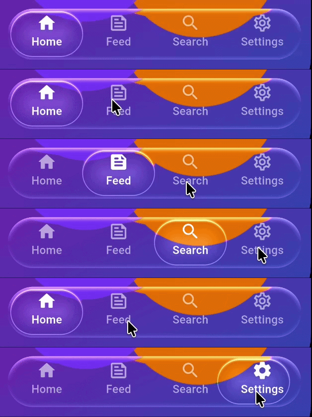
BarBlurOptions.frosted()
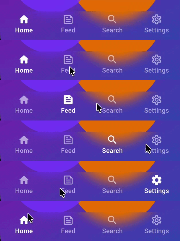
BarBlurOptions.liquidGlass()
AnimatedBarOptions
IconStyle.Default
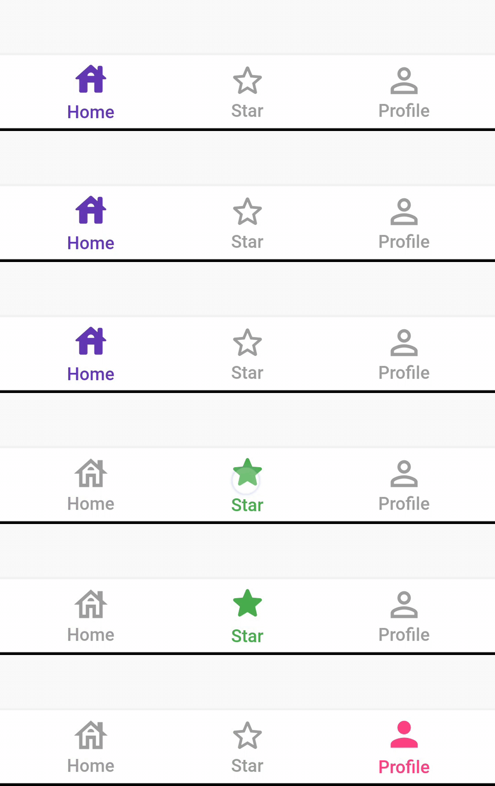
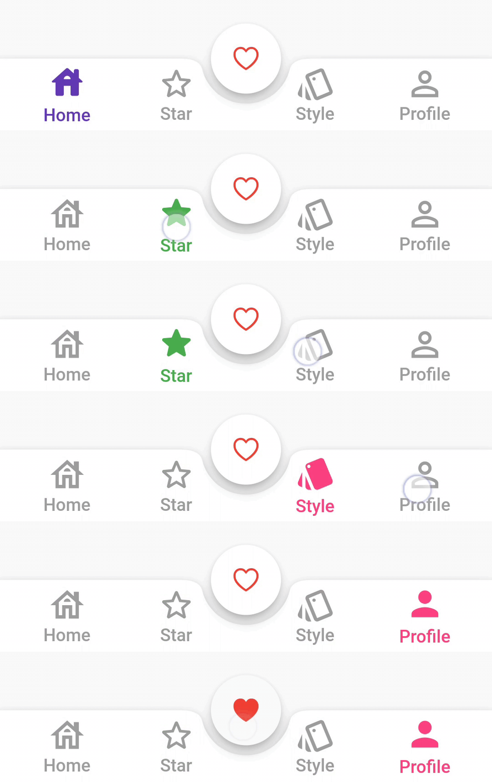
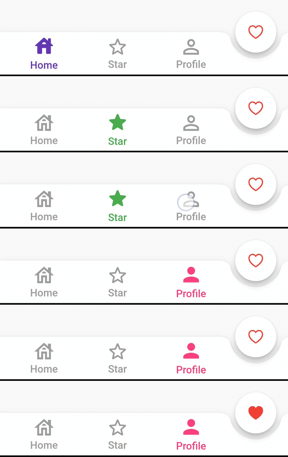
IconStyle.simple
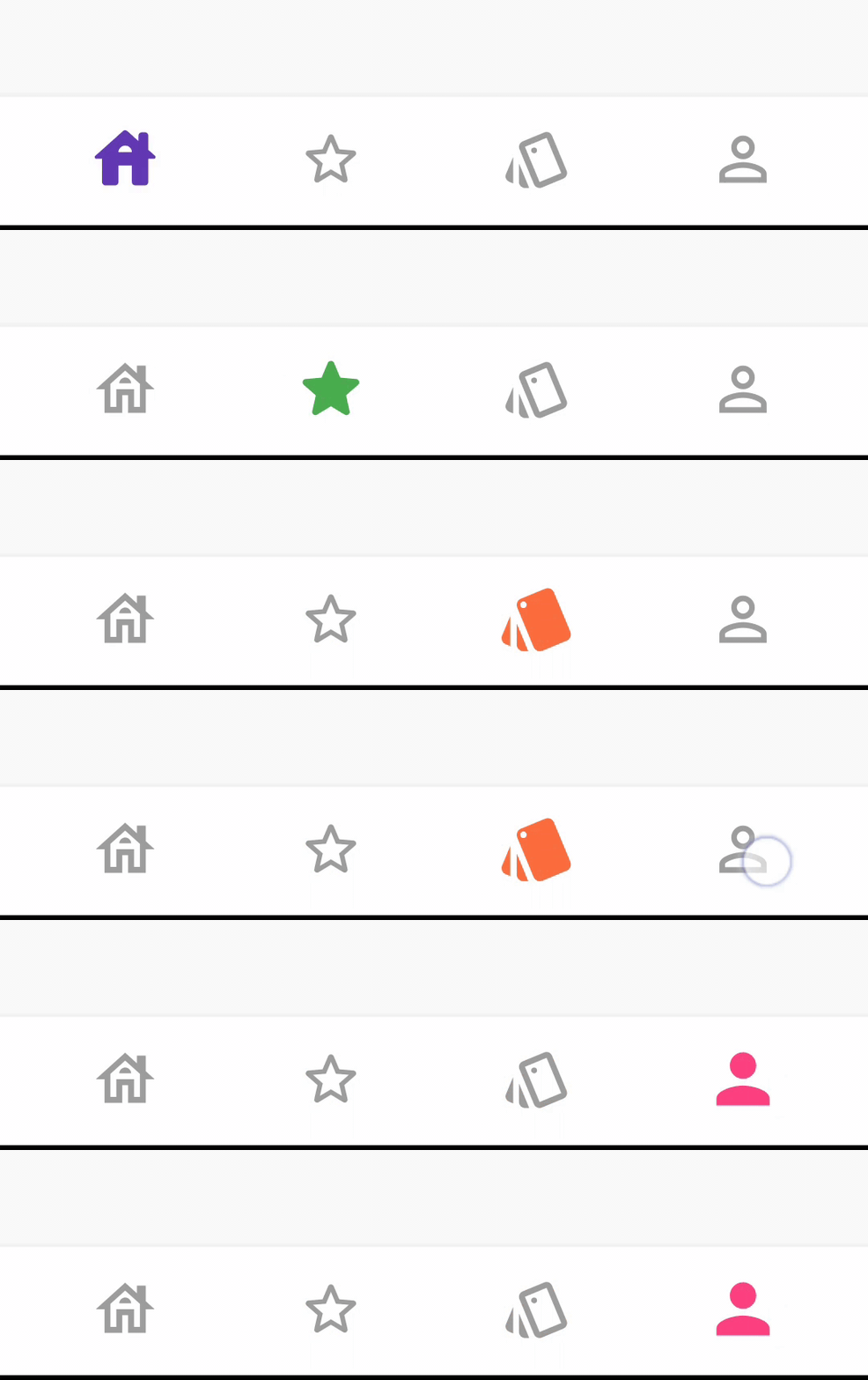
IconStyle.animated
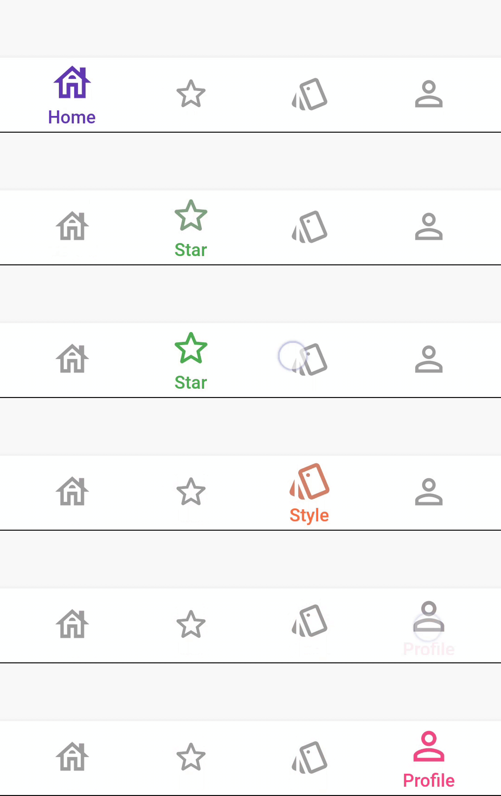
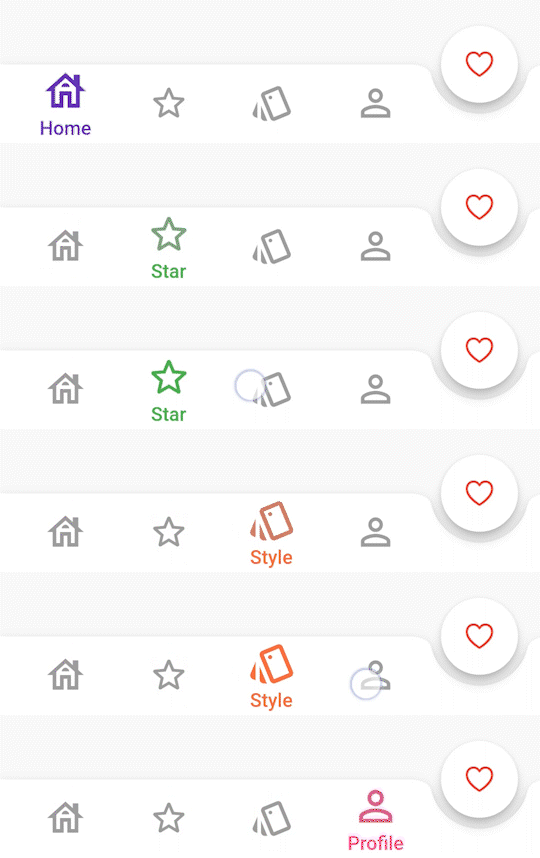
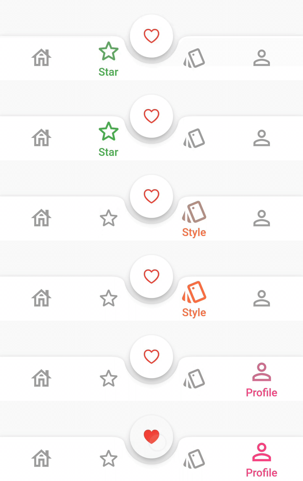
BarAnimation.fade


BarAnimation.blink

BarAnimation.liquid
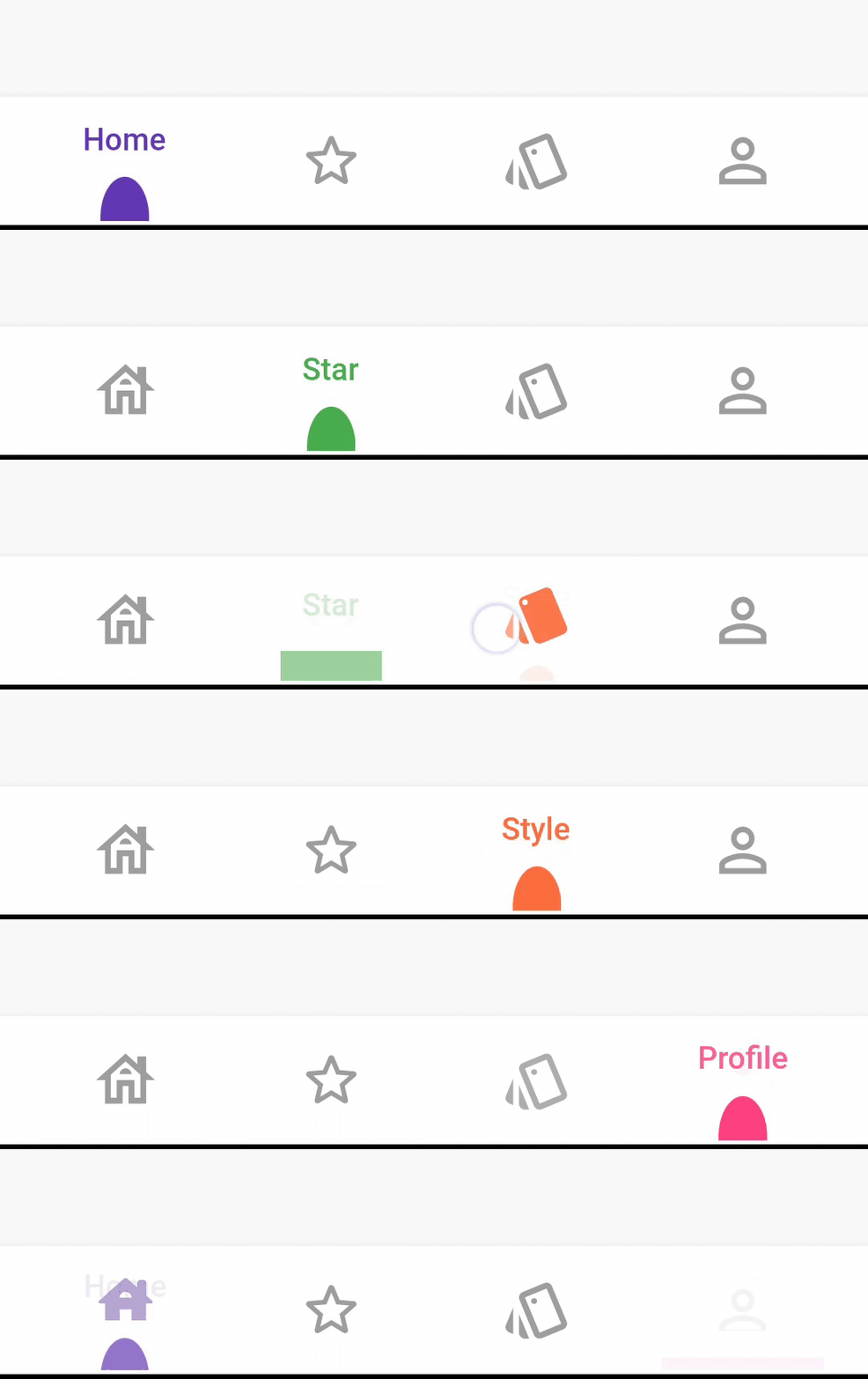
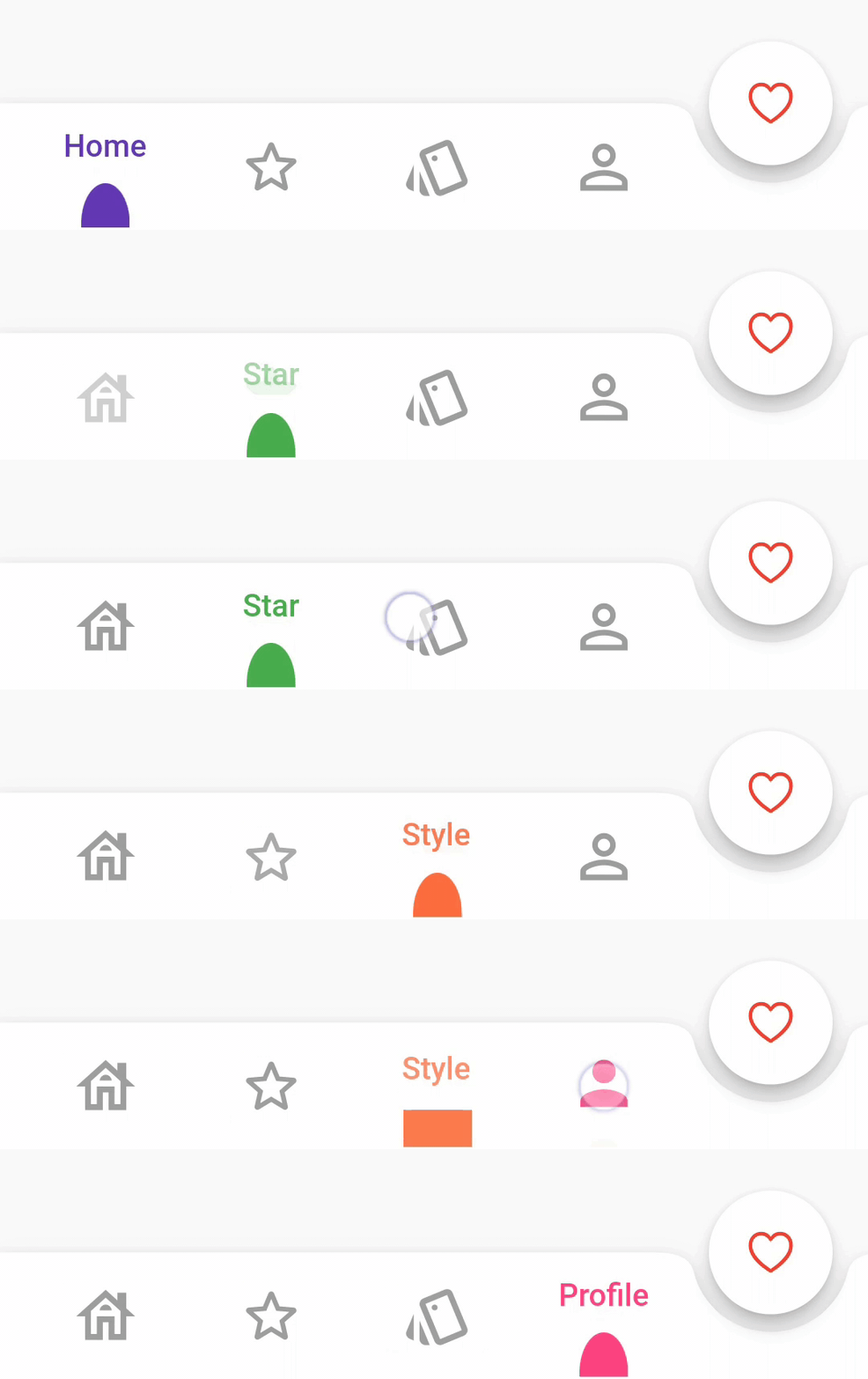
BarAnimation.drop

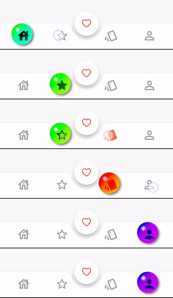
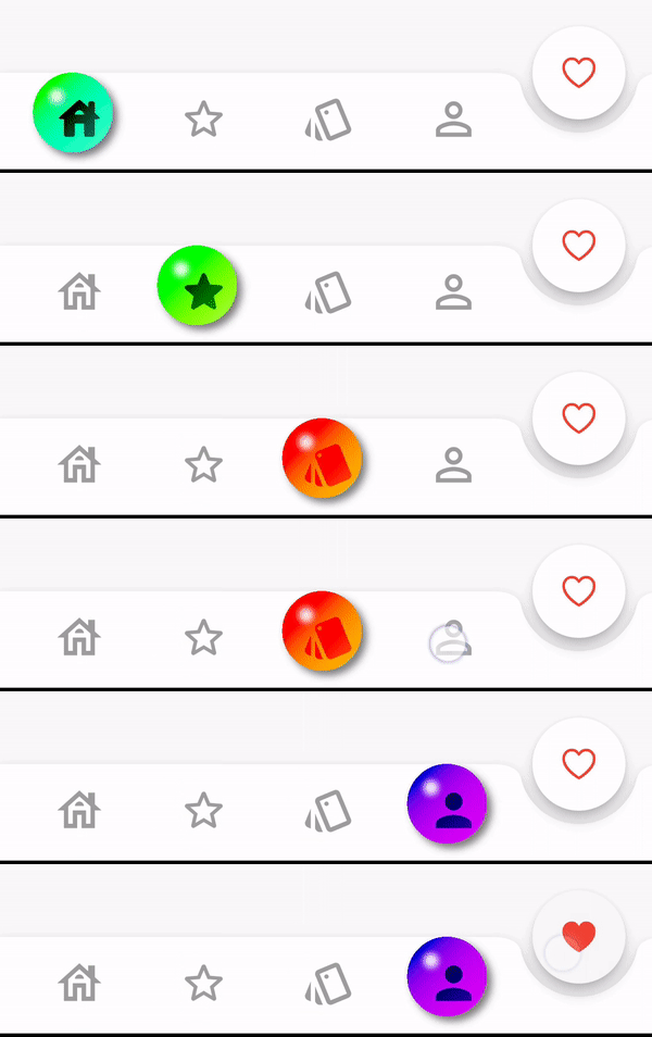
DotBarOptions
DotStyle.circle


DotStyle.tile


BubbleBarOptions
BubbleBarStyle.horizotnal


BubbleFillStyle.outlined


BubbleBarStyle.vertical

BubbleFillStyle.outlined


List<dynamic> items is changed to List<BottomBarItem> items
From version 1.0.0 option: AnimatedBarOptions and BubbleBarOptions will be used to change the bar items type and properties.
StylishBottomBar(
//  option: const BarBlurOptions.liquidGlass(),
//
//  option: const BarBlurOptions.frosted(),
//
//  option: AnimatedBarOptions(
//    iconSize: 32,
//    barAnimation: BarAnimation.liquid,
//    iconStyle: IconStyle.animated,
//    opacity: 0.3,
//  ),
//
//  option: BubbleBarOptions(
//    barStyle: BubbleBarStyle.horizotnal,
//    // barStyle: BubbleBarStyle.vertical,
//    bubbleFillStyle: BubbleFillStyle.fill,
//    // bubbleFillStyle: BubbleFillStyle.outlined,
//    opacity: 0.3,
//  ),
//
  option: DotBarOptions(
    dotStyle: DotStyle.tile,
    gradient: const LinearGradient(
      colors: [
        Colors.deepPurple,
        Colors.pink,
      ],
      begin: Alignment.topLeft,
      end: Alignment.bottomRight,
    ),
  ),
  items: [
    BottomBarItem(
      icon: const Icon(Icons.abc),
      title: const Text('Abc'),
      backgroundColor: Colors.red,
      selectedIcon: const Icon(Icons.read_more),
    ),
    BottomBarItem(
      icon: const Icon(Icons.safety_divider),
      title: const Text('Safety'),
      backgroundColor: Colors.orange,
    ),
    BottomBarItem(
      icon: const Icon(Icons.cabin),
      title: const Text('Cabin'),
      backgroundColor: Colors.purple,
    ),
  ],
  fabLocation: StylishBarFabLocation.end,
  hasNotch: true,
  currentIndex: selected,
  onTap: (index) {
    setState(() {
      selected = index;
      controller.jumpToPage(index);
    });
  },
)
Contributions and pull requests are welcome! We value your input and appreciate any improvements or suggestions you can provide. Feel free to submit a pull request with your changes. Don't forget to star the repository if you find it useful. Thank you for your collaboration!
निर्भरता सूची 3 आइटम
{"sdk":"flutter"}^6.0.0{"sdk":"flutter"}उपयोग के अनुसार छाँटें, गतिविधि की तुलना करें और अपनाने से पहले मूल प्रोजेक्ट की आवश्यकताएँ जाँचें।
“A repository is the most basic element of GitHub.”
GitHub Docs — About repositories ↗