
 v1.0.4
animated_notch_bottom_bar
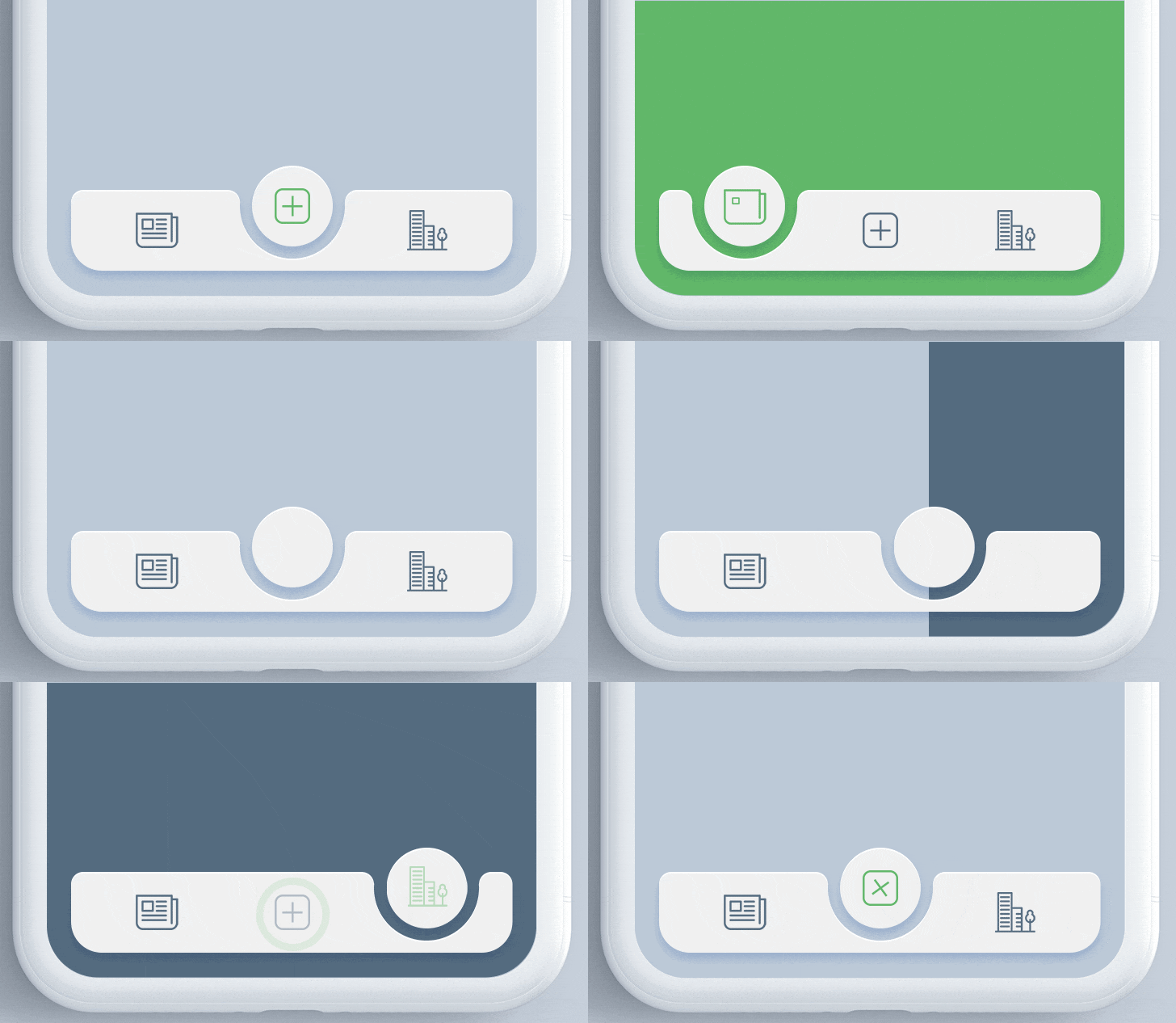
इस पैकेज की मदद से आप किसी भी विजेट को बच्चों के रूप में उपयोग करके किसी भी एनीमेटेड नॉच बॉटम नेविगेशन बार को प्राप्त कर सकते हैं।
422लाइक 5.1 हज़ार30-दिन डाउनलोड150Pub अंक
AndroidiOSWebmacOSWindowsLinux
Flutter के TabBar संघटक

{"sdk":"flutter"}{"sdk":"flutter"}यह अंग्रेज़ी मूल स्नैपशॉट है। नवीनतम सामग्री GitHub पर देखें।
animated_notch_bottom_bar version Flutter Website Dart Website https://img.shields.io/badge/platform-android-blue https://img.shields.io/badge/platform-iOS-blue https://img.shields.io/badge/platform-Web-deepskyblue https://img.shields.io/badge/platform-Mac-deepskyblue https://img.shields.io/badge/platform-Linux-deepskyblue https://img.shields.io/badge/platform-Windows-deepskyblue https://app.codacy.com/project/badge/Grade/dc683c9cc61b499fa7cdbf54e4d9ff35 https://img.shields.io/github/license/Mindinventory/animated_notch_bottom_bar MIT License
A Flutter package for animating the position of selected item in bottomNavigationBar with notch like design. Inspired by react-native-tabbar-interaction plugin.
Add the dependency in pubspec.yaml:
dependencies:
  ...
  animated_notch_bottom_bar: ^1.0.0
Place AnimatedNotchBottomBar in the bottomNavigationBar parameter of a Scaffold widget and provide NotchBottomBarController to AnimatedNotchBottomBar.
bottomNavigationBar:  AnimatedNotchBottomBar(
  notchBottomBarController: _controller,
  ...
)
Widget as bottom bar itemYou can also set any animated widget.
bottomNavigationBar:  AnimatedNotchBottomBar(
  pageController: _pageController,
  bottomBarItems: [
    const BottomBarItem(
        inActiveItem: Icon(
           Icons.home_filled,
            color: Colors.blueGrey,
        ),
        activeItem: Icon(
          Icons.home_filled,
          color: Colors.blueAccent,
        ),
        itemLabel: 'Page 1',
  ),
    const BottomBarItem(
        inActiveItem: Icon(
            Icons.star,
            color: Colors.blueGrey,
          ),
        activeItem: Icon(
            Icons.star,
            color: Colors.blueAccent,
        ),
        itemLabel: 'Page 2',
  ),

     ///svg item
    BottomBarItem(
        inActiveItem: SvgPicture.asset(
          'assets/search_icon.svg',
           color: Colors.blueGrey,
       ),
       activeItem: SvgPicture.asset(
          'assets/search_icon.svg',
           color: Colors.black,
       ),
       itemLabel: 'Page 3',
    ),
     ...
)
bottomNavigationBar:  AnimatedNotchBottomBar(
     ...
     removeMargins: true,
     ...
)
bottomNavigationBar:  AnimatedNotchBottomBar(
     ...
     bottomBarWidth: 500.0,
     bottomBarHeight: 62.0,
     ...
)
bottomNavigationBar:  AnimatedNotchBottomBar(
     ...
     durationInMilliSeconds: 300,
     ...
)
bottomNavigationBar:  AnimatedNotchBottomBar(
     ...
     showLabel: true,
     itemLabelStyle: TextStyle(
                      color: Colors.black,
                      fontSize: 16.0
                    ),
     ...
)
bottomNavigationBar:  AnimatedNotchBottomBar(
     ...
      notchColor: Colors.black87,
     ...
)
bottomNavigationBar:  AnimatedNotchBottomBar(
     ...
     notchGradient: const LinearGradient(
        begin: Alignment.topRight,
        end: Alignment.bottomLeft,
        colors: [
          Colors.red,
          Colors.green,
        ],
     ),
     ...
)
bottomNavigationBar:  AnimatedNotchBottomBar(
     ...
     showBottomRadius = false,
     showTopRadius = false,
     ...
)
bottomNavigationBar:  AnimatedNotchBottomBar(
     ...
     elevation = 2.0,
     ...
)
bottomNavigationBar:  AnimatedNotchBottomBar(
    ...
    showBlurBottomBar: true,
    blurOpacity: 0.2,
    blurFilterX: 5.0,
    blurFilterY: 10.0,
    ...
)
Starting with version 1.0.0 of the package, NotchBottomBarController have been added for control the animation instead of PageController. The pageController field has been removed and notchBottomBarController is required now.
notchBottomBarController - The controller which allows you to control the page.bottomBarItems - Navigation items, required more than one item and less than six.onTap - Required to listen when an item is tapped it provides the selected item's index.color - The bottom bar's background color.removeMargins - To remove side and bottom margins by default it's false.bottomBarWidth - To provide width for web and desktop app.durationInMilliSeconds - To set duration time in MilliSeconds.showLabel: To show or hide the label under bottom bar item.itemLabelStyle - The bottom bar's item text style.showShadow - If false the bottom bar's elevation will be removed.showBlurBottomBar - If true the bottom bar will look blur.blurOpacity - To set opacity of blur effect.blurFilterX - Creates an image filter that applies a Gaussian blur at x axis.blurFilterY - Creates an image filter that applies a Gaussian blur at y axis.notchColor - Customizable notch's color.notchGradient - Add Gradient to notch.showTopRadius - If set false the top corner radius will be removed.showBottomRadius - If set false the top corner radius will be removed.elevation - Set elevation of bottom bar.bottomBarHeight - To set height of bottom bar.title - the bottom bar item labelactiveItem - the selected item.inActiveItem - the inactive item.Contribution towards our repository is always welcome, we request contributors to create a pull request to the main branch only.
Animated Notch Bottom Bar is MIT-licensed.
We’d be really happy if you send us links to your projects where you use our component. Just send an email to sales@mindinventory.com and do let us know if you have any questions or suggestion regarding our work.