

 v0.2.4
circular_countdown_timer
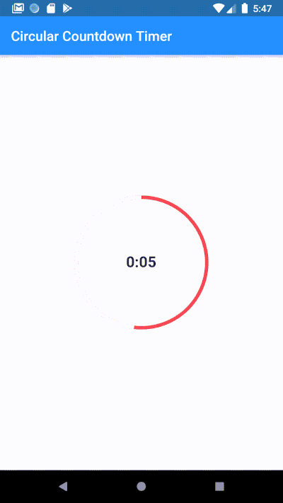
Circular Countdown Timer का उपयोग करके एक एनिमेटेड सर्कुलर काउंटडाउन बनाएं।
617लाइक 30.4 हज़ार30-दिन डाउनलोड140Pub अंक
AndroidiOSWebmacOSWindowsLinux
Circular Countdown Timer का उपयोग करके एनिमेटेड सर्कुलर काउंटडाउन बनाएं

यह अंग्रेज़ी मूल स्नैपशॉट है। नवीनतम सामग्री GitHub पर देखें।
Make an animated circular countdown using Circular Countdown Timer.
To use this plugin, add circular_countdown_timer as a dependency in your pubspec.yaml file.
CircularCountDownTimer(
     duration: 10,
     initialDuration: 0,
     controller: CountDownController(),
     width: MediaQuery.of(context).size.width / 2,
     height: MediaQuery.of(context).size.height / 2,
     ringColor: Colors.grey[300]!,
     ringGradient: null,
     fillColor: Colors.purpleAccent[100]!,
     fillGradient: null,
     backgroundColor: Colors.purple[500],
     backgroundGradient: null,
     strokeWidth: 20.0,
     strokeCap: StrokeCap.round,
     textStyle: TextStyle(
         fontSize: 33.0, color: Colors.white, fontWeight: FontWeight.bold),
     textAlign: TextAlign.center,
     textFormat: CountdownTextFormat.S,
     isReverse: false,
     isReverseAnimation: false,
     isTimerTextShown: true,
     autoStart: false,
     onStart: () {
        debugPrint('Countdown Started');
     },
     onComplete: () {
        debugPrint('Countdown Ended');
     },
     onChange: (String timeStamp) {
        debugPrint('Countdown Changed $timeStamp');
     },
     timeFormatterFunction: (defaultFormatterFunction, duration) {
        if (duration.inSeconds == 0) {
           return "Start";
        } else {
           return Function.apply(defaultFormatterFunction, [duration]);
        }
     },
 );
| Name | Type | Default Value | Description |
|---|---|---|---|
key |
Key |
null | Key for Countdown Timer. |
duration |
int |
null | Countdown duration in Seconds. |
initialDuration |
int |
0 | Countdown initial elapsed Duration in Seconds. |
controller |
CountDownController |
null | Controls (i.e Start, Pause, Resume, Restart) the Countdown Timer. |
width |
double |
null | Width of the Countdown Widget. |
height |
double |
null | Height of the Countdown Widget. |
ringColor |
Color |
null | Ring Color for Countdown Widget. |
ringGradient |
Gradient |
null | Ring Gradient for Countdown Widget. Note that ringColor will not be effective if gradient is provided. |
fillColor |
Color |
null | Filling Color for Countdown Widget. |
fillGradient |
Gradient |
null | Filling Gradient for Countdown Widget. Note that fillColor will not be effective if gradient is provided. |
backgroundColor |
Color |
null | Background Color for Countdown Widget. |
backgroundGradient |
Gradient |
null | Background Gradient for Countdown Widget. Note that backgroundColor will not be effective if gradient is provided. |
strokeWidth |
double |
5.0 | Border Thickness of the Countdown Ring. |
strokeCap |
StrokeCap |
StrokeCap.butt | Begin and end contours with a flat edge and no extension. |
textStyle |
TextStyle |
TextStyle(fontSize: 16.0,color: Colors.black,) | Text Style for Countdown Text. |
textFormat |
String |
null | Format for the Countdown Text. |
isReverse |
bool |
false | Handles Countdown Timer (true for Reverse Countdown (max to 0), false for Forward Countdown (0 to max)). |
isReverseAnimation |
bool |
false | Handles Animation Direction (true for Reverse Animation, false for Forward Animation). |
isTimerTextShown |
bool |
true | Handles visibility of the Countdown Text. |
autoStart |
bool |
true | Handles the timer start. |
onStart |
VoidCallback |
null | This Callback will execute when the Countdown Starts. |
onComplete |
VoidCallback |
null | This Callback will execute when the Countdown Ends. |
onChange |
ValueChanged<String> |
null | This Callback will execute when the Countdown Changes. |
timeFormatterFunction |
Function(Function(Duration duration) defaultFormatterFunction,Duration duration) |
null | This Callback allows you to format the current duration to any String in Countdown Widget. |


निर्भरता सूची 3 आइटम
{"sdk":"flutter"}{"sdk":"flutter"}^3.0.0उपयोग के अनुसार छाँटें, गतिविधि की तुलना करें और अपनाने से पहले मूल प्रोजेक्ट की आवश्यकताएँ जाँचें।
“A repository is the most basic element of GitHub.”
GitHub Docs — About repositories ↗