

v1.0.4
grouped_buttons
एक सरल पैकेज जो चेकबॉक्स और रेडियो बटन के समूहन को बहुत आसान बनाता है।
82लाइक 30230-दिन डाउनलोड30Pub अंक
प्लेटफ़ॉर्म डेटा नहीं
फ्लटर विजेट्स का एक सेट जो चेकबॉक्स और रेडियो बटन के समूहन को बहुत आसान बनाता है!

यह अंग्रेज़ी मूल स्नैपशॉट है। नवीनतम सामग्री GitHub पर देखें।

A set of Flutter widgets that makes grouping Checkboxes and Radio Buttons much easier!
Add the following to your pubspec.yaml file:
dependencies:
  grouped_buttons: ^1.0.4
CheckboxGroupCheckboxGroup(
labels: <String>[
"Sunday",
"Monday",
"Tuesday",
"Wednesday",
"Thursday",
"Friday",
"Saturday",
"Sunday",
],
onSelected: (List<String> checked) => print(checked.toString())
);
RadioButtonGroupRadioButtonGroup(
labels: <String>[
"Option 1",
"Option 2",
],
onSelected: (String selected) => print(selected)
);
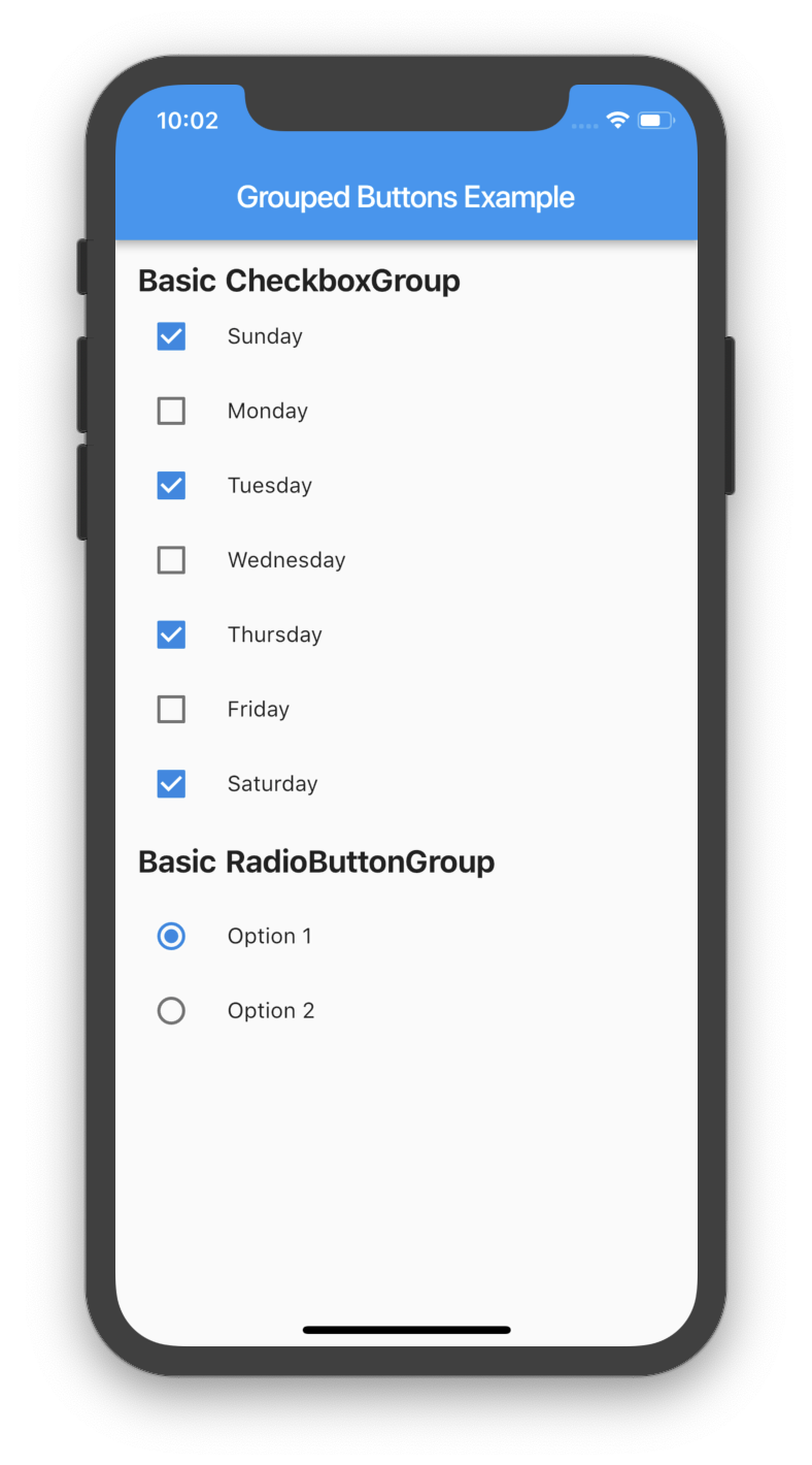
There are several options that allow for more control.
CheckboxGroup| Properties | Description |
|---|---|
activeColor |
The color to use when a Checkbox is checked. |
checkColor |
The color to use for the check icon when a Checkbox is checked. |
checked |
Specifies which boxes to be automatically checked. Every element must match a label. This is useful for clearing all selections (set it to []). If this is non-null, then the user must handle updating this list; otherwise, the state of the CheckboxGroup won't change. |
disabled |
Specifies which boxes should be disabled. If this is non-null, no boxes will be disabled. The strings passed to this must match the labels. |
itemBuilder |
Called when needed to build a CheckboxGroup element. |
labels |
(required) A list of strings that describes each Checkbox. Each label must be distinct. |
labelStyle |
The style to use for the labels. |
margin |
Empty space surrounding the CheckboxGroup. |
onChange |
Called when the value of the CheckboxGroup changes. |
onSelected |
Called when the user makes a selection. |
orientation |
Specifies the orientation to display elements. Either GroupedButtonsOrientation.HORIZONTAL or GroupedButtonsOrientation.VERTICAL. |
padding |
Empty space in which to inset the CheckboxGroup. |
tristate |
If true the checkbox's value can be true, false, or null. |
List<String> _checked = ["A", "B"];

CheckboxGroup(
  orientation: GroupedButtonsOrientation.HORIZONTAL,
  margin: const EdgeInsets.only(left: 12.0),
  onSelected: (List selected) => setState((){
    _checked = selected;
  }),
  labels: <String>[
    "A",
    "B",
  ],
  checked: _checked,
  itemBuilder: (Checkbox cb, Text txt, int i){
    return Column(
      children: <Widget>[
        Icon(Icons.polymer),
        cb,
        txt,
      ],
    );
  },
);
RadioButtonGroup| Properties | Description |
|---|---|
activeColor |
The color to use when a Radio button is checked. |
disabled |
Specifies which buttons should be disabled. If this is non-null, no buttons will be disabled. The strings passed to this must match the labels. |
itemBuilder |
Called when needed to build a RadioButtonGroup element. |
labels |
(required) A list of strings that describes each Radio button. Each label must be distinct. |
labelStyle |
The style to use for the labels. |
margin |
Empty space surrounding the RadioButtonGroup. |
onChange |
Called when the value of the RadioButtonGroup changes. |
onSelected |
Called when the user makes a selection. |
orientation |
Specifies the orientation to display elements. Either GroupedButtonsOrientation.HORIZONTAL or GroupedButtonsOrientation.VERTICAL. |
padding |
Empty space in which to inset the RadioButtonGroup. |
picked |
Specifies which Radio button to automatically pick. Every element must match a label. This is useful for clearing what is picked (set it to ""). If this is non-null, then the user must handle updating this; otherwise, the state of the RadioButtonGroup won't change. |
String _picked = "Two";

RadioButtonGroup(
  orientation: GroupedButtonsOrientation.HORIZONTAL,
  margin: const EdgeInsets.only(left: 12.0),
  onSelected: (String selected) => setState((){
    _picked = selected;
  }),
  labels: <String>[
    "One",
    "Two",
  ],
  picked: _picked,
  itemBuilder: (Radio rb, Text txt, int i){
    return Column(
      children: <Widget>[
        Icon(Icons.public),
        rb,
        txt,
      ],
    );
  },
);
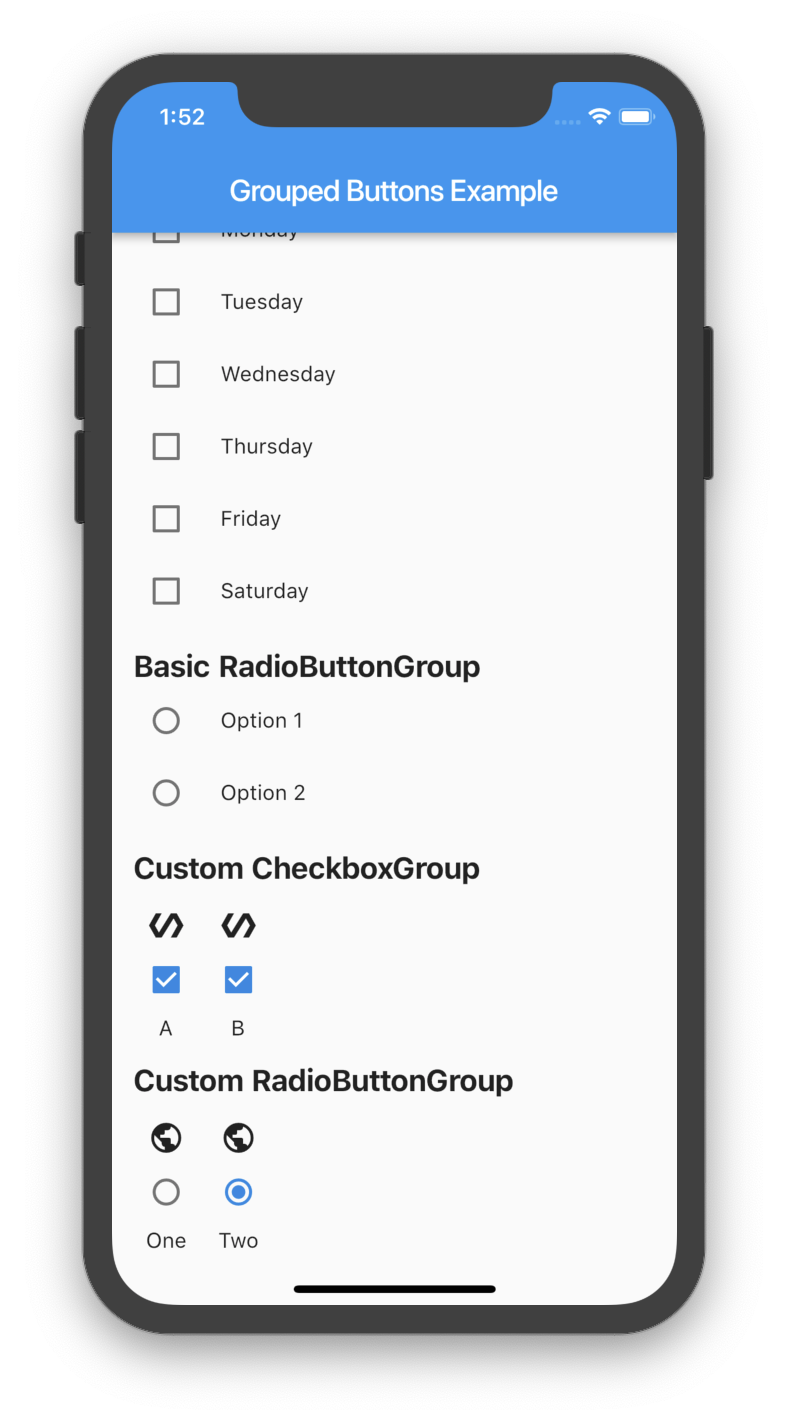
निर्भरता सूची 2 आइटम
{"sdk":"flutter"}{"sdk":"flutter"}उपयोग के अनुसार छाँटें, गतिविधि की तुलना करें और अपनाने से पहले मूल प्रोजेक्ट की आवश्यकताएँ जाँचें।
“A repository is the most basic element of GitHub.”
GitHub Docs — About repositories ↗