
 v3.0.4
flutter_rounded_date_picker
आपको तारीखों और वर्षों का चयन करने में सहायता करने वाला फ्लटर प्लगइन, जिसमें गोल कैलेंडर और कस्टमाइज़ किए गए थीम होते हैं।
301लाइक 14 हज़ार30-दिन डाउनलोड125Pub अंक
AndroidiOSWebmacOSWindowsLinux
आपको तारीखों और वर्षों का चयन करने में सहायता करने वाला फ्लटर प्लगइन, जिसमें गोल कैलेंडर और कस्टमाइज़ किए गए थीम होते हैं।

{"sdk":"flutter"}यह अंग्रेज़ी मूल स्नैपशॉट है। नवीनतम सामग्री GitHub पर देखें।
The Flutter plugin that help you can choose dates and years with rounded calendars and customizable themes.
Screenshot Screenshot Screenshot Screenshot
Add dependencies in pubspec.yaml file. Add 2 things in it including flutter_localizations
dependencies:
  flutter_localizations:
    sdk: flutter
  flutter_rounded_date_picker: 3.0.2
import packages into your dart.
import 'package:flutter_localizations/flutter_localizations.dart';
import 'package:flutter_rounded_date_picker/rounded_picker.dart';
Add localization delegates in MaterialApp Widget and add languages that your app supports.
MaterialApp(
    localizationsDelegates: [
          GlobalMaterialLocalizations.delegate,
          GlobalWidgetsLocalizations.delegate,
    ],
    supportedLocales: [
          const Locale('en', 'US'), // English
          const Locale('th', 'TH'), // Thai
    ],
    ...
)
Show date picker which you can specify a date that allows users to choose.
DateTime newDateTime = await showRoundedDatePicker(
  context: context,
  initialDate: DateTime.now(),
  firstDate: DateTime(DateTime.now().year - 1),
  lastDate: DateTime(DateTime.now().year + 1),
  borderRadius: 16,
),
Screenshot Screenshot
Show year picker which you can specify a year start and end that allows users to choose.
DateTime newDateTime = await showRoundedDatePicker(
  context: context,
  initialDatePickerMode: DatePickerMode.year,
  theme: ThemeData(primarySwatch: Colors.green),
);
Screenshot
You can assign themes to the date picker by using ThemeData class and PrimarySwatch.
DateTime newDateTime = await showRoundedDatePicker(
  context: context,
  theme: ThemeData(primarySwatch: Colors.pink),
);
Screenshot
Dark theme
DateTime newDateTime = await showRoundedDatePicker(
  context: context,
  theme: ThemeData.dark(),
);
Screenshot
Custom Theme with ThemeData
DateTime newDateTime = await showRoundedDatePicker(
  context: context,
  background: Colors.white,
  theme: ThemeData(
    primaryColor: Colors.red[400],
    accentColor: Colors.green[800],
    dialogBackgroundColor: Colors.purple[50],
    textTheme: TextTheme(
      body1: TextStyle(color: Colors.red),
      caption: TextStyle(color: Colors.blue),
    ),
    disabledColor: Colors.orange,
    accentTextTheme: TextTheme(
      body2 : TextStyle(color: Colors.green[200]),
    ),
  ),
);
Screenshot
You can use styleDatePicker field for date picker style such as font size, weight, text color each part in the date picker.
Example custom font size and padding for displaying on a Tablet. (Pixel C, iPad 9.7")
DateTime newDateTime = await showRoundedDatePicker(
                        context: context,
                        theme: ThemeData(primarySwatch: Colors.deepPurple),
                        styleDatePicker: MaterialRoundedDatePickerStyle(
                          textStyleDayButton: TextStyle(fontSize: 36, color: Colors.white),
                          textStyleYearButton: TextStyle(
                            fontSize: 52,
                            color: Colors.white,
                          ),
                          textStyleDayHeader: TextStyle(
                            fontSize: 24,
                            color: Colors.white,
                          ),
                          textStyleCurrentDayOnCalendar:
                              TextStyle(fontSize: 32, color: Colors.white, fontWeight: FontWeight.bold),
                          textStyleDayOnCalendar: TextStyle(fontSize: 28, color: Colors.white),
                          textStyleDayOnCalendarSelected:
                              TextStyle(fontSize: 32, color: Colors.white, fontWeight: FontWeight.bold),
                          textStyleDayOnCalendarDisabled: TextStyle(fontSize: 28, color: Colors.white.withOpacity(0.1)),
                          textStyleMonthYearHeader:
                              TextStyle(fontSize: 32, color: Colors.white, fontWeight: FontWeight.bold),
                          paddingDatePicker: EdgeInsets.all(0),
                          paddingMonthHeader: EdgeInsets.all(32),
                          paddingActionBar: EdgeInsets.all(16),
                          paddingDateYearHeader: EdgeInsets.all(32),
                          sizeArrow: 50,
                          colorArrowNext: Colors.white,
                          colorArrowPrevious: Colors.white,
                          marginLeftArrowPrevious: 16,
                          marginTopArrowPrevious: 16,
                          marginTopArrowNext: 16,
                          marginRightArrowNext: 32,
                          textStyleButtonAction: TextStyle(fontSize: 28, color: Colors.white),
                          textStyleButtonPositive:
                              TextStyle(fontSize: 28, color: Colors.white, fontWeight: FontWeight.bold),
                          textStyleButtonNegative: TextStyle(fontSize: 28, color: Colors.white.withOpacity(0.5)),
                          decorationDateSelected: BoxDecoration(color: Colors.orange[600], shape: BoxShape.circle),
                          backgroundPicker: Colors.deepPurple[400],
                          backgroundActionBar: Colors.deepPurple[300],
                          backgroundHeaderMonth: Colors.deepPurple[300],
                        ),
                        styleYearPicker: MaterialRoundedYearPickerStyle(
                          textStyleYear: TextStyle(fontSize: 40, color: Colors.white),
                          textStyleYearSelected:
                              TextStyle(fontSize: 56, color: Colors.white, fontWeight: FontWeight.bold),
                          heightYearRow: 100,
                          backgroundPicker: Colors.deepPurple[400],
                        ));
Screenshot
Screenshot
Screenshot
Added the action button and the button's custom text.
DateTime newDateTime = await showRoundedDatePicker(
                        ...
                        textActionButton: "ACTION",
                        onTapActionButton: (){
                           //
                        },
                        textPositiveButton: "OK",
                        textNegativeButton: "CANCEL");
Screenshot
Customize the header of the weekday.
DateTime newDateTime = await showRoundedDatePicker(
                        ...
                        customWeekDays: ["SUN", "MON", "TUE", "WED", "THU", "FRI", "SAT"]);
Screenshot
Add closed date cannot be selected.
DateTime newDateTime = await showRoundedDatePicker(
                        ...
                        listDateDisabled: [
                                                  DateTime.now().subtract(Duration(days: 2)),
                                                  DateTime.now().subtract(Duration(days: 4)),
                                                  DateTime.now().subtract(Duration(days: 6)),
                                                  DateTime.now().subtract(Duration(days: 8)),
                                                  DateTime.now().subtract(Duration(days: 10)),
                                                  DateTime.now().add(Duration(days: 2)),
                                                  DateTime.now().add(Duration(days: 4)),
                                                  DateTime.now().add(Duration(days: 6)),
                                                  DateTime.now().add(Duration(days: 8)),
                                                  DateTime.now().add(Duration(days: 10)),
                                                ]);
Screenshot
Add callback when tap on day.
DateTime newDateTime = await showRoundedDatePicker(
                        ...
                        onTapDay: (DateTime dateTime, bool available) {
                          if (!available) {
                            showDialog(
                                context: context,
                                builder: (c) => CupertinoAlertDialog(title: Text("This date cannot be selected."),actions: <Widget>[
                                  CupertinoDialogAction(child: Text("OK"),onPressed: (){
                                    Navigator.pop(context);
                                  },)
                                ],));
                          }
                          return available;
                        });
Screenshot
Customize the display format of the day widget.
DateTime newDateTime = await showRoundedDatePicker(
                        ...
                        builderDay:
                            (DateTime dateTime, bool isCurrentDay, bool isSelected, TextStyle defaultTextStyle) {
                          if (isSelected) {
                            return Container(
                              decoration: BoxDecoration(color: Colors.orange[600], shape: BoxShape.circle),
                              child: Center(
                                child: Text(
                                  dateTime.day.toString(),
                                  style: defaultTextStyle,
                                ),
                              ),
                            );
                          }

                          if (dateTime.day == 10) {
                            return Container(
                              decoration: BoxDecoration(
                                  border: Border.all(color: Colors.pink[300], width: 4), shape: BoxShape.circle),
                              child: Center(
                                child: Text(
                                  dateTime.day.toString(),
                                  style: defaultTextStyle,
                                ),
                              ),
                            );
                          }
                          if (dateTime.day == 12) {
                            return Container(
                              decoration: BoxDecoration(
                                  border: Border.all(color: Colors.pink[300], width: 4), shape: BoxShape.circle),
                              child: Center(
                                child: Text(
                                  dateTime.day.toString(),
                                  style: defaultTextStyle,
                                ),
                              ),
                            );
                          }

                          return Container(
                            child: Center(
                              child: Text(
                                dateTime.day.toString(),
                                style: defaultTextStyle,
                              ),
                            ),
                          );
                        });
Screenshot
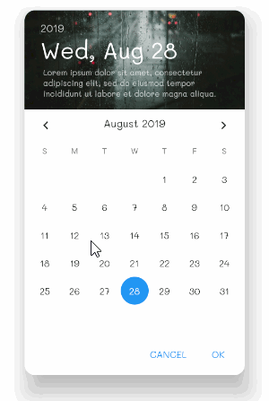
Use images as the header of the date picker and you can also add more details.
DateTime newDateTime = await showRoundedDatePicker(
  context: context,
  theme: ThemeData(primarySwatch: Colors.blue),
  imageHeader: AssetImage("assets/images/calendar_header.jpg"),
  description: "Lorem ipsum dolor sit amet, consectetur adipiscing elit, sed do eiusmod tempor incididunt ut labore et dolore magna aliqua.",
);
Screenshot
You can adjust the Font-family in the date picker.
DateTime newDateTime = await showRoundedDatePicker(
  context: context,
  fontFamily: "Mali"
);
Screenshot
You can set the date picker locale. By specifying the language code and country code. As of April 2019, this package supports about 52 languages.
DateTime newDateTime = await showRoundedDatePicker(
  context: context,
  locale: Locale("zh","CN"),
  theme: ThemeData(primarySwatch: Colors.pink),
);
Screenshot
If you are using Thai language And use the Buddhist era (543 BCE). Plugins that support these capabilities.
DateTime newDateTime = await showRoundedDatePicker(
  context: context,
  locale: Locale("th", "TH"),
  era: EraMode.BUDDHIST_YEAR,
);
Screenshot
Show time picker, all feature of date picker is available (except description)
final timePicked = await showRoundedTimePicker(
  context: context,
  initialTime: TimeOfDay.now(),
);
Screenshot
Show date and duration picker iOS style.
Add Flutter Cupertino Localizations in dependencies pub.yaml.
dependencies:
  flutter:
    sdk: flutter
  flutter_localizations:
    sdk: flutter
  flutter_cupertino_localizations: 1.0.1
Add CupertinoLocalizations delegate to localizations delegate on your App. The cupertino date picker will use current app locale in picker.
MaterialApp(
  debugShowCheckedModeBanner: false,
  localizationsDelegates: [
    GlobalMaterialLocalizations.delegate,
    GlobalWidgetsLocalizations.delegate,
    DefaultCupertinoLocalizations.delegate,
    GlobalCupertinoLocalizations.delegate,  // Add global cupertino localiztions.
  ],
  locale: Locale('en', 'US'),  // Current locale
  supportedLocales: [
    const Locale('en', 'US'), // English
    const Locale('th', 'TH'), // Thai
  ],
)
Call the method for displaying date picker. The callback date time instance will be return with onDateTimeChange.
CupertinoRoundedDatePicker.show(
  context,
  fontFamily: "Mali",
  textColor: Colors.white,
  background: Colors.red[300],
  borderRadius: 16,
  initialDatePickerMode: CupertinoDatePickerMode.date,
  onDateTimeChanged: (newDateTime) {
    //
  },
);
Screenshot
More Cupertino Date Picker Mode
CupertinoDatePickerMode.date
CupertinoDatePickerMode.dateAndTime
CupertinoDatePickerMode.time
Screenshot Screenshot
using Thai and Buddhist Year
/// Current locale is TH.
CupertinoRoundedDatePicker.show(
  context,
  fontFamily: "Mali",
  textColor: Colors.white,
  era: EraMode.BUDDHIST_YEAR,
  background: Colors.red[300],
  borderRadius: 16,
  initialDatePickerMode: CupertinoDatePickerMode.date,
  onDateTimeChanged: (newDateTime) {
    //
  },
);
Screenshot
in iOS , Flutter cupertino support duration and timer picker.
CupertinoRoundedDurationPicker.show(
  context,
  initialTimerDuration: Duration(minute:10),
  initialDurationPickerMode: CupertinoTimerPickerMode.hms,
  fontFamily: "Mali",
  onDurationChanged: (newDuration) {
    //
  },
);
Screenshot
More Cupertino Duration Picker Mode
CupertinoTimerPickerMode.hms
CupertinoTimerPickerMode.hm
CupertinoTimerPickerMode.ms
Screenshot Screenshot