

 v0.3.2
flutter_rounded_progress_bar
फ्लटर में रंग और सीमा के साथ कस्टमाइज़ किए गए राउंडेड प्रोग्रेसबार।
92लाइक 59830-दिन डाउनलोड140Pub अंक
AndroidiOSWebmacOSWindowsLinux
benznest/flutter_rounded_progress_bar open-source repository details.

यह अंग्रेज़ी मूल स्नैपशॉट है। नवीनतम सामग्री GitHub पर देखें।
Custom Progressbar
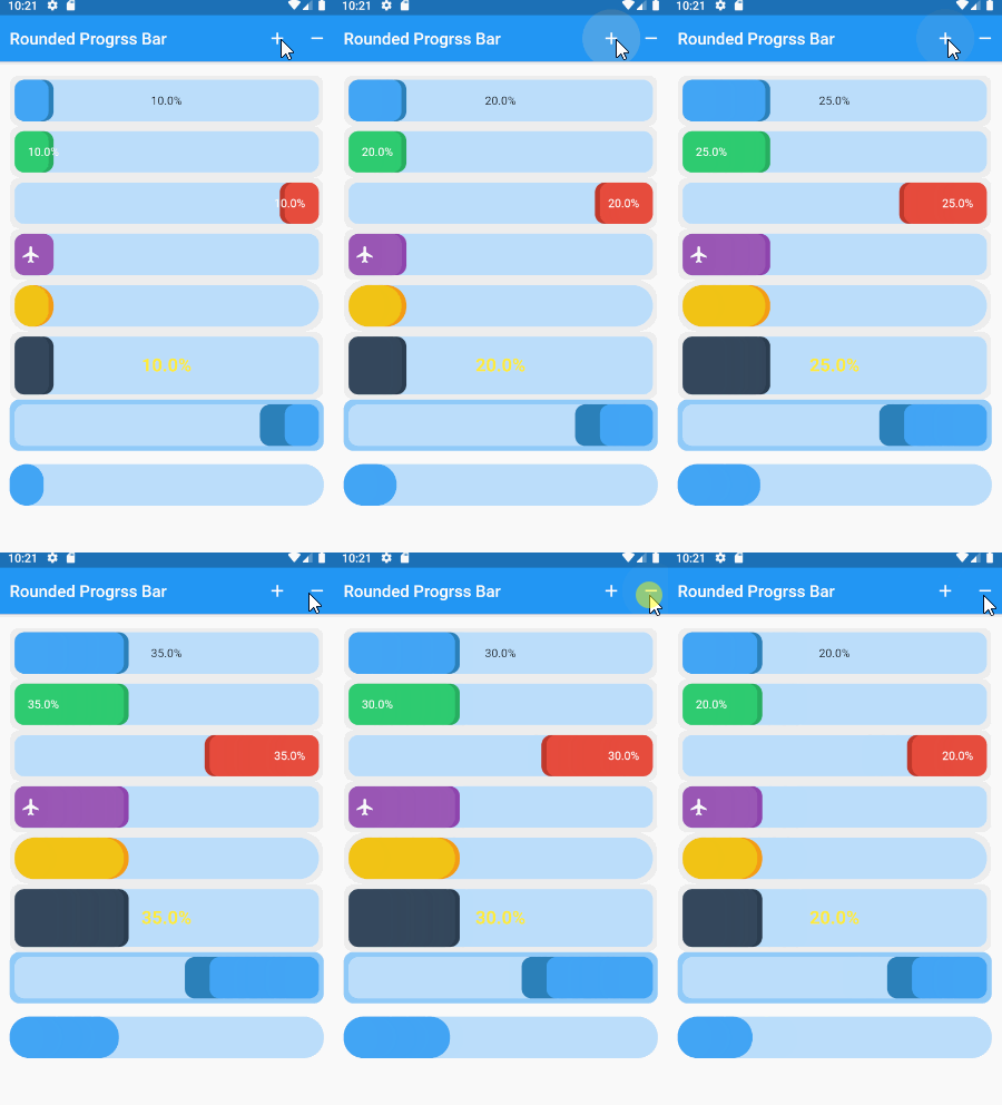
add dependency in pubspec.yaml
dependencies:
  flutter_rounded_progress_bar: 0.2.0
simple rounded progress bar.
RoundedProgressBar(
    childLeft: Text("$percent%",
        style: TextStyle(color: Colors.white)),
    percent: percent,
    theme: RoundedProgressBarTheme.green)

Support Widget 3 position as childCenter , childLeft , childRight
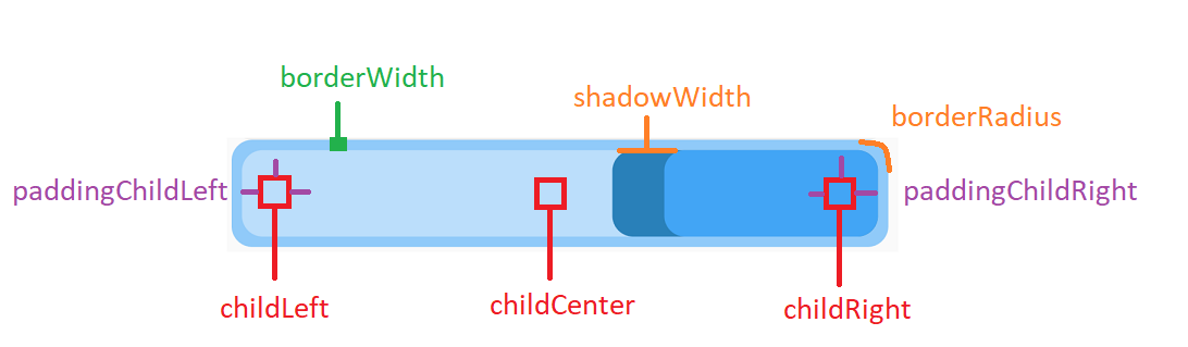
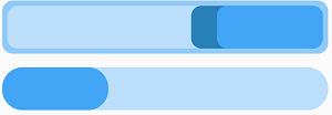
use RoundedProgressBarStyle class
RoundedProgressBar(
    style: RoundedProgressBarStyle(
        widthShadow: 30, colorBorder: Colors.blue[200]),
    percent: percent,
    reverse: true,
),
RoundedProgressBar(
    style: RoundedProgressBarStyle(
        borderWidth: 0,
        widthShadow: 0),
    margin: EdgeInsets.symmetric(vertical: 16),
    borderRadius: BorderRadius.circular(24),
    percent: percent,
),
duration animation.
RoundedProgressBar(
    milliseconds:1000,
     percent: percent,
     theme: RoundedProgressBarTheme.yellow,
     borderRadius: BorderRadius.circular(24)),

RoundedProgressBarTheme.blue,
RoundedProgressBarTheme.red
RoundedProgressBarTheme.green
RoundedProgressBarTheme.purple
RoundedProgressBarTheme.yellow
RoundedProgressBarTheme.midnight
Simple using icon.
IconRoundedProgressBar(
    icon: Padding(
        padding: EdgeInsets.all(8), child: Icon(Icons.person)),
    theme: RoundedProgressBarTheme.green,
    margin: EdgeInsets.symmetric(vertical: 16),
    borderRadius: BorderRadius.circular(6),
    percent: percent,
),

Custom background and icon.
IconRoundedProgressBar(
    widthIconSection: 70,
    icon: Padding(
        padding: EdgeInsets.all(8),
        child: Icon(Icons.airline_seat_flat, color: Colors.white)),
    style: RoundedProgressBarStyle(
        colorBackgroundIcon: Color(0xffc0392b),
        colorProgress: Color(0xffe74c3c),
        colorProgressDark: Color(0xffc0392b),
        colorBorder: Color(0xff2c3e50),
        backgroundProgress: Color(0xff4a627a),
        borderWidth: 4,
        widthShadow: 6),
    margin: EdgeInsets.symmetric(vertical: 16),
    borderRadius: BorderRadius.circular(6),
    percent: percent,
),

निर्भरता सूची 2 आइटम
{"sdk":"flutter"}{"sdk":"flutter"}उपयोग के अनुसार छाँटें, गतिविधि की तुलना करें और अपनाने से पहले मूल प्रोजेक्ट की आवश्यकताएँ जाँचें।
“A repository is the most basic element of GitHub.”
GitHub Docs — About repositories ↗