

 v0.6.0
gradient_widgets
सुंदर ग्रेडिएंट के साथ लगाए गए फ्लटर विजेट्स का न्यूनतम सेट।
89लाइक 61730-दिन डाउनलोड60Pub अंक
प्लेटफ़ॉर्म डेटा नहीं
घेरे वाले ग्रेडिएंट के साथ फ्लूटर विजेट्स

यह अंग्रेज़ी मूल स्नैपशॉट है। नवीनतम सामग्री GitHub पर देखें।


As of ^0.5.0,
shadowColoris available for gradient buttons and cards
A minimal set of Flutter widgets encased with beautiful gradients.
You can use them when your UI needs user attention/focus, , e.g., login or send actions, or important shopping item title (see Gradient Screens to get the idea 😉)
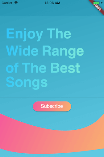
☑️ GradientText
☑️ GradientCard
☑️ GradientButton
☑️ CircularGradientButton + Shadow Color
☑️ GradientProgressIndicator
☑️ CircularGradientProgressIndicator
◻️ GradientAppBar
In your pubspec.yaml root add:
dependencies:
  gradient_widgets: ^0.6.0
then,
import 'package:gradient_widgets/gradient_widgets.dart';
GradientCard(
    gradient: Gradients.tameer,
    shadowColor: Gradients.tameer.colors.last.withOpacity(0.25),
    elevation: 8,
);
most parameters are the same as the Card.

must be gradient.colors.length = 2
indeterminate
GradientProgressIndicator(gradient: Gradients.rainbowBlue,);
determinate
GradientProgressIndicator(
  gradient: Gradients.rainbowBlue,
  value: 0.65,
);

must be gradient.colors.length = 2
indeterminate
GradientCircularProgressIndicator(
  gradient: Gradients.aliHussien,
);
determinate
GradientCircularProgressIndicator(
  gradient: Gradients.aliHussien,
  radius: 100,
);
GradientButton(
  child: Text('Gradient'),
  callback: () {},
  gradient: Gradients.backToFuture,
  shadowColor: Gradients.backToFuture.colors.last.withOpacity(0.25),
),
most parameters are the same as any *Button.
CircularGradientButton(
  child: Icon(Icons.gradient),
  callback: (){},
  gradient: Gradients.rainbowBlue,
  shadowColor: Gradients.rainbowBlue.colors.last.withOpacity(0.5),
),
most parameters are the same as FloatingActionButton.
GradientText(
  'Hello',
  shaderRect: Rect.fromLTWH(0.0, 0.0, 50.0, 50.0),
  gradient: Gradients.hotLinear,
  style: TextStyle(fontSize: 40.0,),
),
all parameters are the same as the Text.
For help getting started with Flutter, view our online documentation.
For help on editing package code, view the documentation.
निर्भरता सूची 2 आइटम
{"sdk":"flutter"}{"sdk":"flutter"}उपयोग के अनुसार छाँटें, गतिविधि की तुलना करें और अपनाने से पहले मूल प्रोजेक्ट की आवश्यकताएँ जाँचें।
“A repository is the most basic element of GitHub.”
GitHub Docs — About repositories ↗