


 v5.3.1
flutter_smart_dialog
एक शानदार Flutter डायलॉग समाधान, आसानी से टोस्ट, लोडिंग और कस्टम डायलॉग का उपयोग करें, डायलॉग के उपयोग को आसान बनाएं!
645लाइक 17.7 हज़ार30-दिन डाउनलोड160Pub अंक
AndroidiOSWebmacOSWindowsLinux
एक अधिक शानदार Flutter Dialog समाधान | एक अधिक शानदार Flutter Dialog समाधान | https://xdd666t.github.io/flutter_use/web/index.html#/smartDialog

यह अंग्रेज़ी मूल स्नैपशॉट है। नवीनतम सामग्री GitHub पर देखें।



Feature and Usage(Must read!):super detailed guide
功能和用法(必看!): 超详细指南
Language: English | 中文
Migrate doc:3.x migrate 4.0 | 3.x 迁移 4.0
Flutter 2:Please use flutter_smart_dialog: 4.2.5
An elegant Flutter Dialog solution.
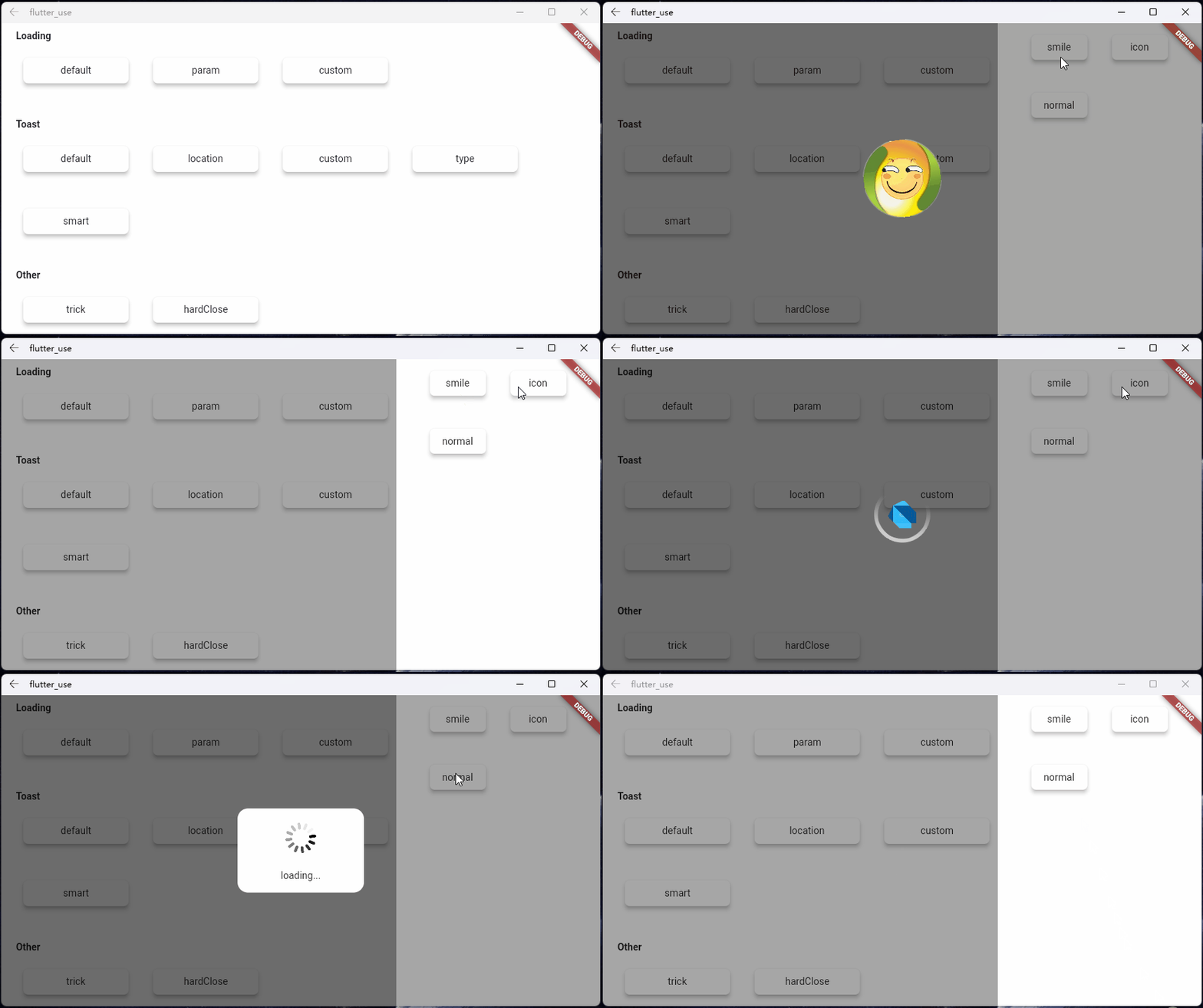
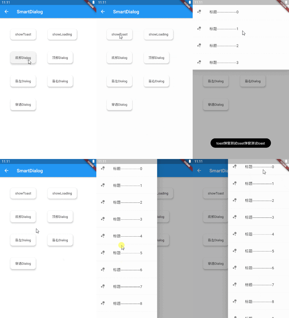
Do not need BuildContext
Can penetrate dark background, click on the page behind dialog
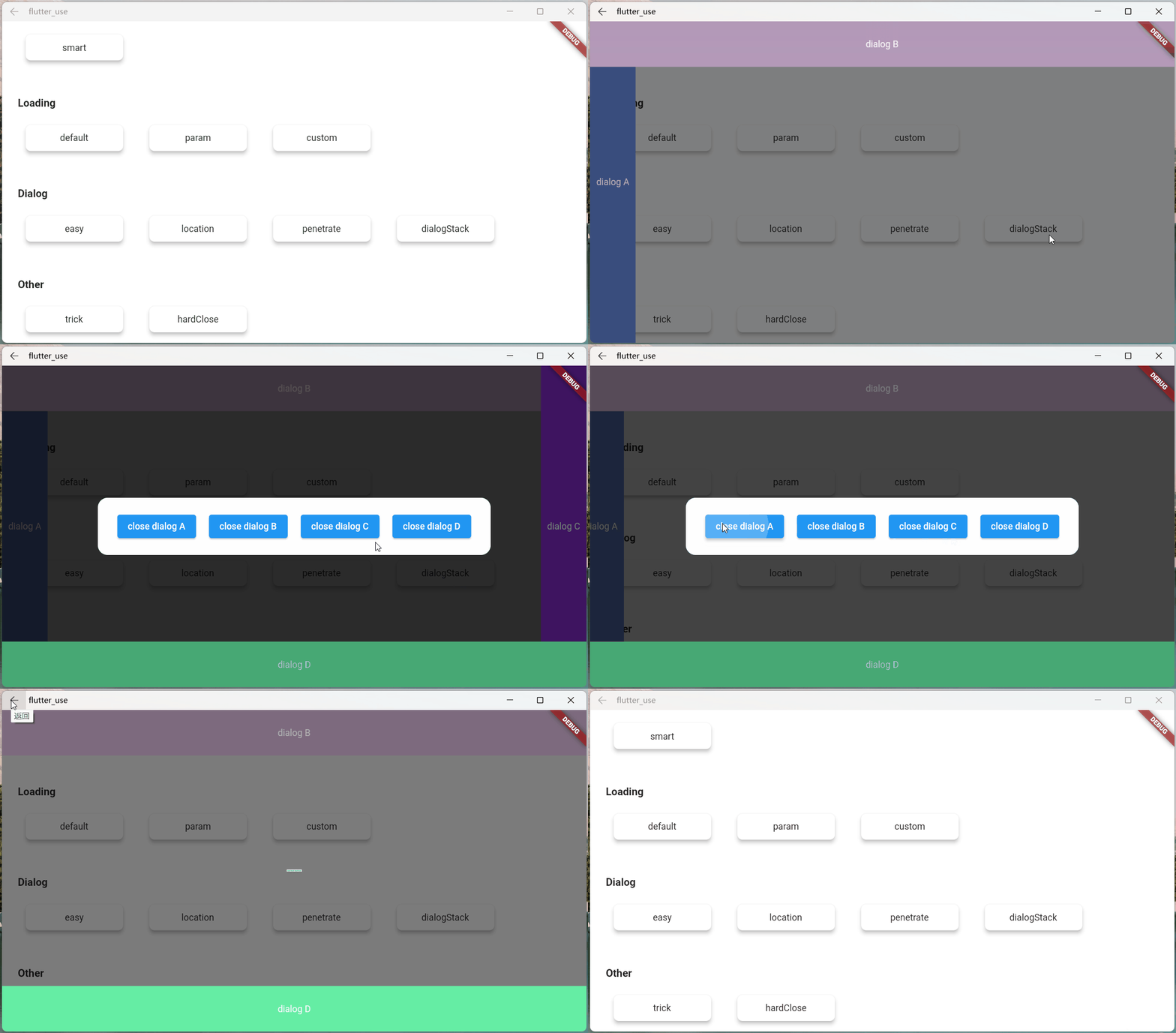
Support dialog stack,close the specified dialog
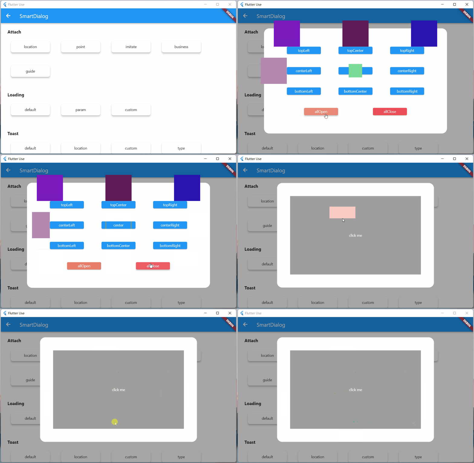
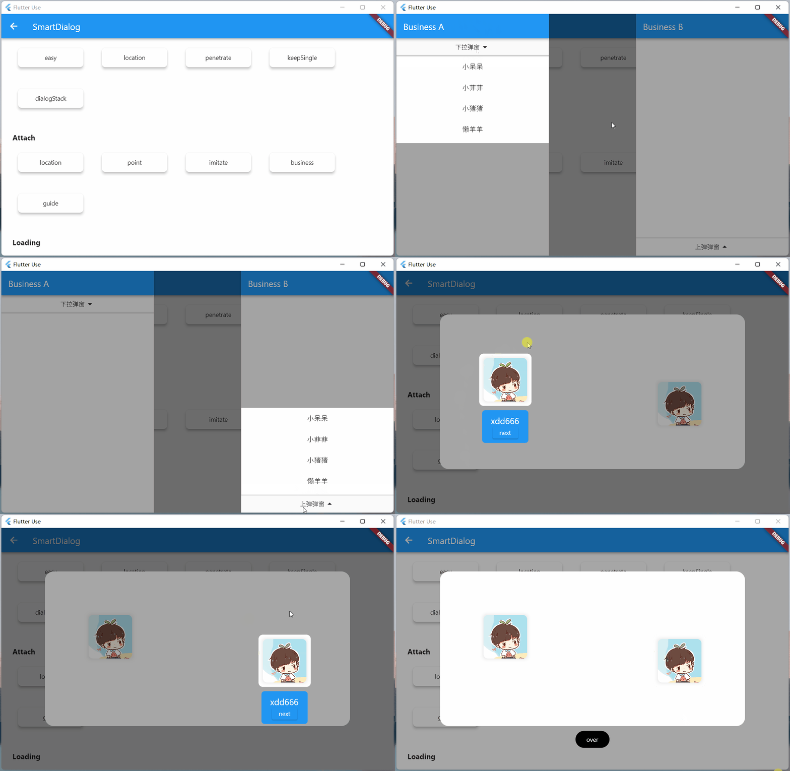
Support positioning widget, display the specified location dialog
Support highlight feature,dissolve the specified location mask
Easily implement toast,loading,attach dialog,custome dialog,custome notify
initialization
void main() => runApp(MyApp());

class MyApp extends StatelessWidget {
  @override
  Widget build(BuildContext context) {
    return MaterialApp(
      home: HomePage,
      // here
      navigatorObservers: [FlutterSmartDialog.observer],
      // here
      builder: FlutterSmartDialog.init(),
    );
  }
}
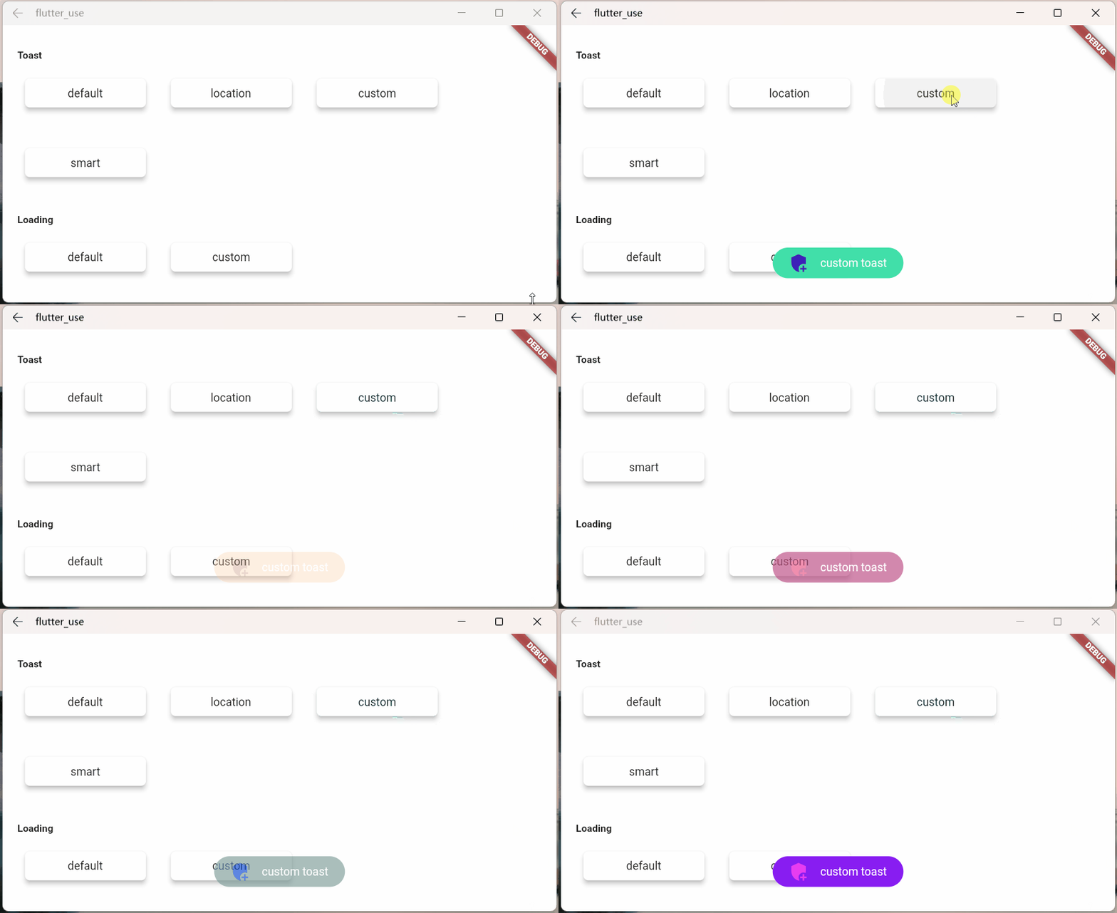
Advanced initialization: configure global custom Loading and Toast
SmartDialog's showLoading and showToast provide a default style. Of course, custom param are definitely supported.
SmartDialog.showLoading(builder: (_) => CustomLoadingWidget);SmartDialog.showLoading();Let me show you the following
void main() => runApp(MyApp());

class MyApp extends StatelessWidget {
  @override
  Widget build(BuildContext context) {
    return MaterialApp(
      home: HomePage,
      // here
      navigatorObservers: [FlutterSmartDialog.observer],
      // here
      builder: FlutterSmartDialog.init(
        //custom default toast widget
        toastBuilder: (String msg) => CustomToastWidget(msg: msg),
        //custom default loading widget
        loadingBuilder: (String msg) => CustomLoadingWidget(msg: msg),
        //custom default notify widget
        notifyStyle: FlutterSmartNotifyStyle(
          successBuilder: (String msg) => CustomSuccessWidget(msg: msg),
          failureBuilder: (String msg) => CustomFailureWidget(msg: msg),
          warningBuilder: (String msg) => CustomWarningWidget(msg: msg),
          alertBuilder: (String msg) => CustomAlertWidget(msg: msg),
          errorBuilder: (String msg) => CustomErrorWidget(msg: msg),
        ),
      ),
    );
  }
}
SmartDialog.config
  ..custom = SmartConfigCustom(
    maskColor: Colors.black.withOpacity(0.35),
    useAnimation: true,
  )
  ..attach = SmartConfigAttach(
    animationType: SmartAnimationType.scale,
    usePenetrate: false,
  )
  ..loading = SmartConfigLoading(
    clickMaskDismiss: false,
    leastLoadingTime: const Duration(milliseconds: 0),
  )
  ..toast = SmartConfigToast(
    intervalTime: const Duration(milliseconds: 100),
    displayTime: const Duration(milliseconds: 2000),
  );
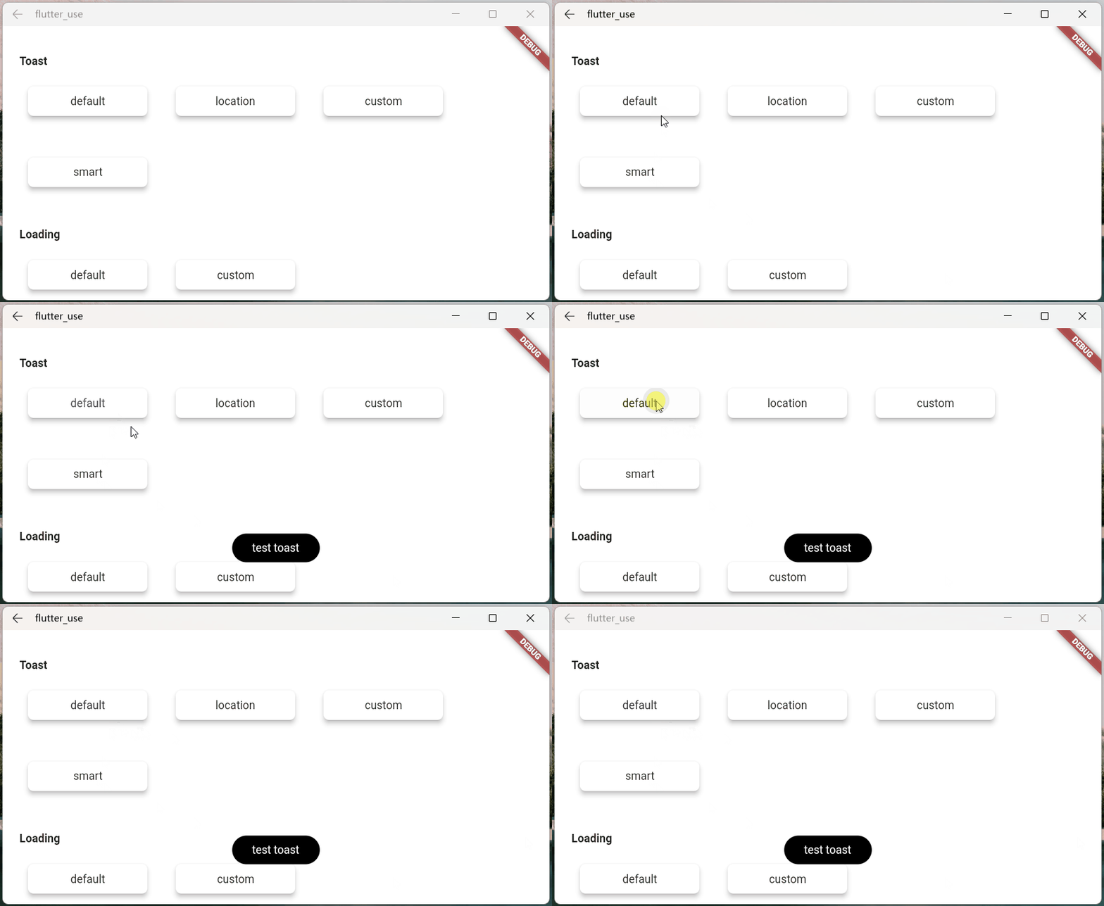
SmartDialog.showToast('test toast');
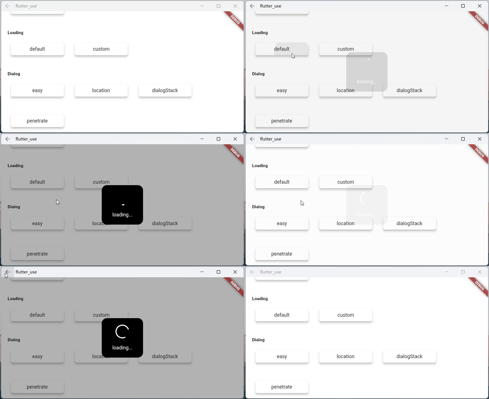
SmartDialog.showLoading();
await Future.delayed(Duration(seconds: 2));
SmartDialog.dismiss();
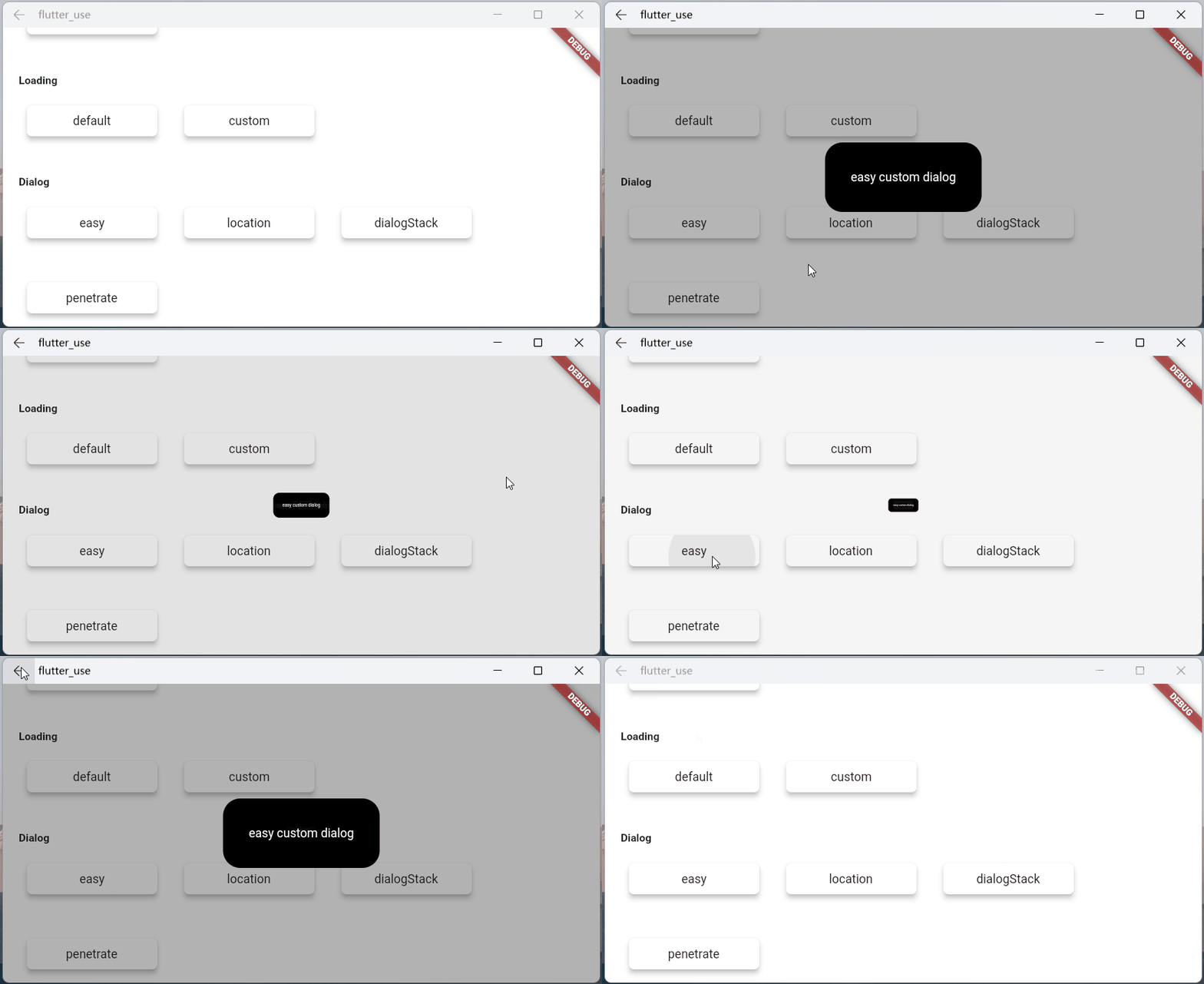
SmartDialog.show(builder: (context) {
  return Container(
    height: 80,
    width: 180,
    decoration: BoxDecoration(
      color: Colors.black,
      borderRadius: BorderRadius.circular(10),
    ),
    alignment: Alignment.center,
    child:
    Text('easy custom dialog', style: TextStyle(color: Colors.white)),
  );
});
निर्भरता सूची 5 आइटम
{"sdk":"flutter"}^1.0.1^1.0.0{"sdk":"flutter"}^6.0.0उपयोग के अनुसार छाँटें, गतिविधि की तुलना करें और अपनाने से पहले मूल प्रोजेक्ट की आवश्यकताएँ जाँचें।
“A repository is the most basic element of GitHub.”
GitHub Docs — About repositories ↗