Flutter Community: draggable_scrollbar
Draggable Scrollbar
Pub
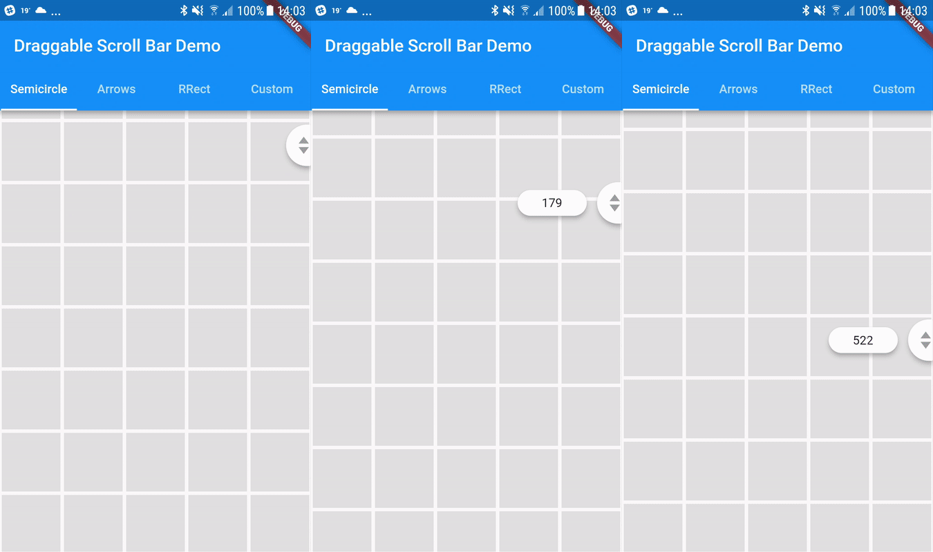
A scrollbar that can be dragged for quickly navigation through a vertical list. Additionaly it can show label next to scrollthumb with information about current item, for example date of picture created
Usage
You can use one of the three built-in scroll thumbs, or you can create a custom thumb for your own app!
You can play with all of these examples by running the app found in the example folder.
Example
https://github.com/fluttercommunity/flutter-draggable-scrollbar/raw/gh-pages/demo.gif
Semicircle Thumb
DraggableScrollbar.semicircle(
  controller: myScrollController,
  child: GridView.builder(
    gridDelegate: SliverGridDelegateWithFixedCrossAxisCount(
      crossAxisCount: 5,
    ),
    controller: myScrollController,
    padding: EdgeInsets.zero,
    itemCount: 1000,
    itemBuilder: (context, index) {
      return Container(
        alignment: Alignment.center,
        margin: EdgeInsets.all(2.0),
        color: Colors.grey[300],
      );
    },
  ),
);
Arrows thumb + label
DraggableScrollbar.arrows(
  labelTextBuilder: (double offset) => Text("${offset ~/ 100}"),
  controller: myScrollController,
  child: ListView.builder(
    controller: myScrollController,
    itemCount: 1000,
    itemExtent: 100.0,
    itemBuilder: (context, index) {
      return Container(
        padding: EdgeInsets.all(8.0),
        child: Material(
          elevation: 4.0,
          borderRadius: BorderRadius.circular(4.0),
          color: Colors.purple[index % 9 * 100],
          child: Center(
            child: Text(index.toString()),
          ),
        ),
      );
    },
  ),
);
Rounded Rectangle Thumb
DraggableScrollbar.rrect(
  controller: myScrollController,
  child: ListView.builder(
    controller: myScrollController,
    itemCount: 1000,
    itemExtent: 100.0,
    itemBuilder: (context, index) {
      return Container(
        padding: EdgeInsets.all(8.0),
        child: Material(
          elevation: 4.0,
          borderRadius: BorderRadius.circular(4.0),
          color: Colors.green[index % 9 * 100],
          child: Center(
            child: Text(index.toString()),
          ),
        ),
      );
    },
  ),
);
Custom
DraggableScrollbar(
  controller: myScrollController,
  child: ListView.builder(
    controller: myScrollController,
    itemCount: 1000,
    itemExtent: 100.0,
    itemBuilder: (context, index) {
      return Container(
        padding: EdgeInsets.all(8.0),
        child: Material(
          elevation: 4.0,
          borderRadius: BorderRadius.circular(4.0),
          color: Colors.cyan[index % 9 * 100],
          child: Center(
            child: Text(index.toString()),
          ),
        ),
      );
    },
  ),
  heightScrollThumb: 48.0,
  backgroundColor: Colors.blue,
  scrollThumbBuilder: (
    Color backgroundColor,
    Animation<double> thumbAnimation,
    Animation<double> labelAnimation,
    double height, {
    Text labelText,
  }) {
    return FadeTransition(
      opacity: thumbAnimation,
      child: Container(
        height: height,
        width: 20.0,
        color: backgroundColor,
      ),
    );
  },
);


 v0.1.0