
 v1.0.2
dot_navigation_bar
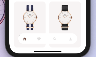
सरल चिकनी एनिमेशन, एक अच्छा और साफ UI/UX बॉटम नेविगेशन बार प्रदान करते हैं।
435लाइक 91230-दिन डाउनलोड150Pub अंक
AndroidiOSWebmacOSWindowsLinux
एक बॉटम नेविगेशन बार जिसे आप अपनी जरूरत के अनुसार कस्टमाइज़ कर सकते हैं, कोई भी सीमा नहीं। आप आसान और चिकनी एनीमेशन के साथ नेविगेशन बार के दिखावट को भी कस्टमाइज़ कर सकते हैं, जो एक अच्छा और साफ यूआई/यूएक्स प्रदान करता है।

{"sdk":"flutter"}{"sdk":"flutter"}यह अंग्रेज़ी मूल स्नैपशॉट है। नवीनतम सामग्री GitHub पर देखें।
https://img.shields.io/badge/Maintained%3F-Yes-green?style=for-the-badge
undefined
undefined
undefined
undefined
undefined
undefined
undefined
undefined
undefined
A bottom navigation bar that you can customize with the options you need, without any limits. You can also customize the appearance of the navigation bar with simple smooth animations, providing a nice and clean UI/UX.
style1 Example flutter project
NEW
To install, add it to your pubspec.yaml file:
dependencies:
    dot_navigation_bar:
import 'package:dot_navigation_bar/dot_navigation_bar.dart';
call DotNavigationBar's constructor:
extendBody: true,
if you are not intersted inmaking round nav bar with show body behind the navbar you have to make that
extendBody: false,
Widget build(BuildContext context) {
  return Scaffold(
    body: Center(),
    extendBody: true,//<------like this
    bottomNavigationBar:  DotNavigationBar(
          currentIndex: _SelectedTab.values.indexOf(_selectedTab),
          onTap: _handleIndexChanged,
          dotIndicatorColor: Colors.black,
          // enableFloatingNavBar: false
          items: [


          ],
        ),
  );
}
   Widget build(BuildContext context) {
    return Scaffold(
      body: Container(
        child: Image.asset("assets/IMG.png"),
      ),
      bottomNavigationBar:  DotNavigationBar(
          currentIndex: _SelectedTab.values.indexOf(_selectedTab),
          onTap: _handleIndexChanged,
          // dotIndicatorColor: Colors.black,
          items: [
            /// Home
            DotNavigationBarItem(
              icon: Icon(Icons.home),
              selectedColor: Colors.purple,
            ),

            /// Likes
            DotNavigationBarItem(
              icon: Icon(Icons.favorite_border),
              selectedColor: Colors.pink,
            ),

            /// Search
            DotNavigationBarItem(
              icon: Icon(Icons.search),
              selectedColor: Colors.orange,
            ),

            /// Profile
            DotNavigationBarItem(
              icon: Icon(Icons.person),
              selectedColor: Colors.teal,
            ),

          ],
        ),
    );
  }
The constructor has 18 attributes related to the Widget:
items: A list of tabs to display, ie Home, Profile,Cart, etccurrentIndex: The tab to display.onTap:Returns the index of the tab that was tapped.selectedItemColor:The color of the icon and text when the item is selected.unselectedItemColor: The color of the icon and text when the item is not selected.margin:A convenience field for the margin surrounding the entire widget.itemPadding:The padding of each item.duration: The transition duration.curve: The transition curve.dotIndicatorColor:The color of the Dot indicator.marginR:margin for the bar to give some radius .paddingR:padding for the bar to give some radius.borderRadius:border radius for nav bar.backgroundColor:bgd colors for the nav bar.boxShadow: floating nav bar shadow ,it takes List of BoxShadowenableFloatingNavBar: make Floating nav bar enabled.enablePaddingAnimation: enable the animation on item during item change.splashColor: Color of the item's Splash Color. To disable, use Colors.transparent.marginR = const EdgeInsets.symmetric(horizontal: 50, vertical: 20),
paddingR = const EdgeInsets.only(bottom: 5, top: 10),
borderRadius = 30,
backgroundColor = Colors.white, enableFloatingNavBar=true, enablePaddingAnimation=true
@iamvivekkaushik @buraktabn @Zheng Xiangrui