

 v1.2.0
awesome_card
अपने एप्लिकेशन में क्रेडिट कार्ड विजेट बनाने के लिए Flutter पैकेज।
287लाइक 4 हज़ार30-दिन डाउनलोड145Pub अंक
AndroidiOSWebmacOSWindowsLinux
एक फ्लटर पैकेज जो आपके एप्लिकेशन में आसानी से क्रेडिट कार्ड बनाने में मदद करता है।

यह अंग्रेज़ी मूल स्नैपशॉट है। नवीनतम सामग्री GitHub पर देखें।
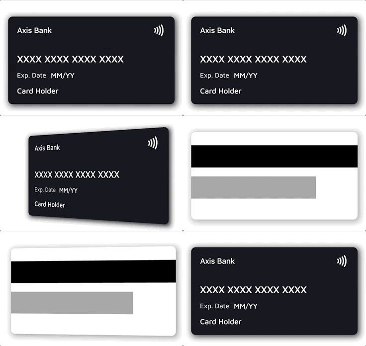



XXXX XXXXXX XXXXX)
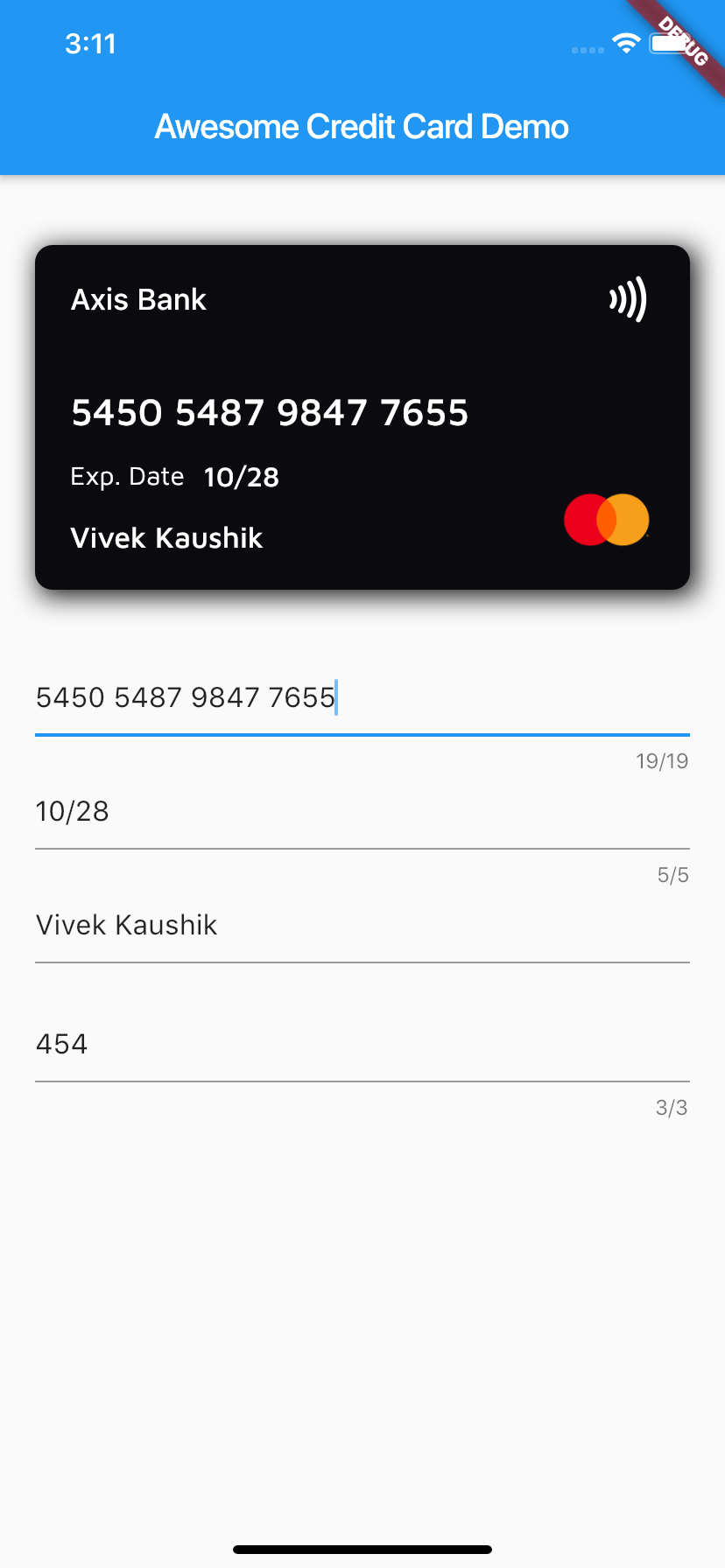
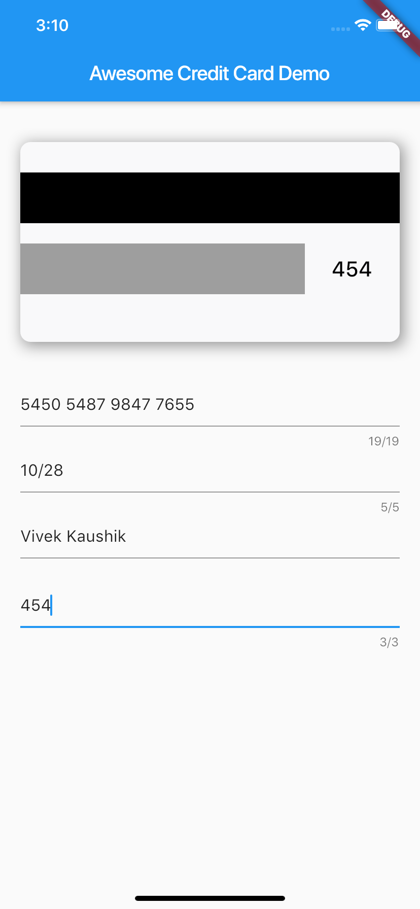
Add the dependency to your pubspec.yaml:
dependencies:
  awesome_card: ^1.2.0
Requires Dart 3 / Flutter 3.10 or newer.
Then import it in your Dart file:
import 'package:awesome_card/awesome_card.dart';
The only required parameters are the two backgrounds — everything else has sensible defaults:
CreditCard(
  frontBackground: CardBackgrounds.black,
  backBackground: CardBackgrounds.white,
)
A fully configured card:
CreditCard(
  cardNumber: "5450 7879 4864 7854",
  cardExpiry: "10/25",
  cardHolderName: "Card Holder",
  cvv: "456",
  bankName: "Axis Bank",
  cardType: CardType.masterCard, // optional — auto-detected from cardNumber
  showBackSide: false,
  frontBackground: CardBackgrounds.black,
  backBackground: CardBackgrounds.white,
  showShadow: true,
  isContactless: true,
  textExpDate: 'Exp. Date',
  textName: 'Name',
  textExpiry: 'MM/YY',
)
The card flips whenever showBackSide changes across a rebuild. A common
pattern is to flip it while the CVV field has focus:
class _MyPageState extends State<MyPage> {
  bool showBack = false;
  late final FocusNode _cvvFocus;

  @override
  void initState() {
    super.initState();
    _cvvFocus = FocusNode()
      ..addListener(() => setState(() => showBack = _cvvFocus.hasFocus));
  }

  @override
  void dispose() {
    _cvvFocus.dispose();
    super.dispose();
  }

  @override
  Widget build(BuildContext context) {
    return Column(
      children: [
        CreditCard(
          cardNumber: cardNumber,
          cvv: cvv,
          showBackSide: showBack,
          frontBackground: CardBackgrounds.black,
          backBackground: CardBackgrounds.white,
        ),
        TextField(focusNode: _cvvFocus, /* CVV input */),
      ],
    );
  }
}
Every text field's style can be overridden. Each style is merged over the
default, so a partial override (e.g. only fontSize) keeps the default
font, weight, and color for everything else:
CreditCard(
  // ...
  bankNameTextStyle: TextStyle(fontSize: 20),
  cardNumberTextStyle: TextStyle(fontSize: 24, letterSpacing: 2),
  cardExpiryTextStyle: TextStyle(fontStyle: FontStyle.italic),
  cardHolderNameTextStyle: TextStyle(fontWeight: FontWeight.bold),
  cvvTextStyle: TextStyle(color: Colors.red),
)
Text colors default to frontTextColor (white) on the front and
backTextColor (black) on the back.
Any widget works as a card background — a Container, gradient, or image:
// Built-in solid backgrounds
frontBackground: CardBackgrounds.black,
backBackground: CardBackgrounds.white,

// Solid color from a hex value
frontBackground: CardBackgrounds.custom(0xff1b447b),

// Anything else — e.g. a gradient
frontBackground: Container(
  decoration: BoxDecoration(
    gradient: LinearGradient(colors: [Colors.indigo, Colors.blueAccent]),
  ),
),
To replace the entire front or back content (e.g. to center the card number or add extra elements), pass your own widget — it is stacked on top of the background and receives the full card area:
CreditCard(
  frontBackground: CardBackgrounds.black,
  backBackground: CardBackgrounds.white,
  frontLayout: MyCustomFront(),
  backLayout: MyCustomBack(),
)
When cardType is not provided, the brand is detected from cardNumber and
the matching icon and number mask are applied automatically. Supported brands:
| Brand | Example prefixes |
|---|---|
| Visa | 4 |
| Mastercard | 51–55, 2221–2720 |
| American Express | 34, 37 |
| RuPay | 60, 6521, 6522 |
| Elo | 401178, 431274, 6362, 6516, 6550, … |
| Discover | 6011, 65, 644–649 |
| Diners Club | 300–305, 36, 38 |
| JCB | 35, 2131, 1800 |
| Maestro | 50, 56–69 |
The detection helpers are exported and can be used standalone:
CardType type = getCardType('4111111111111111');        // CardType.visa
String mask  = getCardTypeMask(cardNumber: '378282246310005'); // XXXX XXXXXX XXXXX
Widget icon  = getCardTypeIcon(cardNumber: '5555555555554444'); // Mastercard logo
To force a specific brand regardless of the number, pass cardType. To force
a specific mask, pass mask.
Brands the package doesn't ship (regional or store cards) can be registered
via customBrands. They are checked before the built-in detection and
support their own icon and optional number mask:
CreditCard(
  cardNumber: cardNumber,
  customBrands: [
    CardBrand(
      name: 'troy',
      icon: Image.asset('assets/troy.png', width: 55, height: 40),
      pattern: RegExp(r'^9792'),
      mask: 'XXXX XXXX XXXX XXXX', // optional
    ),
  ],
  frontBackground: CardBackgrounds.black,
  backBackground: CardBackgrounds.white,
)
Precedence: explicit cardType → customBrands (first match wins) →
built-in detection.
| Parameter | Type | Default | Description |
|---|---|---|---|
frontBackground |
Widget |
required | Background widget of the front side |
backBackground |
Widget |
required | Background widget of the back side |
cardNumber |
String? |
— | Card number; shown masked-style as typed. Empty shows the brand mask |
cardExpiry |
String? |
— | Expiry string, e.g. 10/25 |
cardHolderName |
String? |
— | Cardholder name (ellipsized when too long) |
cvv |
String? |
— | CVV shown on the back side |
bankName |
String |
'' |
Bank name shown at the top of the front |
cardType |
CardType? |
auto | Override the auto-detected brand |
customBrands |
List<CardBrand>? |
— | Custom brands checked before built-in detection |
mask |
String? |
auto | Override the auto-selected number mask |
showBackSide |
bool |
false |
Which side is visible; changing it animates the flip |
showShadow |
bool |
false |
Drop shadow behind the card |
isContactless |
bool? |
true |
Show the contactless (NFC) icon |
width |
double? |
screen width − margins | Card width |
height |
double? |
width / 2 + 24 |
Card height |
horizontalMargin |
double |
20 |
Horizontal margin used when width is not set |
frontTextColor |
Color |
Colors.white |
Default text color on the front |
backTextColor |
Color |
Colors.black |
Default text color on the back |
textExpDate |
String? |
'Exp. Date' |
Label above/next to the expiry |
textExpiry |
String? |
'MM/YY' |
Placeholder when cardExpiry is empty |
textName |
String? |
'Card Holder' |
Placeholder when cardHolderName is empty |
bankNameTextStyle |
TextStyle? |
— | Merged over the bank name style |
cardNumberTextStyle |
TextStyle? |
— | Merged over the card number style |
cardExpiryTextStyle |
TextStyle? |
— | Merged over the expiry style |
cardHolderNameTextStyle |
TextStyle? |
— | Merged over the holder name style |
cvvTextStyle |
TextStyle? |
— | Merged over the CVV style |
frontLayout |
Widget? |
built-in | Replaces the entire front content |
backLayout |
Widget? |
built-in | Replaces the entire back content |
A complete demo app lives in example/ — card preview wired to
text fields with live brand detection and the CVV-focus flip. Run it with:
cd example
flutter run
The package ships with a regression test suite (flutter test) covering
brand detection, null-safety, text-style merging, and narrow-card layouts.
Issues and pull requests are welcome! Please run flutter analyze and
flutter test before submitting a PR.
Awesome Card is released under the MIT license. See LICENSE for details.
निर्भरता सूची 3 आइटम
{"sdk":"flutter"}{"sdk":"flutter"}^3.1.3उपयोग के अनुसार छाँटें, गतिविधि की तुलना करें और अपनाने से पहले मूल प्रोजेक्ट की आवश्यकताएँ जाँचें।
“A repository is the most basic element of GitHub.”
GitHub Docs — About repositories ↗