
 v3.3.3
animated_digit
एक स्क्रॉल नंबर एनिमेशन विजेट, कोई भी संख्या जिसे स्क्रॉल एनिमेशन प्रभाव की आवश्यकता हो और आसानी से उपयोग करने योग्य हो।
240लाइक 67.4 हज़ार30-दिन डाउनलोड150Pub अंक
AndroidiOSWebmacOSWindowsLinux
एक स्क्रॉलिंग डिजिट एनीमेशन विजेट

{"sdk":"flutter"}{"sdk":"flutter"}यह अंग्रेज़ी मूल स्नैपशॉट है। नवीनतम सामग्री GitHub पर देखें।
English | 中文简体
Scroll animation numbers widget, any number that need animation effects and easy to use.
Example GIF
// only show
AnimatedDigitWidget(
  value: 9999
),
// simple state control
int value = 9999;
AnimatedDigitWidget(
  value: value
  textStyle: TextStyle(color: Colors.pink),
),
setState((){
  value = 191919;
});
Built-in accuracy calculation
AnimatedDigitController _controller = AnimatedDigitController(10240.987);

AnimatedDigitWidget(
  controller: _controller,
  textStyle: TextStyle(color: Colors.pink),
  fractionDigits: 2, // number of decimal places reserved, not rounded
  enableSeparator: true, // like this 10,240.98
),
// UI Result => 10,240.98

// increment
_controller.addValue(1314);

// minus
_controller.minusValue(1314); // from v3.1.0 added

// times
_controller.timesValue(1314); // from v3.1.0 added

// divide
_controller.divideValue(1314); // from v3.1.0 added

// reset
_controller.resetValue(1314);

// last
_controller.dispose();
AnimatedDigitWidget(
  value: 12531.98, // or use controller
),
AnimatedDigitWidget(
  value: 12531.98, // or use controller
  enableSeparator: true,
),
AnimatedDigitWidget(
  value: 12531.98, // or use controller
  fractionDigits: 2,
  enableSeparator: true,
),
SingleDigitProvider(
  data: SingleDigitData(
    useTextSize: true,
    builder: (size, value, isNumber, child) {
      return isNumber ? child : FlutterLogo();
    },
  ),
  child: AnimatedDigitWidget(
    value: 12531.98, // or use controller
    textStyle: TextStyle(color: Colors.pink[200], fontSize: 30),
    separateLength: 1,
    separateSymbol: "#",
    enableSeparator: true,
  ),
),
AnimatedDigitWidget(
  value: 12531.98, // or use controller
  textStyle: TextStyle(color: Colors.orangeAccent.shade700, fontSize: 30),
  fractionDigits: 2,
  enableSeparator: true,
  separateSymbol: "·",
  separateLength: 3,
  decimalSeparator: ",",
  prefix: "\$",
  suffix: "€",
),
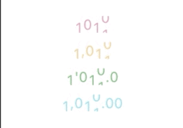
The add a ValueColor object to valueColors, which is an array, you can add more ...,but always take the last eligible
Since version v3.3.1+1, colors have supported animated transitions instead of abrupt direct color switching, eliminating harsh transitions.
int value = 9999; // or use Controller.value
AnimatedDigitWidget(
  value: value,
  textStyle: TextStyle(
    color: Colors.orange[200],
    fontSize: 30,
  ),
  valueColors: [
    ValueColor(
      //When value <= 0 , the color changes to red
      condition: () => value <= 0,
      color: Colors.red,
    ),
    // you can add more ...,but always take the last eligible.
  ],
),
AnimatedDigitWidget(
  ...,
  firstScrollAnimate: false // set false | >= v3.3.1+1
),
range: [0, 9], 🐧0 ➡️ 00、1 ➡️ 01、2 ➡️ 02 ...
AnimatedDigitWidget(
  ...,
  fractionDigits: 0, // It must be set to 0; if there are decimal places, it's really unnecessary (wry smile)~~
  enableMinIntegerDigits: true // set true, | >= v3.3.1+2
),
⚠️
valueandcontrollercannot be bothnull. ⚠️controllerhas higher priority.
controller - digit controller, The displayed number can be controlled via addValue and resetValue.
value - the display number.
textStyle - the numbers text style.boxDecoration - Use with decoration of Container.
int, default 0.
1000520.98765 ):0 => 1000520;1 => 1000520.9;2 => 1000520.98;3 => 1000520.987;N => 1000520.[N];The default
0means an integer, when it is a decimal, if the value is less than thefractionDigits, it will be filled with0to the right, and the truncation method is used, so there is no rounding.
decimalSeparator - the decimal separator,can be replaced by other symbols in place of decimal separators, default ..
enableSeparator - enable digit separator. default false not enable, only true, separateLength and separateSymbol valid.
true): 1000520 => 1,000,520 (seealso separateLength or separateSymbol)
separateSymbol - the numbers separator symbol (only enableSeparator is true), make numbers much easier to read, default ,.
1000520 ):, => 1,000,520' => 1'000'520- => 1-000-520
separateLength - the numbers separator length (only enableSeparator is true), separateSymbol by separator length insert, default 3.
1000520 ):1 => 1,0,0,0,5,2,02 => 1,00,05,203 => 1,000,520
duration - the animate duration, default Duration(milliseconds: 300).curve - the animate curve, default Curves.easeInOut. look animate curve.loop - enable loop scroll animate. default true, always scroll down, not scroll up from 9 -> 0; false, scroll up and down.
autoSize - the default true is to automatically expand and contract according to the size of the ( number / symbol ) itself, false, the text size of the number 0 is used as the container size of each number, which can ensure the same width, but it seems that there is a slight interval between 1 and other numbers 😊 .
animateAutoSize - the animation resizing. default true, false will change directly to the size of the number/symbol.
prefix - the text to display in front of the counter.suffix - the text to display after the counter.