सार्वजनिक जानकारी से बना चयन मार्गदर्शन। केवल संदर्भ हेतु।
AnimatedDigit एक Flutter widget है जो संख्याओं के लिए चिकनी स्क्रॉल एनीमेशन प्रभाव प्रदान करता है, जो दृश्य रूप से आकर्षक संक्रमण के साथ डायनामिक संख्यात्मक मान दिखाने के लिए आदर्श है। यह स्वचालित रूप से अंकों के स्क्रॉलिंग को हैंडल करके एनीमेटेड काउंटर या स्कोर डिस्प्ले के कार्यान्वयन को सरल बनाता है, जिससे वास्तविक समय में संख्या अपडेट की आवश्यकता वाले ऐप्स में इसे आसानी से एकीकृत किया जा सकता है। यह पैकेज Android, iOS, Web, macOS, Windows और Linux जैसे कई प्लेटफॉर्म का समर्थन करता है, जिससे उपकरणों के बीच सुसंगत व्यवहार सुनिश्चित होता है।
उपयोग
खेल में लाइव स्कोर प्रदर्शित करना
एनिमेटिंग काउंटडाउन टाइमर्स
गतिशील सांख्यिकी दिखा रहा है
प्रगति सूचकांक को अद्यतन करें
डिजिटल घड़ियाँ बनाना
परिवर्तनशील मेट्रिक्स का दृश्यकरण
मुख्य विशेषताएँ
अंकों के लिए स्मूथ स्क्रॉल एनीमेशन
उपयोग में आसान API
किसी भी पूर्णांक मान का समर्थन करता है
क्रॉस-प्लेटफॉर्म संगतता
कस्टमाइज़ किए गए गति और अवधि
आवश्यक सेटअप न्यूनतम
इनके लिए उपयुक्त
गेम विकासकर्ता
डैशबोर्ड बिल्डर्स
रियल-टाइम डेटा प्रदर्शन एप्स
शैक्षिक ऐप्स
इंटरैक्टिव यूआई घटक
विचार योग्य बातें
पूर्णांक के लिए सबसे उपयुक्त, दशमलव के लिए नहीं
एकल डिजिट स्टाइलिंग के लिए सीमित कस्टमाइजेशन
बहुत अधिक अपडेट दरों के साथ प्रदर्शन में भिन्नता हो सकती है
बड़े संख्या परास के लिए अनअनुकूलित डिज़ाइन किया गया है
मान बदलाव के हस्तचालित संभाल की आवश्यकता है
मूल README
संबंधित सोर्स रिपॉज़िटरी के मूल README का स्नैपशॉट। नवीनतम सामग्री के लिए रिपॉज़िटरी देखें।
Scroll animation numbers widget, any number that need animation effects and easy to use.
Usage
🚴🏻 Easy Show
// only showAnimatedDigitWidget(
value: 9999
),
🚄 Easy Show & State
// simple state control
int value = 9999;
AnimatedDigitWidget(
  value: value
  textStyle: TextStyle(color: Colors.pink),
),
setState((){
  value = 191919;
});
🎡 Controller
Built-in accuracy calculation
AnimatedDigitController _controller = AnimatedDigitController(10240.987);
AnimatedDigitWidget(
controller: _controller,
textStyle: TextStyle(color: Colors.pink),
fractionDigits: 2, // number of decimal places reserved, not rounded
enableSeparator: true, // like this 10,240.98
),
// UI Result => 10,240.98// increment
_controller.addValue(1314);
// minus
_controller.minusValue(1314); // from v3.1.0 added// times
_controller.timesValue(1314); // from v3.1.0 added// divide
_controller.divideValue(1314); // from v3.1.0 added// reset
_controller.resetValue(1314);
// last
_controller.dispose();
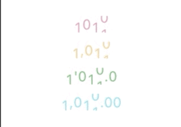
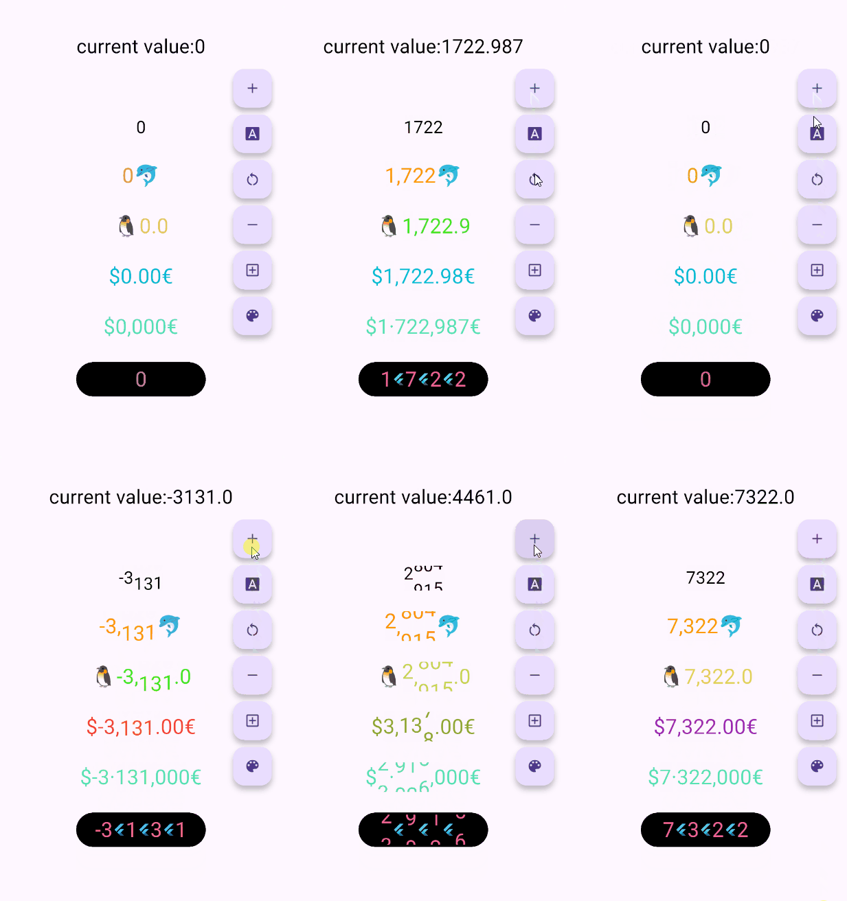
🖼 UI Effect Image & 💻 Code Example
AnimatedDigitWidget(
  value: 12531.98, // or use controller
),
AnimatedDigitWidget(
  value: 12531.98, // or use controller
  enableSeparator: true,
),
AnimatedDigitWidget(
  value: 12531.98, // or use controller
  fractionDigits: 2,
  enableSeparator: true,
),
The add a ValueColor object to valueColors, which is an array, you can add more ...,but always take the last eligible
Since version v3.3.1+1, colors have supported animated transitions instead of abrupt direct color switching, eliminating harsh transitions.
int value = 9999; // or use Controller.valueAnimatedDigitWidget(
value: value,
textStyle: TextStyle(
color: Colors.orange[200],
fontSize: 30,
),
valueColors: [
ValueColor(
//When value <= 0 , the color changes to red
condition: () => value <= 0,
color: Colors.red,
),
// you can add more ...,but always take the last eligible.
],
),
🍓Disable the initial scroll animation.
AnimatedDigitWidget(
...,
firstScrollAnimate: false// set false | >= v3.3.1+1
),
🍋Support for padding the integer part with leading zeros when the number of digits is less than the specified minimum
range: [0, 9], 🐧0 ➡️ 00、1 ➡️ 01、2 ➡️ 02 ...
AnimatedDigitWidget(
...,
fractionDigits: 0, // It must be set to 0; if there are decimal places, it's really unnecessary (wry smile)~~
enableMinIntegerDigits: true// set true, | >= v3.3.1+2
),
⚠️ value and controller cannot be both null.
⚠️ controller has higher priority.
controller - digit controller, The displayed number can be controlled via addValue and resetValue.
value - the display number.
🍑 TextStyle And BoxStyle Setting
textStyle - the numbers text style.
boxDecoration - Use with decoration of Container.
🍇 Int Type(default) Or Decimal Type Setting
fractionDigits - the fraction digits, int, default0.
🖌 Example ( 1000520.98765 ):
0 => 1000520;
1 => 1000520.9;
2 => 1000520.98;
3 => 1000520.987;
N => 1000520.[N];
The default 0 means an integer, when it is a decimal, if the value is less than the fractionDigits, it will be filled with 0 to the right, and the truncation method is used, so there is no rounding.
🍓 Numbers Free Style Setting
decimalSeparator - the decimal separator,can be replaced by other symbols in place of decimal separators, default..
enableSeparator - enable digit separator. defaultfalse not enable, only true, separateLength and separateSymbol valid.
🖌 Example (true): 1000520 => 1,000,520 (seealso separateLength or separateSymbol)
separateSymbol - the numbers separator symbol (only enableSeparator is true), make numbers much easier to read, default,.
🖌 Example ( 1000520 ):
, => 1,000,520
' => 1'000'520
- => 1-000-520
separateLength - the numbers separator length (only enableSeparator is true), separateSymbol by separator length insert, default3.
🖌 Example ( 1000520 ):
1 => 1,0,0,0,5,2,0
2 => 1,00,05,20
3 => 1,000,520
🥝 Scroll Animation Setting
duration - the animate duration, default Duration(milliseconds: 300).
curve - the animate curve, default Curves.easeInOut. look animate curve.
loop - enable loop scroll animate. default true, always scroll down, not scroll up from 9 -> 0; false, scroll up and down.
🍎 Digital Size Scheme Setting
autoSize - the default true is to automatically expand and contract according to the size of the ( number / symbol ) itself, false, the text size of the number 0 is used as the container size of each number, which can ensure the same width, but it seems that there is a slight interval between 1 and other numbers 😊 .
animateAutoSize - the animation resizing. default true, false will change directly to the size of the number/symbol.
🍒 Number prefix and suffix Setting
prefix - the text to display in front of the counter.