
 v1.0.3
day_month_picker
इस पैकेज के साथ आप अपने इच्छित महीने और दिन को आसानी से चुन सकते हैं! चयनकर्ता से एक सरल तारीख चयन प्रक्रिया चुनें — वर्ष की आवश्यकता नहीं है। आनंद लें!
29लाइक 10330-दिन डाउनलोड150Pub अंक
AndroidiOSWebmacOSWindowsLinux
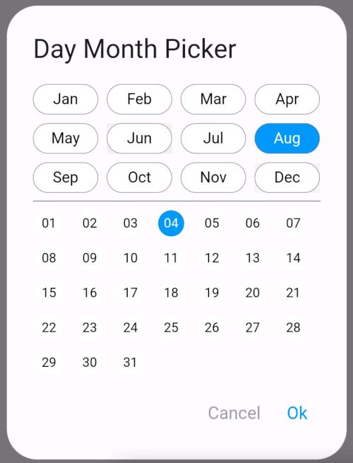
एक रिपो जो आपको डायलॉग से महीने और महीने की तारीख चुनने में मदद कर सकता है। अगर आप उपयोगकर्ता को वर्ष विकल्प नहीं दिखाना चाहते हैं
यह अंग्रेज़ी मूल स्नैपशॉट है। नवीनतम सामग्री GitHub पर देखें।
The DayMonthPicker widget is a customizable Flutter component that allows users to select a specific day and month from a dialog interface. It is particularly useful in forms or applications where date input is needed without year.
Easy selection of months and days Customizable appearance Built-in support for existing day and month values Callback function to handle changes
const DayMonthPicker({
  Key? key,
  this.surfaceTintColor,
  this.titleTextStyle,
  this.selectedMonthBgColor = Colors.blue,
  this.unSelectedMonthBgColor = Colors.white,
  this.selectedDayBgColor = Colors.blue,
  this.unSelectedDayBgColor = Colors.white,
  this.title = "Date Month Picker",
  this.selectedMonthTextStyle = const TextStyle(color: Colors.white, fontSize: 14),
  this.unSelectedMonthTextStyle = const TextStyle(color: Colors.black, fontSize: 14),
  this.selectedDayTextStyle = const TextStyle(color: Colors.white, fontSize: 12),
  this.unSelectedDayTextStyle = const TextStyle(color: Colors.black, fontSize: 12),
  this.child = const Padding(
    padding: EdgeInsets.all(8.0),
    child: Text("Month Picker"),
  ),
  this.cancelTextStyle = const TextStyle(color: Colors.grey, fontSize: 16),
  this.okTextStyle = const TextStyle(color: Colors.blue, fontSize: 16),
  this.existingDay,
  this.existingMonth,
  required this.onChange,
});
Short and useful examples for package users.
DayMonthPicker(onChange: (DayMonth? dayMonth){
        if(dayMonth != null) {
          print("Day: ${dayMonth.day}");
          print("Month: ${dayMonth.month}");
        }
      }),
@override
Widget build(BuildContext context) {
  return Scaffold(
    appBar: AppBar(title: Text('Day Month Picker Example')),
    body: Center(
      child: DayMonthPicker(
        onChange: (dayMonth) {
          // Do something with the selected day and month
          print('Selected Day: ${dayMonth.day}, Month: ${dayMonth.month}');
        },
      ),
    ),
  );
}

निर्भरता सूची 3 आइटम
{"sdk":"flutter"}{"sdk":"flutter"}^3.0.0उपयोग के अनुसार छाँटें, गतिविधि की तुलना करें और अपनाने से पहले मूल प्रोजेक्ट की आवश्यकताएँ जाँचें।
“A repository is the most basic element of GitHub.”
GitHub Docs — About repositories ↗