google_nav_bar
https://forthebadge.com/images/badges/built-with-love.svg https://img.shields.io/badge/license-MIT-green?style=for-the-badge https://img.shields.io/pub/v/google_nav_bar.svg?style=for-the-badge
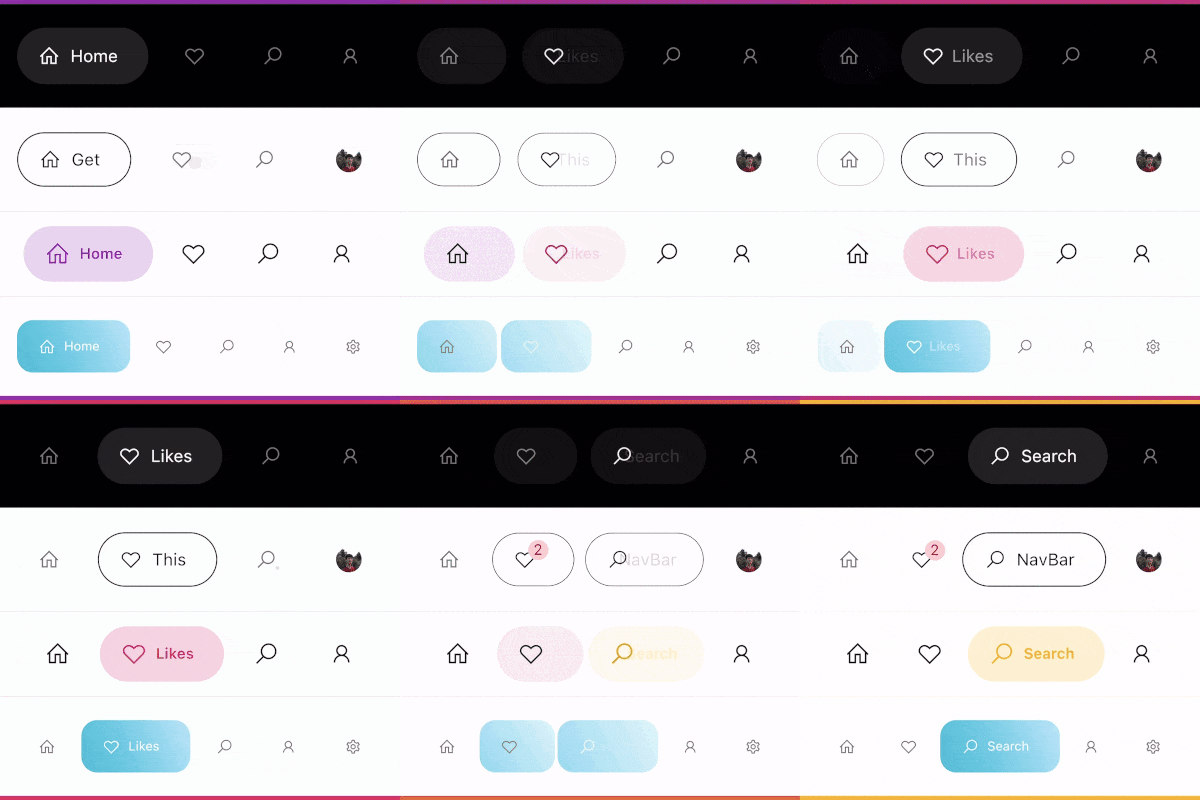
A modern google style nav bar for flutter.
google_nav_bar
GoogleNavBar is a Flutter widget designed by Aurelien Salomon and developed by sooxt98.
Getting Started
Add this to your package's pubspec.yaml file:
...
dependencies:
  google_nav_bar: ^5.0.7
Now in your Dart code, you can use:
import 'package:google_nav_bar/google_nav_bar.dart';
Usage
Style your tab globally with GNav's attribute, if you wish to style tab separately, use GButton's attribute
GNav(
  rippleColor: Colors.grey[800], // tab button ripple color when pressed
  hoverColor: Colors.grey[700], // tab button hover color
  haptic: true, // haptic feedback
  tabBorderRadius: 15,
  tabActiveBorder: Border.all(color: Colors.black, width: 1), // tab button border
  tabBorder: Border.all(color: Colors.grey, width: 1), // tab button border
  tabShadow: [BoxShadow(color: Colors.grey.withOpacity(0.5), blurRadius: 8)], // tab button shadow
  curve: Curves.easeOutExpo, // tab animation curves
  duration: Duration(milliseconds: 900), // tab animation duration
  gap: 8, // the tab button gap between icon and text
  color: Colors.grey[800], // unselected icon color
  activeColor: Colors.purple, // selected icon and text color
  iconSize: 24, // tab button icon size
  tabBackgroundColor: Colors.purple.withOpacity(0.1), // selected tab background color
  padding: EdgeInsets.symmetric(horizontal: 20, vertical: 5), // navigation bar padding
  tabs: [
    GButton(
      icon: LineIcons.home,
      text: 'Home',
    ),
    GButton(
      icon: LineIcons.heart_o,
      text: 'Likes',
    ),
    GButton(
      icon: LineIcons.search,
      text: 'Search',
    ),
    GButton(
      icon: LineIcons.user,
      text: 'Profile',
    )
  ]
)
View the example folder
There are 4 different use case included in the /example directory, go try it out!


 v5.0.7