
 v3.2.3
onboarding_overlay
लक्ष्य तत्व के साथ या बिना ओनबोर्ड ओवरले को नियंत्रित करने में लचीलापन (onboard_overlay से फॉर्क किया गया)
375लाइक 5.6 हज़ार30-दिन डाउनलोड150Pub अंक
AndroidiOSWebmacOSWindowsLinux
फ्लटर एप्लिकेशन के लिए एक लचीला और कस्टमाइज़ करने योग्य ओनबोर्डिंग विजेट। इस विजेट का उपयोग आर्बिट्ररी संख्या में चरणों और शुरुआती बिंदुओं के साथ ओनबोर्डिंग अनुभव बनाने के लिए किया जा सकता है। इसमें फोकस नोड्स, टेक्स्ट स्टाइल्स और ओवरले रंग जैसे विभिन्न कस्टमाइज़ेशन विकल्प समर्थित हैं, जिससे आप अपने ऐप की सुविधाओं के माध्यम से उपयोगकर्ताओं को आसानी से मार्गदर्शन कर सकते हैं।

{"sdk":"flutter"}^2.1.0^3.0.0{"sdk":"flutter"}^3.0.2यह अंग्रेज़ी मूल स्नैपशॉट है। नवीनतम सामग्री GitHub पर देखें।
A flexible onboarding widget that can start and stop with an arbitrary number of steps and arbitrary starting point
List<FocusNodes> somewhere accessiblefinal List<FocusNode> overlayKeys = <FocusNode>[
FocusNode(),
FocusNode(),
FocusNode(),
];
List<OnboardingSteps> somewhere accessiblefinal List<OnboardingSteps> steps = [OnboardingStep(
focusNode: _focusNodes != null ? _focusNodes[0] : null,
title: "Hi",
titleTextStyle: Theme.of(context).textTheme.headline5.copyWith(
color: Theme.of(context).canvasColor,
),
bodyText:
'''Check this out''',
bodyTextStyle: Theme.of(context).textTheme.subtitle1.copyWith(
color: Theme.of(context).canvasColor,
),
hasLabelBox: false,
fullscreen: true,
overlayColor: Theme.of(context).primaryColorDark.withOpacity(0.8),
hasArrow: false,
),]
FocusNodes to the widgets.Focus(
focusNode: focusNode[0]
Text(
'You have pushed the button this many times:',
),
)
void main() {
  runApp(App());
}

class App extends StatefulWidget {
  final GlobalKey<OnboardingState> onboardingKey = GlobalKey<OnboardingState>();

  @override
  _AppState createState() => _AppState();
}

class _AppState extends State<App> {
  List<FocusNode> focusNodes = <FocusNode>[];

  @override
  void initState() {
    super.initState();

    focusNodes = List<FocusNode>.generate(
      7,
      (int i) => FocusNode(debugLabel: i.toString()),
      growable: false,
    );
  }

  @override
  Widget build(BuildContext context) => MaterialApp(
        home: Onboarding(
          key: widget.onboardingKey,
          steps: steps,
          onChanged: (int index) {
            debugPrint('----index $index');
            if (index == 5) {
              /// interrupt onboarding on specific step
              /// widget.onboardingKey.currentState.hide();
              /// or do something else
            }
          },
          child: Home(
            focusNodes: focusNodes,
          ),
        ),
      );
}
final OnboardingState? onboarding = Onboarding.of(context);

if (onboarding != null) {
  onboarding.show();
}
@override
void initState() {
  super.initState();
  WidgetsBinding.instance.addPostFrameCallback((Duration timeStamp) {
    final OnboardingState? onboarding = Onboarding.of(context);
    if (onboarding != null) {
      onboarding.show();
    }
  });
}
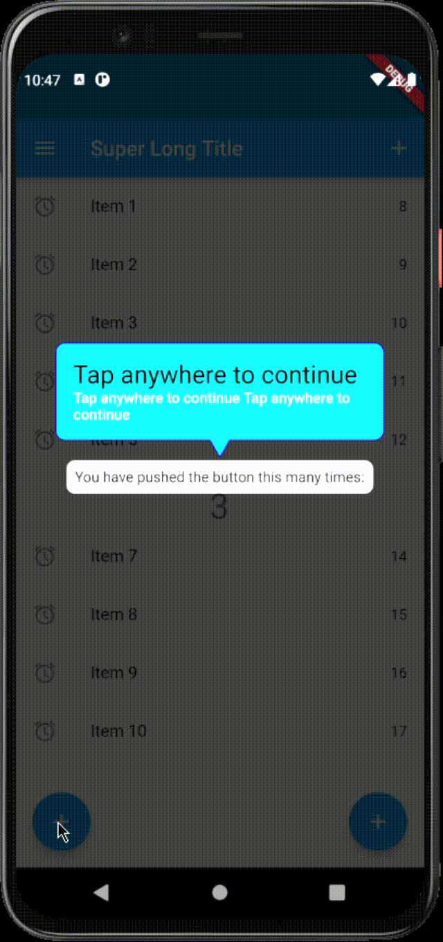
The text can be wrapped in a box, than support all kind of decorations and
only shape: BoxShape.rectangle For this to happen, you have to set
hasLabelBox equal to true, labelBoxDecoration, which supports only
BoxDecoration
The Label box also supports having an arrow. This is controlled by
hasArrow. The position is not calculated automatically. The default
position is top. You will have to specify the position via arrowPosition by
using the enum ArrowPosition. The ArrowPosition.top and
ArrowPosition.bottom calculates the horizontal position automatically
according to the widget of interest (the focused one which is visible through
the overlay), the other arrow positions are centered in the label box e.g.
ArrowPosition.topCenter, ArrowPosition.bottomCenter. In addition there
are 2 new settings from v3.0.0 - ArrowPosition.autoVertical and
ArrowPosition.autoVerticalCenter, which will take care of positioning the
arrow automatically relative to the label box and widget position.
The onboarding also supports forwarding the onTap event to the widget of
interest. You can control the behavior for each step using the
overlayBehavior. It accepts the Flutter enum HitTestBehavior. By default, the
value used is HitTestBehavior.opaque.
HitTestBehavior.opaque ignores the clicks on the focused widget and always
will navigate to next stepHitTestBehavior.translucent forwards clicks on the focused widget and on the
overlay in the same timeHitTestBehavior.deferToChild the clicks on the hole are forwarded to the
focused widget, clicks on the overlay navigates to next step.Sometimes the titleText and the bodyText might not fit well in the
constrained label box, because of the long texts, longer translations or
smaller screens. There are 2 behaviors for this scenario. The default one
will limit the title to 2 lines and the bodyText to 5 lines and will overflow
both with ellipsis, the second one is to automatically resize the texts. This
is controlled by the Onboarding property autoSizeTexts, which default value
is false.
The onboarding can show only a portion of the defined steps with a specific
start index. Use showWithSteps method. Remember that the steps indexes are
0-based (starting from zero)
@override
void initState() {
  super.initState();
  WidgetsBinding.instance.addPostFrameCallback((Duration timeStamp) {
    final OnboardingState? onboarding = Onboarding.of(context);
    if (onboarding != null) {
      onboarding.showWithSteps(3, <int>[3,4,5,6]);
    }
  });
  }
showFromIndex method. Remember that the steps indexes are
0-based (starting from zero)@override
void initState() {
super.initState();
WidgetsBinding.instance.addPostFrameCallback((Duration timeStamp) {
final OnboardingState? onboarding = Onboarding.of(context);
if (onboarding != null) {
onboarding.showFromIndex(3);
}
});
}
stepBuilder is for you. With
stepBuilder, you can change the layout, add images or something else.Important: If you want to inherit your App Theme from your app instead of
using the style properties. You need to wrap your stepBuilder code with a
Scaffold or Material widgets.
Important: Clicks on the overlay are ignored if stepBuilder is set. Clicks
on the hole or on the widget depend on the HitTestBehavior.
HitTestBehavior.translucent and HitTestBehavior.deferToChild will
forward clicks on the hole to the focused widgetHitTestBehavior.opaque ignores clicks on the hole and on the overlay
are ignored. Call callbacks provided by the stepBuilderOnboardingStep(
focusNode: focusNodes[0],
titleText: 'Tap anywhere to continue ',
titleTextColor: Colors.black,
bodyText: 'Tap anywhere to continue Tap anywhere to continue',
labelBoxPadding: const EdgeInsets.all(16.0),
labelBoxDecoration: BoxDecoration(
shape: BoxShape.rectangle,
borderRadius: const BorderRadius.all(Radius.circular(8.0)),
color: const Color(0xFF00E1FF),
border: Border.all(
color: const Color(0xFF1E05FB),
width: 1.0,
style: BorderStyle.solid,
),
),
arrowPosition: ArrowPosition.autoVertical,
hasArrow: true,
hasLabelBox: true,
fullscreen: true,
stepBuilder: (
BuildContext context,
OnboardingStepRenderInfo renderInfo,
) {
return SingleChildScrollView(
child: Column(
children: [
Text(
renderInfo.titleText,
style: renderInfo.titleStyle,
),
Row(
crossAxisAlignment: CrossAxisAlignment.start,
children: [
Image.asset(
'assets/demo.gif',
width: 50,
),
const SizedBox(
width: 10,
),
Flexible(
child: AutoSizeText(
renderInfo.bodyText,
style: renderInfo.bodyStyle,
),
),
],
),
Row(
children: [
TextButton(
onPressed: renderInfo.nextStep,
child: Text('Next'),
),
const SizedBox(
width: 10,
),
TextButton(
onPressed: renderInfo.close,
child: Text('close'),
),
],
),
],
),
);
},
),
onTapCallback with the overlayBehavior gives
more control.HitTestBehavior.opaqueHitTestBehavior.translucentHitTestBehavior.deferToChildUsing the TapArea you can specify what happens when the user clicked on
certain area. The possible options are hole, label and overlay
OnboardingStep(
  focusNode: focusNodes[4],
  titleText: 'Menu',
  bodyText: 'You can open menu from here',
  overlayColor: Colors.green.withOpacity(0.9),
  shape: const CircleBorder(),
  overlayBehavior: HitTestBehavior.translucent,
  onTapCallback:
      (TapArea area, VoidCallback next, VoidCallback close) {
    if (area == TapArea.hole) {
      next();
    }
  },
),
From v.3.0.0 It is possible to combine onTapCallback and
stepBuilder. No navigation will be executed except if you call next()
method from onTapCallback or the stepBuilder. You can customize the
behavior using the TapArea enum to get the area where the user clicked. By
using the HitTestBehavior you can again customize if the clicks on the
hole are ignored or forwarded to the focused widget. Again if you define the
overlayBehavior with HitTestBehavior.deferToChild the click on the hole
or the widget in focus will not be controlled by the onTapCallback
From v3.0.0 there is an additional OverlayController (ChangeNotifier)
attached to the OverlayState that provides the currentIndex,
currentStep and isVisible.
final OnboardingState? onboarding = Onboarding.of(context);
if( onboarding?.controller.isVisible ?? false) {
  // do some logic here
}
showPulseAnimation on an
OnboardingStep is set to true. In addition you can change the inner and
outer colors of the pulse animation. Thanks to the author
Gautier of the
pal package for the inspiration.Onboarding parameter debugBoundaries
which is false by default.From v.3.1.0 The package can be used with ResponsiveFramework. For this to work as expected you need to perform these changes to your code:
Onboarding widget under the ResponsiveWrapper.builderBuilder to be able to access the inherited widget for
ResponsiveWrapperDataOnboarding widget.Example:
return MaterialApp(
      home: ResponsiveWrapper.builder(
        Builder(builder: (context) {
          final ResponsiveWrapperData data = ResponsiveWrapper.of(context);
          final scaleWidth = data.screenWidth / data.scaledWidth;
          final scaleHeight = data.screenHeight / data.scaledHeight;

          return Onboarding(
            key: widget.onboardingKey,
            steps: steps,
            globalOnboarding: true,
            debugBoundaries: true,
            child: const Home(),
            scaleWidth: scaleWidth,
            scaleHeight: scaleHeight,
          );
        }),
        maxWidth: 1200,
        minWidth: 480,
        defaultScale: true,
        breakpoints: [
          const ResponsiveBreakpoint.autoScale(800, name: TABLET),
        ],
      ),
      initialRoute: "/",
    );
From 3.2.1 [stepPainterBuilder] is a callback function that passes the
context, the title String, the hole Rect nd if the arrow position isTop
bool. By default it is null and it will use the LabelPainter. You can
use this to draw custom shapes around the hole. You can use the
LabelPainter as a reference
From 3.2.3
false to disable the animation of the overlay hole.Example:
OnboardingStep(
  focusNode: focusNodes[0],
  titleText: 'Tap anywhere to continue ',
  labelBoxMargin: const EdgeInsets.symmetric(horizontal: 16.0), // <--This ensures that there will be always padding around the label box on the left and right sides
  labelBoxDecoration: BoxDecoration(
    shape: BoxShape.rectangle,
    borderRadius: const BorderRadius.all(Radius.circular(8.0)),
    color: const Color(0xFF00E1FF),
  ),
),
Example:
OnboardingStep(
  focusNode: focusNodes[0],
  titleText: 'Tap anywhere to continue',
  labelBoxVerticalDistance: 16.0, // default is kSpace = 4.0
),