


 v1.6.0
u_credit_card
uCreditCard - उपयोग में आसान, सुंदर कार्ड UI Flutter पैकेज।
84लाइक 1.7 हज़ार30-दिन डाउनलोड160Pub अंक
AndroidiOSWebmacOSWindowsLinux
💳 "u_credit_card" एक ओपन सोर्स फ्लटर पैकेज है जो आपके ऐप में डेबिट या क्रेडिट कार्ड के UI को दिखाने के लिए कस्टमाइज़ करने योग्य समाधान प्रदान करता है।

यह अंग्रेज़ी मूल स्नैपशॉट है। नवीनतम सामग्री GitHub पर देखें।
A Flutter widget that renders a realistic, customizable credit-card UI with optional flip animation, balance display, and provider-logo support.


CreditCardController.Widget), provider logo position, background image, card width, and card-number masking.| It is | It isn't |
|---|---|
| A presentation-layer widget for displaying card details | A card-number or CVV validator |
| Useful for wallets, dashboards, fintech mockups | A payment-processing or tokenization library |
| Pure Dart + Flutter, no platform channels | A PCI-compliant input form |
If you need card-input form fields or Luhn validation as part of a payment flow, pair this widget with a dedicated forms or payments package.
Add the dependency to your pubspec.yaml:
dependencies:
  u_credit_card: ^1.6.0
Then fetch it:
flutter pub get
Import it where you need it:
import 'package:u_credit_card/u_credit_card.dart';
The widget needs three values: cardholder name, card number, and the "Valid Thru" date.
CreditCardUi(
  cardHolderFullName: 'John Doe',
  cardNumber: '1234567812345678',
  validThru: '10/24',
)
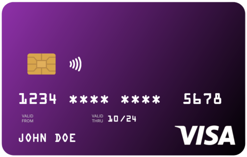
By default, the card is purple, shows the NFC icon next to the chip, and masks the middle digits of the card number.
Each recipe builds on the quick-start example and shows only the parameters that change.
Set topLeftColor and bottomRightColor to control the gradient. If you omit bottomRightColor, a darker shade of topLeftColor is used automatically.
CreditCardUi(
  cardHolderFullName: 'John Doe',
  cardNumber: '1234567812345678',
  validThru: '10/24',
  topLeftColor: Colors.red,
  bottomRightColor: Colors.purpleAccent,
)
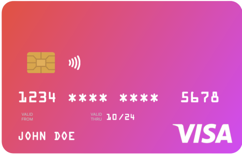
Because card text is rendered in white, avoid light gradient colors.
Use the width parameter rather than wrapping the widget in a SizedBox. The card is laid out at its natural width of 300 logical pixels and scales proportionally to fit width. Values above 300 are clamped.
CreditCardUi(
  width: 240,
  cardHolderFullName: 'John Doe',
  cardNumber: '1234567812345678',
  validThru: '10/24',
)
cardType controls the small label at the top of the card (CREDIT, DEBIT, PREPAID, GIFT CARD); pass CardType.other to hide the label.
creditCardType controls the network logo (Visa, Mastercard, Amex, Discover). If omitted, the widget auto-detects the network from cardNumber. Pass CreditCardType.none to hide the logo entirely.
CreditCardUi(
  cardHolderFullName: 'John Doe',
  cardNumber: '4111111111111111',  // detected as Visa
  validThru: '10/24',
  cardType: CardType.debit,
  // creditCardType: CreditCardType.mastercard, // optional override
)
cardProviderLogo accepts any widget — typically your bank or wallet logo. Position it on the left or right of the card-type label with cardProviderLogoPosition. Add a background image with backgroundDecorationImage; both NetworkImage and AssetImage are supported.
CreditCardUi(
  cardHolderFullName: 'John Doe',
  cardNumber: '1234567812345678',
  validThru: '10/24',
  cardProviderLogo: const FlutterLogo(),
  cardProviderLogoPosition: CardProviderLogoPosition.right,
  backgroundDecorationImage: const DecorationImage(
    fit: BoxFit.cover,
    image: NetworkImage('https://example.com/card-bg.png'),
  ),
)
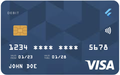
Set showBalance: true and pass a balance to render the amount in the top-left of the card. Enabling autoHideBalance: true replaces the figure with a "TAP TO SEE BALANCE" placeholder; tapping reveals it for two seconds. currencySymbol defaults to $.
CreditCardUi(
  cardHolderFullName: 'John Doe',
  cardNumber: '1234567812345678',
  validThru: '10/24',
  showBalance: true,
  balance: 128.32,
  autoHideBalance: true,
  currencySymbol: '€',
)
Set enableFlipping: true to render a back side (with the CVV) and enable a horizontal-drag gesture that flips between sides. Provide the CVV with cvvNumber.
CreditCardUi(
  cardHolderFullName: 'John Doe',
  cardNumber: '1234567812345678',
  validThru: '10/24',
  enableFlipping: true,
  cvvNumber: '123',
)
Haptic feedback fires on each flip; disable it with disableHapticFeedBack: true.
For flows that need to flip the card in response to UI events — for example, flipping to the back when a CVV input field gains focus — attach a CreditCardController.
class CheckoutCard extends StatefulWidget {
  const CheckoutCard({super.key});

  @override
  State<CheckoutCard> createState() => _CheckoutCardState();
}

class _CheckoutCardState extends State<CheckoutCard> {
  final _cardController = CreditCardController();
  final _cvvFocusNode = FocusNode();

  @override
  void initState() {
    super.initState();
    _cvvFocusNode.addListener(() {
      if (_cvvFocusNode.hasFocus) {
        _cardController.flipToBack();
      } else {
        _cardController.flipToFront();
      }
    });
  }

  @override
  void dispose() {
    _cardController.dispose();
    _cvvFocusNode.dispose();
    super.dispose();
  }

  @override
  Widget build(BuildContext context) {
    return Column(
      children: [
        CreditCardUi(
          controller: _cardController,
          enableFlipping: true,
          cardHolderFullName: 'John Doe',
          cardNumber: '1234567812345678',
          validThru: '10/24',
          cvvNumber: '123',
        ),
        TextField(
          focusNode: _cvvFocusNode,
          decoration: const InputDecoration(labelText: 'CVV'),
        ),
        ElevatedButton(
          onPressed: _cardController.flipCard,
          child: const Text('Flip'),
        ),
      ],
    );
  }
}
CreditCardController exposes:
| Member | Description |
|---|---|
flipCard() |
Toggles between front and back. |
flipToFront() |
Flips to the front; no-op if already on the front. |
flipToBack() |
Flips to the back; no-op if already on the back. |
isFlipped |
Getter — true when the back side is showing. |
CreditCardController extends ChangeNotifier, so you can addListener to react to flip state changes. Call dispose() from your widget's dispose method.
The controller has no effect when enableFlipping: false. Pair the two parameters together.
Listed alphabetically. Defaults reflect the constructor; null means "not provided".
| Name | Type | Default | Description |
|---|---|---|---|
autoHideBalance |
bool? |
false |
Shows a "TAP TO SEE BALANCE" placeholder; tapping reveals the balance for 2 seconds. |
backgroundDecorationImage |
DecorationImage? |
null |
Image painted under the gradient. Supports NetworkImage and AssetImage. |
balance |
double? |
0.0 |
Balance displayed when showBalance is true. |
bottomRightColor |
Color? |
derived | Bottom-right gradient stop. Defaults to a darker shade of topLeftColor. |
cardHolderFullName |
String |
required | Rendered uppercased on the front of the card. |
cardNumber |
String |
required | The card number. Spaces, dashes, and asterisks are normalized before display. |
cardProviderLogo |
Widget? |
null |
Any widget — typically a bank or brand logo. |
cardProviderLogoPosition |
CardProviderLogoPosition |
.right |
Position of cardProviderLogo relative to the card-type label. |
cardType |
CardType |
.credit |
Drives the small label at the top of the card. CardType.other hides the label. |
controller |
CreditCardController? |
null |
Drives programmatic flipping. Requires enableFlipping: true. |
creditCardType |
CreditCardType? |
null |
Overrides the auto-detected network logo. Pass .none to hide it. |
currencySymbol |
String? |
'$' |
Prefix shown before the balance. |
cvvNumber |
String? |
'***' |
Shown on the back of the card when flipped. |
disableHapticFeedBack |
bool? |
false |
Disables haptic feedback on flip and balance tap. (Note: the capital "B" reflects the existing public API.) |
doesSupportNfc |
bool |
true |
Shows the NFC icon next to the chip. |
enableFlipping |
bool? |
false |
Renders the back side and enables the drag-to-flip gesture. Required for controller to take effect. |
placeNfcIconAtTheEnd |
bool |
false |
Moves the NFC icon to the opposite side of the chip. Has no effect when doesSupportNfc: false. |
scale |
double |
1.0 |
Deprecated — use width instead. Will be removed in a future minor release. |
shouldMaskCardNumber |
bool |
true |
Masks the middle digits with *. Card numbers under 12 digits are never masked. |
showBalance |
bool? |
false |
Shows the balance area in place of the card-type label. |
showValidFrom |
bool |
true |
Shows the "VALID FROM" segment when validFrom is provided. |
showValidThru |
bool |
true |
Shows the "VALID THRU" segment. |
topLeftColor |
Color |
Colors.purple |
Top-left gradient stop. |
validFrom |
String? |
null |
Optional "MM/YY" start date. |
validThru |
String |
required | "MM/YY" expiration date. |
width |
double? |
null |
Maximum width in logical pixels. Capped at 300; smaller values scale the card proportionally. |
Full API documentation is available on pub.dev.
scale → width (since 1.3.0). scale: 0.8 is equivalent to width: 240. The scale parameter will be removed in a future minor release.disableShowingCardLogo removed (since 1.1.0). Use creditCardType: CreditCardType.none instead.CreditCardController added in 1.6.0 for programmatic flipping. Existing widgets using only the drag gesture need no changes.Durations).>=3.3.0 <4.0.0.Bug reports, feature requests, and pull requests are welcome. See CONTRIBUTING.md and the Code of Conduct.
For security-sensitive reports, follow the guidance in SECURITY.md.
Released under the BSD 3-Clause License.

Utpal Barman
Built with ♥ in Bangladesh — ধন্যবাদ

निर्भरता सूची 4 आइटम
{"sdk":"flutter"}{"sdk":"flutter"}>=0.3.0 <2.0.0>=9.0.0 <11.0.0उपयोग के अनुसार छाँटें, गतिविधि की तुलना करें और अपनाने से पहले मूल प्रोजेक्ट की आवश्यकताएँ जाँचें।
“A repository is the most basic element of GitHub.”
GitHub Docs — About repositories ↗