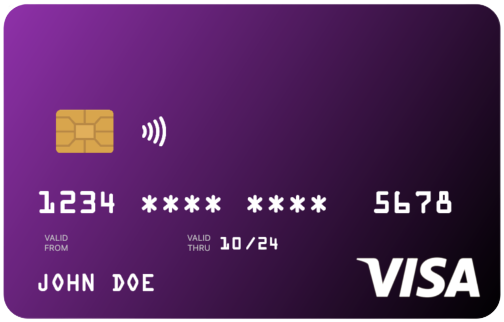
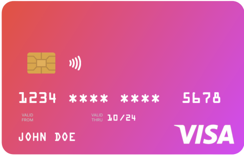
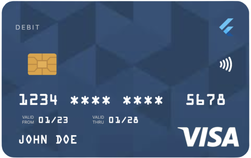
सार्वजनिक जानकारी से बना चयन मार्गदर्शन। केवल संदर्भ हेतु।
uCreditCard एक Flutter पैकेज है जो आसान उपयोग, दृश्य रूप से आकर्षक क्रेडिट कार्ड UI घटक प्रदान करता है। विकासकर्ताओं के लिए डिज़ाइन किया गया है जो साफ और आधुनिक कार्ड इंटरफ़ेस खोज रहे हैं, यह Android, iOS, Web, macOS, Windows और Linux जैसे कई प्लेटफ़ॉर्म को समर्थन देता है। इस पैकेज के माध्यम से उपयोगकर्ता अनुभव को बढ़ाया जाता है जो उपयोगी डिज़ाइन और भुगतान या वित्त संबंधी ऐप में बेहतर एकीकरण प्रदान करता है। यह फ्लटर ऐप में कार्ड विवरण को सुरक्षित और शैलीपूर्ण तरीके से प्रदर्शित करने के लिए आदर्श है।
उपयोग
एप्प में क्रेडिट कार्ड विवरण प्रदर्शित करना
भुगतान फॉर्म इंटरफेस बनाना
वित्त या बैंकिंग एप्लिकेशन बनाना
खरीदारी अनुभव में सुधार करना
सुरक्षित कार्ड इनपुट स्क्रीन डिज़ाइन करना
मुख्य विशेषताएँ
सुंदर और कस्टमाइज़ किए गए कार्ड UI
क्रॉस-प्लेटफॉर्म संगतता
Flutter के साथ सरल एकीकरण
कई ऑपरेटिंग सिस्टम का समर्थन करता है
सभी उपकरणों के लिए प्रतिक्रियाशील डिज़ाइन
इनके लिए उपयुक्त
Flutter विकासकर्ता भुगतान ऐप बना रहे हैं
लचीले कार्ड घटक चाहने डिज़ाइनर
सुरक्षित कार्ड प्रदर्शन की आवश्यकता वाले ऐप्स
फ्रंटएंड-केंद्रित वित्तीय उपकरण
कार्ड-आधारित इंटरफेस का त्वरित प्रोटोटाइपिंग
विचार योग्य बातें
पूर्ण भुगतान प्रोसेसिंग शामिल नहीं है
संवेदनशील डेटा के हैंडलिंग के लिए मैन्युअल हैंडलिंग की आवश्यकता होती है
UI तक सीमित; कोई स्कैनिंग कार्यक्षमता नहीं
उत्पादन भुगतान गेटवे के लिए उपयुक्त नहीं
उपयोगकर्ता को अतिरिक्त सुरक्षा उपाय कार्यान्वित करने की आवश्यकता है
मूल README
संबंधित सोर्स रिपॉज़िटरी के मूल README का स्नैपशॉट। नवीनतम सामग्री के लिए रिपॉज़िटरी देखें।
u_credit_card
A Flutter widget that renders a realistic, customizable credit-card UI with optional flip animation, balance display, and provider-logo support.
Because card text is rendered in white, avoid light gradient colors.
Sizing the card
Use the width parameter rather than wrapping the widget in a SizedBox. The card is laid out at its natural width of 300 logical pixels and scales proportionally to fit width. Values above 300 are clamped.
cardType controls the small label at the top of the card (CREDIT, DEBIT, PREPAID, GIFT CARD); pass CardType.other to hide the label.
creditCardType controls the network logo (Visa, Mastercard, Amex, Discover). If omitted, the widget auto-detects the network from cardNumber. Pass CreditCardType.none to hide the logo entirely.
cardProviderLogo accepts any widget — typically your bank or wallet logo. Position it on the left or right of the card-type label with cardProviderLogoPosition. Add a background image with backgroundDecorationImage; both NetworkImage and AssetImage are supported.
Set showBalance: true and pass a balance to render the amount in the top-left of the card. Enabling autoHideBalance: true replaces the figure with a "TAP TO SEE BALANCE" placeholder; tapping reveals it for two seconds. currencySymbol defaults to $.
Set enableFlipping: true to render a back side (with the CVV) and enable a horizontal-drag gesture that flips between sides. Provide the CVV with cvvNumber.
Haptic feedback fires on each flip; disable it with disableHapticFeedBack: true.
Programmatic flipping API
For flows that need to flip the card in response to UI events — for example, flipping to the back when a CVV input field gains focus — attach a CreditCardController.