सार्वजनिक जानकारी से बना चयन मार्गदर्शन। केवल संदर्भ हेतु।
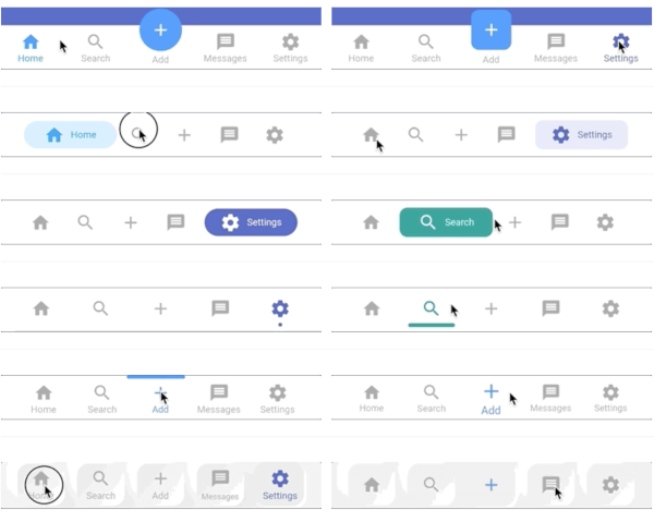
फ्लटर के लिए एक बहुत अनुकूलित स्थायी नीचे की नेविगेशन बार, जो अधिकतम 20 अलग-अलग शैलियों का समर्थन करती है। यह Android, iOS, Web, macOS, Windows और Linux सहित सभी प्लेटफॉर्मों पर स्थिर नेविगेशन अनुभव प्रदान करती है। पैकेज डेवलपर्स को रंग, आइकन, लेबल और एनीमेशन के लिए विस्तृत अनुकूलन विकल्पों के साथ एक सुसंगत और दृश्य रूप से आकर्षक नीचे की नेविगेशन को आसानी से लागू करने में सक्षम बनाता है। उपयोगकर्ता इंटरैक्शन के दौरान दृश्यमान रहने वाले विश्वसनीय, पुन: उपयोगी नेविगेशन बार की आवश्यकता वाले ऐप्स के लिए आदर्श है।
उपयोग
मोबाइल ऐप नेविगेशन
क्रॉस-प्लेटफ़ॉर्म एप्लिकेशन
डैशबोर्ड इंटरफेस
ई-कॉमर्स ऐप्स
बहु-स्क्रीन एप्लिकेशन
मुख्य विशेषताएँ
अधिकतम 20 निर्मित शैलियाँ
कस्टमाइज़ेबल रंग और आइकन
स्थायी दृश्यता
कई प्लेटफॉर्म का समर्थन करता है
एनिमेशन समर्थन
pub के माध्यम से आसान एकीकरण
इनके लिए उपयुक्त
मोबाइल-पहले एप्लिकेशन बना रहे विकासकर्ता
डिज़ाइन-केंद्रित UI कार्यान्वयन
स्थिर नेविगेशन की आवश्यकता वाले ऐप्स
प्लेटफॉर्म के बीच सुगमता को प्राथमिकता देने वाली टीमें
न्यूनतम बॉलरप्लेट की आवश्यकता वाले प्रोजेक्ट
विचार योग्य बातें
जटिल लेआउट के लिए अतिरिक्त स्टाइलिंग की आवश्यकता हो सकती है
केवल निचले स्थान पर सीमित
कुछ शैलियाँ सभी डिज़ाइन प्रणालियों के लिए उपयुक्त नहीं हो सकती हैं
अत्यधिक कस्टमाइजेशन का प्रदर्शन प्रभाव
राज्य प्रबंधन का सावधानीपूर्वक उपयोग करने की आवश्यकता है
मूल README
संबंधित सोर्स रिपॉज़िटरी के मूल README का स्नैपशॉट। नवीनतम सामग्री के लिए रिपॉज़िटरी देखें।
Persistent Bottom Navigation Bar
A persistent/static bottom navigation bar for Flutter.
NOTE: Those migrating from pre 6.0.0 version should check the latest readme and changelog as there are many breaking changes introduced in the latest update.
Styles
Style15
Style16
Style1
Style9
Style7
Style10
Style12
Style13
Style3
Style6
Neumorphic
Neumorphic without subtitle
Note: These do not include all style variations
Features
Highly customizable persistent bottom navigation bar.
Ability to push new screens with or without bottom navigation bar.
20 styles for the bottom navigation bar.
Includes functions for pushing screen with or without the bottom navigation bar i.e. pushNewScreen() and pushNewScreenWithRouteSettings().
Based on flutter's Cupertino(iOS) bottom navigation bar.
Can be translucent for a particular tab.
Custom styling for the navigation bar. Click here for more information.
The main widget then to be declared is PersistentTabView. NOTE: This widget includes SCAFFOLD (based on CupertinoTabScaffold), so no need to declare it. Following is an example for demonstration purposes:
classMyAppextendsStatelessWidget{
constMyApp({Key key}) : super(key: key);
@overrideWidgetbuild(BuildContext context) {
returnPersistentTabView(
context,
controller: _controller,
screens: _buildScreens(),
items: _navBarsItems(),
handleAndroidBackButtonPress: true, // Default is true.
resizeToAvoidBottomInset: true, // This needs to be true if you want to move up the screen on a non-scrollable screen when keyboard appears. Default is true.
stateManagement: true, // Default is true.
hideNavigationBarWhenKeyboardAppears: true,
popBehaviorOnSelectedNavBarItemPress: PopActionScreensType.all,
padding: constEdgeInsets.only(top: 8),
backgroundColor: Colors.grey.shade900,
isVisible: true,
animationSettings: constNavBarAnimationSettings(
navBarItemAnimation: ItemAnimationSettings( // Navigation Bar's items animation properties.
duration: Duration(milliseconds: 400),
curve: Curves.ease,
),
screenTransitionAnimation: ScreenTransitionAnimationSettings( // Screen transition animation on change of selected tab.
animateTabTransition: true,
duration: Duration(milliseconds: 200),
screenTransitionAnimationType: ScreenTransitionAnimationType.fadeIn,
),
),
confineToSafeArea: true,
navBarHeight: kBottomNavigationBarHeight,
navBarStyle: _navBarStyle, // Choose the nav bar style with this property
);
}
}
Note: You still can use regular Navigator functions like 'pushNamed' but be sure to check the argument routeAndNavigatorSettings your PersistentBottomNavBarItem for route settings and some other navigator related properties
To push a new screen, use the following functions to control the visibility of bottom navigation bar on a particular screen. You can use your own logic to implement platform-specific behavior. One of the solutions could be to use the property withNavBar and toggle it according to the Platform.
In platform-specific behavior, while pushing a new screen, on Android it will push the screen WITHOUT the bottom navigation bar but on iOS it will persist the bottom navigation bar. This is the default behavior specified by each platform.
Pop all screens until the first screen on the selected tab
    PersistentNavBarNavigator.popUntilFirstScreenOnSelectedTabScreen(
        context,
        routeName: "/", //If you haven't defined a routeName for the first screen of the selected tab then don't use the optional property `routeName`. Otherwise it may not work as intended
    );
Some Useful Tips
Pop to any screen in the navigation graph for a given tab:
To push bottom sheet on top of the Navigation Bar, use showModalBottomScreen and set it's property useRootNavigator to true. See example project for an illustration.
Custom Navigation Bar Styling
If you want to have your own style for the navigation bar, follow these steps:
Declare your custom widget. Please keep in mind that you will have to handle the function onSelectedItem and the integer selectedIndex yourself to maintain full functionality. Also please note that you can define your own model for the navigation bar item instead of the provided PersistentBottomNavBarItem. See this example below for better understanding:
In the main PersistentTabView widget, set the navBarStyle property as NavBarStyle.custom and pass on the custom widget you just created in the customWidget property like this:
NOTE: In the 'onSelected' function of the customWidget, don't forgot to change the index of the controller
Done! As we can see, some of the other properties like iconSize, items are not required here so you can skip those properties. To control the bottom padding of the screen, use bottomScreenPadding. If you give too much bottomScreenPadding but less height in the custom widget or vice versa, layout issues might appear.
Animated Icons
Animated icons are now supported in PersistentBottomNavBarItem. You will need to define and use an AnimationController and Animation<double> for it to work. Following is an example.