




 v1.2.0
gradient_elevated_button
視覚的に魅力的なUI用のグラデーション背景を持つカスタムFlutterボタン。
15いいね 33830日間ダウンロード150Pub ポイント
AndroidiOSWebmacOSWindowsLinux
視覚的に魅力的なUI用のグラデーション背景を持つカスタムFlutterボタン。

以下は英語原文のスナップショットです。最新版は GitHub をご覧ください。



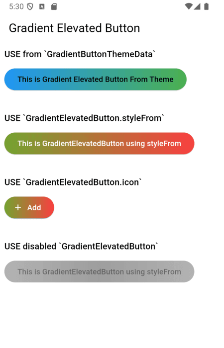
A customizable elevated button with gradient support for your Flutter applications. This package allows you to create buttons with gradient backgrounds, custom foreground colors, and various other customizable properties using the GradientElevatedButton widget.
GradientButtonThemeExtension (via ThemeExtension) to apply a consistent style across your app. (Old: GradientButtonThemeData is deprecated)
The recommended way to theme all gradient buttons is to use GradientButtonThemeExtension with ThemeData.extensions:
MaterialApp(
  theme: ThemeData(
    extensions: <ThemeExtension<dynamic>>[
      GradientButtonThemeExtension(
        style: GradientElevatedButton.styleFrom(
          backgroundGradient: const LinearGradient(
            colors: [Colors.blue, Colors.green],
            begin: Alignment.centerLeft,
            end: Alignment.centerRight,
          ),
          foregroundColor: Colors.black,
        ),
      ),
    ],
  ),
  home: ...,
)
Then use GradientElevatedButton as usual:
GradientElevatedButton(
  onPressed: () {},
  child: Text('Themed Gradient Button'),
)
GradientButtonThemeData is deprecated and will be removed in a future release. Migrate to ThemeExtension as shown above.
// Deprecated usage:
GradientButtonThemeData(
  data: GradientElevatedButton.styleFrom(
    backgroundGradient: const LinearGradient(
      colors: [Colors.blue, Colors.green],
      begin: Alignment.centerLeft,
      end: Alignment.centerRight,
    ),
    foregroundColor: Colors.black,
  ),
  child: MaterialApp(
    // ...
  ),
)
Alternatively, you can style the GradientElevatedButton directly using GradientElevatedButton.styleFrom to define the button's gradient, shape, and other properties:
Widget gradientWidget = GradientElevatedButton(
  onPressed: () {

  },
  style: GradientElevatedButton.styleFrom(
    gradient: const LinearGradient(colors: [
      Color.fromARGB(255, 166, 206, 57),
      Color.fromARGB(255, 0, 175, 173),
    ],
      disabledGradient: const LinearGradient(colors: [
        Colors.grey.withAlpha(200),
        Colors.grey,
        Colors.grey.withAlpha(200),
      ],
        begin: Alignment.topCenter,
        end: Alignment.bottomCenter,
      ),
    ),
  ),
  child: const Text("This is Gradient Elevated Button"),
);
You can fully customize the GradientElevatedButton using the following properties:
LinearGradient (or other types) that defines the background gradient.LinearGradient (or other types) that defines the disabled background gradient.ShapeBorder like RoundedRectangleBorder or StadiumBorder.To migrate from GradientButtonThemeData to the new ThemeExtension approach:
GradientButtonThemeData from your widget tree.GradientButtonThemeExtension to your ThemeData.extensions.GradientButtonThemeExtension.of(context) to access the style if needed.GradientElevatedButton widgets will now use the theme from the extension.See the example and code comments for more details.
click here for example
Please file any issues or provide feedback by visiting the Issues and Feedback for this repository.
For suggestions or further feedback, feel free to send an email to chegz.dev@gmail.com, and we'd be happy to hear from you!
依存関係一覧 3 件
{"sdk":"flutter"}{"sdk":"flutter"}^6.0.0用途で絞り込み、開発状況を比較し、採用前に元のリポジトリで要件を確認しましょう。
“A repository is the most basic element of GitHub.”
GitHub Docs — About repositories ↗