

 v3.1.0
progress_dialog_null_safe
カスタマイズ可能なプログレスダイアログを表示するための軽量でnull安全なFlutterパッケージで、動的なコンテンツ更新とさまざまなスタイルオプションをサポートしています。
46いいね 300030日間ダウンロード140Pub ポイント
AndroidiOSWebmacOSWindowsLinux
CodingFries/progress_dialog open-source repository details.

以下は英語原文のスナップショットです。最新版は GitHub をご覧ください。
A light weight package to show progress dialog. As it is a stateful widget, you can change the text shown on the dialog dynamically.
This is the original package and it's owner https://github.com/fayaz07/progress_dialog
It was discontinued by him, but i really liked the package so I am trynna revive it :D I added null safety and updated most of the stuff making it null safe and useable again :)
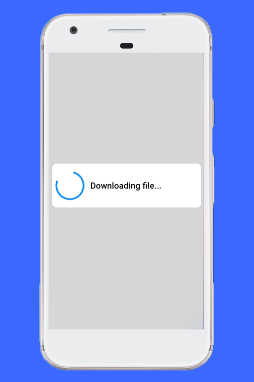
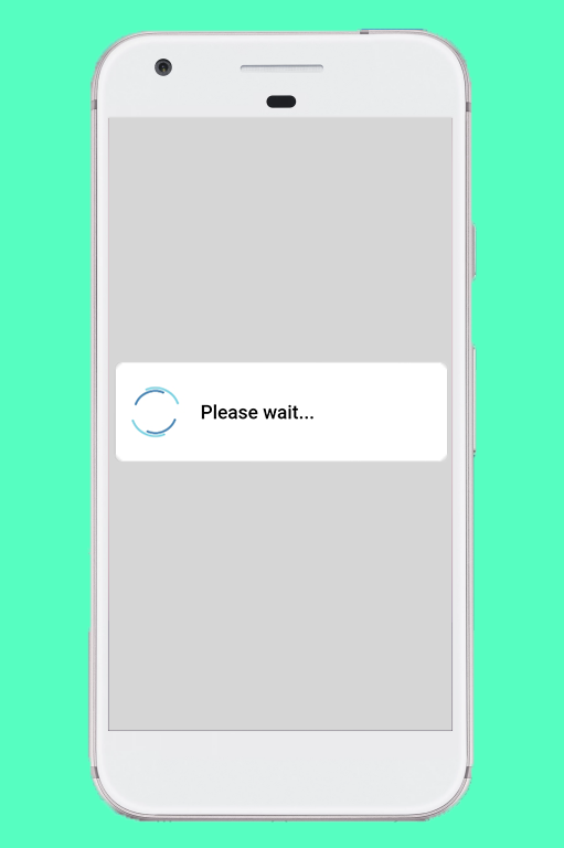
Import the package in your dart file
import 'package:progress_dialog/progress_dialog_null_safe.dart';
Create and initialise a ProgressDialog object inside the build() method passing context to it
final ProgressDialog pr = ProgressDialog(context);
//For normal dialog
pr = ProgressDialog(context,type: ProgressDialogType.Normal, isDismissible: true/false, showLogs: true/false);

//For showing progress percentage
pr =  ProgressDialog(context,type: ProgressDialogType.Download, isDismissible: true/false, showLogs: true/false);
pr.style(
  message: 'Downloading file...',
  borderRadius: 10.0,
  backgroundColor: Colors.white,
  progressWidget: CircularProgressIndicator(),
  elevation: 10.0,
  insetAnimCurve: Curves.easeInOut,
  progress: 0.0,
  textDirection: TextDirection.rtl,
  maxProgress: 100.0,
  progressTextStyle: TextStyle(
     color: Colors.black, fontSize: 13.0, fontWeight: FontWeight.w400),
  messageTextStyle: TextStyle(
     color: Colors.black, fontSize: 19.0, fontWeight: FontWeight.w600)
  );
Note: You don't need to use all parameters, all of them are optional
await pr.show();
pr.update(
  progress: 50.0,
  message: "Please wait...",
  progressWidget: Container(
    padding: EdgeInsets.all(8.0), child: CircularProgressIndicator()),
  maxProgress: 100.0,
  progressTextStyle: TextStyle(
    color: Colors.black, fontSize: 13.0, fontWeight: FontWeight.w400),
  messageTextStyle: TextStyle(
    color: Colors.black, fontSize: 19.0, fontWeight: FontWeight.w600),
  );
Note: You don't need to use all parameters, all of them are optional
pr.hide().then((isHidden) {
  print(isHidden);
});

// or
await pr.hide();
Navigating to next screens must be done after the completion of Future - hide(). See here for example
bool isProgressDialogShowing = pr.isShowing();
print(isProgressDialogShowing);
    pr = ProgressDialog(
      context,
      type: ProgressDialogType.Normal,
      isDismissible: true,
      /// your body here
      customBody: LinearProgressIndicator(
        valueColor: AlwaysStoppedAnimation<Color>(Colors.blueAccent),
        backgroundColor: Colors.white,
      ),
    );
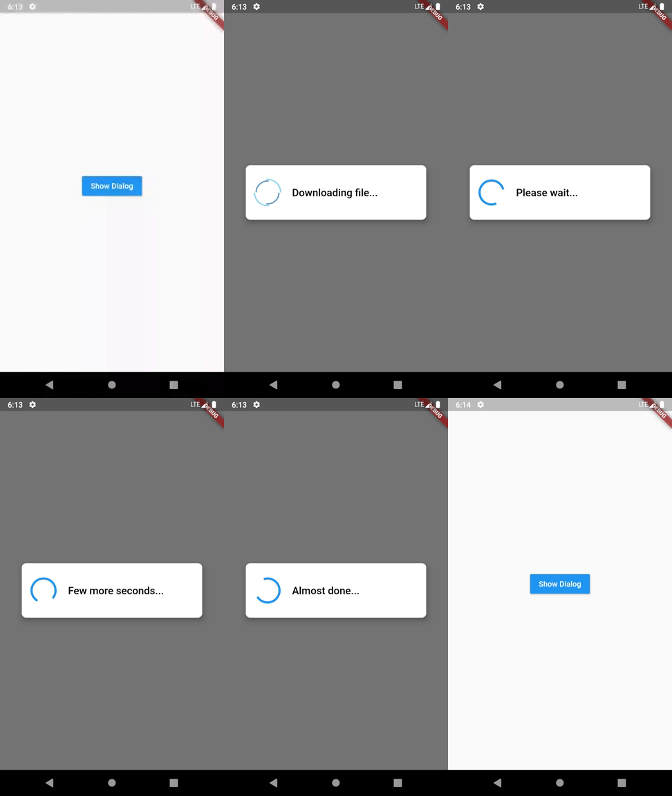
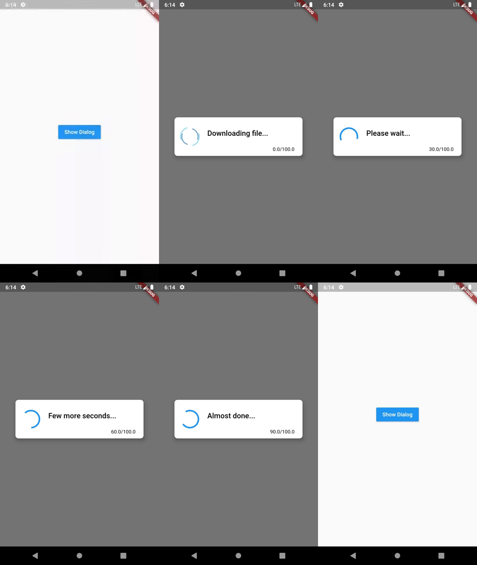
If you don't like to configure/style the dialog and continue with the default style, it's okay but just have a look at our default configuration.
| Attribute | Value |
|---|---|
| Dismissible | true |
| ProgressDialogType | ProgressDialogType.Normal |
| BackgroundColor | Colors.white |
| BorderRadius | RoundedRectangularBorder(radius: 8.0) |
| AnimationCurve | Curves.easeInOut |
| Elevation | 8.0 |
| ProgressWidget | Double_rings_loding_indicator |
| MessageTextStyle | color: Colors.black, fontSize: 19.0, fontWeight: FontWeight.w600 |
| ProgressTextStyle | color: Colors.black, fontSize: 13.0, fontWeight: FontWeight.w400 |
| showLogs | false |
| Attribute | Can be updated during instantiating | Can be updated during styling | Can be updated during dialog is shown |
|---|---|---|---|
| Dismissible | Yes | No | No |
| ProgressDialogType | Yes | No | No |
| BackgroundColor | No | Yes | No |
| BorderRadius | No | Yes | No |
| AnimationCurve | No | Yes | No |
| Elevation | No | Yes | No |
| ProgressWidget | No | Yes | Yes |
| MessageTextStyle | No | Yes | Yes |
| ProgressTextStyle | No | Yes | Yes |
| ShowLogs | Yes | No | No |
Loading indicator -> https://loading.io/
依存関係一覧 3 件
{"sdk":"flutter"}{"sdk":"flutter"}^5.0.0用途で絞り込み、開発状況を比較し、採用前に元のリポジトリで要件を確認しましょう。
“A repository is the most basic element of GitHub.”
GitHub Docs — About repositories ↗